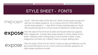
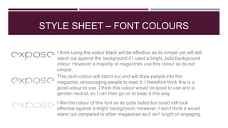
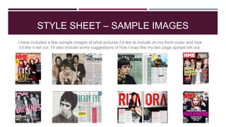
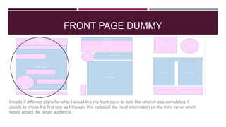
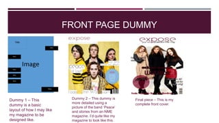
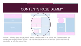
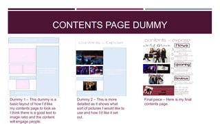
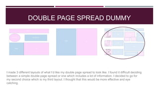
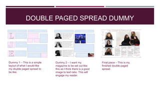
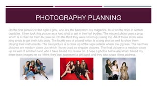
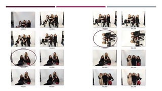
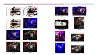
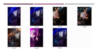
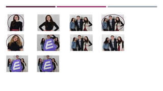
2. STYLE SHEET - FONTS
Aural - I like the style of this font as I think it looks quite young and
will suit my target audience. It’s a unique font so I think that this
would draw people in. I also think it looks sophisticated so I think
this would look good on a front cover so therefore I shall use this.
I like the style of this font as I think it looks simple yet effective as the
text would still stand out on a front cover but will also appeal to an
older target audience as well.
I like the style of this font as its bold and would stand out against
other magazines. It would also draw people in as the clarity of it is
clean. However with it being bold it is too similar to other music
magazines out there so it doesn't have a unique selling point.
3. STYLE SHEET – FONT COLOURS
I think using the colour black will be effective as its simple yet will still
stand out against the background if I used a bright, bold background
colour. However a majority of magazines use this colour so its not
unique.
I like the colour of this font as its quite faded but could still look
effective against a bright background. However, I don’t think it would
stand out compared to other magazines as it isn’t bright or engaging.
This plum colour will stand out and will draw people into the
magazine, encouraging people to read it. I therefore think this is a
good colour to use. I think this colour would be good to use and is
gender neutral, so I can then go on to keep it this way.
4. STYLE SHEET – SAMPLE IMAGES
I have included a few sample images of what pictures I’d like to include on my front cover and how
I’d like it set out. I’ll also include some suggestions of how I may like my two page spread set out.
5. FRONT PAGE DUMMY
I made 3 different plans for what I would like my front cover to look like when it was completed. I
decide to chose the first one as I thought this included the most information on the front cover which
would attract the target audience.
6. FRONT PAGE DUMMY
Dummy 1 – This
dummy is a basic
layout of how I may like
my magazine to be
designed like.
Dummy 2 – This dummy is
more detailed using a
picture of the band ‘Peace’
and stories from an NME
magazine. I’d quite like my
magazine to look like this.
Final piece – This is my
complete front cover.
7. CONTENTS PAGE DUMMY
I made 3 different plans of how I would like my contents page to be spread out. Contents pages are
usually crammed with lots of different interesting and entertaining so I wanted to also use that so I
decided to go with the second plan.
8. CONTENTS PAGE DUMMY
Dummy 1 – This dummy is a
basic layout of how I’d like
my contents page to look as
I think there is a good text to
image ratio and the content
will engage people.
Dummy 2 – This is more
detailed as it shows what
sort of pictures I would like to
use and how I’d like it set
out.
Final piece – Here is my final
contents page.
9. DOUBLE PAGE SPREAD DUMMY
I made 3 different layouts of what I’d like my double page spread to look like. I found it difficult deciding
between a simple double page spread or one which includes a lot of information. I decided to go for
my second choice which is my third layout. I thought that this would be more effective and eye
catching.
10. DOUBLE PAGED SPREAD DUMMY
Dummy 2 – I want my
magazine to be set out like
this as I think there is a good
image to text ratio. This will
engage my reader.
Dummy 1 – This is a simple
layout of what I would like
my double paged spread to
be like.
Final piece – This is my
finished double paged
spread.
11. PHOTOGRAPHY PLANNING
On the first picture circled I got 3 girls, who are the band from my magazine, to sit on the floor in certain
positions. I then took this picture as a long shot to get in their full bodies. The second photo uses a prop
which is a chair for them to pose on. On the third they were stood up posing too. All of these shots were
long shots to get their fully body. The fourth was of a band which is a long shot as well to show them
playing their instruments. The next picture is a close up of the sign outside where the gig was. The next two
pictures are medium close ups which I have used as singular pictures. The final picture is a medium close
up as well of another band who I have based my review on. These 3 photos below are what I based my
three main images on as I think they best represent a girl band and they also show direct address.