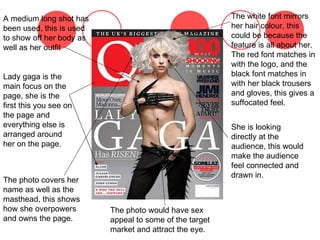
The document analyzes magazine covers and pages from various music magazines. It discusses the layout, design choices, and photographic techniques used on the covers and pages. Across the magazines analyzed, common techniques included using medium or long shots of artists to showcase them, placing the masthead in the top left, framing contents around the main image, and using a limited color palette including red, black, and white. The layouts are designed to draw attention to the featured artist and keep the design clean and eye-catching.