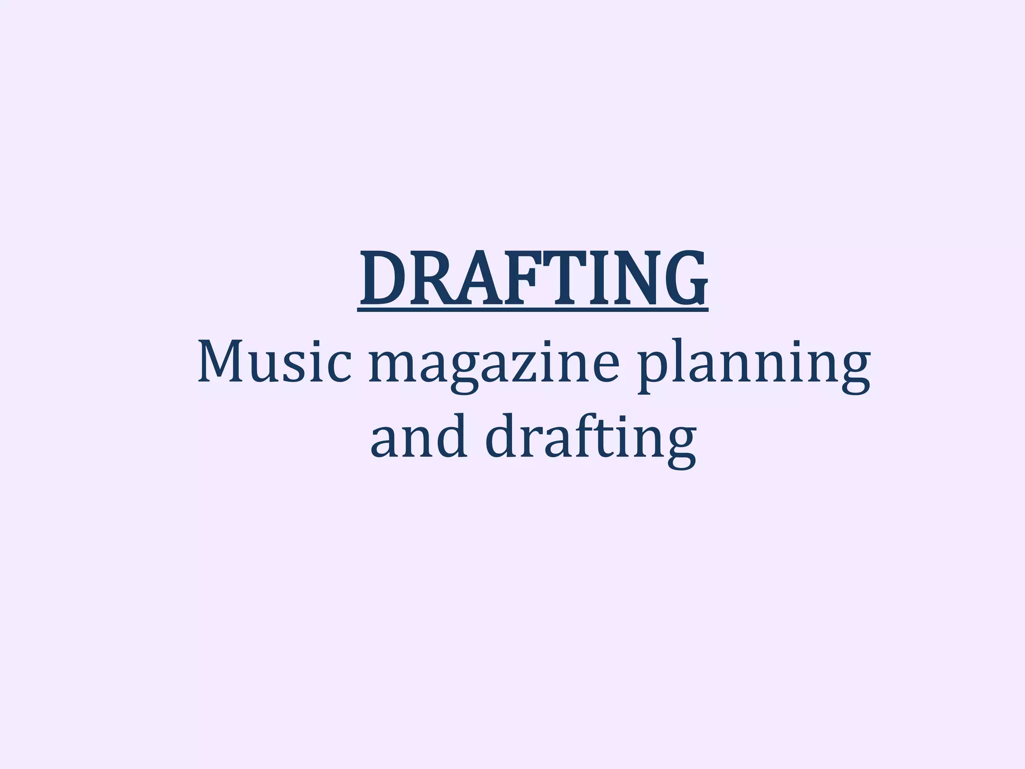
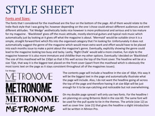
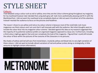
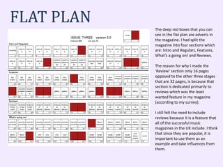
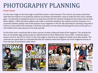
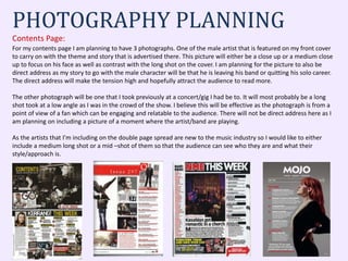
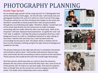
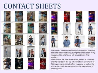
DRAFTING
Music magazine planning
and drafting
The fonts that I considered for the masthead are the four on the bottom of the page. All of them would relate to the
Indie Rock style that I was going for, however depending on the one I chose could attract different audiences and emit
different attitudes. ‘Fat Wedge’ aesthetically looks nice however is more professional and serious and is too mature
for my magazine . ‘Blacklisted’ gives off the music attitude, mostly electrical guitars and typical rock music which
automatically just by looking at it gives off what the magazine is about. ‘Mermaid’ would be suitable since it is a
simple, straight forward font which fits into the organised category that I’m looking for. Unfortunately it does not
automatically suggest the genre of the magazine which would mean extra work and effort would have to be placed
into each months issue to make a point about the magazine’s genre. Eventually, explicitly showing the genre could
lead to the magazine looking too busy and tacky. Lastly, ‘Right Chalk’ would add a more creative, fun style to the
magazine however it is also more immature and childlike than my other options. Eventually I decided on ‘Blacklisted’.
The size of this masthead will be 150pt so that it fits well across the top of the front cover. The headline will be at a
size 72pt, that way it is the biggest text placed on the front cover (apart from the masthead which is obviously the
most iconic text on the page as it stays consistent throughout all of the magazines issues).
STYLE SHEET
Fonts and Sizes:
Mermaid:
Blacklisted:
Fat Wedge:
Right Chalk:
The contents page will include a headline in the size of 60pt, this way it
will be the biggest text in the page and automatically illustrate what
the page will include. Also, I do not want the headline going all across
the top of the page and therefore having it at size 60pt will be just
enough for it to be eye-catching and noticeable but not overwhelming.
On my double page spread I will only use two fonts. For the headline I
am planning on using Britannic Bold in the size 60. The same font will
be used for the pull quote to tie in the themes. The article (size 12) as
well as cover line (size 21) that gives the headline a slight introduction
will be written in Minion Pro.
STYLE SHEET
Colours:
I had debated using a colour such as red or yellow, since they are the colour scheme going throughout my magazine,
for my masthead however later decided that using dark grey will look more aesthetically pleasing and fit in with the
Blacklisted font. I did not want the masthead to be completely black as I did not want it to attract all of the attention.
Instead I wanted the audience to focus on the pictures and headlines.
The reason I chose to use yellow and red as my colour scheme is because most of the rock/indie rock music
magazines use them colours and I am sure that it will resonate well with the audience. My initial thoughts were to
include the colour blue into my magazine colour scheme. I decided against this idea as my research suggested that
the majority of my potential audience prefers an organised magazine opposed to a busy one. Furthermore, including
a third colour might go against that and over complicate the look of the magazine. I figured that I could still include
the colour of blue within the pictures of the costume of the characters in my pictures.
My shades of yellow and red will vary from toned down, mustardy yellow and blood red, to very light variations of
these colours. I did not want to include vibrant variations of red and yellow (unless doing so strategically, in little
amounts to highlight certain information).
DUMMIESI decided to do my dummies digitally. That way I could do them to scale and
have a clear understanding as to what sizes I will be doing for my actual
construction of the front cover, contents page and double page spread.
Obviously for the purpose of this PowerPoint I had made the smaller so that
they could all fit. They are still readable and visible. I wanted to make the
layout and blocking of the three products a mixture of organised and busy.
This is why the cover page as well as the contents page are more organised
and spaced out contrasted to the double page spread in which all the photos,
text, pull quotes and titles are placed closely together.
The dummies are displayed on the right and below. On the right there is the
sample front cover and below there are the contents page (left) and double
page spread (right).
PULL
QUOTE
HEADLINE
ARTICLE TEXT
ARTICLE TEXT
ARTICLE TEXT
ARTICLE TEXT
WORKING TITLE
HEADLINE
HEADLINE
HEADLINE
COVERLINE
COVERLINE
COVERLINE
HEADLINE
COVERLINE
BAR
CODE
WORKING TITLE
COVERLINE
HEADLINE
COVERLINE
COVERLINE
HEADLINE
COVERLINE
COVERLINE
HEADLINE
COVERLINE
COVERLINE
COVERLINE
COVERLINE
COVERLINE
HEADLINE
COVERLINE
COVERLINE
The deep red boxes that you can
see in the flat plan are adverts in
the magazine. I had split the
magazine into four sections which
are: Intro and Regulars, Features,
What’s a going on! and Reviews.
The reason for why I made the
‘Review’ section only 16 pages
opposed to the other three stages
that are 32 pages, is because that
section is dedicated primarily to
reviews which was the least
wanted feature in my magazine
(according to my survey).
I still felt the need to include
reviews because it is a feature that
all of the successful music
magazines in the UK include. I think
that since they are popular, it is
important to use them as an
example and take influences from
them.
FLAT PLAN
PHOTOGRAPHY PLANNING
Front Cover:
For the main image on the cover page I would like to have a male character. This is due to my survey results that
state that the majority of my potential audience are females and therefore I want to make the front cover a female
gaze. I am planning on taking the picture at a long shot and with the character looking into the camera lens to show
direct address. I think that direct address will create a connection between the audience and the character. It is a
successful method used by most of the popular music magazines in the UK. My reasoning for choosing a long shot is
to focus on the outfit of the character so that the male does not only attract female gaze but also can be seen as a
role model to the males because of his style and vibe.
On the front cover I would also like to have a picture of what is featured inside of the magazine. This could be the
focus of my double page spread to give an advertisement of what ‘Metronome’ has to offer. I could also place a
picture of one or two CD’s or vinyl's on the cover page to show that my magazine includes up to date reviews. This
could also be a good idea as it automatically tells the audience what kind of genre my music magazine focuses on
from the type of artist/band I place there.
PHOTOGRAPHY PLANNING
Contents Page:
For my contents page I am planning to have 3 photographs. One of the male artist that is featured on my front cover
to carry on with the theme and story that is advertised there. This picture will either be a close up or a medium close
up to focus on his face as well as contrast with the long shot on the cover. I am planning for the picture to also be
direct address as my story to go with the male character will be that he is leaving his band or quitting his solo career.
The direct address will make the tension high and hopefully attract the audience to read more.
The other photograph will be one that I took previously at a concert/gig I had be to. It will most probably be a long
shot took at a low angle as I was in the crowd of the show. I believe this will be effective as the photograph is from a
point of view of a fan which can be engaging and relatable to the audience. There will not be direct address here as I
am planning on including a picture of a moment where the artist/band are playing.
As the artists that I’m including on the double page spread are new to the music industry so I would like to either
include a medium long shot or a mid –shot of them so that the audience can see who they are and what their
style/approach is.
PHOTOGRAPHY PLANNING
Double Page Spread:
On my double page spread I will be using around 5 to 7 photographs that
will be distributed on both pages . On the left side, I will include only one
photograph therefore the scale of it will be on most if not all of the page.
This picture will be the one that introduces the readers to the artists and
therefore I would like to clearly present their style and personalities
through the use of blocking and angles. Therefore, ideally, I would have one
of the artists look directly into the camera lens to make immediate
connecting with the reader while the other one looks away . Both of the
characters’ will have impassive facial expressions to signify the ‘cool’ and
‘chill’ vibe. In addition, I will take this picture somewhere that has a solid
background (such as a wall or a backdrop) instead of an open setting so
that when I add the title and cover line, it will not blend with the
surroundings but be easy to read. This photo will be a medium shot to
focus on the characters clothing and give the right amount of background
needed for the title.
The pictures featured on the right side will vary in orientation (horizontal
and vertical) as well as shots. I will include some pictures that are long
shots and include the full surrounding as well as costume of the characters.
Theses pictures will usually be the ones that include large items/props.
All of the pictures will be two shots as I want to show the closeness
between the two artists and the bond that they have. Also, most of not all
of the pictures will be took at an eye-level angle. That way the audience
feels as though they are the camera lens and are hanging out with the
artists. The reader-artist relationship seems more realistic.
CONTACT SHEETS
The contact sheets shows some of the pictures that I had
took and considered using during the construction of my
magazine. Not all of these will be used in my final
product.
Some photos are took in the studio, others at a concert
and the first 10 on the top left were taken specifically to
fit the genre and attitude of my magazine as well as the
article that I will feature on the double page spread of
the magazine.

Drafting

  • 1.
  • 2.
    The fonts thatI considered for the masthead are the four on the bottom of the page. All of them would relate to the Indie Rock style that I was going for, however depending on the one I chose could attract different audiences and emit different attitudes. ‘Fat Wedge’ aesthetically looks nice however is more professional and serious and is too mature for my magazine . ‘Blacklisted’ gives off the music attitude, mostly electrical guitars and typical rock music which automatically just by looking at it gives off what the magazine is about. ‘Mermaid’ would be suitable since it is a simple, straight forward font which fits into the organised category that I’m looking for. Unfortunately it does not automatically suggest the genre of the magazine which would mean extra work and effort would have to be placed into each months issue to make a point about the magazine’s genre. Eventually, explicitly showing the genre could lead to the magazine looking too busy and tacky. Lastly, ‘Right Chalk’ would add a more creative, fun style to the magazine however it is also more immature and childlike than my other options. Eventually I decided on ‘Blacklisted’. The size of this masthead will be 150pt so that it fits well across the top of the front cover. The headline will be at a size 72pt, that way it is the biggest text placed on the front cover (apart from the masthead which is obviously the most iconic text on the page as it stays consistent throughout all of the magazines issues). STYLE SHEET Fonts and Sizes: Mermaid: Blacklisted: Fat Wedge: Right Chalk: The contents page will include a headline in the size of 60pt, this way it will be the biggest text in the page and automatically illustrate what the page will include. Also, I do not want the headline going all across the top of the page and therefore having it at size 60pt will be just enough for it to be eye-catching and noticeable but not overwhelming. On my double page spread I will only use two fonts. For the headline I am planning on using Britannic Bold in the size 60. The same font will be used for the pull quote to tie in the themes. The article (size 12) as well as cover line (size 21) that gives the headline a slight introduction will be written in Minion Pro.
  • 3.
    STYLE SHEET Colours: I haddebated using a colour such as red or yellow, since they are the colour scheme going throughout my magazine, for my masthead however later decided that using dark grey will look more aesthetically pleasing and fit in with the Blacklisted font. I did not want the masthead to be completely black as I did not want it to attract all of the attention. Instead I wanted the audience to focus on the pictures and headlines. The reason I chose to use yellow and red as my colour scheme is because most of the rock/indie rock music magazines use them colours and I am sure that it will resonate well with the audience. My initial thoughts were to include the colour blue into my magazine colour scheme. I decided against this idea as my research suggested that the majority of my potential audience prefers an organised magazine opposed to a busy one. Furthermore, including a third colour might go against that and over complicate the look of the magazine. I figured that I could still include the colour of blue within the pictures of the costume of the characters in my pictures. My shades of yellow and red will vary from toned down, mustardy yellow and blood red, to very light variations of these colours. I did not want to include vibrant variations of red and yellow (unless doing so strategically, in little amounts to highlight certain information).
  • 4.
    DUMMIESI decided todo my dummies digitally. That way I could do them to scale and have a clear understanding as to what sizes I will be doing for my actual construction of the front cover, contents page and double page spread. Obviously for the purpose of this PowerPoint I had made the smaller so that they could all fit. They are still readable and visible. I wanted to make the layout and blocking of the three products a mixture of organised and busy. This is why the cover page as well as the contents page are more organised and spaced out contrasted to the double page spread in which all the photos, text, pull quotes and titles are placed closely together. The dummies are displayed on the right and below. On the right there is the sample front cover and below there are the contents page (left) and double page spread (right). PULL QUOTE HEADLINE ARTICLE TEXT ARTICLE TEXT ARTICLE TEXT ARTICLE TEXT WORKING TITLE HEADLINE HEADLINE HEADLINE COVERLINE COVERLINE COVERLINE HEADLINE COVERLINE BAR CODE WORKING TITLE COVERLINE HEADLINE COVERLINE COVERLINE HEADLINE COVERLINE COVERLINE HEADLINE COVERLINE COVERLINE COVERLINE COVERLINE COVERLINE HEADLINE COVERLINE COVERLINE
  • 5.
    The deep redboxes that you can see in the flat plan are adverts in the magazine. I had split the magazine into four sections which are: Intro and Regulars, Features, What’s a going on! and Reviews. The reason for why I made the ‘Review’ section only 16 pages opposed to the other three stages that are 32 pages, is because that section is dedicated primarily to reviews which was the least wanted feature in my magazine (according to my survey). I still felt the need to include reviews because it is a feature that all of the successful music magazines in the UK include. I think that since they are popular, it is important to use them as an example and take influences from them. FLAT PLAN
  • 6.
    PHOTOGRAPHY PLANNING Front Cover: Forthe main image on the cover page I would like to have a male character. This is due to my survey results that state that the majority of my potential audience are females and therefore I want to make the front cover a female gaze. I am planning on taking the picture at a long shot and with the character looking into the camera lens to show direct address. I think that direct address will create a connection between the audience and the character. It is a successful method used by most of the popular music magazines in the UK. My reasoning for choosing a long shot is to focus on the outfit of the character so that the male does not only attract female gaze but also can be seen as a role model to the males because of his style and vibe. On the front cover I would also like to have a picture of what is featured inside of the magazine. This could be the focus of my double page spread to give an advertisement of what ‘Metronome’ has to offer. I could also place a picture of one or two CD’s or vinyl's on the cover page to show that my magazine includes up to date reviews. This could also be a good idea as it automatically tells the audience what kind of genre my music magazine focuses on from the type of artist/band I place there.
  • 7.
    PHOTOGRAPHY PLANNING Contents Page: Formy contents page I am planning to have 3 photographs. One of the male artist that is featured on my front cover to carry on with the theme and story that is advertised there. This picture will either be a close up or a medium close up to focus on his face as well as contrast with the long shot on the cover. I am planning for the picture to also be direct address as my story to go with the male character will be that he is leaving his band or quitting his solo career. The direct address will make the tension high and hopefully attract the audience to read more. The other photograph will be one that I took previously at a concert/gig I had be to. It will most probably be a long shot took at a low angle as I was in the crowd of the show. I believe this will be effective as the photograph is from a point of view of a fan which can be engaging and relatable to the audience. There will not be direct address here as I am planning on including a picture of a moment where the artist/band are playing. As the artists that I’m including on the double page spread are new to the music industry so I would like to either include a medium long shot or a mid –shot of them so that the audience can see who they are and what their style/approach is.
  • 8.
    PHOTOGRAPHY PLANNING Double PageSpread: On my double page spread I will be using around 5 to 7 photographs that will be distributed on both pages . On the left side, I will include only one photograph therefore the scale of it will be on most if not all of the page. This picture will be the one that introduces the readers to the artists and therefore I would like to clearly present their style and personalities through the use of blocking and angles. Therefore, ideally, I would have one of the artists look directly into the camera lens to make immediate connecting with the reader while the other one looks away . Both of the characters’ will have impassive facial expressions to signify the ‘cool’ and ‘chill’ vibe. In addition, I will take this picture somewhere that has a solid background (such as a wall or a backdrop) instead of an open setting so that when I add the title and cover line, it will not blend with the surroundings but be easy to read. This photo will be a medium shot to focus on the characters clothing and give the right amount of background needed for the title. The pictures featured on the right side will vary in orientation (horizontal and vertical) as well as shots. I will include some pictures that are long shots and include the full surrounding as well as costume of the characters. Theses pictures will usually be the ones that include large items/props. All of the pictures will be two shots as I want to show the closeness between the two artists and the bond that they have. Also, most of not all of the pictures will be took at an eye-level angle. That way the audience feels as though they are the camera lens and are hanging out with the artists. The reader-artist relationship seems more realistic.
  • 9.
    CONTACT SHEETS The contactsheets shows some of the pictures that I had took and considered using during the construction of my magazine. Not all of these will be used in my final product. Some photos are took in the studio, others at a concert and the first 10 on the top left were taken specifically to fit the genre and attitude of my magazine as well as the article that I will feature on the double page spread of the magazine.