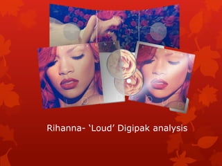
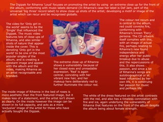
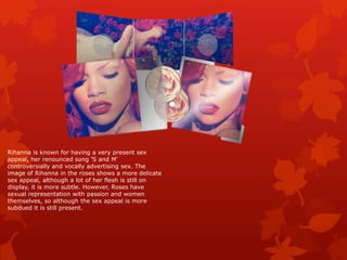
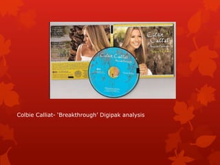
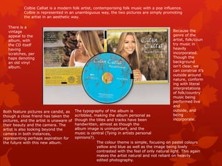
Digipak research
‘Digipak’ is a brand in its own right, being a particular style of CD,
DVD or BD packaging. It is a registered trademark of AGI-
Shorewood, an Atlas Holdings LLC company.

Digipaks have a gatefold, meaning they are in the style of a book.
They include plastic trays to hold CDs/DVDs.

‘Digipak’ was the first alternative form of packaging from generic
jewel cases; it was the first new form of CD packaging to be used
by major record labels such as EMI, Universal etc…
Rihanna- ‘Loud’ Digipak analysis
The Digipak for Rihanna ‘Loud’ focuses on promoting the artist by using an extreme close up for the front of
     the album, conforming with music labels demand (In Rihanna’s case her label is Def Jam, part of the
     universal ‘big three’ record label) to show close up shots of the artist; developing a motif or image of the
     artist which can recur and be recognised globally.

                                                                                     The colour red recurs and
   The video for ‘Only girl in                                                       is central to the album,
   the world’ seems to be the                                                        red could connote fire,
   ‘Single’ that influenced the                                                      conforming with
   Digipak. The music video                                                          Rihanna’s known ‘Fiery’
   features lots of close ups of                                                     persona. The CD artwork
   Rihanna, and also similar                                                         itself complies with this,
   shots of nature that appear                                                       with an image of actual
   inside the cover. This is                                                         fire, perhaps relating to
   denoting ‘Only girl in the                                                        Rihanna’s new found
   world’ to be one of the most                                                      independence and
   popular singles of the                                                            energy after her public
   album, and is creating a                                                          breakup due to abuse
   constant image and appeal         The extreme close up of Rihanna                 and the repercussions of
   with the album and the            shows a vulnerability because of                this. It also shows
   video, making Rihanna as          her closed eyes and unreadable                  passion, and since a lot
   an artist recognisable and        expression. ‘Red’ is again                      of Rihanna’s songs are
   branded.                          central, coinciding with her                    autobiographical or at
                                     vibrant new hair, and her                       least influenced by her
                                     makeup here deliberately red to                 own life, it is construing
                                     further illuminate the colour red.              her passion for music
                                                                                     and perhaps life.
The inside image of Rihanna in the bed of roses is
more aesthetic than the front featured image, but it       The white of the dress featured on the artist contrasts
makes less of a statement, and the artist isn’t shown      with the red, and also has a timeless connotation with
as clearly. On the inside however the image can be         fire and ice, again underlying the vulnerability of
shown in its full capacity, and acts as a more             Rihanna that features on the front of the album despite
‘exclusive’ image of the artist for those who have         the album being about female strength.
actually bought the Digipak.
Rihanna is known for having a very present sex
appeal, her renounced song ‘S and M’
controversially and vocally advertising sex. The
image of Rihanna in the roses shows a more delicate
sex appeal, although a lot of her flesh is still on
display, it is more subtle. However, Roses have
sexual representation with passion and women
themselves, so although the sex appeal is more
subdued it is still present.
Colbie Calliat- ‘Breakthrough’ Digipak analysis
Colbie Calliat is a modern folk artist, contemporising folk music with a pop influence.
           Colbie is represented in an unambiguous way, the two pictures are simply promoting
           the artist in an aesthetic way.

  There is a
  vintage                                                                                      Because the
  appeal to the                                                                                genre of the
  album, with                                                                                  artist, folk/coun
  the CD itself                                                                                try music in
  having                                                                                       heavily
  scratches, per                                                                               incorporated.
  haps denoting                                                                                Though the
  an old vinyl                                                                                 background
  album.                                                                                       isn’t clear, we
                                                                                               can construe it’s
                                                                                               outside around
                                                                                               nature, conform
                                                                                               ing with literal
                                                                                               interpretations
                                                                                               of folk/country
                                                                                               music being
                                                                                               performed live
                                                                                               and
Both feature pictures are candid, as     The typography of the album is                        outside, and
though a close friend has taken the      scribbled, making the album personal as               being
pictures, and the artist is unaware of   though the titles and tracks have been                incorporate.
their beauty and the camera. The         handwritten, almost as though the
artist is also looking beyond the        album image is unimportant, and the
camera in both instances,                music is central (Tying in artists personal
representing perhaps aspiration for      opinions?).
the future with this new album.                      The colour theme is simple, focusing on pastel colours
                                                     yellow and blue as well as the image being lowly
                                                     contrasted with the feel of only natural light. This again
                                                     makes the artist natural and not reliant on heavily
                                                     edited photography.

Digipak research

  • 1.
  • 2.
    ‘Digipak’ is abrand in its own right, being a particular style of CD, DVD or BD packaging. It is a registered trademark of AGI- Shorewood, an Atlas Holdings LLC company. Digipaks have a gatefold, meaning they are in the style of a book. They include plastic trays to hold CDs/DVDs. ‘Digipak’ was the first alternative form of packaging from generic jewel cases; it was the first new form of CD packaging to be used by major record labels such as EMI, Universal etc…
  • 3.
  • 4.
    The Digipak forRihanna ‘Loud’ focuses on promoting the artist by using an extreme close up for the front of the album, conforming with music labels demand (In Rihanna’s case her label is Def Jam, part of the universal ‘big three’ record label) to show close up shots of the artist; developing a motif or image of the artist which can recur and be recognised globally. The colour red recurs and The video for ‘Only girl in is central to the album, the world’ seems to be the red could connote fire, ‘Single’ that influenced the conforming with Digipak. The music video Rihanna’s known ‘Fiery’ features lots of close ups of persona. The CD artwork Rihanna, and also similar itself complies with this, shots of nature that appear with an image of actual inside the cover. This is fire, perhaps relating to denoting ‘Only girl in the Rihanna’s new found world’ to be one of the most independence and popular singles of the energy after her public album, and is creating a breakup due to abuse constant image and appeal The extreme close up of Rihanna and the repercussions of with the album and the shows a vulnerability because of this. It also shows video, making Rihanna as her closed eyes and unreadable passion, and since a lot an artist recognisable and expression. ‘Red’ is again of Rihanna’s songs are branded. central, coinciding with her autobiographical or at vibrant new hair, and her least influenced by her makeup here deliberately red to own life, it is construing further illuminate the colour red. her passion for music and perhaps life. The inside image of Rihanna in the bed of roses is more aesthetic than the front featured image, but it The white of the dress featured on the artist contrasts makes less of a statement, and the artist isn’t shown with the red, and also has a timeless connotation with as clearly. On the inside however the image can be fire and ice, again underlying the vulnerability of shown in its full capacity, and acts as a more Rihanna that features on the front of the album despite ‘exclusive’ image of the artist for those who have the album being about female strength. actually bought the Digipak.
  • 5.
    Rihanna is knownfor having a very present sex appeal, her renounced song ‘S and M’ controversially and vocally advertising sex. The image of Rihanna in the roses shows a more delicate sex appeal, although a lot of her flesh is still on display, it is more subtle. However, Roses have sexual representation with passion and women themselves, so although the sex appeal is more subdued it is still present.
  • 6.
  • 7.
    Colbie Calliat isa modern folk artist, contemporising folk music with a pop influence. Colbie is represented in an unambiguous way, the two pictures are simply promoting the artist in an aesthetic way. There is a vintage Because the appeal to the genre of the album, with artist, folk/coun the CD itself try music in having heavily scratches, per incorporated. haps denoting Though the an old vinyl background album. isn’t clear, we can construe it’s outside around nature, conform ing with literal interpretations of folk/country music being performed live and Both feature pictures are candid, as The typography of the album is outside, and though a close friend has taken the scribbled, making the album personal as being pictures, and the artist is unaware of though the titles and tracks have been incorporate. their beauty and the camera. The handwritten, almost as though the artist is also looking beyond the album image is unimportant, and the camera in both instances, music is central (Tying in artists personal representing perhaps aspiration for opinions?). the future with this new album. The colour theme is simple, focusing on pastel colours yellow and blue as well as the image being lowly contrasted with the feel of only natural light. This again makes the artist natural and not reliant on heavily edited photography.