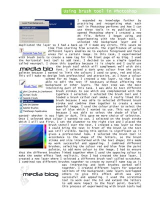
1. I expanded my knowledge further by
practising and recognising what each
tool in Photoshop performs and how I can
use these tools in my publication. I
opened Photoshop where I created a new
A4 file. Before I began using and
experimenting with the brush tool, I
unlocked the background layer and I
duplicated the layer so I had a back up if I made any errors. This saves me
time from starting from scratch. The significance of using
different layers enables me to explore foreground and focal
areas for a certain image. In this task, I experimented
with brush tools to create a name tag for the front page of my blog. I used
the horizontal text tool to add text. I decided to use a simple typeface
called neuropol. I chose this typeface because it is simple and I could use
the brush tool which will complement well with this
font. I selected a dark grey colour from the paint
palette because I wanted to limit the colours I used to grey, red and blue.
This will make my design look professional and attractive, as I have a colour
scheme for my image. I created a new layer, so that I was
able to edit the text if necessary without affecting the
background or other layers. The next step was the most
interesting part of this task. I was able to text different
brush strokes to see which one complemented with the
typeface I selected. I selected the brush tool and I
loaded a brush called real smoke. I really liked this
brush because I was able to selected different brush
stroke and combine them together to create a more
powerful image. I used the colour picker to select the
hue of blue which I wanted to use. This was useful
because I was able to select the shade of blue I
wanted- whether it was light or dark. This gave me more choice of selection.
Once I selected what colour I wanted to use, I selected on the brush stroke
which I will use first. I set the diameter to the right size and I placed the
brush stencil over the text. I created a new layer so that
I could bring the text in front of the brush so the text
was still visible. Having this option is significant as it
gives a professional look. I selected the brush tool in
accordance to the shape of the letters, so the brush
stroke and size intertwined with the text shape; this made
my work successful and appealing. I combined different
brushes, selecting the colour red and blue from the paint
palette, to add more colour to the image. I had to ensure
that the different brushes linked together when I used the opposing colour to
make the smoke effect look realistic. Once I had created the base layer, I
created a new layer where I selected a different brush tool called scratchsm.
I combined two different brushes together to create my overall name tag as it
was interesting and both brushes worked well
together. I created different layers for separate
sections of the background; some layers overlapped
others to give this effect which was very
successful and appealing. I used the scratchsm
tool to work over the txt and extend the letters
to add more impact to the focal point. Overall,
this process of experimenting with brush tools had
Using brush tool in Photoshop
2. increased my understanding and usage of the
different tools available in Photoshop and how I
can imply them to my publications. I found this
task very interesting and creative, as the final
output represent the significant of Photoshop.
Final design