
Recommended
More Related Content
What's hot
What's hot (20)
Similar to Fajardo, winfreya m. 11 caritas, abm
Similar to Fajardo, winfreya m. 11 caritas, abm (20)
Recently uploaded
Recently uploaded (20)
Fajardo, winfreya m. 11 caritas, abm
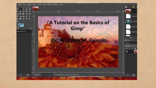
- 1. A Tutorial on the Basics of Gimp By: Winfreya M. Fajardo “A Tutorial on the Basics of Gimp” By: Winfreya M. Fajardo
- 2. The Basics of Gimp; Imaging and Design What is a Gimp? A Gimp application is an app used in editing, designing and blending images GHIMP; GNU Image Manipulation Program) is a free and open-source raster graphics editor used for image retouching and editing, free-form drawing, converting between different image formats, and more specialized tasks.
- 3. Steps in Imaging and Designing Step 1: Adding a text Use a text tool to add some text. You will get a new text layer which you can also see if you look at the layers dialogue. You can use the move tool to move the text where you like to have it. Then merge it with the white layer below by choosing Merge Down from the Layer menu. You should now have one layer with black text on white background Using colors, invert you will achieve something like the picture above
- 4. Step 2: Adding Colors First of all blur the image a bit using Filters, Blur, and Gaussian blur (a value of 5 may be a good start) Now add a new layer to the image with the help of the New Layer button in the layer’s dialogue Choose it to be white It will be created just made the text layer effectively hiding
- 5. It will be active which can be seen from the fact that it has a blue background in the layers dialogue Click some times on the eye symbol to see how you can make a layer dialogue. Click some times on the eye symbol to see how you can a layer invisible and make the other layer active by clicking on its small preview in the layers dialogue At the end, leave the new white layer visible and active Use the plasma plugin to make this layer a little colorful; Filters, Render, Clouds, Plasma(Yes, you are invited to experiment with the parameters)
- 6. Use the plasma plugin to make this layer a little colorful; Filters, Render, Clouds, Plasma(Yes, you are invited to experiment with the parameters) The layers dialogue should look something like this now
- 7. Bumpmapping It’s getting funny now; Use the bumpmap plugin with the blurred text layer as a bumpmap on the plasma layer, You can play with the other parameters, but they have sensible defaults You’ll get an image like the one above Now (still on the plasma layer) choose add layer from the layers dialogue menu Choose the mask to be white Nothing will change on the image for now, but the layer dialogue will look like this
- 8. Using the layer mask Now activate the text layer again. (you don’t have to make the layers on top invisible to work on this layer Now activate the text layer again. (you don’t have to make the layers on top invisible to work on this layer Make sure you have the mask of the top layer selected and the layer is activated Choose Edit → Paste. You will again get a floating selection, shown in the layer dialog like this:
- 9. Use the layer dialog menu to Anchor Layer, which will anchor the floating selection into the previous activated layer (which is the mask of the plasma layer in our case). This will leave you with the following scenario:
- 10. Adjusting the levels Now add a new layer and fill it with some color (e.g. with the help of the bucket fill tool) and use Raise Layer or Lower Layer from the layer dialog menu to achieve something like this: Now you’ll see that the image of the logo isn’t very sharp. We’ll change this now. We’ll change this now. Make sure you have selected the plasma layer’s mask and open Layers → Colors → Levels
- 11. This tool is one of the most important tools you have! Play with the little triangles you’ll see in the two grey gradients and watch their effect on the image. For now, try to achieve something like the following:
- 12. What we do here is making the border of the mask sharper, and by that means, sharpening the whole picture (the area which is neither 100% opaque nor transparent will become smaller) -But we can easily avoid the picture getting pixel-steps by leaving still a smooth transition between opaque and transparent parts of the layer. . - (If you didn’t realize it by now - I bet you did - the layer mask works in such a way that all black parts of the mask will become transparent parts of the layer and all white parts will stay opaque (with smooth transitions realized by values of grey).
- 13. Creating a drop-shadow -Using the layer menu you will have noticed the entry Duplicate Layer. Use this now. Then use Apply Layer Mask and Lower Layer which should leave you with something like this: -Make sure you check the Keep Transparency option (the little box next to the layer mode) and then fill that duplicated layer with black - You can paint over the text with a paint tool or simply drag a black color from the color selector and drop it over the image. -You do not have to be careful: the Keep Transparency button will let you paint only on opaque parts of the image. This will give you:
- 14. -Now make sure you uncheck the button again and move the layer some pixels to the right and downwards. -You can move it with the Move tool while pressing Shift so that it moves the current layer instead of picking a new one. -(Alternatively, can use Layer → Transform → Offset and enter a small offset for both X and Y: this will offset the contents of the layer without moving the layer itself.) -Then blur your layer and adjust the transparency with the slider so the background will shine through: You’ve just generated a so-called drop shadow, which greatly enhances the 3D effect and is used in very many places. That’s it! Now have a lot of fun making flying logos!