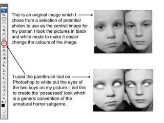
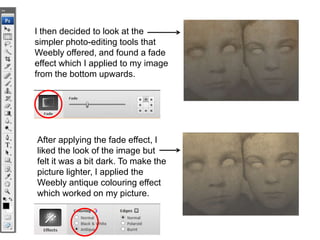
Photo editing process…
      By Stephanie Caldecott
This is an original image which I
chose from a selection of potential
photos to use as the central image for
my poster. I took the pictures in black
and white mode to make it easier
change the colours of the image.


I used the paintbrush tool on
Photoshop to white out the eyes of
the two boys on my picture. I did this
to create the ‘possessed’ look which
is a generic convention of the
unnatural horror subgenre.
I then created a new layer and
used to paint bucket tool to put a
brown colour over the layer. After
this, I changed the opacity from
100% to 50% to create a sepia
effect over my image.


To give my picture an old, worn
out, antique look, I found a scratchy
background design and lowered the
opacity. I then layered it over my
image to add the scratched effect.
I then decided to look at the
simpler photo-editing tools that
Weebly offered, and found a fade
effect which I applied to my image
from the bottom upwards.


After applying the fade effect, I
liked the look of the image but
felt it was a bit dark. To make the
picture lighter, I applied the
Weebly antique colouring effect
which worked on my picture.
To create the burnt, faded boarder
around the central image of the two
faces, I used the burn tool with black
colouring to blend in with the black
background.


                                         To create the intense colouring
                                         of the central image, I used the
                                         ‘curves’ tool to change the
                                         contrast and saturation of the
                                         image.


I also used the burn tool randomly
on different parts of the central
image to make the picture look
older and damaged in relation to the
old, damaged town of Woodwich.

Photo Editing Process

  • 1.
    Photo editing process… By Stephanie Caldecott
  • 2.
    This is anoriginal image which I chose from a selection of potential photos to use as the central image for my poster. I took the pictures in black and white mode to make it easier change the colours of the image. I used the paintbrush tool on Photoshop to white out the eyes of the two boys on my picture. I did this to create the ‘possessed’ look which is a generic convention of the unnatural horror subgenre.
  • 3.
    I then createda new layer and used to paint bucket tool to put a brown colour over the layer. After this, I changed the opacity from 100% to 50% to create a sepia effect over my image. To give my picture an old, worn out, antique look, I found a scratchy background design and lowered the opacity. I then layered it over my image to add the scratched effect.
  • 4.
    I then decidedto look at the simpler photo-editing tools that Weebly offered, and found a fade effect which I applied to my image from the bottom upwards. After applying the fade effect, I liked the look of the image but felt it was a bit dark. To make the picture lighter, I applied the Weebly antique colouring effect which worked on my picture.
  • 5.
    To create theburnt, faded boarder around the central image of the two faces, I used the burn tool with black colouring to blend in with the black background. To create the intense colouring of the central image, I used the ‘curves’ tool to change the contrast and saturation of the image. I also used the burn tool randomly on different parts of the central image to make the picture look older and damaged in relation to the old, damaged town of Woodwich.