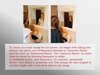
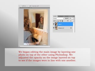
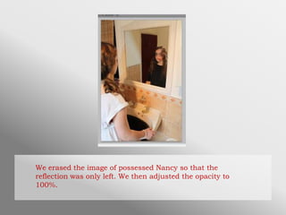
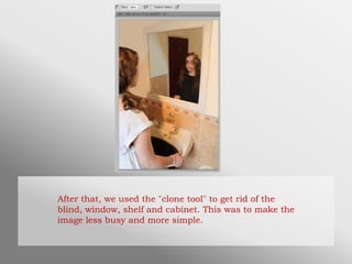
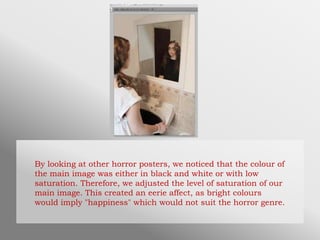
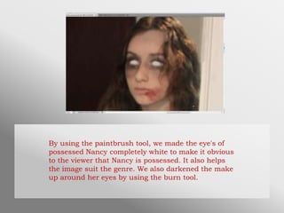
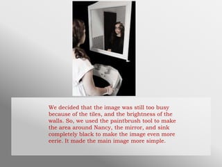
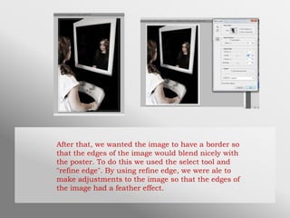
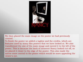
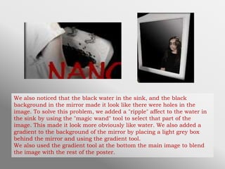
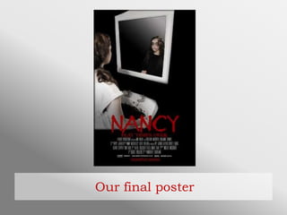
Creating Our Poster
To create our main image for our poster, we began with taking two
photos; one photo was of Roseanne dressed as "Innocent Nancy"
and the other as "Possessed Nancy". For "innocent Nancy" we used
mise-en-scene by dressing Roseanne in white
to symbolize purity, and innocence. To contrast, "possessed
Nancy" wore black to symbolize evil. This brings the idea of good vs
evil (the bright side vs the dark side) to the image.
We began editing the main image by layering one
photo on top of the other using Photoshop. We
adjusted the opacity on the image layered on top
to see if the images were in line with one another.
We erased the image of possessed Nancy so that the
reflection was only left. We then adjusted the opacity to
100%.
After that, we used the "clone tool" to get rid of the
blind, window, shelf and cabinet. This was to make the
image less busy and more simple.
By looking at other horror posters, we noticed that the colour of
the main image was either in black and white or with low
saturation. Therefore, we adjusted the level of saturation of our
main image. This created an eerie affect, as bright colours
would imply "happiness" which would not suit the horror genre.
By using the paintbrush tool, we made the eye's of
possessed Nancy completely white to make it obvious
to the viewer that Nancy is possessed. It also helps
the image suit the genre. We also darkened the make
up around her eyes by using the burn tool.
We decided that the image was still too busy
because of the tiles, and the brightness of the
walls. So, we used the paintbrush tool to make
the area around Nancy, the mirror, and sink
completely black to make the image even more
eerie. It made the main image more simple.
After that, we wanted the image to have a border so
that the edges of the image would blend nicely with
the poster. To do this we used the select tool and
"refine edge". By using refine edge, we were ale to
make adjustments to the image so that the edges of
the image had a feather effect.
We then placed the main image on the poster we had previously
created.
To finish the poster we added a tagline and the credits, which are
features used by many film posters that we have looked at. We also
transformed the size of the main image and moved it to the left of the
poster. This is because the back of innocent Nancy looked cut off, so
we placed it closer to the edge of the poster. This also made the
mirror more central to the poster which would be more appealing the
viewer's eye.
We also noticed that the black water in the sink, and the black
background in the mirror made it look like there were holes in the
image. To solve this problem, we added a "ripple" affect to the water in
the sink by using the "magic wand" tool to select that part of the
image. This made it look more obviously like water. We also added a
gradient to the background of the mirror by placing a light grey box
behind the mirror and using the gradient tool.
We also used the gradient tool at the bottom the main image to blend
the image with the rest of the poster.
Our final poster

Creating Our Poster

  • 1.
  • 2.
    To create ourmain image for our poster, we began with taking two photos; one photo was of Roseanne dressed as "Innocent Nancy" and the other as "Possessed Nancy". For "innocent Nancy" we used mise-en-scene by dressing Roseanne in white to symbolize purity, and innocence. To contrast, "possessed Nancy" wore black to symbolize evil. This brings the idea of good vs evil (the bright side vs the dark side) to the image.
  • 3.
    We began editingthe main image by layering one photo on top of the other using Photoshop. We adjusted the opacity on the image layered on top to see if the images were in line with one another.
  • 4.
    We erased theimage of possessed Nancy so that the reflection was only left. We then adjusted the opacity to 100%.
  • 5.
    After that, weused the "clone tool" to get rid of the blind, window, shelf and cabinet. This was to make the image less busy and more simple.
  • 6.
    By looking atother horror posters, we noticed that the colour of the main image was either in black and white or with low saturation. Therefore, we adjusted the level of saturation of our main image. This created an eerie affect, as bright colours would imply "happiness" which would not suit the horror genre.
  • 7.
    By using thepaintbrush tool, we made the eye's of possessed Nancy completely white to make it obvious to the viewer that Nancy is possessed. It also helps the image suit the genre. We also darkened the make up around her eyes by using the burn tool.
  • 8.
    We decided thatthe image was still too busy because of the tiles, and the brightness of the walls. So, we used the paintbrush tool to make the area around Nancy, the mirror, and sink completely black to make the image even more eerie. It made the main image more simple.
  • 9.
    After that, wewanted the image to have a border so that the edges of the image would blend nicely with the poster. To do this we used the select tool and "refine edge". By using refine edge, we were ale to make adjustments to the image so that the edges of the image had a feather effect.
  • 10.
    We then placedthe main image on the poster we had previously created. To finish the poster we added a tagline and the credits, which are features used by many film posters that we have looked at. We also transformed the size of the main image and moved it to the left of the poster. This is because the back of innocent Nancy looked cut off, so we placed it closer to the edge of the poster. This also made the mirror more central to the poster which would be more appealing the viewer's eye.
  • 11.
    We also noticedthat the black water in the sink, and the black background in the mirror made it look like there were holes in the image. To solve this problem, we added a "ripple" affect to the water in the sink by using the "magic wand" tool to select that part of the image. This made it look more obviously like water. We also added a gradient to the background of the mirror by placing a light grey box behind the mirror and using the gradient tool. We also used the gradient tool at the bottom the main image to blend the image with the rest of the poster.
  • 12.