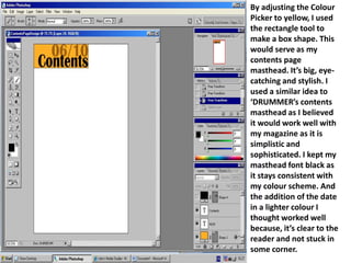
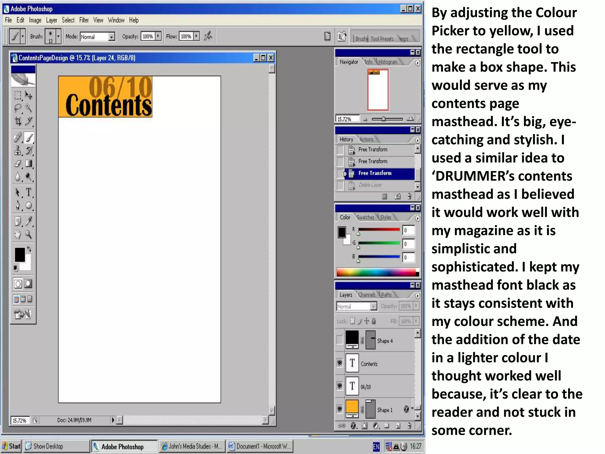
By adjusting the Colour Picker to yellow, the document creator used the rectangle tool to make a box shape as the contents page masthead. This masthead would be big, eye-catching and stylish, similar to another magazine's masthead. The creator kept the masthead font black to stay consistent with the colour scheme and added the date in a lighter colour for clarity.
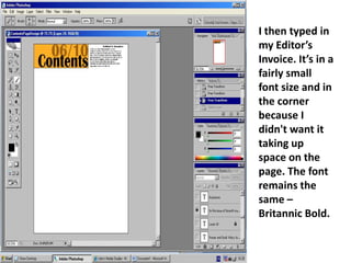
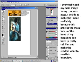
The creator then added an Editor's Invoice in a small corner font. An image of the main artist focus was added and initially positioned on the left, but issues arose so it was moved to the right instead, though problems remained. Positioning it back to the left left wasted space, so a grey banner was added to make elements more
1. By adjusting the Colour Picker to yellow, I used the rectangle tool to make a box shape. This would serve as my contents page masthead. It’s big, eye-catching and stylish. I used a similar idea to ‘DRUMMER’s contents masthead as I believed it would work well with my magazine as it is simplistic and sophisticated. I kept my masthead font black as it stays consistent with my colour scheme. And the addition of the date in a lighter colour I thought worked well because, it’s clear to the reader and not stuck in some corner.
2. I then typed in my Editor’s Invoice. It’s in a fairly small font size and in the corner because I didn't want it taking up space on the page. The font remains the same – Britannic Bold.
3. I eventually add my main image to my contents page. I decide to make the image really big because this artist is the main focus of the issue of my magazine so I have to really sell him and make the readers want to read his interview.
4. I change my mind and decide to position the main image on the right hand side instead of the left. However I found problems with this positioning as the picture under the masthead looked a little off. I want everything to be almost parallel to each other on the page.
5. I decide to position it back to where it was originally however there was a problem with quite a bit of wasted space. Therefore I added a grey banner or margin to the edge of the page. I felt this helped my main image and masthead to became more parallel and look neater.
6. I re-add my features, and added two additional images to accompany the feature’s page numbers. I think the boxes around the sub-headings work well because they stand out and everything is in it’s own section making it easier for the reader to see.
7. Finally, I add the page numbers to the pictures so it is easy for the readers to turn to. And also added a floating quote – ‘”Music is my life” – Ray Matthews speaks out’ as I feel this can target the reader emotionally because they feel they can relate to this statement and therefore relate to the artist.