1. Mock up feedback
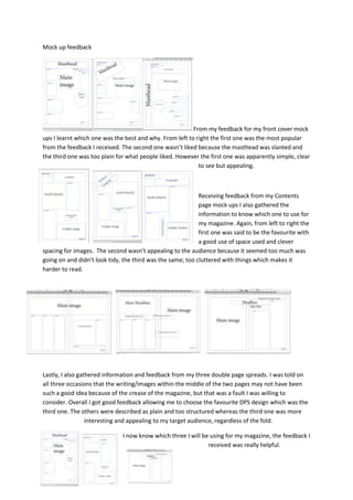
From my feedback for my front cover mock
ups I learnt which one was the best and why. From left to right the first one was the most popular
from the feedback I received. The second one wasn’t liked because the masthead was slanted and
the third one was too plain for what people liked. However the first one was apparently simple, clear
to see but appealing.
Receiving feedback from my Contents
page mock ups I also gathered the
information to know which one to use for
my magazine. Again, from left to right the
first one was said to be the favourite with
a good use of space used and clever
spacing for images. The second wasn’t appealing to the audience because it seemed too much was
going on and didn’t look tidy, the third was the same; too cluttered with things which makes it
harder to read.
Lastly, I also gathered information and feedback from my three double page spreads. I was told on
all three occasions that the writing/images within the middle of the two pages may not have been
such a good idea because of the crease of the magazine, but that was a fault I was willing to
consider. Overall I got good feedback allowing me to choose the favourite DPS design which was the
third one. The others were described as plain and too structured whereas the third one was more
interesting and appealing to my target audience, regardless of the fold.
I now know which three I will be using for my magazine, the feedback I
received was really helpful.