
![Relative Frequency
[(Category Contribution) / (Total of all
Categories)] x 100 expressed in bar chart
form.](https://image.slidesharecdn.com/kamleshwar-pareto-140408014925-phpapp02/85/Pareto-chart-importance-making-16-320.jpg)
![Cumulative Frequency
[(Relative Frequency of Category
Contribution) + (Previous Cumulative
Frequency)] expressed as a line graph](https://image.slidesharecdn.com/kamleshwar-pareto-140408014925-phpapp02/85/Pareto-chart-importance-making-17-320.jpg)

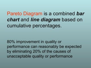
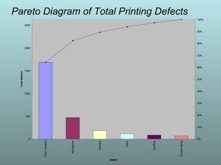
The Pareto Principle, or 80:20 rule, suggests that a small number of causes (20%) are responsible for the majority of effects (80%), as illustrated by Vilfredo Pareto's observations on wealth distribution and crop yields. This principle applies across various fields, including quality management, emphasizing that by addressing the vital few issues, one can achieve significant improvements. Using tools like Pareto charts, organizations can prioritize actions to tackle the most impactful problems and maximize resource allocation for quality enhancement.


![Unit ii tqm principles [continuous process improvement]](https://cdn.slidesharecdn.com/ss_thumbnails/unit-iitqmprinciplescontinuousprocessimprovement-170124044704-thumbnail.jpg?width=640&height=640&fit=bounds)


