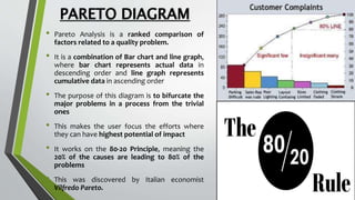
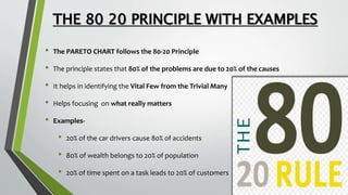
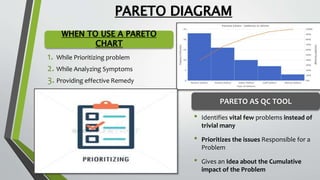
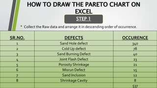
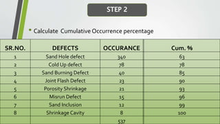
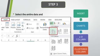
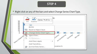
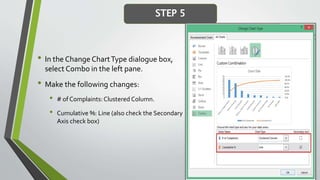
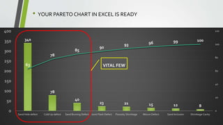
The document provides an overview of Pareto diagrams, emphasizing their use in analyzing quality problems by showing a ranked comparison of factors. It explains the 80-20 principle, where 20% of causes contribute to 80% of the problems, and illustrates how to create a Pareto chart in Excel with steps for data arrangement, cumulative percentage calculation, and chart creation. The tool helps prioritize vital issues, allowing users to focus on significant problems for effective remediation.


![: QCL-14-v3_[pareto diagram]_[banasthali university]_[Radhika Sharma]](https://cdn.slidesharecdn.com/ss_thumbnails/chlng4-141231094904-conversion-gate01-thumbnail.jpg?width=640&height=640&fit=bounds)


