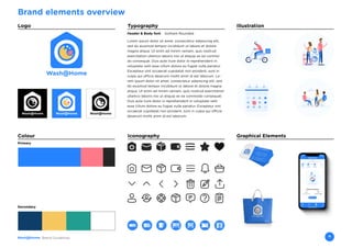
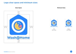
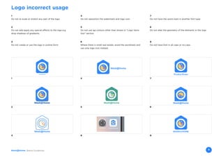
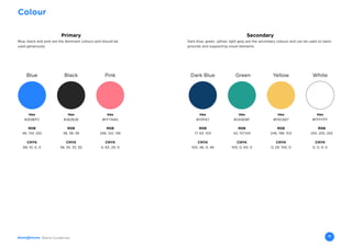
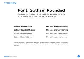
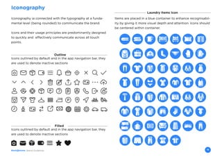
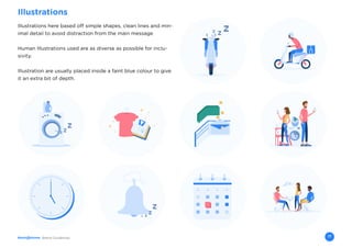
This document outlines branding guidelines for Wash@Home, including:
- The logo, its variations, minimum sizes, and incorrect uses
- Primary and secondary colors that should be used consistently
- Gotham Rounded as the primary typography across all platforms
- Iconography that clearly communicates through rounded simple shapes
- Illustrations that are inclusive and help expand the visual language
- Graphical elements that showcase the brand across applications
The guidelines provide a flexible yet consistent brand identity system to represent Wash@Home.
When you’re in a battle against an almighty enemy (the seemingly endless supply of dull online learning that gets cranked out throughout our industry), it pays to know yourself and to know where your strengths lie. That's why we've created a set of Brand Guidelines (what we call our 'Brand Battlepack'). It's our true North. It's what keeps us consistent. If you'd like to find out more about the Growth Engineering brand, this is a good place to start!
To find out more, please visit: www.growthengineering.co.uk
A Brand Style guide for Debbie Goulding Makeup Artist. This style guide provides a platform which ensures that every visual representation of Debbie Goulding’s logo is consistent and adheres to the Debbie Goulding image and brand.
CMN Flooring Inc. is a professional flooring installer in the Omaha, NE area.
As part of an Advanced Graphic Design course, we were prompted to choose a company that we wanted to rebrand. I chose CMN Flooring and here is the process book that describes the journey I had with the company and my process in rebranding it.
As any professional designer should understand, it’s not that simple. Even if you (a designer) are not color blind, over 8% of your male clients are likely to be, as are 8% of their male target markets (color blindness is rarer in females — more like 0.5%). If your design work is unsightly or hard to read for this substantial group, you’ve made a pretty huge mistake.
And say you want to design but do happen to be color blind? Not a big deal. Learn a few tricks and you’ll be fine.
In this slide, we’ll give pointers for non-color blind designers on how to consider a color blind audience, and tips for color blind designers on how to keep your colors straight.
Precision. Innovation. Professionalism.
These words are essential for Breavis core philosophy and its path to company’s success increasing over years. The company has always stayed true to its core values.
At 7Frames, we create explainers, ads, social media videos, presentations, and more using various animation mediums. Known for our storytelling and creative visualization, we work with businesses and agencies to create more effective and engaging content. Visit 7frames.in for more details about videos and design.
This is The Littlefield Company brand guideline. The purpose of this guide is an attempt to formalize our ever-developing brand. As the company grows and evolves, this book will evolve with it.
Style guidelines for Cherriots employees. Includes design guidelines, examples of applying the brand, writing tips, Cherriots terminology, and style, formatting, and word choice.
All organizations have a brand or corporate identity and the way in which it is perceived is often vital to the way in which clients and employees respond to that organization. The key to good brand identity design is the simple communication of the client's public image. Brand should reflect the company, and the products or services that company provides. A good brand identity enables a company to position itself visually in the market alongside its competitors.
My overall task is to create such a brand identity and brand identity program - from the logo through appropriate design applications, such as stationery, menus, napkins, uniforms, web home page and signage. I must choose one of the particular culturally-based themes to reflect the bistro's personality - give it a name and design a brand identity (logo) and set of brand guidelines. It is important to have an idea of how the concept of a particular country and culture will work as a space where people will be spending some time eating and drinking. The brand identity for the chosen bistro must reflect this concept. Each of these bistros should also reflect the area they are located in, basing on my demographic and style research.
Of all the options, I chose British Colonial themed bistro of which will be located in the area of Bangsar, Kuala Lumpur. Designed in Adobe InDesign and Adobe Illustrator, this is the brand identity manual for the bistro, showing a set of consistent and flexible guidelines and rules so that future items can be designed using these guidelines and rules and remain part of a growing consistent brand identity.
Address : 8100 Boone Boulevard Suite 150, Vienna, Fairfax, Virginia, 22182, United States
Phone Number : (703) 991-2766
Email : info@treehouseeyes.com
Hours of Operation : Monday-Friday 9am - 5pm
Website : https://treehouseeyes.com
Treehouse specializes in first-rate eye care for kids, offering an array of effective myopia treatments. Our team is comprised of leading optometrists and ophthalmologists who are involved in both research and clinical practice. We are focused on treating childhood myopia, giving children opportunities that their parents never had. We are equally committed to delivering top-notch service and a nurturing space for both children and parents. To find out your child's risk for myopia, take our short quiz or consult Treehouse for expert advice.
Visit treehouseeyes.com to schedule your child’s myopia test appointment with a myopia specialist.
White wonder, Work developed by Eva TschoppMansi Shah
White Wonder by Eva Tschopp
A tale about our culture around the use of fertilizers and pesticides visiting small farms around Ahmedabad in Matar and Shilaj.
Dive into the innovative world of smart garages with our insightful presentation, "Exploring the Future of Smart Garages." This comprehensive guide covers the latest advancements in garage technology, including automated systems, smart security features, energy efficiency solutions, and seamless integration with smart home ecosystems. Learn how these technologies are transforming traditional garages into high-tech, efficient spaces that enhance convenience, safety, and sustainability.
Ideal for homeowners, tech enthusiasts, and industry professionals, this presentation provides valuable insights into the trends, benefits, and future developments in smart garage technology. Stay ahead of the curve with our expert analysis and practical tips on implementing smart garage solutions.
7 Alternatives to Bullet Points in PowerPointAlvis Oh
So you tried all the ways to beautify your bullet points on your pitch deck but it just got way uglier. These points are supposed to be memorable and leave a lasting impression on your audience. With these tips, you'll no longer have to spend so much time thinking how you should present your pointers.
Can AI do good? at 'offtheCanvas' India HCI preludeAlan Dix
Invited talk at 'offtheCanvas' IndiaHCI prelude, 29th June 2024.
https://www.alandix.com/academic/talks/offtheCanvas-IndiaHCI2024/
The world is being changed fundamentally by AI and we are constantly faced with newspaper headlines about its harmful effects. However, there is also the potential to both ameliorate theses harms and use the new abilities of AI to transform society for the good. Can you make the difference?
Book Formatting: Quality Control Checks for DesignersConfidence Ago
This presentation was made to help designers who work in publishing houses or format books for printing ensure quality.
Quality control is vital to every industry. This is why every department in a company need create a method they use in ensuring quality. This, perhaps, will not only improve the quality of products and bring errors to the barest minimum, but take it to a near perfect finish.
It is beyond a moot point that a good book will somewhat be judged by its cover, but the content of the book remains king. No matter how beautiful the cover, if the quality of writing or presentation is off, that will be a reason for readers not to come back to the book or recommend it.
So, this presentation points designers to some important things that may be missed by an editor that they could eventually discover and call the attention of the editor.
3. 3Brand Guidelines
Welcome to our brand
This reference guide displays a flexible and prominent
brand identity
A system has been made to keep all the branding
element consistent
4. Brand Guidelines 4
Brand elements overview
Logo Typography
Iconography
Illustration
Graphical ElementsColour
Header & Body font: Gotham Rounded
Lorem ipsum dolor sit amet, consectetur adipiscing elit,
sed do eiusmod tempor incididunt ut labore et dolore
magna aliqua. Ut enim ad minim veniam, quis nostrud
exercitation ullamco laboris nisi ut aliquip ex ea commo-
do consequat. Duis aute irure dolor in reprehenderit in
voluptate velit esse cillum dolore eu fugiat nulla pariatur.
Excepteur sint occaecat cupidatat non proident, sunt in
culpa qui officia deserunt mollit anim id est laborum. Lo-
rem ipsum dolor sit amet, consectetur adipiscing elit, sed
do eiusmod tempor incididunt ut labore et dolore magna
aliqua. Ut enim ad minim veniam, quis nostrud exercitation
ullamco laboris nisi ut aliquip ex ea commodo consequat.
Duis aute irure dolor in reprehenderit in voluptate velit
esse cillum dolore eu fugiat nulla pariatur. Excepteur sint
occaecat cupidatat non proident, sunt in culpa qui officia
deserunt mollit anim id est laborum.
Primary
Secondary
5. 5Brand Guidelines
Logo
The Wash@Home logo is a valuable assest
It is important to use it correctly to build a strong and
consistent brand presence in the market
The following pages outline how it should be used and
not to be used
8. Brand Guidelines 8
Logo clear space and minimum sizes
Minimum SizesClear Space
Digital
54 px Wide
Print
19mm Wide
9. Brand Guidelines 9
Logo incorrect usage
1
Do not re-scale or stretch any part of the logo
5
Do not use lgo colours other than shown in “Logo Varia-
tion” section
4
Do not reposition the watermark and logo icon
7
Do not have the word mark in another font type
6
Where there is small real estate, avoid the wordmark and
use only logo icon instead.
8
Do not alter the geometry of the elements in the logo
3
Do not create or use the logo in outline form
9
Do not have font in all caps or no caps
2
Do not add apply any special effects to the logo e.g
drop shadows of gradients
1
2
3
4
Wash@Home
7
5 8
6
WASH@HOME
9
10. 10Brand Guidelines
Colour
The colour palette is fresh, modern and clean
Designs should be done with a more preference to using
the primary colours as oppose to the secondary colours
11. Brand Guidelines 11
Primary Secondary
Colour
Blue Dark BlueBlack GreenPink WhiteYellow
Hex
#2E86FC
Hex
#262626
Hex
#FF7A8A
Hex
#113F67
Hex
#2A9D8F
Hex
#F6C667
Hex
#FFFFFF
RGB
46, 134, 252
RGB
38, 38, 38
RGB
256, 122, 138
RGB
17, 63, 103
RGB
42, 157,143
RGB
246, 198, 103
RGB
255, 255, 255
CMYK
89, 10, 0, 0
CMYK
38, 35, 33, 92
CMYK
0, 63, 29, 0
CMYK
100, 46, 0, 46
CMYK
100, 0, 60, 0
CMYK
0, 29. 100, 0
CMYK
0, 0, 0, 0
Blue, black and pink are the dominant colours and should be
used generously
Dark blue, green, yellow, light grey are the secondary colours and can be used on back-
grounds and supporting visual elements.
12. 12Brand Guidelines
Typography
All effort should be made to keep branding consistent
across all platforms and touchpoints using the same font
type but font weight can differ as required.
13. Brand Guidelines 13
Typography
Font: Gotham Rounded
Gotham Rounded is the rounded version of the ever popular Gotham typeface. Its rounded
corners lend it a much more warm and friendly feel compared to the strong and authoritative
Gotham.
Aa Bb Cc Dd Ee Ff Gg Hh Ii Jj Kk Ll Mm Nn Oo Pp Qq Rr Ss
Tt Uu Vv Ww Xx Yy Zz 1 2 3 4 5 6 7 8 9 ! @ # $ %
Gotham Rounded Bold This font is very welcoming
Gotham Rounded Medium This font is very welcoming
Gotham Rounded Book This font is very welcoming
Gotham Rounded Light This font is very welcoming
15. Brand Guidelines 15
Iconography
Laundry Items Icon
Iconography ia connected with the typography at a funda-
mental level (being rounded) to communicate the brand.
Icons and their usage principles are predominantly designed
to quickly and effectively communicate across all touch
points.
Items are placed in a blue container to enhance recognisabil-
ity by giving it more visual depth and attention. Icons should
be centered within container.
Icons outlined by default and in the app navigation bar, they
are used to denote inactive sections
Filled
Icons outlined by default and in the app navigation bar, they
are used to denote inactive sections
Outline
17. Brand Guidelines 17
Illustrations
Illustrations here based off simple shapes, clean lines and min-
imal detail to avoid distraction from the main message
Human Illustrations used are as diverse as possible for inclu-
sivity.
Illustration are usually placed inside a faint blue colour to give
it an extra bit of depth.
18. 18Brand Guidelines
Graphical Elements
There is a core library of bespoke assests to showcase
the brand in difference applications.
These illustrative elements helps to expand on the overall
visual language.
20. 20Brand Guidelines
More Information
If you have any questions or require futher assistance,
please contact us at :
brand@washathome.com
www.washathome.com