Download as PDF, PPTX


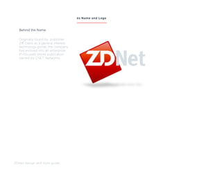
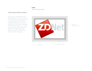
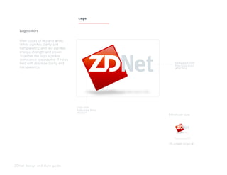
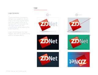
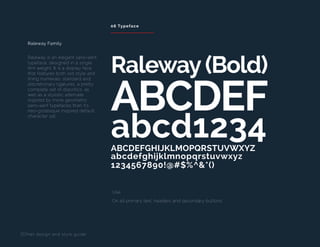
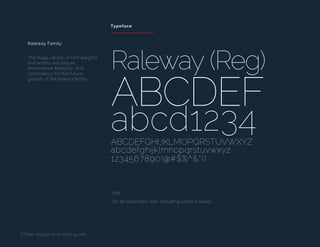
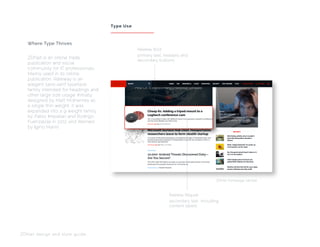
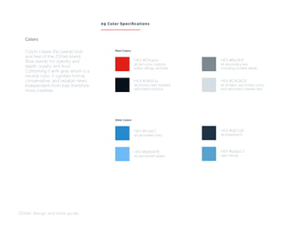

The ZDNet Design and Style Guide outlines guidelines for using the ZDNet logo and branding on its website, focusing on visual standards and best practices for brand consistency. Key elements include specifications for logo placement, color usage, font choices (specifically the Raleway typeface), and grid systems for responsive design. The document emphasizes clarity, legibility, and the importance of maintaining a cohesive brand identity across various digital platforms.