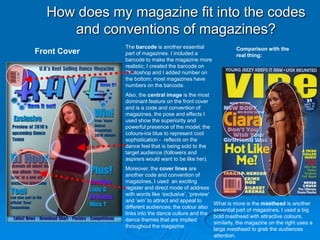
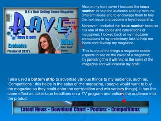
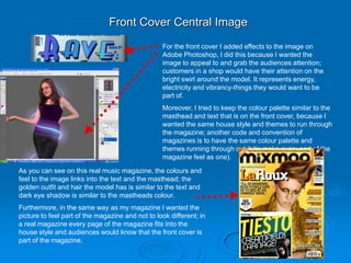
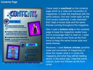
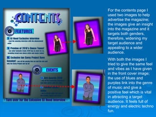
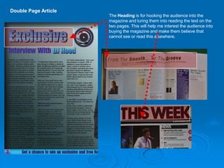
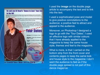
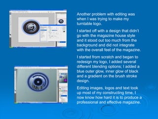
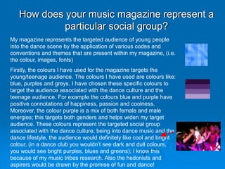
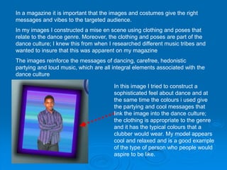
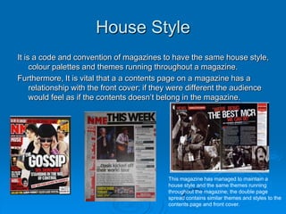
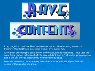
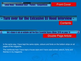
Evaluation
How does my magazine fit into the codes
     and conventions of magazines?
              The barcode is another essential                  Comparison with the
Front Cover   part of magazines. I included a                   real thing:
              barcode to make the magazine more
              realistic; I created the barcode on
              Photoshop and I added number on
              the bottom; most magazines have
              numbers on the barcode.
              Also, the central image is the most
              dominant feature on the front cover
              and is a code and convention of
              magazines, the pose and effects I
              used show the superiority and
              powerful presence of the model; the
              colours-ice blue to represent cool
              sophistication - reflects on the
              dance feel that is being sold to the
              target audience (followers and
              aspirers would want to be like her).
              Moreover, the cover lines are
              another code and convention of
              magazines, I used an exciting
              register and direct mode of address
              with words like ‘exclusive’, ‘preview’
              and ‘win’ to attract and appeal to
                                                       What is more is the masthead is another
              different audiences; the colour also
                                                       essential part of magazines, I used a big
              links into the dance culture and the
                                                       bold masthead with attractive colours,
              dance themes that are implied
                                                       similarly, the magazine on the right uses a
              throughout the magazine
                                                       large masthead to grab the audiences
                                                       attention.
Also on my front cover I included the issue
                                         number to help the audience keep up with the
                                         different issues and to encourage them to buy
                                         the next issue and become a loyal readership.
                                         Moreover, I included the issue number because
                                         it is one of the codes and conventions of
                                         magazines; I looked back at my magazine
                                         annotations in my preliminary task to help me
                                         follow and develop my magazine.

                                          This is one of the things a magazine reader
                                          expects to see on the cover of a magazine;
                                          by providing this it will help in the sales of the
                                          magazine and will increase my profit.


I also used a bottom strip to advertise various things to my audience, such as,
‘Competitions’; this helps in the sales of the magazine, (people would want to buy
the magazine so they could enter the competition and win various things). It has the
same effect as ticker tape headlines on a TV program and entices the audience into
the product
Front Cover Central Image
                                                  For the front cover I added effects to the image on
                                                  Adobe Photoshop, I did this because I wanted the
                                                  image to appeal to and grab the audiences attention;
                                                  customers in a shop would have their attention on the
                                                  bright swirl around the model. It represents energy,
                                                  electricity and vibrancy-things they would want to be
                                                  part of.
                                                  Moreover, I tried to keep the colour palette similar to the
                                                  masthead and text that is on the front cover, because I
                                                  wanted the same house style and themes to run through
                                                  the magazine; another code and convention of
                                                  magazines is to have the same colour palette and
                                                  themes running through out it (to make every part of the
                                                  magazine feel as one).

As you can see on this real music magazine, the colours and
feel to the image links into the text and the masthead; the
golden outfit and hair the model has is similar to the text and
dark eye shadow is similar to the mastheads colour.
Furthermore, in the same way as my magazine I wanted the
picture to feel part of the magazine and not to look different; in
a real magazine every page of the magazine fits into the
house style and audiences would know that the front cover is
part of the magazine.
Contents Page

                I have used a masthead on the contents
                page which is a code and convention of
                magazines. It made the masthead with the
                same colours, font and ‘circle splat’ as the
                front covers masthead; it was important
                that I kept a house style and the same
                themes running throughout the magazine.
                Also I used a bottom strip in the contents
                page to keep the magazine reader busy
                and to encourage them to read on. I used
                the same colours and fonts as the front
                cover to keep the same house style and
                same themes.
                Moreover, I used feature articles (another
                code and convention of magazines) to
                show the reader what is in inside the
                magazine and what they will be reading
                about; in the same way, I kept the same
                colours, fonts and themes as the front
                cover.
For the contents page I
used two images to help
advertise the magazine;
the images give an insight
into the magazine and it
targets both genders,
therefore, widening my
target audience and
appealing to a wider
audience.
With both the images I
tried to give the same feel
and vibes as I have given
in the front cover image;
the use of blues and
purples link into the genre
of music and give a
positive feel which is vital
in attracting a target
audience. It feels full of
energy and electric techno
fun.
Double Page Article
                      The Heading is for hooking the audience into the
                      magazine and luring them into reading the text on the
                      two pages. This will help me interest the audience into
                      buying the magazine and make them believe that
                      cannot see or read this elsewhere.
I used the image on the double page
article to accompany the text and to link
into the text.
I used a sophisticated pose and model
to give positive connotations to the
audience; a positive feel to attract and
appeal to the audience.
Moreover, on Photoshop I designed a
logo to go with the ‘Tour Dates’; I used
an effective logo with similar colours
that I have already applied to the
magazine to keep the same house
style, themes and feel to the magazine.
What is more, is that I carried on the
bottom strip from the front cover and
contents pages to keep the same look
and house style to the magazine; I don’t
want the audience to feel as if the
double page spread is not part of this
dance magazine
What difficulties did you face while you was
                   constructing your magazine?

While I was constructing my magazine I faced several
different issues and problems. One of the main
problems was saving my magazine; sometimes it
wouldn’t save in the right format and I would have to         1st
make several copies of the file and save it to my
memory stick.
                                                              edit
Another difficulty was when I was editing my images,
it was very time consuming and it took up most of my
constructing time; getting the right colours and effects
were vital in appealing to a target audience (editing       2nd
images to a high standard and making them look like
real magazine images). Maintaining a consistent
                                                            edit
house style was challenging but essential.
Moreover, another problem was when I was trying to
take pictures from Adobe Photoshop and apply them
to my magazine on Adobe In Design; I had to save it
for ‘web and devices’ on the PNG format and then
‘place’ it onto my magazine file.
Another problem with editing was
when I was trying to make my
turntable logo.
I started off with a design that didn’t
go with the magazine house style
and it stood out too much from the
background and did not integrate
with the overall feel of the magazine.
I started from scratch and began to
redesign my logo, I added several
different blending options; I added a
blue outer glow, inner glow of black
and a gradient on the brush stroke
design.
Editing images, logos and text took
up most of my constructing time, I
now know how hard it is to produce a
professional and effective magazine.
How does your music magazine represent a
           particular social group?
My magazine represents the targeted audience of young people
into the dance scene by the application of various codes and
conventions and themes that are present within my magazine, (i.e.
the colour, images, fonts)
Firstly, the colours I have used for the magazine targets the
young/teenage audience. The colours I have used are colours like:
blue, purples and greys. I have chosen these specific colours to
target the audience associated with the dance culture and the
teenage audience. For example the colours blue and purple have
positive connotations of happiness, passion and coolness.
Moreover, the colour purple is a mix of both female and male
energies; this targets both genders and helps widen my target
audience. These colours represent the targeted social group
associated with the dance culture; being into dance music and the
dance lifestyle, the audience would definitely like cool and bright
colour, (in a dance club you wouldn’t see dark and dull colours,
you would see bright purples, blues and greens); I know this
because of my music tribes research. Also the hedonists and
aspirers would be drawn by the promise of fun and dance!
Secondly the fonts link into the genre and targeted audience. I chose
my fonts which relate and represent the dance genre.
If I had used fonts that were unclear and unreadable it would have had
a negative impact on the sales of the magazine. It is essential that the
designer and editor of a magazine use the appropriate fonts to illustrate
their product. What is more, is that the fonts I have used relates to the
dance genre as the colours and design of the font is something that the
audience would instantly recognise as associated with the high energy,
vibrant dance genre.
In a magazine it is important that the images and costumes give the right
messages and vibes to the targeted audience.
In my images I constructed a mise en scene using clothing and poses that
relate to the dance genre. Moreover, the clothing and poses are part of the
dance culture; I knew this from when I researched different music tribes and
wanted to insure that this was apparent on my magazine
The images reinforce the messages of dancing, carefree, hedonistic
partying and loud music, which are all integral elements associated with the
dance culture

                                       In this image I tried to construct a
                                       sophisticated feel about dance and at
                                       the same time the colours i used give
                                       the partying and cool messages that
                                       link the image into the dance culture;
                                       the clothing is appropriate to the genre
                                       and it has the typical colours that a
                                       clubber would wear. My model appears
                                       cool and relaxed and is a good example
                                       of the type of person who people would
                                       aspire to be like.
House Style
It is a code and convention of magazines to have the same house style,
     colour palettes and themes running throughout a magazine.
Furthermore, It is vital that a a contents page on a magazine has a
     relationship with the front cover; if they were different the audience
     would feel as if the contents doesn’t belong in the magazine.


                                             This magazine has managed to maintain a
                                             house style and the same themes running
                                             throughout the magazine; the double page
                                             spread contains similar themes and styles to the
                                             contents page and front cover.
In my magazine I think that I kept the same colours and themes running throughout it,
therefore, I feel that I have established a house style successfully
An example of keeping the same themes and colours, is in my mastheads. I have used the
same fonts, gradient colours and effects; they both look like they’re from the same magazine
(this is the look and feel that I wanted the mastheads to have).
Moreover, I think that I have definitely maintained a house style and kept to the same
colours of blue, purples and greys.
Front Cover


                                                                        Contents


                                                        Double Page Article

In the same way, I have kept the same styles, colours and fonts on the bottom strips on all
pages of the magazine.
This reinforces how I have kept a house style and I have used similar colours, fonts and
themes in my magazine.
What kind of magazine institution would
   sell and distribute your magazine?
In my Opinion the magazine institution that would distribute my magazine is the EMAP
magazine institution.
Emap, is a British media company that was founded in London in 1947. Emap, stands for
East Midland Allied Press.
Emap specialises in magazine publishing, it most successful magazine was ‘Smash Hits’
which was a pop magazine. Moreover, this institution distributes a magazine called ‘Mixmag’
that is a Dance magazine. Mixmag is a British dance music and clubbing magazine. It styles
itself as "the world's biggest selling dance music magazine."
This magazine is one the most successful dance magazines around and it is similar my
magazine; it contains themes of dance, colours of dance, fonts that relate to the genre and
images that contain elements of dance.
Moreover, I think that this institution should take on my magazine alongside Mixmag, my
magazine is just as professional and unique as Mixmag.
Firstly, the genre is the same and Mixmag is one of the only dance magazines
around, therefore, I think that EMAP should take on my magazine because it will
bring EMAP profit and by appealing and successfully drawing the audiences
attention the sales should rise; giving EMAP a good reputation.
Looking back at you Preliminary task, what have
       you learnt in progression of you full project?
 I think I have definitely made a progression from my first magazine (Preliminary
      task: Produce a school magazine) and I have developed my IT skills in
      order to produce an effective Music Magazine. The Preliminary task was a
      starting point to get used to using the technology and it differs to the my
      main task of creating a music magazine.
 After I had produced my school magazine, I had acquired a great amount of
      skill and knowledge about the technology involved with constructing the
      magazine.
 There are not many factors that are similar between both magazines; I have
      made a music magazine that uses different themes, colours and use of
      imagery.

School Magazine Links:
Front Cover Link
Contents Link:
Conclusion
    Overall, throughout the construction of my magazines
    (School and Music Magazine) and the research work I
    have done about both the magazines and music industry, I
    have acquired a great amount of skill which have I put to
    good use and used the technologies and software
    effectively. To add to this, I have come to understand a
    great deal about tribes, music industries, magazine
    institutions and conventions and how these factors have
    such an impact upon the production, sales, genre and
    target audience of different magazines.


   Made By Hassan Yasin

Evaluation

  • 1.
  • 2.
    How does mymagazine fit into the codes and conventions of magazines? The barcode is another essential Comparison with the Front Cover part of magazines. I included a real thing: barcode to make the magazine more realistic; I created the barcode on Photoshop and I added number on the bottom; most magazines have numbers on the barcode. Also, the central image is the most dominant feature on the front cover and is a code and convention of magazines, the pose and effects I used show the superiority and powerful presence of the model; the colours-ice blue to represent cool sophistication - reflects on the dance feel that is being sold to the target audience (followers and aspirers would want to be like her). Moreover, the cover lines are another code and convention of magazines, I used an exciting register and direct mode of address with words like ‘exclusive’, ‘preview’ and ‘win’ to attract and appeal to What is more is the masthead is another different audiences; the colour also essential part of magazines, I used a big links into the dance culture and the bold masthead with attractive colours, dance themes that are implied similarly, the magazine on the right uses a throughout the magazine large masthead to grab the audiences attention.
  • 3.
    Also on myfront cover I included the issue number to help the audience keep up with the different issues and to encourage them to buy the next issue and become a loyal readership. Moreover, I included the issue number because it is one of the codes and conventions of magazines; I looked back at my magazine annotations in my preliminary task to help me follow and develop my magazine. This is one of the things a magazine reader expects to see on the cover of a magazine; by providing this it will help in the sales of the magazine and will increase my profit. I also used a bottom strip to advertise various things to my audience, such as, ‘Competitions’; this helps in the sales of the magazine, (people would want to buy the magazine so they could enter the competition and win various things). It has the same effect as ticker tape headlines on a TV program and entices the audience into the product
  • 4.
    Front Cover CentralImage For the front cover I added effects to the image on Adobe Photoshop, I did this because I wanted the image to appeal to and grab the audiences attention; customers in a shop would have their attention on the bright swirl around the model. It represents energy, electricity and vibrancy-things they would want to be part of. Moreover, I tried to keep the colour palette similar to the masthead and text that is on the front cover, because I wanted the same house style and themes to run through the magazine; another code and convention of magazines is to have the same colour palette and themes running through out it (to make every part of the magazine feel as one). As you can see on this real music magazine, the colours and feel to the image links into the text and the masthead; the golden outfit and hair the model has is similar to the text and dark eye shadow is similar to the mastheads colour. Furthermore, in the same way as my magazine I wanted the picture to feel part of the magazine and not to look different; in a real magazine every page of the magazine fits into the house style and audiences would know that the front cover is part of the magazine.
  • 5.
    Contents Page I have used a masthead on the contents page which is a code and convention of magazines. It made the masthead with the same colours, font and ‘circle splat’ as the front covers masthead; it was important that I kept a house style and the same themes running throughout the magazine. Also I used a bottom strip in the contents page to keep the magazine reader busy and to encourage them to read on. I used the same colours and fonts as the front cover to keep the same house style and same themes. Moreover, I used feature articles (another code and convention of magazines) to show the reader what is in inside the magazine and what they will be reading about; in the same way, I kept the same colours, fonts and themes as the front cover.
  • 6.
    For the contentspage I used two images to help advertise the magazine; the images give an insight into the magazine and it targets both genders, therefore, widening my target audience and appealing to a wider audience. With both the images I tried to give the same feel and vibes as I have given in the front cover image; the use of blues and purples link into the genre of music and give a positive feel which is vital in attracting a target audience. It feels full of energy and electric techno fun.
  • 7.
    Double Page Article The Heading is for hooking the audience into the magazine and luring them into reading the text on the two pages. This will help me interest the audience into buying the magazine and make them believe that cannot see or read this elsewhere.
  • 8.
    I used theimage on the double page article to accompany the text and to link into the text. I used a sophisticated pose and model to give positive connotations to the audience; a positive feel to attract and appeal to the audience. Moreover, on Photoshop I designed a logo to go with the ‘Tour Dates’; I used an effective logo with similar colours that I have already applied to the magazine to keep the same house style, themes and feel to the magazine. What is more, is that I carried on the bottom strip from the front cover and contents pages to keep the same look and house style to the magazine; I don’t want the audience to feel as if the double page spread is not part of this dance magazine
  • 9.
    What difficulties didyou face while you was constructing your magazine? While I was constructing my magazine I faced several different issues and problems. One of the main problems was saving my magazine; sometimes it wouldn’t save in the right format and I would have to 1st make several copies of the file and save it to my memory stick. edit Another difficulty was when I was editing my images, it was very time consuming and it took up most of my constructing time; getting the right colours and effects were vital in appealing to a target audience (editing 2nd images to a high standard and making them look like real magazine images). Maintaining a consistent edit house style was challenging but essential. Moreover, another problem was when I was trying to take pictures from Adobe Photoshop and apply them to my magazine on Adobe In Design; I had to save it for ‘web and devices’ on the PNG format and then ‘place’ it onto my magazine file.
  • 10.
    Another problem withediting was when I was trying to make my turntable logo. I started off with a design that didn’t go with the magazine house style and it stood out too much from the background and did not integrate with the overall feel of the magazine. I started from scratch and began to redesign my logo, I added several different blending options; I added a blue outer glow, inner glow of black and a gradient on the brush stroke design. Editing images, logos and text took up most of my constructing time, I now know how hard it is to produce a professional and effective magazine.
  • 11.
    How does yourmusic magazine represent a particular social group? My magazine represents the targeted audience of young people into the dance scene by the application of various codes and conventions and themes that are present within my magazine, (i.e. the colour, images, fonts) Firstly, the colours I have used for the magazine targets the young/teenage audience. The colours I have used are colours like: blue, purples and greys. I have chosen these specific colours to target the audience associated with the dance culture and the teenage audience. For example the colours blue and purple have positive connotations of happiness, passion and coolness. Moreover, the colour purple is a mix of both female and male energies; this targets both genders and helps widen my target audience. These colours represent the targeted social group associated with the dance culture; being into dance music and the dance lifestyle, the audience would definitely like cool and bright colour, (in a dance club you wouldn’t see dark and dull colours, you would see bright purples, blues and greens); I know this because of my music tribes research. Also the hedonists and aspirers would be drawn by the promise of fun and dance!
  • 12.
    Secondly the fontslink into the genre and targeted audience. I chose my fonts which relate and represent the dance genre. If I had used fonts that were unclear and unreadable it would have had a negative impact on the sales of the magazine. It is essential that the designer and editor of a magazine use the appropriate fonts to illustrate their product. What is more, is that the fonts I have used relates to the dance genre as the colours and design of the font is something that the audience would instantly recognise as associated with the high energy, vibrant dance genre.
  • 13.
    In a magazineit is important that the images and costumes give the right messages and vibes to the targeted audience. In my images I constructed a mise en scene using clothing and poses that relate to the dance genre. Moreover, the clothing and poses are part of the dance culture; I knew this from when I researched different music tribes and wanted to insure that this was apparent on my magazine The images reinforce the messages of dancing, carefree, hedonistic partying and loud music, which are all integral elements associated with the dance culture In this image I tried to construct a sophisticated feel about dance and at the same time the colours i used give the partying and cool messages that link the image into the dance culture; the clothing is appropriate to the genre and it has the typical colours that a clubber would wear. My model appears cool and relaxed and is a good example of the type of person who people would aspire to be like.
  • 14.
    House Style It isa code and convention of magazines to have the same house style, colour palettes and themes running throughout a magazine. Furthermore, It is vital that a a contents page on a magazine has a relationship with the front cover; if they were different the audience would feel as if the contents doesn’t belong in the magazine. This magazine has managed to maintain a house style and the same themes running throughout the magazine; the double page spread contains similar themes and styles to the contents page and front cover.
  • 15.
    In my magazineI think that I kept the same colours and themes running throughout it, therefore, I feel that I have established a house style successfully An example of keeping the same themes and colours, is in my mastheads. I have used the same fonts, gradient colours and effects; they both look like they’re from the same magazine (this is the look and feel that I wanted the mastheads to have). Moreover, I think that I have definitely maintained a house style and kept to the same colours of blue, purples and greys.
  • 16.
    Front Cover Contents Double Page Article In the same way, I have kept the same styles, colours and fonts on the bottom strips on all pages of the magazine. This reinforces how I have kept a house style and I have used similar colours, fonts and themes in my magazine.
  • 17.
    What kind ofmagazine institution would sell and distribute your magazine? In my Opinion the magazine institution that would distribute my magazine is the EMAP magazine institution. Emap, is a British media company that was founded in London in 1947. Emap, stands for East Midland Allied Press. Emap specialises in magazine publishing, it most successful magazine was ‘Smash Hits’ which was a pop magazine. Moreover, this institution distributes a magazine called ‘Mixmag’ that is a Dance magazine. Mixmag is a British dance music and clubbing magazine. It styles itself as "the world's biggest selling dance music magazine." This magazine is one the most successful dance magazines around and it is similar my magazine; it contains themes of dance, colours of dance, fonts that relate to the genre and images that contain elements of dance. Moreover, I think that this institution should take on my magazine alongside Mixmag, my magazine is just as professional and unique as Mixmag.
  • 18.
    Firstly, the genreis the same and Mixmag is one of the only dance magazines around, therefore, I think that EMAP should take on my magazine because it will bring EMAP profit and by appealing and successfully drawing the audiences attention the sales should rise; giving EMAP a good reputation.
  • 19.
    Looking back atyou Preliminary task, what have you learnt in progression of you full project? I think I have definitely made a progression from my first magazine (Preliminary task: Produce a school magazine) and I have developed my IT skills in order to produce an effective Music Magazine. The Preliminary task was a starting point to get used to using the technology and it differs to the my main task of creating a music magazine. After I had produced my school magazine, I had acquired a great amount of skill and knowledge about the technology involved with constructing the magazine. There are not many factors that are similar between both magazines; I have made a music magazine that uses different themes, colours and use of imagery. School Magazine Links: Front Cover Link Contents Link:
  • 20.
    Conclusion Overall, throughout the construction of my magazines (School and Music Magazine) and the research work I have done about both the magazines and music industry, I have acquired a great amount of skill which have I put to good use and used the technologies and software effectively. To add to this, I have come to understand a great deal about tribes, music industries, magazine institutions and conventions and how these factors have such an impact upon the production, sales, genre and target audience of different magazines.  Made By Hassan Yasin