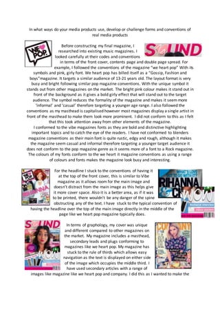
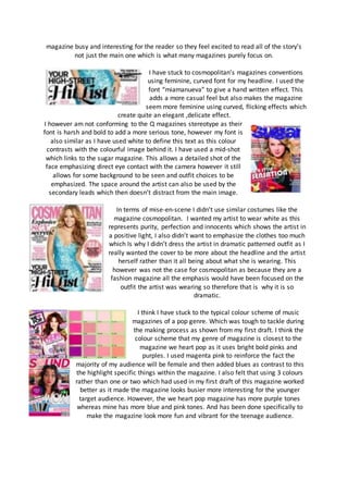
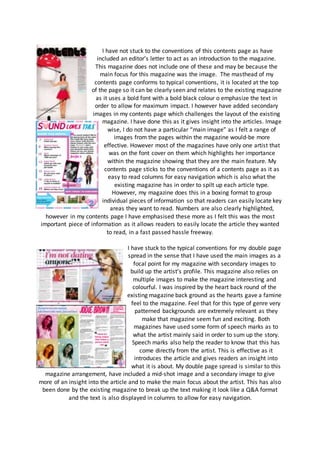
In what ways do your media products use, develop or challenge forms and conventions of
real media products
Before constructing my final magazine, I
researched into existing music magazines. I
looked carefully at their codes and conventions
in terms of the front cover, contents page and double page spread. For
example, I followed the conventions of the magazine “we heart pop” With its
symbols and pink, girly font. We heart pop has billed itself as a “Gossip, Fashion and
boys”magazine. It targets a similar audience of 13-21 years old. The layout format is very
busy and bright following similar pop magazine conventions. With the unique symbol it
stands out from other magazines on the market. The bright pink colour makes it stand out in
front of the background as it gives a bold girly effect that will stand out to the target
audience. The symbol reduces the formality of the magazine and makes it seem more
‘informal’ and ‘casual’ therefore targeting a younger age range. I also followed the
conventions as my masthead is capitalised however most magazines display a single artist in
front of the masthead to make them look more prominent. I did not conform to this as I felt
that this took attention away from other elements of the magazine.
I conformed to the vibe magazines fonts as they are bold and distinctive highlighting
important topics and to catch the eye of the readers. I have not conformed to blenders
magazine conventions as their main font is quite rustic, edgy and rough, although it makes
the magazine seem casual and informal therefore targeting a younger target audience it
does not conform to the pop magazine genre as it seems more of a font to a Rock magazine.
The colours of my fonts conform to the we heart it magazine conventions as using a range
of colours and fonts makes the magazine look busy and interesting.
For the headline I stuck to the conventions of having it
at the top of the front cover, this is similar to Vibe
magazine as it allows room for the main image and
doesn’t distract from the main image as this helps give
it more cover space. Also it is a better area, as if it was
to be printed, there wouldn’t be any danger of the spine
obstructing any of the text. I have stuck to the typical convention of
having the headline over the top of the main image directly in the middle of the
page like we heart pop magazine typically does.
In terms of graphology, my cover was unique
and different compared to other magazines on
the market. My magazine includes a masthead,
secondary leads and plugs conforming to
magazines like we heart pop. My magazine has
stuck to the rule of thirds which allows easy
navigation as the text is displayed on either side
of the image which occupies the middle third. I
have used secondary articles with a range of
images like magazine like we heart pop and company. I did this as I wanted to make the
magazine busy and interesting for the reader so they feel excited to read all of the story’s
not just the main one which is what many magazines purely focus on.
I have stuck to cosmopolitan’s magazines conventions
using feminine, curved font for my headline. I used the
font “miamanueva” to give a hand written effect. This
adds a more casual feel but also makes the magazine
seem more feminine using curved, flicking effects which
create quite an elegant ,delicate effect.
I however am not conforming to the Q magazines stereotype as their
font is harsh and bold to add a more serious tone, however my font is
also similar as I have used white to define this text as this colour
contrasts with the colourful image behind it. I have used a mid-shot
which links to the sugar magazine. This allows a detailed shot of the
face emphasizing direct eye contact with the camera however it still
allows for some background to be seen and outfit choices to be
emphasized. The space around the artist can also be used by the
secondary leads which then doesn’t distract from the main image.
In terms of mise-en-scene I didn’t use similar costumes like the
magazine cosmopolitan. I wanted my artist to wear white as this
represents purity, perfection and innocents which shows the artist in
a positive light, I also didn’t want to emphasize the clothes too much
which Is why I didn’t dress the artist in dramatic patterned outfit as I
really wanted the cover to be more about the headline and the artist
herself rather than it all being about what she is wearing. This
however was not the case for cosmopolitan as because they are a
fashion magazine all the emphasis would have been focused on the
outfit the artist was wearing so therefore that is why it is so
dramatic.
I think I have stuck to the typical colour scheme of music
magazines of a pop genre. Which was tough to tackle during
the making process as shown from my first draft. I think the
colour scheme that my genre of magazine is closest to the
magazine we heart pop as it uses bright bold pinks and
purples. I used magenta pink to reinforce the fact the
majority of my audience will be female and then added blues as contrast to this
the highlight specific things within the magazine. I also felt that using 3 colours
rather than one or two which had used in my first draft of this magazine worked
better as it made the magazine looks busier more interesting for the younger
target audience. However, the we heart pop magazine has more purple tones
whereas mine has more blue and pink tones. And has been done specifically to
make the magazine look more fun and vibrant for the teenage audience.
I have not stuck to the conventions of this contents page as have
included an editor’s letter to act as an introduction to the magazine.
This magazine does not include one of these and may be because the
main focus for this magazine was the image. The masthead of my
contents page conforms to typical conventions, it is located at the top
of the page so it can be clearly seen and relates to the existing magazine
as it uses a bold font with a bold black colour o emphasize the text in
order to allow for maximum impact. I however have added secondary
images in my contents page which challenges the layout of the existing
magazine. I have done this as it gives insight into the articles. Image
wise, I do not have a particular “main image” as I felt a range of
images from the pages within the magazine would-be more
effective. However most of the magazines have only one artist that
was on the font cover on them which highlights her importance
within the magazine showing that they are the main feature. My
contents page sticks to the conventions of a contents page as it as
easy to read columns for easy navigation which is also what the
existing magazine has in order to spilt up each article type.
However, my magazine does this in a boxing format to group
individual pieces of information so that readers can easily locate key
areas they want to read. Numbers are also clearly highlighted,
however in my contents page I have emphasised these more as I felt this was the most
important piece of information as it allows readers to easily locate the article they wanted
to read, in a fast passed hassle freeway.
I have stuck to the typical conventions for my double page
spread in the sense that I have used the main images as a
focal point for my magazine with secondary images to
build up the artist’s profile. This magazine also relies on
multiple images to make the magazine interesting and
colourful. I was inspired by the heart back round of the
existing magazine back ground as the hearts gave a famine
feel to the magazine. Feel that for this type of genre very
patterned backgrounds are extremely relevant as they
make that magazine seem fun and exciting. Both
magazines have used some form of speech marks as to
what the artist mainly said in order to sum up the story.
Speech marks also help the reader to know that this has
come directly from the artist. This is effective as it
introduces the article and gives readers an insight into
what it is about. My double page spread is similar to this
magazine arrangement, have included a mid-shot image and a secondary image to give
more of an insight into the article and to make the main focus about the artist. This has also
been done by the existing magazine to break up the text making it look like a Q&A format
and the text is also displayed in columns to allow for easy navigation.

Evaluation 1

  • 1.
    In what waysdo your media products use, develop or challenge forms and conventions of real media products Before constructing my final magazine, I researched into existing music magazines. I looked carefully at their codes and conventions in terms of the front cover, contents page and double page spread. For example, I followed the conventions of the magazine “we heart pop” With its symbols and pink, girly font. We heart pop has billed itself as a “Gossip, Fashion and boys”magazine. It targets a similar audience of 13-21 years old. The layout format is very busy and bright following similar pop magazine conventions. With the unique symbol it stands out from other magazines on the market. The bright pink colour makes it stand out in front of the background as it gives a bold girly effect that will stand out to the target audience. The symbol reduces the formality of the magazine and makes it seem more ‘informal’ and ‘casual’ therefore targeting a younger age range. I also followed the conventions as my masthead is capitalised however most magazines display a single artist in front of the masthead to make them look more prominent. I did not conform to this as I felt that this took attention away from other elements of the magazine. I conformed to the vibe magazines fonts as they are bold and distinctive highlighting important topics and to catch the eye of the readers. I have not conformed to blenders magazine conventions as their main font is quite rustic, edgy and rough, although it makes the magazine seem casual and informal therefore targeting a younger target audience it does not conform to the pop magazine genre as it seems more of a font to a Rock magazine. The colours of my fonts conform to the we heart it magazine conventions as using a range of colours and fonts makes the magazine look busy and interesting. For the headline I stuck to the conventions of having it at the top of the front cover, this is similar to Vibe magazine as it allows room for the main image and doesn’t distract from the main image as this helps give it more cover space. Also it is a better area, as if it was to be printed, there wouldn’t be any danger of the spine obstructing any of the text. I have stuck to the typical convention of having the headline over the top of the main image directly in the middle of the page like we heart pop magazine typically does. In terms of graphology, my cover was unique and different compared to other magazines on the market. My magazine includes a masthead, secondary leads and plugs conforming to magazines like we heart pop. My magazine has stuck to the rule of thirds which allows easy navigation as the text is displayed on either side of the image which occupies the middle third. I have used secondary articles with a range of images like magazine like we heart pop and company. I did this as I wanted to make the
  • 2.
    magazine busy andinteresting for the reader so they feel excited to read all of the story’s not just the main one which is what many magazines purely focus on. I have stuck to cosmopolitan’s magazines conventions using feminine, curved font for my headline. I used the font “miamanueva” to give a hand written effect. This adds a more casual feel but also makes the magazine seem more feminine using curved, flicking effects which create quite an elegant ,delicate effect. I however am not conforming to the Q magazines stereotype as their font is harsh and bold to add a more serious tone, however my font is also similar as I have used white to define this text as this colour contrasts with the colourful image behind it. I have used a mid-shot which links to the sugar magazine. This allows a detailed shot of the face emphasizing direct eye contact with the camera however it still allows for some background to be seen and outfit choices to be emphasized. The space around the artist can also be used by the secondary leads which then doesn’t distract from the main image. In terms of mise-en-scene I didn’t use similar costumes like the magazine cosmopolitan. I wanted my artist to wear white as this represents purity, perfection and innocents which shows the artist in a positive light, I also didn’t want to emphasize the clothes too much which Is why I didn’t dress the artist in dramatic patterned outfit as I really wanted the cover to be more about the headline and the artist herself rather than it all being about what she is wearing. This however was not the case for cosmopolitan as because they are a fashion magazine all the emphasis would have been focused on the outfit the artist was wearing so therefore that is why it is so dramatic. I think I have stuck to the typical colour scheme of music magazines of a pop genre. Which was tough to tackle during the making process as shown from my first draft. I think the colour scheme that my genre of magazine is closest to the magazine we heart pop as it uses bright bold pinks and purples. I used magenta pink to reinforce the fact the majority of my audience will be female and then added blues as contrast to this the highlight specific things within the magazine. I also felt that using 3 colours rather than one or two which had used in my first draft of this magazine worked better as it made the magazine looks busier more interesting for the younger target audience. However, the we heart pop magazine has more purple tones whereas mine has more blue and pink tones. And has been done specifically to make the magazine look more fun and vibrant for the teenage audience.
  • 3.
    I have notstuck to the conventions of this contents page as have included an editor’s letter to act as an introduction to the magazine. This magazine does not include one of these and may be because the main focus for this magazine was the image. The masthead of my contents page conforms to typical conventions, it is located at the top of the page so it can be clearly seen and relates to the existing magazine as it uses a bold font with a bold black colour o emphasize the text in order to allow for maximum impact. I however have added secondary images in my contents page which challenges the layout of the existing magazine. I have done this as it gives insight into the articles. Image wise, I do not have a particular “main image” as I felt a range of images from the pages within the magazine would-be more effective. However most of the magazines have only one artist that was on the font cover on them which highlights her importance within the magazine showing that they are the main feature. My contents page sticks to the conventions of a contents page as it as easy to read columns for easy navigation which is also what the existing magazine has in order to spilt up each article type. However, my magazine does this in a boxing format to group individual pieces of information so that readers can easily locate key areas they want to read. Numbers are also clearly highlighted, however in my contents page I have emphasised these more as I felt this was the most important piece of information as it allows readers to easily locate the article they wanted to read, in a fast passed hassle freeway. I have stuck to the typical conventions for my double page spread in the sense that I have used the main images as a focal point for my magazine with secondary images to build up the artist’s profile. This magazine also relies on multiple images to make the magazine interesting and colourful. I was inspired by the heart back round of the existing magazine back ground as the hearts gave a famine feel to the magazine. Feel that for this type of genre very patterned backgrounds are extremely relevant as they make that magazine seem fun and exciting. Both magazines have used some form of speech marks as to what the artist mainly said in order to sum up the story. Speech marks also help the reader to know that this has come directly from the artist. This is effective as it introduces the article and gives readers an insight into what it is about. My double page spread is similar to this magazine arrangement, have included a mid-shot image and a secondary image to give more of an insight into the article and to make the main focus about the artist. This has also been done by the existing magazine to break up the text making it look like a Q&A format and the text is also displayed in columns to allow for easy navigation.