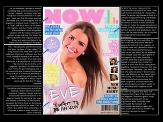
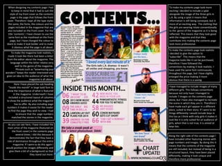
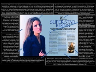
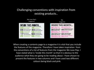
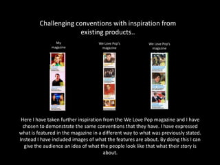
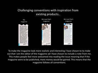
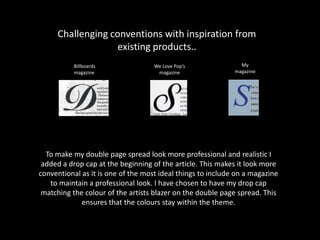
The document discusses how the media product challenges and develops conventions of real media products. It summarizes how various design elements were incorporated from existing magazines to make the mock magazine look realistic and professional. These elements include using consistent fonts, colors, images of artists, and layouts inspired by magazines like We Love Pop and Billboard. The document also explains how splats, mastheads, barcodes, and drop caps were included to follow industry conventions and make the magazine seem like a real purchasable product.