Here I have analysed different Rock related contents pages and double page spread's so I could see how they were structured for the production of my own magazine.
Here I have analysed different Rock related contents pages and double page spread's so I could see how they were structured for the production of my own magazine.
The French Revolution, which began in 1789, was a period of radical social and political upheaval in France. It marked the decline of absolute monarchies, the rise of secular and democratic republics, and the eventual rise of Napoleon Bonaparte. This revolutionary period is crucial in understanding the transition from feudalism to modernity in Europe.
For more information, visit-www.vavaclasses.com
How to Create Map Views in the Odoo 17 ERPCeline George
The map views are useful for providing a geographical representation of data. They allow users to visualize and analyze the data in a more intuitive manner.
The Art Pastor's Guide to Sabbath | Steve ThomasonSteve Thomason
What is the purpose of the Sabbath Law in the Torah. It is interesting to compare how the context of the law shifts from Exodus to Deuteronomy. Who gets to rest, and why?
The Roman Empire A Historical Colossus.pdfkaushalkr1407
The Roman Empire, a vast and enduring power, stands as one of history's most remarkable civilizations, leaving an indelible imprint on the world. It emerged from the Roman Republic, transitioning into an imperial powerhouse under the leadership of Augustus Caesar in 27 BCE. This transformation marked the beginning of an era defined by unprecedented territorial expansion, architectural marvels, and profound cultural influence.
The empire's roots lie in the city of Rome, founded, according to legend, by Romulus in 753 BCE. Over centuries, Rome evolved from a small settlement to a formidable republic, characterized by a complex political system with elected officials and checks on power. However, internal strife, class conflicts, and military ambitions paved the way for the end of the Republic. Julius Caesar’s dictatorship and subsequent assassination in 44 BCE created a power vacuum, leading to a civil war. Octavian, later Augustus, emerged victorious, heralding the Roman Empire’s birth.
Under Augustus, the empire experienced the Pax Romana, a 200-year period of relative peace and stability. Augustus reformed the military, established efficient administrative systems, and initiated grand construction projects. The empire's borders expanded, encompassing territories from Britain to Egypt and from Spain to the Euphrates. Roman legions, renowned for their discipline and engineering prowess, secured and maintained these vast territories, building roads, fortifications, and cities that facilitated control and integration.
The Roman Empire’s society was hierarchical, with a rigid class system. At the top were the patricians, wealthy elites who held significant political power. Below them were the plebeians, free citizens with limited political influence, and the vast numbers of slaves who formed the backbone of the economy. The family unit was central, governed by the paterfamilias, the male head who held absolute authority.
Culturally, the Romans were eclectic, absorbing and adapting elements from the civilizations they encountered, particularly the Greeks. Roman art, literature, and philosophy reflected this synthesis, creating a rich cultural tapestry. Latin, the Roman language, became the lingua franca of the Western world, influencing numerous modern languages.
Roman architecture and engineering achievements were monumental. They perfected the arch, vault, and dome, constructing enduring structures like the Colosseum, Pantheon, and aqueducts. These engineering marvels not only showcased Roman ingenuity but also served practical purposes, from public entertainment to water supply.
The Indian economy is classified into different sectors to simplify the analysis and understanding of economic activities. For Class 10, it's essential to grasp the sectors of the Indian economy, understand their characteristics, and recognize their importance. This guide will provide detailed notes on the Sectors of the Indian Economy Class 10, using specific long-tail keywords to enhance comprehension.
For more information, visit-www.vavaclasses.com
Welcome to TechSoup New Member Orientation and Q&A (May 2024).pdfTechSoup
In this webinar you will learn how your organization can access TechSoup's wide variety of product discount and donation programs. From hardware to software, we'll give you a tour of the tools available to help your nonprofit with productivity, collaboration, financial management, donor tracking, security, and more.
How to Split Bills in the Odoo 17 POS ModuleCeline George
Bills have a main role in point of sale procedure. It will help to track sales, handling payments and giving receipts to customers. Bill splitting also has an important role in POS. For example, If some friends come together for dinner and if they want to divide the bill then it is possible by POS bill splitting. This slide will show how to split bills in odoo 17 POS.
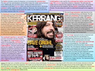
1. The Skyline connotes a sense of uniqueness as it promotes the exclusive story.
This story can’t be read elsewhere and therefore makes the reader want to find out
more. Additionally, the use of the colours yellow and white stand out in
comparison to the black type face which says what the exclusive story is. By having
exclusive in white, it grabs the readers attention. Moreover, the incorporation of
the exclusive in the skyline cleverly draws the reader in as the skyline is one of the
first things read/seen after the masthead.
The Masthead is kerrang!’s Brand identity
and clearly distinguishes it from other
magazines. The cracked letters and
exclamation mark is well known and sets
the magazine apart from other publications
as very few mastheads use graphics. The
masthead itself connotes music and rock as
it is an onomatopoeic word which comes
from the sound of a power chord being
played on a distorted electric guitar. The
connotations of rock, guitars and loud
music from the masthead allow the reader
to understand what genre the magazine is.
The masthead’s type face is sans serif. This
connotes minimalism and also simplicity.
This suggests the Target Audience are not
adults as stereotypically, serif fonts are
used in magazines which have adults as the
Target Audience. The fonts used are bold
and are all in capitals. This represents the
magazine as important and lively as the
magazine stands out, grabbing the reader’s
attention with all of the text. The bold font
is effective in grabbing the reader’s
attention and as a result, the reader is
more likely to read it in comparison to
other magazines that don’t rely on a big,
bold typeface.
A bold typeface is also used for the anchorage text, skyline, cover lines and
pugs. This connotes how all the content is important. This will make the
reader want to read all of the magazine. Not just certain parts. The simplicity
of the text mirrors the simplistic, yet busy layout, connoting the wild rock
lifestyle. This also allows the reader to understand what genre the magazine
is.
Layout- Kerrang! uses a simplistic yet busy layout to connote a busy rock lifestyle. The decision to have Dave Grohl in the centre not only draws attention to him, but
also represents him as the most important. The reader can see that Grohl will be a feature article. Although the large amount of text would suggest that attention
would be off the main image, I think that because it is spread out all around it, the attention is maintained on it. The layout although busy, is simplistic as all the cover
lines and pugs are around the image, creating a box-like shape. It is only the anchorage text that extends into the centre. This represents Dave Grohl as the most
important as the anchorage text relates to him.
The use of pugs and posters adds diversity to the
layout, connoting the busy rock lifestyle. The free
posters are conventions of music magazines and
are used to try draw in the reader. The caption
above the posters would make the reader more
likely to buy the magazine as “rock legends” makes
the posters seem more desirable because of the
their status. The posters would appeal to a younger
T.A ( teenagers) as freebies stereotypically don’t
appeal to adults. Despite Kerrang having a diverse
target audience, the posters would appeal to
teenagers the most as adults aren’t as interested in
them and teenagers like to keep them.
The main image represents Grohl as important and
happy, connoting that the rock lifestyle is a
rewarding thing. Positioned in the centre of the
Front Cover, Grohl is represented as the most
important as all the cover lines, pugs and anchorage
text are surrounding him. The reader will
understand this and will know that a feature article
will relate him. His long hair and beard connote the
rock genre, conveying to the reader the magazine
genre. His black clothing also connotes this.
Furthermore, his smile connotes happiness and also
links to the anchorage text. The main image is
unusual as normally, the main image of a Kerrang!
Magazine has a serious or powerful pose where as
here we see a happy rock star. This represents Dave
Grohl as an exception.
2. The mode of address can be seen in the main image as Grohl
is looking centrally, giving the effect he’s looking at the reader.
This grabs the reader’s attention and they would want to read
on as they feel the magazine is targeted towards them
personally.
The reader would be more inclined to read the
magazine as the main image is unlike the others,
adding a unique sense to the Front Cover and
representing the magazine as different from the
rest.
Colour scheme & House style
The diverse colour scheme consisting of
red, yellow, white and black connotes
vibrancy and liveliness as the colours
together create a busy and eye catchy
Front Cover. The House style is busy and
vibrant, every Kerrang magazine has a
variety of colours, this is to make it stand
out on the shelf and to draw the reader’s
attention to certain pieces of information.
Additionally, Kerrang’s House style always
has the image overlapping with or going
behind the title. This distinguishes it from
other magazines of the alternative rock
genre. The colour white is used to stand
out against the darker colours on the
Front Cover, providing emphasis on the
Masthead. The masthead has
connotations of music and rock however
it also has connotations of purity because
of it’s colour. The colour connotes the
magazines reputability.
The colour red connotes violence , anger
and passion. All connotations associated
with the rock genre. I think that the colour
red was used to convey the magazine’s
genre, this is because of how rock and it’s
subgenres can be aggressive and violent
but also to stand out and grab the
reader’s attention. The eye catchy colours
like red and yellow appeal to teenagers as
for them, lively Front Covers are more
interesting than plain minimalistic covers.
Those covers stereotypically appeal to
adults.
The colour black was used to contrast the lighter colours, making the magazine stand out but also to connote the heaviness of the genre . Dark connotations such as
violence and death are associated with black but also with subgenres of rock. By having the colour black, the reader knows the genre of the magazine and the
connotations of it. By incorporating a golden colour onto the Front Cover, Kerrang is represented as reputable and Dave Grohl is represented as legendary. This is
because gold has connotations of a legendary status and being the best. The anchorage text, in Gold, is about Dave Grohl- representing him as the best. By having
the “legendary” Dave Grohl on their Front Cover, Kerrang! are represented as reputable as they have a well known and popular rock star on their cover.
The anchorage text connotes that Dave Grohl has a
legendary status. This is because the anchorage text
is a golden colour. The use of dramatic language:
“incredible”, “rock icon” and “supergroup” makes
the reader want to find out more. The positioning of
the anchorage text and it’s font size means that it’s
one of the first things the reader will see. Positioned
in the left third and in the second largest font size,
the anchorage text draws the readers attention to it
and the main image, which connotes importance.
The reader will understand that the anchorage text
relates to the main image and will want to find out
more.
The cover lines promote articles inside the magazine
about a variety of bands. This once again represents
Kerrang as having a high status as they have content
relating to the biggest bands on the rock scene. The
fact that the cover lines are spread out across the
page reflects the busy house style. The messy look
connotes a wild rock lifestyle. The decision to have
some cover lines in the left third allow the reader to
gain information about some of the other content as
they read across the Front Cover. The cover lines are
not all clumped together, connoting freedom. This
freedom could relate to the reader listening to the
music of their choice.
3. As expected, the price and barcode are near the bottom of
the right hand side of the Front Cover. This is expected
because it is a convention. I think they chose not to subvert
this convention as the house style already connotes the
rebellious attitude and rock lifestyle.
I think that Kerrang’s target audience is all ages because
anybody of any age can like a particular genre. However, I
think that the primary target audience is 14- 22 year olds of
both genders who like rock music. This is because of the
informal language used.
I think that the secondary target audience
would be adult males who like rock music or
are in a band. This audience would be higher
up in terms of the social ladder however still
not in the higher classes. This is because the
high social classes stereotypically don’t enjoy
this genre of music. Additionally, those people
in the higher classes are also unlikely to be in
a band.
Using Young and Rubicam’s 4c’s model, I
think that the primary target audience are
explorers and aspirers. This is because
music has no limits and people have
freedom over what they listen to. Some
aspirers will read it because it is a huge
brand and they feel they can fit in if they
read it. Additionally, some readers may be
strugglers who just seek escape.
The informal language used wouldn’t
appeal to adults. Although Kerrang uses
dark, masculine colours, I think that the
magazine is targeted towards both
genders as the magazine features both
male and female artists and also because
it’s not only men who like the rock genre.
I think that the primary target audience would be in
the demographic class D or E as they are students
and are unlikely to have jobs. This magazine
wouldn’t appeal to those in higher social classes as
they would prefer other genres.
4. The masthead, positioned at the top of the Front Cover connotes importance as it
is in the biggest font and grabs the reader’s attention. An older edition, this Front
Cover does not have the speech bubble graphic which has become the brand’s
identity. Therefore it relies on a large typeface to appeal to the reader. Like other
music magazines such as Big Cheese and Kerrang!, Rock Sound have chosen not to
subvert the convention of having the masthead at the top of the Front Cover. This
is because it’s position allows the reader to clearly see the brand name.
The feature’s positioning connotes importance and represents the band, My
Chemical Romance (MCR), as important. Additionally, it could also represent
their popularity, as MCR are one of the most famous emo bands to date.
Furthermore, the black and white colours used are part of a vibrant colour
scheme which grabs the reader’s attention. The colour scheme is used
throughout maintaining the reader’s attention.
The simplistic layout reflects the magazine’s
message: A day to remember are the sound of
now. By having a minimalistic layout, the
reader can clearly see the emphasis on A Day
to Remember who take up the whole of the
cover, not just the centre. Unlike Kerrang! and
Big Cheese who have a very busy layout, Rock
Sound have a less cluttered layout with all the
anchorage text and cover lines in the right
third. This encourages the reader to then turn
the page to find out more. Interestingly, the
only convention in the left third are the
posters. I think that the posters were
positioned there because the left third is
looked at first. By having the posters there,
the reader will see them straight away and will
be more likely to buy the magazine. This is
because the posters appeal to the target
audience as they can keep and collect them.
Because they are now drawn to the magazine
because of the posters, they are less likely to
buy other magazines on the shelf because
their attention is on this magazine.
Accompanied with the large typeface, the
reader’s attention is firmly on this magazine.
Due to the bunched up anchorage text and
cover lines, there is a large space in the left
third with nothing in it. This connotes a lack of
professionalism from Rock Sound. This is
interesting because Rock Sound is a
professional magazine and you wouldn’t
expect an alternative music magazine to have
such a large empty space.
A pug has been used to advertise the magazine’s free
posters. The pug adds diversity to the layout and also grabs
the reader’s attention. The free posters appeals to the target
audience as they like to keep posters of their favourite artists
and bands. The posters make the reader more likely to buy
the magazine as they get something for free as well as the
magazine content.
The bottom strip has been used to promote other
artists that they have content on. Moreover, the
bottom strip also shows the diversity of genres
and subgenres the magazine covers as it includes
heavy metal bands. This contrasts to the cover
lines which includes pop punk and alternative
rock bands. This extends the target audience as
more genres are covered meaning more people
would be inclined to read the magazine. The fact
that Rock Sound have content on Slayer and
Slipknot represents them as reputable as these
two bands are very popular and have a high
status in their genres.
As expected, the barcode and price are in the
bottom right hand corner. Most alternative music
magazines have them positioned there as the
emphasis is on other conventions such as the
main image and masthead. Rock Sound chose not
to subvert this convention as the emphasis is on A
Day To Remember, not the price.
The bottom strip’s typeface, although in capitals,
is in a smaller size. This is to keep the attention on
A Day To Remember (ADTR). This represents
ADTR as the most important band in the
magazine. This representation is also seen
through them being the main image and the main
image’s size. The sans serif typeface creates a
bold front cover, attracting a teenage target
audience.
5. Eye catching, bold, sans serif fonts have been used for all of the text. A bold typeface has been used for the masthead to make it stand out and grab the reader’s
attention. Like other alternative music magazines, Rock Sound has this to stand out. Moreover, it also connotes the rock genre. Loud and indiscrete, rock was created
to be heard. This idea of the rock genre needing to be heard is also reflected through the typeface of the half of the anchorage text. The anchorage text’s typeface is
the same as the masthead. This suggests that A Day To Remember’s music should be heard. This is also conveyed through the anchorage text itself. The fact that all
of the text is in capitals connotes importance and also represents all the content as being equally important. This suggests that all the subgenres that are included are
all covered equally. There isn’t a greater coverage of one than another. This shows how Rock Sound are trying to expand their audience because the more subgenres
covered, the more readers the magazine appeals to. In addition, Rock Sound also uses the same typeface A Day To Remember did for their name on the album “For
those who have heart”. Fans would recognise this and would want to find out more. It is also a way to convey that A Day To Remember are on the Front Cover.
I think that the primary target audience are
male teenagers aged 14-18 who like
alternative music. This is because anybody
under the age of 14 stereotypically doesn’t
like these genres of music, they would prefer
less heavy genres like pop music. This is the
same reason why I don’t think girls are the
primary target audience. However they do
make up part of the secondary audience. I
think that the target audience are males
because the vast majority of bands of these
genres are all male. The target audience could
idolise and aspire to be like them.
I think that the magazine targets teenagers
because at that age, they start to explore and
try new music. Rock, metal and hard-core
aren’t mainstream music genres so teens
would explore and find them. This magazine
appeals to fans of these genres. Additionally, I
think that the Primary target audience would
be English or American. This is because these
genres are popular in England and America
therefore the people living there would listen
to it. Furthermore, although the magazine
doesn’t have content on mainstream genres,
the genres they do cover are made up of lots
of American artists. For the last 60 years (at
least), England has been listening to music
produced in America as well as Britain.
American bands featured in the magazine
would appeal to English teens as they listen to
those bands.
I think that the primary audience would be in social classes D
and E as certainly the younger ages of the primary audience
wouldn’t be employed and therefore are in the lowest social
class. Some members of the primary audience would be
employed however stereotypically, it is unlikely that they
would be in regular office jobs (lower middle class, social
grade c1).
As a niche product, Rock Sound isn’t trying to
target a wide range of people. Using Young and
Rubicam’s 4Cs model, I think that the primary
audience would be explorers. This is because they
would explore new genres of music and listen to
music by bands which are in this magazine.
Although the magazine is relatively well known,
explorers don’t care about it’s reputation or
popularity. It’s popularity means that some
Aspirers may read it to fit in with a certain crowd.
The secondary audience would be teenage girls
and adults who are in bands. This is because
stereotypically, girls don’t like heavy genres of
music and therefore aren’t seen as the primary
audience. The fact that there are some girls who
do means that they are secondary audience. Adult
band members would read the magazine for
relatability or for inspiration, hoping to replicate
their idols’ success. Alternatively, both audiences
may just read it to escape from their daily troubles
(Blumler and Katz users and gratification theory).
I think that the secondary audience would be in
the same social classes as the primary audience .
This is because they are the same/similar age.
The cover lines, positioned in the right third,
promote the features inside the magazine. This
makes the reader want to find out more. The
cover lines also follow the colour scheme,
connoting a magazine targeting a male audience.
6. The main image is a mid shot, denoting all of
the band members of ADTR with their
mouths open. This connotes shouting and
aggression. This mid shot represents them
as aggressive and powerful (apart from the
drummer on the far right hand side who’s
facial expression represents him as happy).
This combination of aggressive and happy
reflects their genre of music and their
current emotions. ADTR mix pop punk with
metal core. It’s their pop punk songs that
reflect their happiness.
Furthermore, the mid shot doesn’t have a
tilt, it’s at eye level. This makes the reader
feel at the same level as the band and allow
them to relate. Rock Sound chose to have no
tilt because eye level is more appealing to
the reader than a low angle shot which
makes them feel inferior to ADTR. This
would make them feel intimidated and
therefore they would be less likely to read
the magazine. If a high angle shot was used
then the reader would be less interested in
reading because a high angle shot
represents the band as inferior to the
reader. The reader would be less interested
in reading as they feel the content isn’t as
important as themselves.
The dark clothing worn by the band connotes
violence and aggression, reflecting the band’s type of
music. The clothing allows the reader to understand
the genre of music as well as being able to relate to
it. The band would wear similar clothes to it’s fans.
The size of the main image connotes importance. This is because ADTR take up the whole of the Front Cover and
cover part of the Masthead. The large size grabs the reader’s attention, and with the anchorage text, clearly shows
who the band are. The composition also helps the reader identify the band. With the lead singer at the front (Jeremy
Mckinnon), many fans instantly identify him. By having Mckinnon front and central, fans are drawn to the magazine
because they spot him straight away and are more likely to read on to find out more. Using Richard Dyer’s Star
Theory, it can be suggested that the band were on the cover because of their popularity and large following. These
fans would then buy the magazine because ADTR are on it. This increases the circulation of the magazine.
The vibrant colour scheme makes the
magazine stand out on the shelf, making it
more likely to be bought. The use of the
colour blue connotes a male audience.
This light blue is used for the background,
cover lines and pug. By incorporating this
colour in several different conventions, we
can clearly see how this magazine is
targeted towards males. This vibrant
colour, partnered with black and white,
creates a bold house style.
Black and white are used to contrast each
other, making the white stand out. Used for
the masthead, anchorage text and bottom
strip, these two colours effectively create a
lively Front Cover that grabs the reader’s
attention. I think that the black and white
represent the work of the band. The band mix
genres together. The black representing the
dark, aggressive metal core whilst the white
representing the pop punk side of their music.
The anchorage text conveys to the audience
who the band on the Front Cover are. The
large, sans- serif typeface grabs the reader’s
attention, making it an important part of the
magazine. Interestingly, the anchorage text
is split into two. The first part is the band’s
name. The band’s name is not part of the
blue, black and white colour scheme. This
represents them as rebellious and unique.
This unique representation mirrors their
music as they blend two genres together.
The other part of the anchorage text “The
sound of now!” promotes their music. This
encourages the reader to find out more
about them. This part of the anchorage text
is part of the colour scheme, suggesting that
they have a feature about them.
7. The use of the colour yellow adds
diversity to the colour scheme and
represents them as unique and also
legendary. The yellow connotes
prestige, representing the band as
having a high status in the music
world. This would encourage the
reader to find out more because there
is a reputable band on the cover. A
white outline on the band members
can also been seen. This reinforces
their reputable status.
I think that the magazine also has a
colourful house style. In order to draw
attention to it, the magazine uses
colours that stand out to gain the
reader’s attention. All parts of the
Cover are colourful, there are no areas
that look dull. This creates a magazine
with flair, making it more likely to be
bought by it’s target audience.
I think that this magazine has two
house styles. Firstly, it has well
organised house style. With the
masthead at the top, the barcode and
price in the bottom right hand corner
and anchorage text and cover lines in
the middle/bottom of the right third,
readers can see this magazine is well
laid out. This represents the magazine
as professional and reputable.
Although it may be well organised, it
still has lots of conventions that shows
it is an alternative music magazine. The
house style is still relatively busy
compared to other music magazines
like Classical Music. This house style
allows the reader to see it is an
alternative music magazine because of
how busy the page is. It is only in
comparison with other alternative
magazines like Kerrang! that this
magazine seems less busy.
8. As with most music magazines, the masthead is at the top of the Front Cover. Big Cheese have chosen not to
subvert this convention as it is a part of an organized house style and grabs the reader’s attention. Similar to
Kerrang!, Big Cheese have the main image overlapping with the masthead. This represents the band as more
important than the magazine. The reader would see this and understand the status and popularity of these
bands. Additionally, the masthead is split in two, half of it being flipped on the side. This appeals to the Target
Audience as it’s bold and simplistic, the masthead adds diversity to the layout and creates an eye catching Front
Cover. I think that the Masthead is in the biggest font because it’s the Brand’s identity. Readers can easily
distinguish it from other magazines because of how the masthead is laid out. The reversed “E” in “Cheese” also
connotes a daring attitude. This links with the headline “Rip up the rock rulebook”.
For this Front Cover, the skyline is used to
promote the free posters that come with the
magazine. The posters are an incentive for the
reader to buy the magazine because they get
something for free as well as the magazine.
They can then keep and collect these posters.
The skyline is unconventional as it doesn’t run
across the full length of the Cover. This
connotes a rebellious attitude which is also
associated with the rock genre. At the end of
the skyline, vibrant text advertises a free CD.
This also appeals to the audience.
Interestingly, no pugs have been used on
the Front Cover to advertise free gifts.
Usually with alternative music magazines,
pugs are used to advertise the posters.
They haven’t been used to advertise the
posters because the pug has been used to
show how the story is exclusive.
The tagline also connotes an adult target
audience as it has the date 1996. The
magazine’s audience includes people who have
read it from 1996 onwards, (these people would
now be adults). The typeface used would appeal
to them.
The sans serif typeface creates a bold and
vibrant Front Cover, drawing the reader’s
attention to it. The bold, sans serif font
represents the rock genre as loud and
boisterous. This allows the reader to know the
genre of the magazine. I think that the bold
typeface used for the Masthead attracts a
teenage audience. This is because a smaller,
serif typeface doesn’t appeal to them. A large,
bold typeface stands out and makes them want
to find out more. (1)
Although the masthead may be bold, the
anchorage text, cover lines, headline,
trail article and bottom strip all have a
typeface which looks more professional.
Even though it is not a serif font, it could
be suggested that Big Cheese is also
targeting some young adults because of
the typeface. This more professional-
looking typeface would appeal to adults
because it isn’t in huge bubble writing, it
looks slicker and more professional,
something that appeals to them. The fact
that all the text is in capital letters
connotes importance. This suggests that
all the content is equally important. It also
grabs the reader’s attention whilst
conveying the loud and bold connotations
of rock music. (2)
Like other alternative music magazines, Big Cheese uses the bottom strip to convey to the reader
the bands that the magazine has content on. This makes the reader want to read on. Furthermore,
the fact that the bottom strip includes the band NOFX suggests that Big Cheese are trying to appeal
to adults as well as teenagers. I think this because NOFX are a punk rock band formed in 1983. It’s
predominantly adults who listen to them and because they are on the cover, the adults would read
on to find out more.
As expected, due to it being a convention, the
barcode and price are in the bottom of the right
hand corner. I think that Big Cheese chose not
to subvert this convention because then the
emphasis would be on the barcode and price.
The money conscious teenage audience would
be put off from buying the magazine as the
emphasis would be on the £4.99 price. They
would then reconsider buying because of the
price.
9. The main image is a two shot denoting
the lead singers from the bands Lower
than Atlantis and Pure Love standing
together. This two shot covers part of the
masthead, representing these bands as
more important than the magazine itself.
In addition, there is no tilt. The camera is at eye level and
therefore allows the reader to relate to the image. They feel at
the same level as these rock stars and aren’t discouraged from
reading. If a low angle shot had been used then they would feel
inferior to the image and wouldn’t want to buy the magazine. A
low angle shot would make them feel intimidated as it has
connotations of power and would represent the bands as
superior.
I also think that by having the camera at
eye level, the magazine can use a mode of
address to maintain the reader’s interest.
By having the singer from Lower than
Atlantis look at the camera, it gives the
effect that he is staring at the reader. This
will make the reader want to read on
because they feel the magazine was made
for them. With no tilt, the mode of
address is more evident.
Like Rock Sound, Big Cheese have chosen
to have the main image take up the
whole of the Front Cover, not just the
centre. This reinforces the representation
of them being the most important,
separating themselves from their
readers. Although a mode of address was
used to make the reader feel on the
same level, the representation of Carter
allows the reader to idolise them instead.
The composition of the main image represents Frank Carter, the vocalist in Pure Love
as more important than Mike Duce (the other singer on the Front Cover). This is
because he is positioned behind Duce and is not staring centrally. This represents him
as a powerful rock star because a mode of address is not used. The reader won’t feel
on the same level as him and instead would see him as more important. He contrasts to
Duce as his position connotes irregularity and a rebellious attitude. This links to the
headline. One can clearly see how these bands are represented as breaking the mould.
This emphasises their status above the rest.
Like the bottom strip, the cover lines promote
the artists and bands that feature inside the
magazine. Positioned in the right third, the
cover lines are one of the last things read
before the reader turns the page. Part of the
vibrant colour scheme, the cover lines maintain
the reader’s interest, making it more likely that
the reader will buy the magazine.
The anchorage text is used to provide extra
details to the main image. The anchorage text
allows the reader to see which bands these
vocalists are from. Using Richard Dyer’s Star
Theory, I think that Big Cheese chose to put the
bands’ names because fans will see it and buy
the magazine because their favourite bands are
on there. This increases the circulation of the
magazine. In addition, the anchorage text for
the feature gives a simple summary of what the
feature is about. This simplistic summary
appeals to the teenage audience because they
aren’t attracted to big, lengthily sentences. The
Anchorage text is also part of the vibrant
colour scheme which makes the magazine
stand out.
The leather jacket, tattoos and
messy hair in the main image and
feature clearly convey to the
reader the genres the magazine
covers. Furthermore, the
audience would be more inclined
to buy the magazine because the
fashion and style seen on the
cover is relatable.
10. The trail article gives an
insight into the article inside.
This encourages the reader
to read on so they can find
out more.
The Front Cover has a busy layout with
anchorage text, trail articles, taglines,
features and cover lines all spread out across
the cover. An extremely busy and vibrant
layout grabs the reader’s attention whilst also
conveying the genre through the conventions.
This messy layout has features and trail
articles over the top of other conventions
such as the main image. This connotes the
importance of the features and also a
rebellious attitude as the layout isn’t neat and
organised. The fact that Duce and Carter take
up the whole of the width of the cover
connotes their importance as they take up all
of the cover, not just the centre.
Accompanied with the anchorage text, one
can see how the band represent a breaking of
the mould, a change in the rules. The two are
not from the same band and have united for
the same goal. Although it is common for
different artists to be on the same Cover, it is
not usual for them to team up and have the
same aim. The fact that all the other content (
apart from the posters), are below them
connotes their importance and how this new
rebellious attitude is taking over rock music.
The colour white has been used to stand out against
the darker colours on the Cover. A white outline has
been created around Green Day, this represents them
as almost angelic and holy, this contrasts to their punk
representation. Therefore, I think white has been used
to add emphasis on them. Alternatively, it could be
suggested that they are represented as the angels of
punk music, saviours to the genre.
The vibrant colour scheme links with the bands
on the Front Cover. The colours red, white and
blue are used extensively. I think that these
colours are used to represent the colours on
the American flag and the Union Jack. This is
because the bands on the cover are British and
American. Readers will see this and understand
that the majority of rock music comes from
Britain and America. In addition, I think that not
only are these colours used to grab the reader’s
attention, I think that they are used to connote
the loud and expressive rock genre.
Additionally, the colour black has been used to
connote aggressiveness. This is because some
of the sub genres covered in the magazine are
heavy.
The colour red has connotations of anger and
passion. As well as for vibrancy, red has been
used to connote the passion that goes into rock
music. In addition, it could also connote the
rebellious attitude that these two bands have
as they’re ripping up the rulebook. Red has
been used for the headline in particular to
represent them as rebellious and daring. This
rebellious connotation also applies to the
anchorage text for the feature. Green Day are a
very famous punk band and therefore are
associated with a rebellious representation.
Blue has been used to convey that the magazine
targets a male audience. This is because
stereotypically, girls don’t like rock music. The
fact that the Front Cover doesn’t include
women also shows how the target audience are
males. Furthermore, the colour blue also
creates an eye catching Front Cover, grabbing
the reader’s attention. The colour red is used
throughout the magazine, not just the Front
Cover. This maintains the reader’s attention.
Big Cheese has a busy house style. Like other alternative
music magazines, Big Cheese has this house style to connote
the busy and loud rock genre. This house style has a structure
with everything around and on top of the main image. This
puts on emphasis on the main image and represents them as
the most important.
11. The primary target audience are males aged 15-25 who like the rock genre. This is because
stereotypically, it’s males that like the rock genre. The Front Cover also has the masculine colour blue,
appealing to them. The fact that there are no females on the cover connotes a male audience as girls
would idolise the female rock stars. Due to there being none of the cover, it could be suggested that
the magazine therefore doesn’t target teenage girls. I think that the primary target audience would
include 25 year olds because some of the bands on the Cover were very famous in the 90’s. Teenagers
in the 90’s are now adults. They may read the magazine to catch up on their favourite bands.
I think that the Primary audience would be
in the social classes C1 to E. This is because
some of the adults in the audience could
have office jobs and then come home from
work to read this magazine and escape
from their troubles at work (Blumler and
Katz users and Gratification theory). The
teenage audience may not have a job and
are therefore in the lowest social class.
Those who have a job are unlikely to be in a
high managerial sector and are likely to be
in the working class.
I think that the magazine would target
Explorers. This is because Big Cheese
aren’t a mass market product. As a
niche product, they are targeting fans
of alternative music who are a certain
age. Explorers aren’t looking for social
acceptance or friendships through
reading the big brands. They strive for
discovery. Moreover, they are more
likely to try new things, like listening to
alternative music .
I think that the nationality of the Primary
audience would be English or American. This is
because rock music is very popular in these
countries and the bands on the cover are
English and American. On the other hand, due
to the magazine being distributed globally, the
nationality doesn’t matter too much as the
issue can be translated into the different
languages required.
The secondary audience would be
teenage girls. This is because
stereotypically the genres of music in
this magazine don’t appeal to girls.
Therefore the magazine doesn’t
target them a great deal. The
secondary audience would be in the
lower social classes as they may not
have a job. If they do, they are in the
working class and due their age, won’t
be in the higher classes as they are
too young to have managerial roles.
12. XXL have chosen to subvert the convention of having the masthead run across the width of the Cover.
They have chosen to do this because it wouldn’t look professional if it did stretch across the width of
the cover and also because it connotes a rebellious, thug attitude, mirroring the main image’s
representation. Positioned in the top left corner, the masthead’s size and position contradicts it’s
name. This is because they want the emphasis to be on the artists on the cover. I think they want the
emphasis to be on the artists because one of the key themes in rap music is success. By having the
emphasis on the artists, they are represented as successful. Interestingly, the masthead is similar to
the alternative music magazines that I have analysed in the fact that it is bold and eye catching.
In order to put as much emphasis on the artists as possible,
the cover lines are in the top right hand corner in a smaller
typeface. This contrasts to alternative music magazines
who have the cover lines positioned centrally in the left or
right third. They are also in a larger typeface than the one
seen on this cover. This is because the main images of
those magazines don’t need to connote status or represent
them as powerful.
Unlike alternative music magazines, XXL don’t
advertise free posters through the use of
pugs. Instead, they have an organised house
style. This connotes an older target audience
than the alternative music magazines.
The composition of the main image allows the
reader to see the different generations of rap.
50 Cent is positioned slightly behind Soulja
Boy, connoting how he is older and has
already peaked in his career. In front of him is
Soulja Boy. As a new, popular rapper, he is
represented as successful through the gold
accessories. This shows how they have
achieved their wealthy aspirations. 50 Cent,
an older rapper, is represented as an
onlooker, a modern guardian angel to Soulja
Boy, a young rapper. In order to look
fearsome and powerful, 50 Cent is wearing a
white mask. This connotes purity and
honesty- creating a guardian/angel
representation. This guardian representation
is further cemented through 50 Cent having
his arm over Soulja Boy.
The main image is a two shot denoting two
rappers, 50 Cent and Soulja Boy, posing
intimidatingly. The main image represents
Soulja Boy in particular as successful. This is
conveyed through the expensive gold
accessories he’s wearing. This can be expected
on a rap magazine cover as one of the key
representations of rappers is success. His
wealth is clearly connoted to the audience and
makes them idolise him. This contrasts to some
of the alternative music magazines that I have
analysed which let the reader feel on the same
level as them. This allows them to relate and
makes them more likely to buy the magazine.
The rappers are also represented as aggressive
and intimidating. The mode of address, staring
at the camera, makes the reader feel
intimidated because it gives the effect that the
rappers are staring at them. Accompanied with
tattoos and 50 Cent’s large muscles, the reader
feels intimidated by the aggressive stance and
appearance of the rappers. This fearsome
representation is common in rap magazines as
every rapper wants to be the most feared and
most well known. This intimidating identity is
commonly rapped about too.The anchorage text clearly conveys to the reader who the rappers on the cover are.
Readers of this magazine would already know who they are because of how
successful they are. Therefore, I think that the purpose of the anchorage text is to
grab the reader’s attention. Using Richard Dyer’s Star Theory, fans of Soulja Boy and
50 Cent will buy the magazine because they are on the cover. This increases the
magazine’s circulation. Positioned in the left third, the anchorage text is one of first
things read by the reader. Seeing 50 Cent’s and Soulja Boy’s names, they would want
to buy the magazine.
The headline underneath
the graphic cements this
fearsome representation.
The barcode and price are in the bottom right hand corner. This is to
maintain attention on the main image. If XXL positioned them elsewhere
then the reader would focus on them more and would be more inclined not
to buy it. This is because the $4.99 price is more evident and the target
audience is money conscious.
13. XXL has a very organised and simple layout.
With only the main image overlapping on the
masthead, the magazine has professional
connotations. I think that the reason why the
main image overlaps with the masthead is to
put emphasis on it and to show their high
status. Unlike alternative music magazines,
which have conventions all over the cover,
XXL has most of their conventions in the left
third. This is because the left third is read
first. With most of the conventions there, the
reader can see what the magazine content is
and not have to read all over the cover.
The Masthead uses a large, bold, sans serif typeface to grab the reader’s attention. This connotes an “in your face
attitude”, mirroring the rap attitude. Interestingly, both XXL and the alternative music magazines that I’ve analysed
use a sans serif typeface to stand out. XXL’s simplistic layout would connote an older target audience as magazines
with a simplistic layout tend to appeal to adults. However, the fact that a bold, sans serif font is used throughout
the cover connotes a teenage target audience too. In addition, the typeface used for the Masthead is the same as
the one used for “50” and “BOY”. This represents the artists as equally important and successful as the magazine
itself. The headline’s typeface is smaller, connoting it’s lesser importance. Although it links with the image, it’s
clear what the content is going to be about through the intimidating stance.
The colour scheme used allows the magazine
to stand out whilst connoting the stereotypes
of rap. The colour black is used for the cover
lines, anchorage text and headline. This
connotes darkness and a threat. This
represents the artists as dangerous because
these conventions are about them. Although a
lighter colour could have been used to stand
out, black was used because it connotes the
rappers how they want to be connoted. With a
dangerous and fearsome representation, the
rappers get to feel powerful, fulfilling their
aspirations as other artists look up to them.
The colour white was used to stand out against
the red background of the masthead. These
colours together grab the reader’s attention.
The colour white connotes these artists as
godly because white has heavenly
connotations. The fact that XXL is in white
conveys to the reader that the artists they
feature are the best and of high status. This
represents XXL as reputable as they have the
top artists on their cover.
Red has been used to connote the danger and
consequences that would follow if people got
on the wrong side of these rappers. This
complements the headline’s message. The
connotations of red e.g. anger, violence and
love are all themes in rap music. The reader will
understand this and know that the magazine is
about rap music.
I also think that the layout focuses the
reader’s attention on the main image. This
clearly shows them what some of the content
will be about. With only the cover lines,
barcode and price in the right third, the
emphasis is clearly on the main image. The
main image is positioned centrally and in the
right third, representing them as powerful and
important as it takes up two thirds of the
page.
Furthermore, the anchorage text and
headline differ to those in alternative music
magazines as on this cover, they are
positioned in a line, going down the left third.
This represents 50 Cent as the most
successful and popular as his name is above
Soulja Boy’s. Alternative music magazines
would usually have the anchorage text and
headline going across the image. The fact that
XXL doesn’t represents the rappers as
untouchable.
XXL has an organised and professional house style with the
same colours that run throughout the magazine. The
organised house style includes black text with a large
typeface. This can be seen in the contents page and
double page spread, not just the front cover.
14. The primary target audience would be black
males aged 16- 22 who like rap music. I think
this because stereotypically, white people
don’t listen to rap and hip hop as they prefer
other genres. The Front Cover connotes a
male audience because the colours red and
black appeal to males. The fact that the main
image is two men also reinforces this
connotation. The main image allows the
target audience to idolise and aspire to be like
the rappers seen on the cover.
The primary audience would be in social
classes D and E. This is because due to
their age, some are still in education and
may not have jobs. Those who do, are
unlikely to be in an occupation that puts
them in a high social class. This is because
of their age.
I think that the secondary audience would
be adults, of any race or ethnicity, in the
music industry who like rap music. This is
because the magazine would appeal to
them as it is about a genre that they like
and related to their career. They would
read the magazine to potentially build on
their career, finding out more about artists
and working with them. This audience
would be in the upper or middle class as
the music industry is a respectable
professional industry. Furthermore, the
secondary audience would be Aspirers.
This is because they know the quality of
XXL and would read to find out more about
artists that they could potentially work with
in the future.
Due to the explicit language in rap music and
the adult themes often associated with it, I
think the target audience would be teenagers
and young adults. The music isn’t aimed
towards children so therefore the magazine
isn’t either.
I think that the primary audience would be
English or American. This is because rap and
hip hop is very popular in these countries.
However, the secondary audience could be
any nationality because XXL is distributed
globally.
Using Young and Rubicam’s 4Cs
theory, I think that the target
audience would be Aspirers,
Mainstreamers and Succeeders. This
is because rap and hip hop has
recently become mainstream music.
Lots of people listen to it and
therefore would want to read
magazines of that genre. Due to the
big reputation of XXL, Aspirers would
read it to fit in with the crowd.
Succeeders would read it because
they seek out the best brands, XXL is
one of the most reputable rap
magazines in the world.