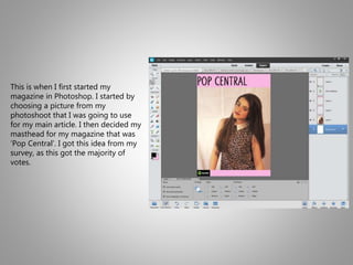
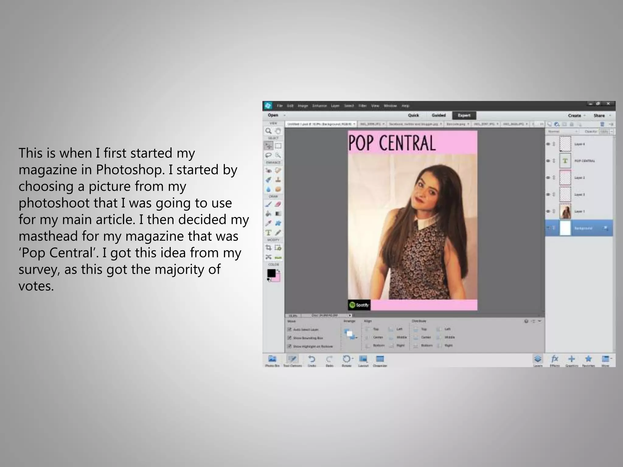
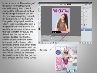
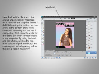
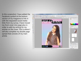
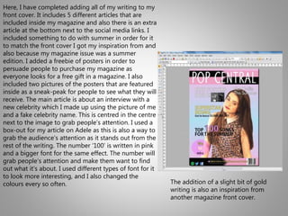
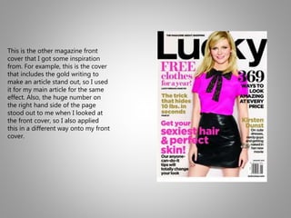
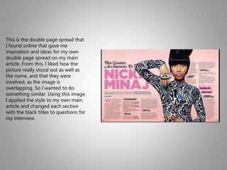
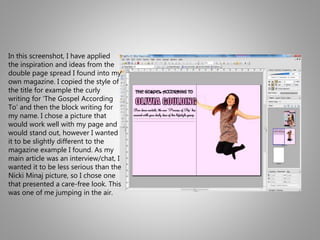
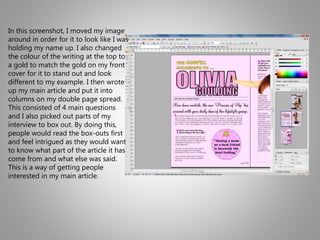
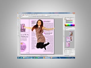
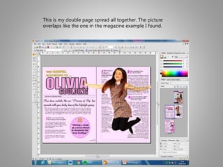
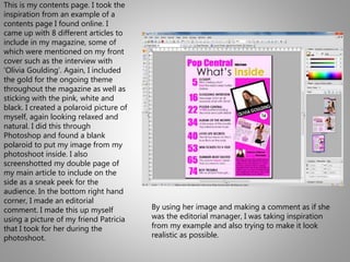
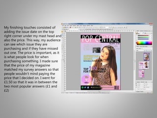
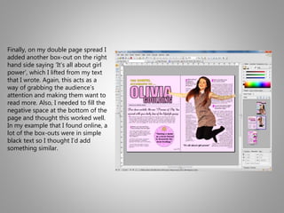
This document summarizes the process of creating a magazine front cover and contents page in Photoshop. Key steps included choosing a main image, designing a masthead, adding article titles and images to the front cover, and taking inspiration from example magazine covers for styles. A double page spread was also created for the main interview article, applying a similar overlapping image and title style seen in an online example. The contents page listed articles and included a sneak peek of the double page spread. Finishing touches like the issue date, price, and box-outs were added.
media school homework coursework questions one a levels sixth form media studies exams preparation powerpoint presentation music magazine front cover contents page double page spread article images editing text layers text masthead coverlines
Instructions for Submissions thorugh G- Classroom.pptxJheel Barad
This presentation provides a briefing on how to upload submissions and documents in Google Classroom. It was prepared as part of an orientation for new Sainik School in-service teacher trainees. As a training officer, my goal is to ensure that you are comfortable and proficient with this essential tool for managing assignments and fostering student engagement.
This is a presentation by Dada Robert in a Your Skill Boost masterclass organised by the Excellence Foundation for South Sudan (EFSS) on Saturday, the 25th and Sunday, the 26th of May 2024.
He discussed the concept of quality improvement, emphasizing its applicability to various aspects of life, including personal, project, and program improvements. He defined quality as doing the right thing at the right time in the right way to achieve the best possible results and discussed the concept of the "gap" between what we know and what we do, and how this gap represents the areas we need to improve. He explained the scientific approach to quality improvement, which involves systematic performance analysis, testing and learning, and implementing change ideas. He also highlighted the importance of client focus and a team approach to quality improvement.
Students, digital devices and success - Andreas Schleicher - 27 May 2024..pptxEduSkills OECD
Andreas Schleicher presents at the OECD webinar ‘Digital devices in schools: detrimental distraction or secret to success?’ on 27 May 2024. The presentation was based on findings from PISA 2022 results and the webinar helped launch the PISA in Focus ‘Managing screen time: How to protect and equip students against distraction’ https://www.oecd-ilibrary.org/education/managing-screen-time_7c225af4-en and the OECD Education Policy Perspective ‘Students, digital devices and success’ can be found here - https://oe.cd/il/5yV
Ethnobotany and Ethnopharmacology:
Ethnobotany in herbal drug evaluation,
Impact of Ethnobotany in traditional medicine,
New development in herbals,
Bio-prospecting tools for drug discovery,
Role of Ethnopharmacology in drug evaluation,
Reverse Pharmacology.
The French Revolution, which began in 1789, was a period of radical social and political upheaval in France. It marked the decline of absolute monarchies, the rise of secular and democratic republics, and the eventual rise of Napoleon Bonaparte. This revolutionary period is crucial in understanding the transition from feudalism to modernity in Europe.
For more information, visit-www.vavaclasses.com
Welcome to TechSoup New Member Orientation and Q&A (May 2024).pdfTechSoup
In this webinar you will learn how your organization can access TechSoup's wide variety of product discount and donation programs. From hardware to software, we'll give you a tour of the tools available to help your nonprofit with productivity, collaboration, financial management, donor tracking, security, and more.
The Art Pastor's Guide to Sabbath | Steve ThomasonSteve Thomason
What is the purpose of the Sabbath Law in the Torah. It is interesting to compare how the context of the law shifts from Exodus to Deuteronomy. Who gets to rest, and why?
2024.06.01 Introducing a competency framework for languag learning materials ...Sandy Millin
http://sandymillin.wordpress.com/iateflwebinar2024
Published classroom materials form the basis of syllabuses, drive teacher professional development, and have a potentially huge influence on learners, teachers and education systems. All teachers also create their own materials, whether a few sentences on a blackboard, a highly-structured fully-realised online course, or anything in between. Despite this, the knowledge and skills needed to create effective language learning materials are rarely part of teacher training, and are mostly learnt by trial and error.
Knowledge and skills frameworks, generally called competency frameworks, for ELT teachers, trainers and managers have existed for a few years now. However, until I created one for my MA dissertation, there wasn’t one drawing together what we need to know and do to be able to effectively produce language learning materials.
This webinar will introduce you to my framework, highlighting the key competencies I identified from my research. It will also show how anybody involved in language teaching (any language, not just English!), teacher training, managing schools or developing language learning materials can benefit from using the framework.
We all have good and bad thoughts from time to time and situation to situation. We are bombarded daily with spiraling thoughts(both negative and positive) creating all-consuming feel , making us difficult to manage with associated suffering. Good thoughts are like our Mob Signal (Positive thought) amidst noise(negative thought) in the atmosphere. Negative thoughts like noise outweigh positive thoughts. These thoughts often create unwanted confusion, trouble, stress and frustration in our mind as well as chaos in our physical world. Negative thoughts are also known as “distorted thinking”.
1. This is when I first started my
magazine in Photoshop. I started by
choosing a picture from my
photoshoot that I was going to use
for my main article. I then decided my
masthead for my magazine that was
‘Pop Central’. I got this idea from my
survey, as this got the majority of
votes.
2. In this screenshot, I have changed
the size of my masthead and
centred it on my front cover. I
changed the colours and lighting
on my image to smooth out my
skin and even everything out with
my background. My background
changed to a light pink and blue
which I took inspiration for from a
magazine front cover I found that
uses the same colour scheme. Also,
this was to match my survey and
the colours that my audience
wanted. I added my strapline
colours of pink and black at the
bottom of my front cover, which
followed a theme of an arrow that I
would then include underneath my
masthead as well. I included Spotify
and Twitter symbols as they were
the social media sights that got the
most amount of votes in my survey.
Barcode
3. Here, I added the black and pink
arrows underneath my masthead
for it to match the strapline theme. I
did this by using the bottom section
arrow at the bottom of my front
cover and repeating it at the top. I
changed my font colour to white for
it to stand out when someone looks
at my magazine. By using the black
and the white as well as the two
main colours of pink and blue, I am
covering and including every colour
that got a vote in my survey.
Masthead
4. In this screenshot, I have added the
Facebook symbol at the bottom
section of my magazine to link in
with the requested social media
links from my survey. I have moved
my front cover into page plus in
order to add my writing for my
articles on the cover. This is where I
will also complete my double page
spread that consists of my main
article.
5. Here, I have completed adding all of my writing to my
front cover. It includes 5 different articles that are
included inside my magazine and also there is an extra
article at the bottom next to the social media links. I
included something to do with summer in order for it
to match the front cover I got my inspiration from and
also because my magazine issue was a summer
edition. I added a freebie of posters in order to
persuade people to purchase my magazine as
everyone looks for a free gift in a magazine. I also
included two pictures of the posters that are featured
inside as a sneak-peak for people to see what they will
receive. The main article is about an interview with a
new celebrity which I made up using the picture of me
and a fake celebrity name. This is centred in the centre
next to the image to grab people’s attention. I used a
box-out for my article on Adele as this is also a way to
grab the audience’s attention as it stands out from the
rest of the writing. The number ‘100’ is written in pink
and a bigger font for the same effect. The number will
grab people’s attention and make them want to find
out what it’s about. I used different types of font for it
to look more interesting, and I also changed the
colours every so often. The addition of a slight bit of gold
writing is also an inspiration from
another magazine front cover.
6. This is the other magazine front
cover that I got some inspiration
from. For example, this is the cover
that includes the gold writing to
make an article stand out, so I used
it for my main article for the same
effect. Also, the huge number on
the right hand side of the page
stood out to me when I looked at
the front cover, so I also applied
this in a different way onto my front
cover.
7. This is the double page spread that
I found online that gave me
inspiration and ideas for my own
double page spread on my main
article. From this, I liked how the
picture really stood out as well as
the name, and that they were
involved, as the image is
overlapping. So I wanted to do
something similar. Using this image,
I applied the style to my own main
article and changed each section
with the black titles to questions for
my interview.
8. In this screenshot, I have applied
the inspiration and ideas from the
double page spread I found into my
own magazine. I copied the style of
the title for example the curly
writing for ‘The Gospel According
To’ and then the block writing for
my name. I chose a picture that
would work well with my page and
would stand out, however I wanted
it to be slightly different to the
magazine example I found. As my
main article was an interview/chat, I
wanted it to be less serious than the
Nicki Minaj picture, so I chose one
that presented a care-free look. This
was one of me jumping in the air.
9. In this screenshot, I moved my image
around in order for it to look like I was
holding my name up. I also changed
the colour of the writing at the top to
a gold to match the gold on my front
cover for it to stand out and look
different to my example. I then wrote
up my main article and put it into
columns on my double page spread.
This consisted of 4 main questions
and I also picked out parts of my
interview to box out. By doing this,
people would read the box-outs first
and feel intrigued as they would want
to know what part of the article it has
come from and what else was said.
This is a way of getting people
interested in my main article.
10.
11. This is my double page spread all together. The picture
overlaps like the one in the magazine example I found.
12. This is my contents page. I took the
inspiration from an example of a
contents page I found online. I
came up with 8 different articles to
include in my magazine, some of
which were mentioned on my front
cover such as the interview with
‘Olivia Goulding’. Again, I included
the gold for the ongoing theme
throughout the magazine as well as
sticking with the pink, white and
black. I created a polaroid picture of
myself, again looking relaxed and
natural. I did this through
Photoshop and found a blank
polaroid to put my image from my
photoshoot inside. I also
screenshotted my double page of
my main article to include on the
side as a sneak peek for the
audience. In the bottom right hand
corner, I made an editorial
comment. I made this up myself
using a picture of my friend Patricia
that I took for her during the
photoshoot.
By using her image and making a comment as if she
was the editorial manager, I was taking inspiration
from my example and also trying to make it look
realistic as possible.
13. My finishing touches consisted of
adding the issue date on the top
right corner under my mast head and
also the price. This way, my audience
can see which issue they are
purchasing and if they have missed
out one. The price is important, as it
is what people look for when
purchasing something. I made sure
that the price of my magazine
matched my survey answers so that
people wouldn’t mind paying the
price that I decided on. I went for
£1.50 so that it was in between the
two most popular answers (£1 and
£2)
14. Finally, on my double page spread I
added another box-out on the right
hand side saying ‘It’s all about girl
power’, which I lifted from my text
that I wrote. Again, this acts as a
way of grabbing the audience’s
attention and making them want to
read more. Also, I needed to fill the
negative space at the bottom of the
page and thought this worked well.
In my example that I found online, a
lot of the box-outs were in simple
black text so I thought I’d add
something similar.