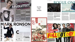
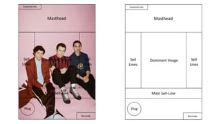
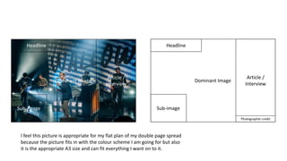
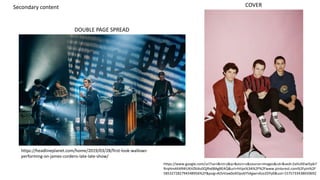
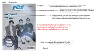
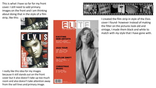
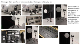
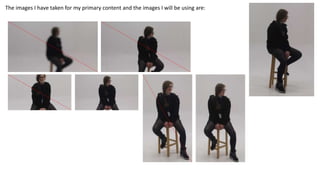
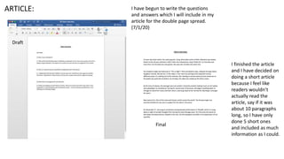
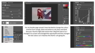
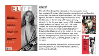
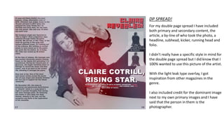
Double
Page
Spreads
Relevant codes and conventions for magazine:
- Potential names.
- Photography for the front cover.
- Main sell lines.
- Sell lines and subheads.
- Graphics and illustrations.
- Features for a double page spread.
- Images for the double page spread.
- Interactive elements (digital).
- Decide if magazine will be print or digital.
Name of magazine:
ELITE magazine
Font, Distortion Of The Brain And Mind
Colour Scheme, Blue, Black and White, Orange, Black, White and Grey.
Masthead,
Legal and ethical issues
Some Legal and Ethical issues that you could face when
creating your magazine are:
- If you don’t credit your secondary content you could face
being sued.
- Not giving credit could also damage your reputation by
using someone elses work without permission and if your
reputation is damaged, the audience might no respect you
and not buy your magazine.
Dominant Image
Masthead
Main Sell-Line
Barcode
Essential info
Sell
Lines
Sell
Lines
Plug
Masthead
Essential info
Dominant Image
Main Sell-Line
Barcode
Sell
Lines
Sell
Lines
Plug
Photographer credit
Headline
Dominant Image
Sub-image
Article /
Interview
Photographer credit
Headline
Dominant Image
Sub-image
Article /
Interview
I feel this picture is appropriate for my flat plan of my double page spread
because the picture fits in with the colour scheme I am going for but also
it is the appropriate A3 size and can fit everything I want on to it.
COVER
DOUBLE PAGE SPREAD
https://headlineplanet.com/home/2019/03/28/first-look-wallows-
performing-on-james-cordens-late-late-show/
Secondary content
https://www.google.com/url?sa=i&rct=j&q=&esrc=s&source=images&cd=&ved=2ahUKEwi5pb7
RrqHmAhXR4IUKHZklAs0QjRx6BAgBEAQ&url=https%3A%2F%2Fwww.pinterest.com%2Fpin%2F
585327282794548956%2F&psig=AOvVaw0oXOpv6Y5Agwrs4zo2DYy0&ust=1575733438650692
Essential information
Masthead
I have used the same font I used in the main sell line as well as adding ‘drop
shadow’ which helps it stand out more so it doesn't look so plain.
The essential information tells us the price of the magazine as well as
the date it was brought out. `The ‘December, 2019’ tells us that this is
an issue that ELITE releases monthly.
Plug
Barcode
The plug shows us how inside the magazine is
a free poster which will edge the reader
further towards wanting to buy the magazine.
Sell-line The ‘featuring’ shows many other artists whose music is enjoyed by may teens
today- this is also used to make more people buy the magazine. I also used
colours for the writing which are in the rainbow overlay I added onto the cover.
Draft 1 – front cover
To make this better I could include some of my
own images as well as giving credit to who
took the picture and adding more sell lines.
Draft dps
I started this double page spread and
didn’t like the way it looked at all, with
any font so I changed it completely,
although I used the same font for the
running head.
These are the four photos that I chose between
for my magazine cover.
I felt as though the bottom right was more
suitable seeing as it has nothing in the
background and mostly focuses on her and her
alone rather than the trees in the back on the
top left and the stairs in the bottom left.
Photographed by Hart & Leshkina for Dazed Digital.
Photographed by Erika Astrid for Paper Magazine.
Photographed by Daria Kobayashi
Ritch for Wonderland Magazine.
This is the image I am wanting to use for my double
page spread, I couldn’t find many A3 images but I
did find this and I feel as though it would fit best,
there is enough space around the image for an
Article, Headline and Primary Images.
Photographed by Savanna Ruedy for Pitch Fork.
First, I changed the saturation, contrast
an levels of the picture I decided to use
for my cover, then I used the brush tool
to make a blank page this orange type
colour and added it on, I decided to try
and copy this style cover for my
magazine:
I then added text onto the
document and decided on the
font ‘Demode Negative.’ Next,
I used the eraser tool to erase
the text that was overlapping
with the image and erased it
so now it looks like she is in
front of the text.
For the ‘essential information,’ I used the
normal Demode font and added the price
as well as the magazines monthly release.
I looked at other magazines to see what they all had and most had their
barcodes on the back however, some had them on the front so I added mine
on the front too. I also added who took the photo I have used for my
magazine cover and the name of the artist.
For the other sell lines I have included things to do with the artist such as
introducing some possible new artists to people and also confirming her
supporting Tame Impala on their new tour next year, on top of that I
added the newly named artists of the decade. I did this just to talk about
something else other than Clairo so more readers could be interested if it
is about two popular artists of our generation.
The two fonts I have used for the sell lines are Arial Black for the bigger
text and Myraid Pro Italic for the smaller text.
This is what I have so far for my front
cover. I still need to add primary
images on the front and I am thinking
about doing that in the style of a film
strip, like this:
I really like this idea for my images
because it still stands out on the front
cover but it also doesn’t take up too much
room and also doesn’t take attention away
from the sell lines and primary image.
I created the film strip in style of the Elvis
cover I found- however instead of making
the filter on the pictures look old and
vintage, I made them black and white to
match with my style that I have gone with.
The images I have taken for my primary content and the images I will be using are:
I only used five of
these pictures but
I decided not to
use the ones
crossed out
because they were
either bad quality,
really blurry or I
just didn’t like the
way they looked.
The images I have taken for my primary content and the images I will be using are:
I have begun to write the questions
and answers which I will include in my
article for the double page spread.
(7/1/20)
I finished the article
and I have decided on
doing a short article
because I feel like
readers wouldn’t
actually read the
article, say if it was
about 10 paragraphs
long, so I have only
done 5 short ones
and included as much
information as I could.
ARTICLE:
Draft
Final
For my double page spread I have decided to change the colour
scheme from orange, black and white to red, blue and black
because I found a light leak online that I liked the look of so I
changed it to screen and changed the opacity/fill and then changed
the text colour so it matches the theme I am going for.
Final designs!
COVER!
This is the final design I have decided on for my magazine cover.
I got inspiration from two other magazines, Uncut Legends and Boxoffice:
I really liked the style that Boxoffice did with their Taron
Egerton, Rocketman edition magazine and I also really
liked the idea of the film strip with my own primary
content. For the film strip idea, I found a PNG on google
Images and took my own pictures for it. The image I
used for the dominant image I got from the ‘Paper
Magazine’ website, the image was photographed by
Erika Astrid and I gave credit at the bottom of the cover
to the photographer, this will help avoid legal issues
because while giving credit, I am not taking credit for
work that isn’t my own, even though I am using it for
my work.
I included a masthead, other sell line, primary content,
secondary content, essential information, a barcode,
sell-lines and subheads.
DP SPREAD!
For my double page spread I have included
both primary and secondary content, the
article, a by-line of who took the photo, a
headline, subhead, kicker, running head and
folio.
I didn’t really have a specific style in mind for
the double page spread but I did know that I
100% wanted to use this picture of the artist.
With the light leak type overlay, I got
inspiration from other magazines in the
genre.
I also included credit for the dominant image
next to my own primary images and I have
said that the person in them is the
photographer.

Magazine cover and dp spread

  • 2.
  • 3.
    Relevant codes andconventions for magazine: - Potential names. - Photography for the front cover. - Main sell lines. - Sell lines and subheads. - Graphics and illustrations. - Features for a double page spread. - Images for the double page spread. - Interactive elements (digital). - Decide if magazine will be print or digital. Name of magazine: ELITE magazine Font, Distortion Of The Brain And Mind Colour Scheme, Blue, Black and White, Orange, Black, White and Grey. Masthead, Legal and ethical issues Some Legal and Ethical issues that you could face when creating your magazine are: - If you don’t credit your secondary content you could face being sued. - Not giving credit could also damage your reputation by using someone elses work without permission and if your reputation is damaged, the audience might no respect you and not buy your magazine.
  • 4.
    Dominant Image Masthead Main Sell-Line Barcode Essentialinfo Sell Lines Sell Lines Plug Masthead Essential info Dominant Image Main Sell-Line Barcode Sell Lines Sell Lines Plug
  • 5.
    Photographer credit Headline Dominant Image Sub-image Article/ Interview Photographer credit Headline Dominant Image Sub-image Article / Interview I feel this picture is appropriate for my flat plan of my double page spread because the picture fits in with the colour scheme I am going for but also it is the appropriate A3 size and can fit everything I want on to it.
  • 6.
    COVER DOUBLE PAGE SPREAD https://headlineplanet.com/home/2019/03/28/first-look-wallows- performing-on-james-cordens-late-late-show/ Secondarycontent https://www.google.com/url?sa=i&rct=j&q=&esrc=s&source=images&cd=&ved=2ahUKEwi5pb7 RrqHmAhXR4IUKHZklAs0QjRx6BAgBEAQ&url=https%3A%2F%2Fwww.pinterest.com%2Fpin%2F 585327282794548956%2F&psig=AOvVaw0oXOpv6Y5Agwrs4zo2DYy0&ust=1575733438650692
  • 7.
    Essential information Masthead I haveused the same font I used in the main sell line as well as adding ‘drop shadow’ which helps it stand out more so it doesn't look so plain. The essential information tells us the price of the magazine as well as the date it was brought out. `The ‘December, 2019’ tells us that this is an issue that ELITE releases monthly. Plug Barcode The plug shows us how inside the magazine is a free poster which will edge the reader further towards wanting to buy the magazine. Sell-line The ‘featuring’ shows many other artists whose music is enjoyed by may teens today- this is also used to make more people buy the magazine. I also used colours for the writing which are in the rainbow overlay I added onto the cover. Draft 1 – front cover To make this better I could include some of my own images as well as giving credit to who took the picture and adding more sell lines.
  • 8.
    Draft dps I startedthis double page spread and didn’t like the way it looked at all, with any font so I changed it completely, although I used the same font for the running head.
  • 9.
    These are thefour photos that I chose between for my magazine cover. I felt as though the bottom right was more suitable seeing as it has nothing in the background and mostly focuses on her and her alone rather than the trees in the back on the top left and the stairs in the bottom left. Photographed by Hart & Leshkina for Dazed Digital. Photographed by Erika Astrid for Paper Magazine. Photographed by Daria Kobayashi Ritch for Wonderland Magazine. This is the image I am wanting to use for my double page spread, I couldn’t find many A3 images but I did find this and I feel as though it would fit best, there is enough space around the image for an Article, Headline and Primary Images. Photographed by Savanna Ruedy for Pitch Fork.
  • 10.
    First, I changedthe saturation, contrast an levels of the picture I decided to use for my cover, then I used the brush tool to make a blank page this orange type colour and added it on, I decided to try and copy this style cover for my magazine: I then added text onto the document and decided on the font ‘Demode Negative.’ Next, I used the eraser tool to erase the text that was overlapping with the image and erased it so now it looks like she is in front of the text. For the ‘essential information,’ I used the normal Demode font and added the price as well as the magazines monthly release.
  • 11.
    I looked atother magazines to see what they all had and most had their barcodes on the back however, some had them on the front so I added mine on the front too. I also added who took the photo I have used for my magazine cover and the name of the artist. For the other sell lines I have included things to do with the artist such as introducing some possible new artists to people and also confirming her supporting Tame Impala on their new tour next year, on top of that I added the newly named artists of the decade. I did this just to talk about something else other than Clairo so more readers could be interested if it is about two popular artists of our generation. The two fonts I have used for the sell lines are Arial Black for the bigger text and Myraid Pro Italic for the smaller text.
  • 12.
    This is whatI have so far for my front cover. I still need to add primary images on the front and I am thinking about doing that in the style of a film strip, like this: I really like this idea for my images because it still stands out on the front cover but it also doesn’t take up too much room and also doesn’t take attention away from the sell lines and primary image. I created the film strip in style of the Elvis cover I found- however instead of making the filter on the pictures look old and vintage, I made them black and white to match with my style that I have gone with.
  • 13.
    The images Ihave taken for my primary content and the images I will be using are: I only used five of these pictures but I decided not to use the ones crossed out because they were either bad quality, really blurry or I just didn’t like the way they looked.
  • 14.
    The images Ihave taken for my primary content and the images I will be using are:
  • 15.
    I have begunto write the questions and answers which I will include in my article for the double page spread. (7/1/20) I finished the article and I have decided on doing a short article because I feel like readers wouldn’t actually read the article, say if it was about 10 paragraphs long, so I have only done 5 short ones and included as much information as I could. ARTICLE: Draft Final
  • 16.
    For my doublepage spread I have decided to change the colour scheme from orange, black and white to red, blue and black because I found a light leak online that I liked the look of so I changed it to screen and changed the opacity/fill and then changed the text colour so it matches the theme I am going for.
  • 17.
  • 18.
    COVER! This is thefinal design I have decided on for my magazine cover. I got inspiration from two other magazines, Uncut Legends and Boxoffice: I really liked the style that Boxoffice did with their Taron Egerton, Rocketman edition magazine and I also really liked the idea of the film strip with my own primary content. For the film strip idea, I found a PNG on google Images and took my own pictures for it. The image I used for the dominant image I got from the ‘Paper Magazine’ website, the image was photographed by Erika Astrid and I gave credit at the bottom of the cover to the photographer, this will help avoid legal issues because while giving credit, I am not taking credit for work that isn’t my own, even though I am using it for my work. I included a masthead, other sell line, primary content, secondary content, essential information, a barcode, sell-lines and subheads.
  • 19.
    DP SPREAD! For mydouble page spread I have included both primary and secondary content, the article, a by-line of who took the photo, a headline, subhead, kicker, running head and folio. I didn’t really have a specific style in mind for the double page spread but I did know that I 100% wanted to use this picture of the artist. With the light leak type overlay, I got inspiration from other magazines in the genre. I also included credit for the dominant image next to my own primary images and I have said that the person in them is the photographer.

Editor's Notes

  • #2 What have you learned from these front covers?