SlideShare a Scribd company logo
Masthead
Pug
Main Image
Anchorage
Cover Line
Masthead
Pug
Skyline
Anchorage
Main Image
Cover Line
Genre
I have chosen to analyse two cover pages, contents pages and doubles
spreads from a variety of pop magazines. Genre conventions of pop magazines
are bright colours, neat and pretty writing and young, popular artists or boy
bands featuring heavily throughout the magazines.
Masthead
The masthead uses a clear yet stylish font, this is an iconic sign as it fits in well with the rest of
the cover and it ties in some bright colours. The style of the font is quite informal, the preferred
reading of this would be that this appeals to readers as it feels more welcoming and targets
every audience. The colour of the font is black, the preferred reading of this would be that black
is a classy colour nonetheless the oppositional reading of some readers could be that the use
of black creates a dark and depressing feel, however Billboard use the bright colours blue and
yellow to fill in the gap of the ‘a’ and ‘d’ which adds to the preppy and fun look. This font is also
used throughout the rest of the cover page in the anchorage and cover lines creating a clean
and finished look.
Main Image
The main image on the Billboard magazine is a long shot of popular female artist Katy Perry.
The image is an indexical sign as some people who are not fans of the genre may have the
stereotype that pop artists are constantly wearing revealing clothes and are just about sex
appeal, yet Katy Perry is wearing an appropriate but cute dress and is draped in flowers. The
flowers could signify youth and purity as they are objects of nature which is usually associated
with freshness, they could be an indexical sign to show Katy Perry’s growth as an artist as
flowers have to grow. The mise-en-scene (clothes and props) complement the colour of the
background well. The preferred reading of this image would be that Katy Perry looks young and
happy and isn’t showing a lot of her body just to look good.
Billboard Magazine
Masthead
The masthead uses an informal font and is very simple but it is instantly recognisable as it is a
very popular magazine, the preferred reading of this could be that the producers want the
readers to feel cool and current. The use of the red background for the white colour of the letter
Q means that the masthead immediately stands out. the oppositional reading of the use of the
colour red could be that it can signify danger and ager, however the preferred reading would be
that red is a vibrant and edgy colour which grabs people’s attention.
Main Image
The main image is a mid shot of Lana Del Ray, straight away the image is quite controversial
due to the blood dripping down her face, the oppositional reading of people who are not of the
target audience would be that it is disturbing and not appropriate for a pop magazine, however
the preferred reading would be that it relates to the anchorage, ‘So What’s So Bloody Good?’.
Also it could be an indexical sign which implies that the tiara is causing her pain, which could
be interpreted as that life being famous isn’t all as glorious as it seems. The use of a mid shot
allows you to focus on the image but it also creates a personal feel as if the readers know the
celebrity in the image.
Q Magazine
Cover Line - Billboard
The main cover line was the only part of the cover page that used a different style and size
font, it was slightly more formal, the preferred reading of this would be that the producers want
this particular part to stand out, most likely because it is in relation to the main image. The font
style is and iconic sign as it is a pretty and fairly feminine font, which relates to Katy Perry.
Cover Line - Q Magazine
The main cover line for this magazine uses a very informal style of font, it uses a bright pink
colour and it is very large this means it is eye catching for the reader, the font almost looks as if
it has been written in lipstick, the preferred reading of this would be that the producer want to
create a personal touch for the readers, also it is a bit quirky and exciting which is good for a
pop magazine. For someone out of the target audience the oppositional reading could be that
the font looks messy and out of place.
Pug - Billboard Magazine
The pug on the cover of the Billboard magazine uses the iconic sign of a circle to highlight it. The circle
does not have a colour fill and is just the outline of a circle, this makes the use of the pug a lighter
touch, it is more attractive rather than a block of colour interrupting the main image. The preferred
reading of this would be that the producers want to make the cover page as professional looking as
possible. The pug is an indexical sign because unless you were a fan of pop or part of the target
audience you wouldn’t really understand it as you would not have heard of these artists before. The
colour for the title of the information in the pug is yellow, yellow is a bright and vibrant colour which can
signify happiness it is also commonly used to highlight things such as hazard labels, the preferred
reading of this would be that it is eye-catching and creates a happy feeling for the reader.
Pug – Q Magazine
The pug for Q magazine is in placed in the middle of magazine so it is one of the first things the reader
will see. It uses the iconic sign of a circle with a jagged edge as the background for the text, the
preferred reading of this would be that the producers wish to add some excitement by not using
typical circle, the jagged edge creates a certain edginess which the target audience would enjoy. The
use of the colour yellow is a symbolic sign as it could signify happiness as it connotes to brightness
and the sun, however the oppositional reading of this could be that someone who isn’t of the target
audience would interpret the use of yellow as signifying danger as the colour is commonly used on
warning signs. The colour yellow ties in the with skyline which uses yellow, the use of the same colour
throughout creates a professional and seamless look as it ties the cover page together.
Headlines
Image
Secondary images
Sections
Headline
Image
Secondary Imag
Section
Sections
The sections used for this magazine are straight away obviously aimed at a younger
target audience, I can tell this through the use sans serif font which creates an
informal look, this would be more preferred by teenagers as the preferred reading
would be that this font style creates a welcoming style. It could also be said that the
font style is a little decorative with the swirls on the capital letters of each word, the
referred reading of this would be that the producers wanted to create a more ‘girly’
style.
Headlines
The use of language for the headline is very informal, ‘mag’, this is something that
young, teenage girls would often use in their everyday lives so the preferred reading of
this would be that the producers wish the readers to feel that they can relate to the
magazine. The font used for the headline is script, this is an iconic sign of
handwritten style, the preferred reading of this would be that the producers want to
create a personal feel and direct address to the reader.
Top of the Pops
Sections
The sections used for billboard magazine use more sophisticated language such as
‘women’, this shows that it is a slightly older target audience. The use of font is sans
serif which is a more informal font type of font, the preferred reading of this would be
that the producers want to create a modern look, the also use italic font this creates a
more classy look, the oppositional reading of this would be that it does not fit in with
the rest of the layout and looks messy.
Headlines
The headline for Billboard is the iconic sign of the word ‘contents’, this is simple and
to the point, the preferred reading of this would be that it creates a clear and neat
look which is attractive to the reader. It also uses the colour white for the headline,
white can be seen as a symbolic sign for freshness and purity therfore the referred
reading of this would be that the producers want a clean look to their contents page.
Billboard
Main Image – Top of the Pops
The main image for Top of The Pops is the iconic sign of a picture of its cover page, the
image is annotated with big pink numbers to show what number page each of the
stories from the cover page are on. The preferred reading of this would be that it is
something more interesting for the young target audience to look at rather than listed
contents. The use of the colour pink could represent teenage girls.
Main Image – Billboard
The main image for the contents page is a close up of popular artist Adele, Adele
mainly attracts and older target audience and this is reflected by the colours used in
the picture she is wearing black and the back ground is grey, the referred reading of
this would be that black and grey are classy ad sophisticated colours, how ever from
someone who is not the target audience the colours may seem dark and depressing
this would be the oppositional reading. Also the close up could also show that
producers want the readers to admire Adele’s make up choices, in addition the use of
the close up creates a personal effect; the preferred reading of this would be that the
producers want the readers to feel on the same level as the celebrity.

More Related Content

What's hot

Magazine Analysis
Magazine AnalysisMagazine Analysis
Magazine Analysis
JessDruett
 
Magazine front cover analysis
Magazine front cover analysis Magazine front cover analysis
Magazine front cover analysis ellyjeffrey
 
Music magazine analysis
Music magazine analysisMusic magazine analysis
Music magazine analysis
BethanyPhilippa
 
Magazine analysis totp 1
Magazine analysis   totp 1Magazine analysis   totp 1
Magazine analysis totp 1Deanna Harnden
 
Research into roducts
Research into roducts Research into roducts
Research into roducts paris12346
 
Contents page evaluations
Contents page evaluationsContents page evaluations
Contents page evaluations
g321bethanybarrows
 
Magazine analysis
Magazine analysisMagazine analysis
Magazine analysis
denirose17
 
AS Media evaluation question 1
AS Media evaluation question 1AS Media evaluation question 1
AS Media evaluation question 1DannyRoth
 
Analysisi of magaixzne
Analysisi of magaixzneAnalysisi of magaixzne
Analysisi of magaixzne
g321bethanybarrows
 
Annotations of double page spreads
Annotations of double page spreadsAnnotations of double page spreads
Annotations of double page spreads
lucyvh
 
Annotations of double page spreads
Annotations of double page spreadsAnnotations of double page spreads
Annotations of double page spreads
lucyvh
 
Article analysis
Article analysisArticle analysis
Article analysis
Katie Snook
 
Contents page analysis
Contents page  analysisContents page  analysis
Contents page analysis
eleanorwest
 
Magazine analysis totp 1
Magazine analysis   totp 1Magazine analysis   totp 1
Magazine analysis totp 1deannaharnden
 

What's hot (15)

Magazine Analysis
Magazine AnalysisMagazine Analysis
Magazine Analysis
 
Magazine front cover analysis
Magazine front cover analysis Magazine front cover analysis
Magazine front cover analysis
 
Music magazine analysis
Music magazine analysisMusic magazine analysis
Music magazine analysis
 
Magazine analysis totp 1
Magazine analysis   totp 1Magazine analysis   totp 1
Magazine analysis totp 1
 
Research into roducts
Research into roducts Research into roducts
Research into roducts
 
Contents page evaluations
Contents page evaluationsContents page evaluations
Contents page evaluations
 
Magazine analysis
Magazine analysisMagazine analysis
Magazine analysis
 
AS Media evaluation question 1
AS Media evaluation question 1AS Media evaluation question 1
AS Media evaluation question 1
 
Analysisi of magaixzne
Analysisi of magaixzneAnalysisi of magaixzne
Analysisi of magaixzne
 
Annotations of double page spreads
Annotations of double page spreadsAnnotations of double page spreads
Annotations of double page spreads
 
Annotations of double page spreads
Annotations of double page spreadsAnnotations of double page spreads
Annotations of double page spreads
 
DPS
DPSDPS
DPS
 
Article analysis
Article analysisArticle analysis
Article analysis
 
Contents page analysis
Contents page  analysisContents page  analysis
Contents page analysis
 
Magazine analysis totp 1
Magazine analysis   totp 1Magazine analysis   totp 1
Magazine analysis totp 1
 

Similar to Music Magazine Analysis

Brand Identity
Brand Identity Brand Identity
Brand Identity
AmelliaS
 
Analysis of Front Cover Music Magazine
Analysis of Front Cover Music MagazineAnalysis of Front Cover Music Magazine
Analysis of Front Cover Music Magazine
courteneyblack
 
Front cover analysis.
Front cover analysis.Front cover analysis.
Front cover analysis.
AmyShields00
 
Magazine research really official [recovered]
Magazine research really official [recovered]Magazine research really official [recovered]
Magazine research really official [recovered]
Karis Hays
 
Analyising music magazines
Analyising music magazinesAnalyising music magazines
Analyising music magazinesJess Stafford
 
Magazine research really official [recovered]
Magazine research really official [recovered]Magazine research really official [recovered]
Magazine research really official [recovered]
eleanorwaring1
 
Textual Analysis
Textual AnalysisTextual Analysis
Textual Analysis
eleanorwaring1
 
Task3 smash hits analysis
Task3 smash hits analysisTask3 smash hits analysis
Task3 smash hits analysisdenhamj1
 
Magazine analysis
Magazine analysis Magazine analysis
Magazine analysis
Vickie Louise
 
Magazine analysis of top of the pops
Magazine analysis of top of the popsMagazine analysis of top of the pops
Magazine analysis of top of the pops
denirose17
 
Tasks 1 4 and hwk 1
Tasks 1 4 and hwk 1Tasks 1 4 and hwk 1
Tasks 1 4 and hwk 1
charlie__1
 
Analysing 3 magazine covers
Analysing 3 magazine coversAnalysing 3 magazine covers
Analysing 3 magazine covers
black-bird
 
Tasks 1 4 and hwk 2
Tasks 1 4 and hwk 2Tasks 1 4 and hwk 2
Tasks 1 4 and hwk 2
charlie__97
 
Analyising music magazines
Analyising music magazinesAnalyising music magazines
Analyising music magazinesjessasmedia4
 
Research and planning all 3
Research and planning all 3Research and planning all 3
Research and planning all 3ReecebahiaGAD
 
Magazine resarch powerp 2 final
Magazine resarch powerp 2 finalMagazine resarch powerp 2 final
Magazine resarch powerp 2 final
Jessica Smith
 
Magazine resarch powerp 2
Magazine resarch powerp 2Magazine resarch powerp 2
Magazine resarch powerp 2
Jessica Smith
 
Music Magazine Research
Music Magazine ResearchMusic Magazine Research
Music Magazine Researchasiyam
 
Analyising music magazines
Analyising music magazinesAnalyising music magazines
Analyising music magazines
jessasmedia4
 

Similar to Music Magazine Analysis (20)

Brand Identity
Brand Identity Brand Identity
Brand Identity
 
Analysis of Front Cover Music Magazine
Analysis of Front Cover Music MagazineAnalysis of Front Cover Music Magazine
Analysis of Front Cover Music Magazine
 
Task 2
Task 2Task 2
Task 2
 
Front cover analysis.
Front cover analysis.Front cover analysis.
Front cover analysis.
 
Magazine research really official [recovered]
Magazine research really official [recovered]Magazine research really official [recovered]
Magazine research really official [recovered]
 
Analyising music magazines
Analyising music magazinesAnalyising music magazines
Analyising music magazines
 
Magazine research really official [recovered]
Magazine research really official [recovered]Magazine research really official [recovered]
Magazine research really official [recovered]
 
Textual Analysis
Textual AnalysisTextual Analysis
Textual Analysis
 
Task3 smash hits analysis
Task3 smash hits analysisTask3 smash hits analysis
Task3 smash hits analysis
 
Magazine analysis
Magazine analysis Magazine analysis
Magazine analysis
 
Magazine analysis of top of the pops
Magazine analysis of top of the popsMagazine analysis of top of the pops
Magazine analysis of top of the pops
 
Tasks 1 4 and hwk 1
Tasks 1 4 and hwk 1Tasks 1 4 and hwk 1
Tasks 1 4 and hwk 1
 
Analysing 3 magazine covers
Analysing 3 magazine coversAnalysing 3 magazine covers
Analysing 3 magazine covers
 
Tasks 1 4 and hwk 2
Tasks 1 4 and hwk 2Tasks 1 4 and hwk 2
Tasks 1 4 and hwk 2
 
Analyising music magazines
Analyising music magazinesAnalyising music magazines
Analyising music magazines
 
Research and planning all 3
Research and planning all 3Research and planning all 3
Research and planning all 3
 
Magazine resarch powerp 2 final
Magazine resarch powerp 2 finalMagazine resarch powerp 2 final
Magazine resarch powerp 2 final
 
Magazine resarch powerp 2
Magazine resarch powerp 2Magazine resarch powerp 2
Magazine resarch powerp 2
 
Music Magazine Research
Music Magazine ResearchMusic Magazine Research
Music Magazine Research
 
Analyising music magazines
Analyising music magazinesAnalyising music magazines
Analyising music magazines
 

Recently uploaded

Embracing GenAI - A Strategic Imperative
Embracing GenAI - A Strategic ImperativeEmbracing GenAI - A Strategic Imperative
Embracing GenAI - A Strategic Imperative
Peter Windle
 
CLASS 11 CBSE B.St Project AIDS TO TRADE - INSURANCE
CLASS 11 CBSE B.St Project AIDS TO TRADE - INSURANCECLASS 11 CBSE B.St Project AIDS TO TRADE - INSURANCE
CLASS 11 CBSE B.St Project AIDS TO TRADE - INSURANCE
BhavyaRajput3
 
Francesca Gottschalk - How can education support child empowerment.pptx
Francesca Gottschalk - How can education support child empowerment.pptxFrancesca Gottschalk - How can education support child empowerment.pptx
Francesca Gottschalk - How can education support child empowerment.pptx
EduSkills OECD
 
"Protectable subject matters, Protection in biotechnology, Protection of othe...
"Protectable subject matters, Protection in biotechnology, Protection of othe..."Protectable subject matters, Protection in biotechnology, Protection of othe...
"Protectable subject matters, Protection in biotechnology, Protection of othe...
SACHIN R KONDAGURI
 
Digital Tools and AI for Teaching Learning and Research
Digital Tools and AI for Teaching Learning and ResearchDigital Tools and AI for Teaching Learning and Research
Digital Tools and AI for Teaching Learning and Research
Vikramjit Singh
 
Adversarial Attention Modeling for Multi-dimensional Emotion Regression.pdf
Adversarial Attention Modeling for Multi-dimensional Emotion Regression.pdfAdversarial Attention Modeling for Multi-dimensional Emotion Regression.pdf
Adversarial Attention Modeling for Multi-dimensional Emotion Regression.pdf
Po-Chuan Chen
 
The Challenger.pdf DNHS Official Publication
The Challenger.pdf DNHS Official PublicationThe Challenger.pdf DNHS Official Publication
The Challenger.pdf DNHS Official Publication
Delapenabediema
 
Lapbook sobre os Regimes Totalitários.pdf
Lapbook sobre os Regimes Totalitários.pdfLapbook sobre os Regimes Totalitários.pdf
Lapbook sobre os Regimes Totalitários.pdf
Jean Carlos Nunes Paixão
 
Additional Benefits for Employee Website.pdf
Additional Benefits for Employee Website.pdfAdditional Benefits for Employee Website.pdf
Additional Benefits for Employee Website.pdf
joachimlavalley1
 
A Strategic Approach: GenAI in Education
A Strategic Approach: GenAI in EducationA Strategic Approach: GenAI in Education
A Strategic Approach: GenAI in Education
Peter Windle
 
The basics of sentences session 5pptx.pptx
The basics of sentences session 5pptx.pptxThe basics of sentences session 5pptx.pptx
The basics of sentences session 5pptx.pptx
heathfieldcps1
 
Sha'Carri Richardson Presentation 202345
Sha'Carri Richardson Presentation 202345Sha'Carri Richardson Presentation 202345
Sha'Carri Richardson Presentation 202345
beazzy04
 
Guidance_and_Counselling.pdf B.Ed. 4th Semester
Guidance_and_Counselling.pdf B.Ed. 4th SemesterGuidance_and_Counselling.pdf B.Ed. 4th Semester
Guidance_and_Counselling.pdf B.Ed. 4th Semester
Atul Kumar Singh
 
Mule 4.6 & Java 17 Upgrade | MuleSoft Mysore Meetup #46
Mule 4.6 & Java 17 Upgrade | MuleSoft Mysore Meetup #46Mule 4.6 & Java 17 Upgrade | MuleSoft Mysore Meetup #46
Mule 4.6 & Java 17 Upgrade | MuleSoft Mysore Meetup #46
MysoreMuleSoftMeetup
 
Acetabularia Information For Class 9 .docx
Acetabularia Information For Class 9  .docxAcetabularia Information For Class 9  .docx
Acetabularia Information For Class 9 .docx
vaibhavrinwa19
 
2024.06.01 Introducing a competency framework for languag learning materials ...
2024.06.01 Introducing a competency framework for languag learning materials ...2024.06.01 Introducing a competency framework for languag learning materials ...
2024.06.01 Introducing a competency framework for languag learning materials ...
Sandy Millin
 
The Accursed House by Émile Gaboriau.pptx
The Accursed House by Émile Gaboriau.pptxThe Accursed House by Émile Gaboriau.pptx
The Accursed House by Émile Gaboriau.pptx
DhatriParmar
 
BÀI TẬP BỔ TRỢ TIẾNG ANH GLOBAL SUCCESS LỚP 3 - CẢ NĂM (CÓ FILE NGHE VÀ ĐÁP Á...
BÀI TẬP BỔ TRỢ TIẾNG ANH GLOBAL SUCCESS LỚP 3 - CẢ NĂM (CÓ FILE NGHE VÀ ĐÁP Á...BÀI TẬP BỔ TRỢ TIẾNG ANH GLOBAL SUCCESS LỚP 3 - CẢ NĂM (CÓ FILE NGHE VÀ ĐÁP Á...
BÀI TẬP BỔ TRỢ TIẾNG ANH GLOBAL SUCCESS LỚP 3 - CẢ NĂM (CÓ FILE NGHE VÀ ĐÁP Á...
Nguyen Thanh Tu Collection
 
Welcome to TechSoup New Member Orientation and Q&A (May 2024).pdf
Welcome to TechSoup   New Member Orientation and Q&A (May 2024).pdfWelcome to TechSoup   New Member Orientation and Q&A (May 2024).pdf
Welcome to TechSoup New Member Orientation and Q&A (May 2024).pdf
TechSoup
 
Thesis Statement for students diagnonsed withADHD.ppt
Thesis Statement for students diagnonsed withADHD.pptThesis Statement for students diagnonsed withADHD.ppt
Thesis Statement for students diagnonsed withADHD.ppt
EverAndrsGuerraGuerr
 

Recently uploaded (20)

Embracing GenAI - A Strategic Imperative
Embracing GenAI - A Strategic ImperativeEmbracing GenAI - A Strategic Imperative
Embracing GenAI - A Strategic Imperative
 
CLASS 11 CBSE B.St Project AIDS TO TRADE - INSURANCE
CLASS 11 CBSE B.St Project AIDS TO TRADE - INSURANCECLASS 11 CBSE B.St Project AIDS TO TRADE - INSURANCE
CLASS 11 CBSE B.St Project AIDS TO TRADE - INSURANCE
 
Francesca Gottschalk - How can education support child empowerment.pptx
Francesca Gottschalk - How can education support child empowerment.pptxFrancesca Gottschalk - How can education support child empowerment.pptx
Francesca Gottschalk - How can education support child empowerment.pptx
 
"Protectable subject matters, Protection in biotechnology, Protection of othe...
"Protectable subject matters, Protection in biotechnology, Protection of othe..."Protectable subject matters, Protection in biotechnology, Protection of othe...
"Protectable subject matters, Protection in biotechnology, Protection of othe...
 
Digital Tools and AI for Teaching Learning and Research
Digital Tools and AI for Teaching Learning and ResearchDigital Tools and AI for Teaching Learning and Research
Digital Tools and AI for Teaching Learning and Research
 
Adversarial Attention Modeling for Multi-dimensional Emotion Regression.pdf
Adversarial Attention Modeling for Multi-dimensional Emotion Regression.pdfAdversarial Attention Modeling for Multi-dimensional Emotion Regression.pdf
Adversarial Attention Modeling for Multi-dimensional Emotion Regression.pdf
 
The Challenger.pdf DNHS Official Publication
The Challenger.pdf DNHS Official PublicationThe Challenger.pdf DNHS Official Publication
The Challenger.pdf DNHS Official Publication
 
Lapbook sobre os Regimes Totalitários.pdf
Lapbook sobre os Regimes Totalitários.pdfLapbook sobre os Regimes Totalitários.pdf
Lapbook sobre os Regimes Totalitários.pdf
 
Additional Benefits for Employee Website.pdf
Additional Benefits for Employee Website.pdfAdditional Benefits for Employee Website.pdf
Additional Benefits for Employee Website.pdf
 
A Strategic Approach: GenAI in Education
A Strategic Approach: GenAI in EducationA Strategic Approach: GenAI in Education
A Strategic Approach: GenAI in Education
 
The basics of sentences session 5pptx.pptx
The basics of sentences session 5pptx.pptxThe basics of sentences session 5pptx.pptx
The basics of sentences session 5pptx.pptx
 
Sha'Carri Richardson Presentation 202345
Sha'Carri Richardson Presentation 202345Sha'Carri Richardson Presentation 202345
Sha'Carri Richardson Presentation 202345
 
Guidance_and_Counselling.pdf B.Ed. 4th Semester
Guidance_and_Counselling.pdf B.Ed. 4th SemesterGuidance_and_Counselling.pdf B.Ed. 4th Semester
Guidance_and_Counselling.pdf B.Ed. 4th Semester
 
Mule 4.6 & Java 17 Upgrade | MuleSoft Mysore Meetup #46
Mule 4.6 & Java 17 Upgrade | MuleSoft Mysore Meetup #46Mule 4.6 & Java 17 Upgrade | MuleSoft Mysore Meetup #46
Mule 4.6 & Java 17 Upgrade | MuleSoft Mysore Meetup #46
 
Acetabularia Information For Class 9 .docx
Acetabularia Information For Class 9  .docxAcetabularia Information For Class 9  .docx
Acetabularia Information For Class 9 .docx
 
2024.06.01 Introducing a competency framework for languag learning materials ...
2024.06.01 Introducing a competency framework for languag learning materials ...2024.06.01 Introducing a competency framework for languag learning materials ...
2024.06.01 Introducing a competency framework for languag learning materials ...
 
The Accursed House by Émile Gaboriau.pptx
The Accursed House by Émile Gaboriau.pptxThe Accursed House by Émile Gaboriau.pptx
The Accursed House by Émile Gaboriau.pptx
 
BÀI TẬP BỔ TRỢ TIẾNG ANH GLOBAL SUCCESS LỚP 3 - CẢ NĂM (CÓ FILE NGHE VÀ ĐÁP Á...
BÀI TẬP BỔ TRỢ TIẾNG ANH GLOBAL SUCCESS LỚP 3 - CẢ NĂM (CÓ FILE NGHE VÀ ĐÁP Á...BÀI TẬP BỔ TRỢ TIẾNG ANH GLOBAL SUCCESS LỚP 3 - CẢ NĂM (CÓ FILE NGHE VÀ ĐÁP Á...
BÀI TẬP BỔ TRỢ TIẾNG ANH GLOBAL SUCCESS LỚP 3 - CẢ NĂM (CÓ FILE NGHE VÀ ĐÁP Á...
 
Welcome to TechSoup New Member Orientation and Q&A (May 2024).pdf
Welcome to TechSoup   New Member Orientation and Q&A (May 2024).pdfWelcome to TechSoup   New Member Orientation and Q&A (May 2024).pdf
Welcome to TechSoup New Member Orientation and Q&A (May 2024).pdf
 
Thesis Statement for students diagnonsed withADHD.ppt
Thesis Statement for students diagnonsed withADHD.pptThesis Statement for students diagnonsed withADHD.ppt
Thesis Statement for students diagnonsed withADHD.ppt
 

Music Magazine Analysis

  • 3. Genre I have chosen to analyse two cover pages, contents pages and doubles spreads from a variety of pop magazines. Genre conventions of pop magazines are bright colours, neat and pretty writing and young, popular artists or boy bands featuring heavily throughout the magazines.
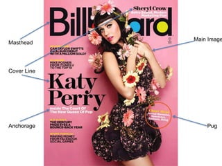
  • 4. Masthead The masthead uses a clear yet stylish font, this is an iconic sign as it fits in well with the rest of the cover and it ties in some bright colours. The style of the font is quite informal, the preferred reading of this would be that this appeals to readers as it feels more welcoming and targets every audience. The colour of the font is black, the preferred reading of this would be that black is a classy colour nonetheless the oppositional reading of some readers could be that the use of black creates a dark and depressing feel, however Billboard use the bright colours blue and yellow to fill in the gap of the ‘a’ and ‘d’ which adds to the preppy and fun look. This font is also used throughout the rest of the cover page in the anchorage and cover lines creating a clean and finished look. Main Image The main image on the Billboard magazine is a long shot of popular female artist Katy Perry. The image is an indexical sign as some people who are not fans of the genre may have the stereotype that pop artists are constantly wearing revealing clothes and are just about sex appeal, yet Katy Perry is wearing an appropriate but cute dress and is draped in flowers. The flowers could signify youth and purity as they are objects of nature which is usually associated with freshness, they could be an indexical sign to show Katy Perry’s growth as an artist as flowers have to grow. The mise-en-scene (clothes and props) complement the colour of the background well. The preferred reading of this image would be that Katy Perry looks young and happy and isn’t showing a lot of her body just to look good. Billboard Magazine
  • 5. Masthead The masthead uses an informal font and is very simple but it is instantly recognisable as it is a very popular magazine, the preferred reading of this could be that the producers want the readers to feel cool and current. The use of the red background for the white colour of the letter Q means that the masthead immediately stands out. the oppositional reading of the use of the colour red could be that it can signify danger and ager, however the preferred reading would be that red is a vibrant and edgy colour which grabs people’s attention. Main Image The main image is a mid shot of Lana Del Ray, straight away the image is quite controversial due to the blood dripping down her face, the oppositional reading of people who are not of the target audience would be that it is disturbing and not appropriate for a pop magazine, however the preferred reading would be that it relates to the anchorage, ‘So What’s So Bloody Good?’. Also it could be an indexical sign which implies that the tiara is causing her pain, which could be interpreted as that life being famous isn’t all as glorious as it seems. The use of a mid shot allows you to focus on the image but it also creates a personal feel as if the readers know the celebrity in the image. Q Magazine
  • 6. Cover Line - Billboard The main cover line was the only part of the cover page that used a different style and size font, it was slightly more formal, the preferred reading of this would be that the producers want this particular part to stand out, most likely because it is in relation to the main image. The font style is and iconic sign as it is a pretty and fairly feminine font, which relates to Katy Perry. Cover Line - Q Magazine The main cover line for this magazine uses a very informal style of font, it uses a bright pink colour and it is very large this means it is eye catching for the reader, the font almost looks as if it has been written in lipstick, the preferred reading of this would be that the producer want to create a personal touch for the readers, also it is a bit quirky and exciting which is good for a pop magazine. For someone out of the target audience the oppositional reading could be that the font looks messy and out of place.
  • 7. Pug - Billboard Magazine The pug on the cover of the Billboard magazine uses the iconic sign of a circle to highlight it. The circle does not have a colour fill and is just the outline of a circle, this makes the use of the pug a lighter touch, it is more attractive rather than a block of colour interrupting the main image. The preferred reading of this would be that the producers want to make the cover page as professional looking as possible. The pug is an indexical sign because unless you were a fan of pop or part of the target audience you wouldn’t really understand it as you would not have heard of these artists before. The colour for the title of the information in the pug is yellow, yellow is a bright and vibrant colour which can signify happiness it is also commonly used to highlight things such as hazard labels, the preferred reading of this would be that it is eye-catching and creates a happy feeling for the reader. Pug – Q Magazine The pug for Q magazine is in placed in the middle of magazine so it is one of the first things the reader will see. It uses the iconic sign of a circle with a jagged edge as the background for the text, the preferred reading of this would be that the producers wish to add some excitement by not using typical circle, the jagged edge creates a certain edginess which the target audience would enjoy. The use of the colour yellow is a symbolic sign as it could signify happiness as it connotes to brightness and the sun, however the oppositional reading of this could be that someone who isn’t of the target audience would interpret the use of yellow as signifying danger as the colour is commonly used on warning signs. The colour yellow ties in the with skyline which uses yellow, the use of the same colour throughout creates a professional and seamless look as it ties the cover page together.
  • 10. Sections The sections used for this magazine are straight away obviously aimed at a younger target audience, I can tell this through the use sans serif font which creates an informal look, this would be more preferred by teenagers as the preferred reading would be that this font style creates a welcoming style. It could also be said that the font style is a little decorative with the swirls on the capital letters of each word, the referred reading of this would be that the producers wanted to create a more ‘girly’ style. Headlines The use of language for the headline is very informal, ‘mag’, this is something that young, teenage girls would often use in their everyday lives so the preferred reading of this would be that the producers wish the readers to feel that they can relate to the magazine. The font used for the headline is script, this is an iconic sign of handwritten style, the preferred reading of this would be that the producers want to create a personal feel and direct address to the reader. Top of the Pops
  • 11. Sections The sections used for billboard magazine use more sophisticated language such as ‘women’, this shows that it is a slightly older target audience. The use of font is sans serif which is a more informal font type of font, the preferred reading of this would be that the producers want to create a modern look, the also use italic font this creates a more classy look, the oppositional reading of this would be that it does not fit in with the rest of the layout and looks messy. Headlines The headline for Billboard is the iconic sign of the word ‘contents’, this is simple and to the point, the preferred reading of this would be that it creates a clear and neat look which is attractive to the reader. It also uses the colour white for the headline, white can be seen as a symbolic sign for freshness and purity therfore the referred reading of this would be that the producers want a clean look to their contents page. Billboard
  • 12. Main Image – Top of the Pops The main image for Top of The Pops is the iconic sign of a picture of its cover page, the image is annotated with big pink numbers to show what number page each of the stories from the cover page are on. The preferred reading of this would be that it is something more interesting for the young target audience to look at rather than listed contents. The use of the colour pink could represent teenage girls. Main Image – Billboard The main image for the contents page is a close up of popular artist Adele, Adele mainly attracts and older target audience and this is reflected by the colours used in the picture she is wearing black and the back ground is grey, the referred reading of this would be that black and grey are classy ad sophisticated colours, how ever from someone who is not the target audience the colours may seem dark and depressing this would be the oppositional reading. Also the close up could also show that producers want the readers to admire Adele’s make up choices, in addition the use of the close up creates a personal effect; the preferred reading of this would be that the producers want the readers to feel on the same level as the celebrity.