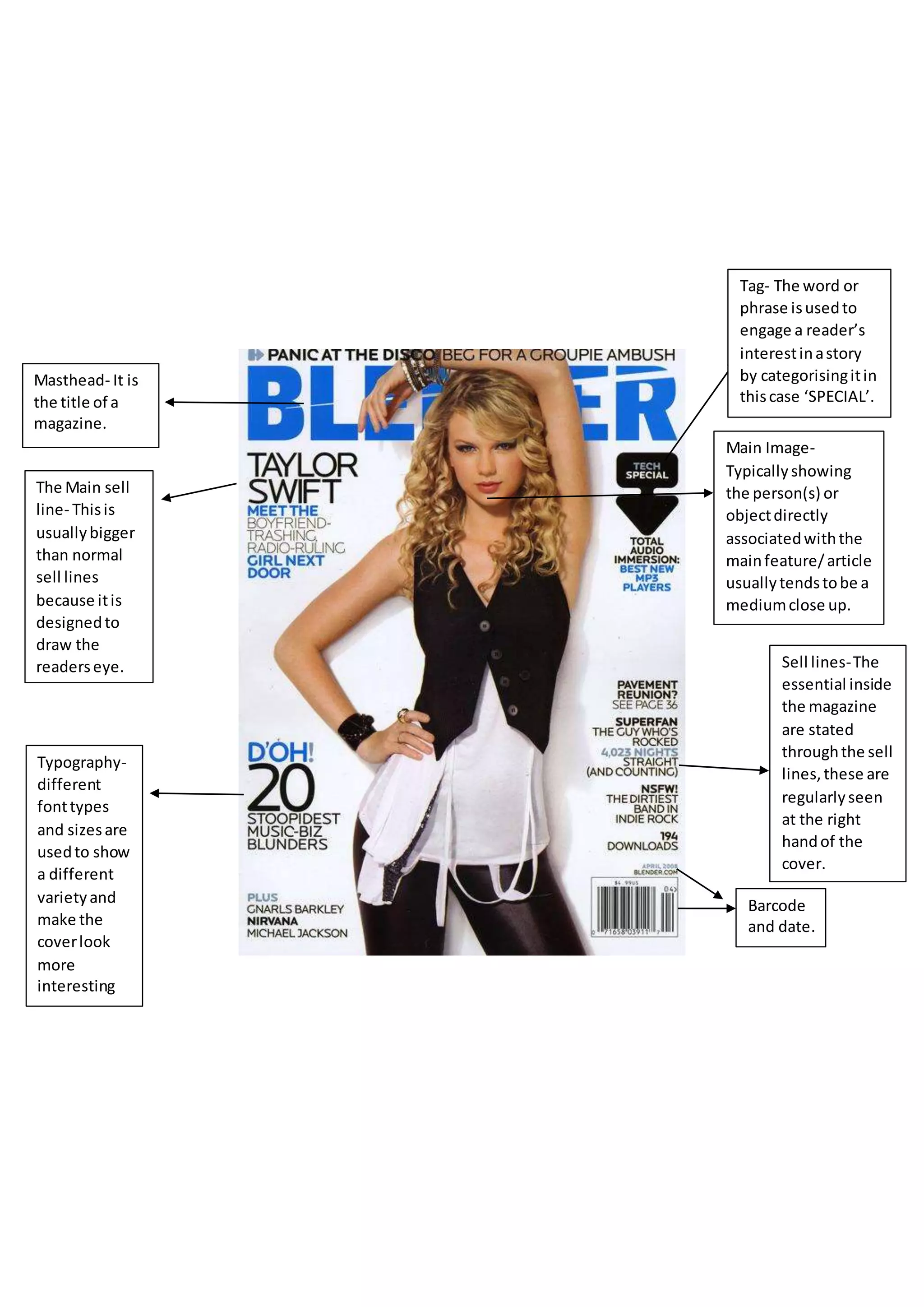
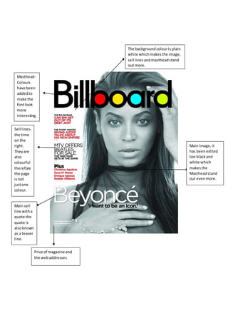
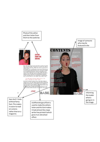
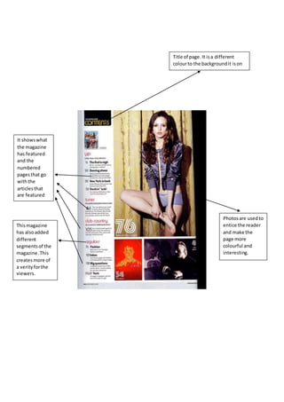
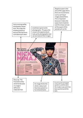
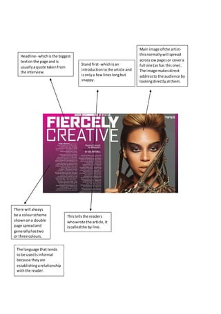
Main Image-
Typicallyshowing
the person(s) or
objectdirectly
associatedwiththe
mainfeature/article
usuallytendstobe a
mediumclose up.
Masthead- It is
the title of a
magazine.
Barcode
and date.
Sell lines-The
essential inside
the magazine
are stated
throughthe sell
lines,these are
regularlyseen
at the right
handof the
cover.
The Main sell
line- Thisis
usuallybigger
than normal
sell lines
because itis
designedto
draw the
readerseye.
Tag- The word or
phrase isusedto
engage a reader’s
interestinastory
by categorisingitin
thiscase ‘SPECIAL’.
Typography-
different
fonttypes
and sizesare
usedto show
a different
varietyand
make the
coverlook
more
interesting
Masthead-
Colours
have been
addedto
make the
fontlook
more
interesting.
Sell lines-
the time
on the
right.
Theyare
also
colourful
therefore
the page
isnot
justone
colour.
Main sell
line witha
quote the
quote is
alsoknown
as a teaser
line.
Price of magazine and
the webaddresses
Main Image,it
has beenedited
too blackand
white which
makesthe
Mastheadstand
out evenmore.
The backgroundcolouris plain
white whichmakesthe image,
sell linesandmastheadstand
out more.
Sans Serif- Fonts
withoutfancy
feet.Thismakes
it easiertoread
on screens
rather thanon a
magazine.
Informing
the reader
whatis
goingon in
the image.
Image of someone
whomay be
featuredinthe
magazine.
Photoof the editor
and theirletterfrom
themto the audience.
A differenttype of fontis
usedto make the editors
letterandthisfont makes
it lookalmostlike atype
writerhasprinteditwhich
givesitan oldschool
effect.
Title of page.It isa different
colourto the backgroundit ison
and makesitstand out.
It showswhat
the magazine
has featured
and the
numbered
pagesthat go
withthe
articlesthat
are featured
Thismagazine
has alsoadded
different
segmentsof the
magazine.This
createsmore of
a verityforthe
viewers.
Photosare usedto
entice the reader
and make the
page more
colourful and
interesting.
Fancy writingswiftly
followedbya block
font.Thismake the
headingstandout
because the twofonts
contradicteach other.
Drop cap- The
firstletterof the
article tendstobe
ina larger/
different/
elaborate font.
A pull quote (enlarged
quote) isusedtocatch
the readerseye andit has
beenpulledoutof the
text.
An image of whothe
article isaboutand
theyhave posedina
funrelaxedmanor.
Creditbeengiventothe
photographer.Thisgivesthe
viewersthe opportunityto
lookup the photographerand
can see more of theirimages.
Negative space isthe
area of the page where
there are no elements
such as writingor
imagesplacedthere.
Thisis important
because itmakesthe
space more simplistic
and the viewercansee
all the aspect of the
spreadsuch as the
background.
Headline- whichisthe biggest
texton the page and is
usuallyaquote takenfrom
the interview.
Standfirst- whichisan
introductiontothe article and
isonlya few lineslongbut
snappy.
Main image of the artist-
thisnormallywill spread
across ow pagesor covera
full one (ashas thisone).
The image makesdirect
addressto the audience by
lookingdirectlyatthem.
There will always
be a colourscheme
shownona double
page spreadand
generallyhastwo
or three colours.
The language that tends
to be usedisinformal
because theyare
establishingarelationship
withthe reader.
Thistellsthe readers
whowrote the article,it
iscalledthe by line.
My findings and research have influenced me on how to present my magazine extract. I have
learned key features and how to make my work look professional which is crucial for the
final product of my course work. I have learnt that different colour schemes make the
background seem more full and enticing t the reader. I have been influenced to do different
types of fonts and sizes of text which will make the text look more interesting and stand out
to the readers. Also photos are key as they are used to draw the viewers eyes to the magazine
and suggest who the main article is about.

Technical deconstruction docx

  • 1.
    Main Image- Typicallyshowing the person(s)or objectdirectly associatedwiththe mainfeature/article usuallytendstobe a mediumclose up. Masthead- It is the title of a magazine. Barcode and date. Sell lines-The essential inside the magazine are stated throughthe sell lines,these are regularlyseen at the right handof the cover. The Main sell line- Thisis usuallybigger than normal sell lines because itis designedto draw the readerseye. Tag- The word or phrase isusedto engage a reader’s interestinastory by categorisingitin thiscase ‘SPECIAL’. Typography- different fonttypes and sizesare usedto show a different varietyand make the coverlook more interesting
  • 2.
    Masthead- Colours have been addedto make the fontlook more interesting. Selllines- the time on the right. Theyare also colourful therefore the page isnot justone colour. Main sell line witha quote the quote is alsoknown as a teaser line. Price of magazine and the webaddresses Main Image,it has beenedited too blackand white which makesthe Mastheadstand out evenmore. The backgroundcolouris plain white whichmakesthe image, sell linesandmastheadstand out more.
  • 3.
    Sans Serif- Fonts withoutfancy feet.Thismakes iteasiertoread on screens rather thanon a magazine. Informing the reader whatis goingon in the image. Image of someone whomay be featuredinthe magazine. Photoof the editor and theirletterfrom themto the audience. A differenttype of fontis usedto make the editors letterandthisfont makes it lookalmostlike atype writerhasprinteditwhich givesitan oldschool effect.
  • 4.
    Title of page.Itisa different colourto the backgroundit ison and makesitstand out. It showswhat the magazine has featured and the numbered pagesthat go withthe articlesthat are featured Thismagazine has alsoadded different segmentsof the magazine.This createsmore of a verityforthe viewers. Photosare usedto entice the reader and make the page more colourful and interesting.
  • 5.
    Fancy writingswiftly followedbya block font.Thismakethe headingstandout because the twofonts contradicteach other. Drop cap- The firstletterof the article tendstobe ina larger/ different/ elaborate font. A pull quote (enlarged quote) isusedtocatch the readerseye andit has beenpulledoutof the text. An image of whothe article isaboutand theyhave posedina funrelaxedmanor. Creditbeengiventothe photographer.Thisgivesthe viewersthe opportunityto lookup the photographerand can see more of theirimages. Negative space isthe area of the page where there are no elements such as writingor imagesplacedthere. Thisis important because itmakesthe space more simplistic and the viewercansee all the aspect of the spreadsuch as the background.
  • 6.
    Headline- whichisthe biggest textonthe page and is usuallyaquote takenfrom the interview. Standfirst- whichisan introductiontothe article and isonlya few lineslongbut snappy. Main image of the artist- thisnormallywill spread across ow pagesor covera full one (ashas thisone). The image makesdirect addressto the audience by lookingdirectlyatthem. There will always be a colourscheme shownona double page spreadand generallyhastwo or three colours. The language that tends to be usedisinformal because theyare establishingarelationship withthe reader. Thistellsthe readers whowrote the article,it iscalledthe by line.
  • 7.
    My findings andresearch have influenced me on how to present my magazine extract. I have learned key features and how to make my work look professional which is crucial for the final product of my course work. I have learnt that different colour schemes make the background seem more full and enticing t the reader. I have been influenced to do different types of fonts and sizes of text which will make the text look more interesting and stand out to the readers. Also photos are key as they are used to draw the viewers eyes to the magazine and suggest who the main article is about.