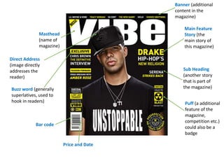
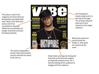
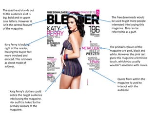
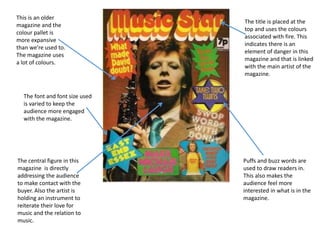
Music magazine
Apisan
Masthead
(name of
magazine)
Banner (additional
content in the
magazine)
Price and Date
Bar code
Main Feature
Story (the
main story of
this magazine)
Sub Heading
(another story
that is part of
the magazine)
Direct Address
(image directly
addresses the
reader)
Puff (a additional
feature of the
magazine,
competition etc.)
could also be a
badge
Buzz word (generally
superlatives, used to
hook in readers)
The colours used in the
magazine are those that can
be typically associated with
men. Black is the dominant
colour and it has
connotations of power.
Yellow has connotations of
danger and white contrasts
the black perfectly.
The masthead is
clearly visible and is in
the top of the page.
The writing is big and
bold and is very
relevant to the target
audience.
The word unstoppable is
almost referring to Drake’s
success and how he meant
to be seen as.
Many buzz words are
used to hook the
reader in. Also puffs
are used to do the
same.
Drake looks very big and strong and
that links to the fact that rappers
are typically viewed as this. He is
directly looking at the audience to
engage with the audience.
The masthead stands out
to the audience as it is
big, bold and in upper
case letters. However it
isn’t the central feature
of the magazine.
Katy Perry’s clothes could
entice the target audience
into buying the magazine.
Her outfit is linked to the
primary colours of the
magazine.
Quote from within the
magazine is used to
interact with the
audience
Katy Perry is looking
right at the reader,
making the buyer feel
more involved and
enticed. This is known
as direct mode of
address.
The free downloads would
be used to get more people
interested into buying this
magazine. This can be
referred to as a puff.
The primary colours of the
magazine are pink, black and
white. However the pink text
gives this magazine a feminine
touch, which you usually
wouldn’t associate with males.
The central figure in this
magazine is directly
addressing the audience
to make contact with the
buyer. Also the artist is
holding an instrument to
reiterate their love for
music and the relation to
music.
The font and font size used
is varied to keep the
audience more engaged
with the magazine.
Puffs and buzz words are
used to draw readers in.
This also makes the
audience feel more
interested in what is in the
magazine.
This is an older
magazine and the
colour pallet is
more expansive
than we’re used to.
The magazine uses
a lot of colours.
The title is placed at the
top and uses the colours
associated with fire. This
indicates there is an
element of danger in this
magazine and that is linked
with the main artist of the
magazine.

Music magazine

  • 1.
  • 2.
    Masthead (name of magazine) Banner (additional contentin the magazine) Price and Date Bar code Main Feature Story (the main story of this magazine) Sub Heading (another story that is part of the magazine) Direct Address (image directly addresses the reader) Puff (a additional feature of the magazine, competition etc.) could also be a badge Buzz word (generally superlatives, used to hook in readers)
  • 3.
    The colours usedin the magazine are those that can be typically associated with men. Black is the dominant colour and it has connotations of power. Yellow has connotations of danger and white contrasts the black perfectly. The masthead is clearly visible and is in the top of the page. The writing is big and bold and is very relevant to the target audience. The word unstoppable is almost referring to Drake’s success and how he meant to be seen as. Many buzz words are used to hook the reader in. Also puffs are used to do the same. Drake looks very big and strong and that links to the fact that rappers are typically viewed as this. He is directly looking at the audience to engage with the audience.
  • 4.
    The masthead standsout to the audience as it is big, bold and in upper case letters. However it isn’t the central feature of the magazine. Katy Perry’s clothes could entice the target audience into buying the magazine. Her outfit is linked to the primary colours of the magazine. Quote from within the magazine is used to interact with the audience Katy Perry is looking right at the reader, making the buyer feel more involved and enticed. This is known as direct mode of address. The free downloads would be used to get more people interested into buying this magazine. This can be referred to as a puff. The primary colours of the magazine are pink, black and white. However the pink text gives this magazine a feminine touch, which you usually wouldn’t associate with males.
  • 5.
    The central figurein this magazine is directly addressing the audience to make contact with the buyer. Also the artist is holding an instrument to reiterate their love for music and the relation to music. The font and font size used is varied to keep the audience more engaged with the magazine. Puffs and buzz words are used to draw readers in. This also makes the audience feel more interested in what is in the magazine. This is an older magazine and the colour pallet is more expansive than we’re used to. The magazine uses a lot of colours. The title is placed at the top and uses the colours associated with fire. This indicates there is an element of danger in this magazine and that is linked with the main artist of the magazine.