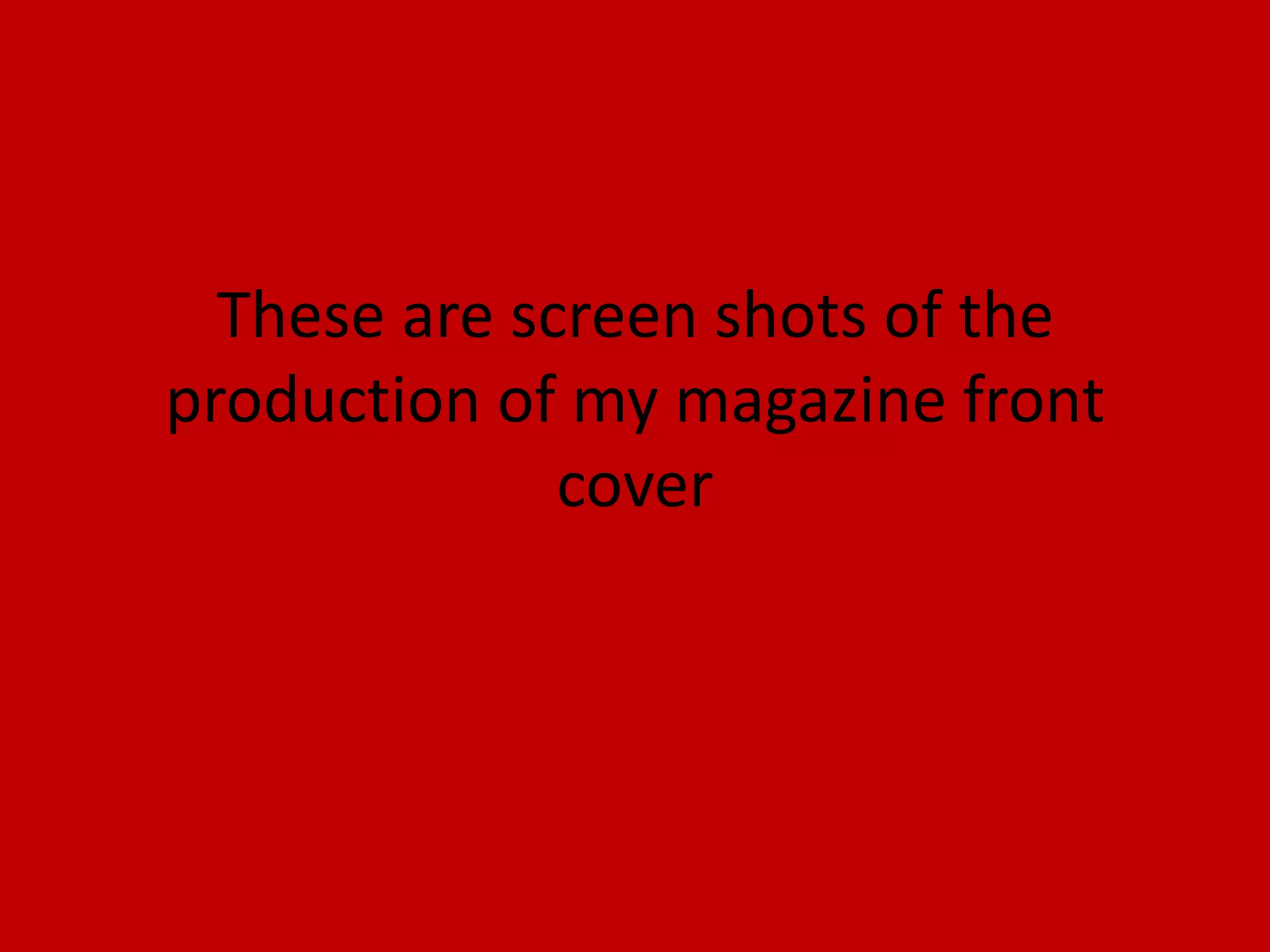
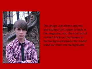
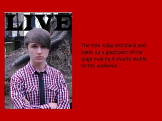
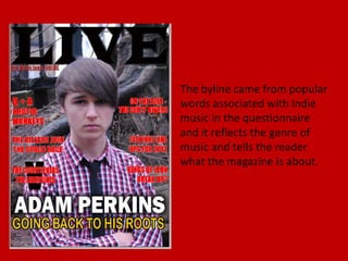
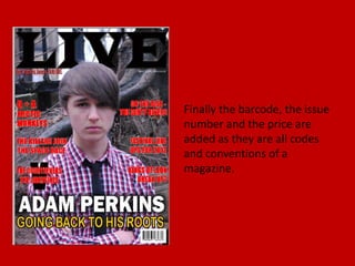
This document summarizes and analyzes the design elements of a magazine cover. It describes how the red and black color contrast makes the model stand out from the background. It also notes that the large, black title takes up a good part of the page to be clearly visible, while the filled top and bottom areas emphasize the model in the center. The stroke on the coverlines makes the only red text stand out and further attract attention. The coverlines and byline also aim to appeal to fans of indie music based on the results of a questionnaire.