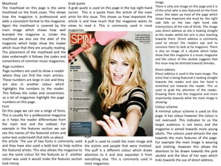
The document analyzes the design elements of a magazine cover and interior pages. It finds that the cover follows most conventions such as large bold cover lines and masthead, but breaks some rules by not centering the main image. Interior pages also adhere to conventions through masthead placement, use of columns and fonts, and direct address in images. Analysis of images, fonts, and colors used suggests the magazine targets mature indie pop music fans aged 16-27.


