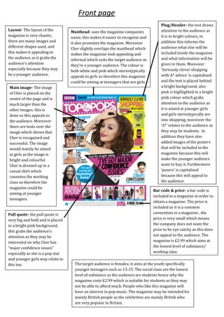
Icon- ‘cover story’ shows
that this story was
featured in the magazine.
Title- a quote from pop star Cher Lloyd has
been used, the quote is not very positive
which can attract the readers of the
magazine and her fans.
Drop capital- the
drop capital is
very big and bold;
also the
background is
pink which allows
the readers to
know where to
start from.
Page number and website-
the page number is placed
on the bottom left which
helps the reader to look for
their wanted articles. The
website is on the bottom left
which promotes the
magazine.
Pull quote- the quotes have been
highlighted in a bright yellow colour
instead of separating the quotes and
placing it in some parts of the article,
this still enables to attract the reader’s
attention.
Images- the gesture Cher
Lloyd does is as if she is
shocked because she
found out about a gossip
which links with the
content of the article page.
The image covers up one
whole page; this allows
the artist to be recognized.
Double spread page
Mode of address- The
language used is very
'cheesy' and colloquial, for
example ‘we <3 boys’ suggest
that the magazine is aimed at
a younger audience as the
language is very simple and
informal so that younger
readers can understand it.
Images- there has been many
images used in the content page,
this is so that it can appeal to the
audience, they're mainly of
fashion and pop stars which
suggest that it is for the younger
audience who are girls. There is
also an image of the magazine
with arrows pointing at each
section indicating which pages
you can find that information
which makes it easier for the
younger audience to follow.
House style- The main colours that has been used
are bright colours such as pink and yellow as this
will appeal to the younger audience creating a
positive atmosphere for them to read. The main
colour is pink which appeals to females as top of the
pops is aimed at young girls, so pink is suitable for
this audience. In addition the white background
compliments the pink and the yellow connotes
summer which creates a positive atmosphere while
reading the magazine.
Masthead- The masthead is inside the mag' which breaks the conventions
of a typical content of a magazine as the title is usually 'contents', this
makes it easier for the younger audience to understand as it is In simple,
informal English. In addition the masthead is in a handwritten font which
makes it look youthful and not harsh looking.
Some sections of the magazine
have been separated into a
different box. This makes the
page look organized and makes it
easier to read different sections.
Content page
Layout- The layout of the
magazine is very chaotic,
there are many images and
different shapes used, and
this makes it appealing to
the audience as it grabs the
audience’s attention
especially because they may
be a younger audience.
Masthead- uses the magazine companies
name, this makes it easier to recognise and
it also promotes the magazine. Moreover
Cher slightly overlaps the masthead which
makes the magazine look appealing and
informal which suits the target audience as
they’re a younger audience. The colour is
both white and pink which stereotypically
appeals to girls so therefore this magazine
could be aiming at teenagers that are girls.
Main image- The image
of Cher is placed on the
centre of the page and is
much larger than the
other images; this is
done so this appeals to
the audience. Moreover
there are texts over the
image which shows that
Cher is recognised and
successful. The image
would mainly be aimed
at girls as the image is
bright and colourful.
Cher is dressed up in a
casual shirt which
connotes the working
class so therefore the
magazine could be
aiming at younger
teenagers.
Pull quote- the pull quote is
very big and bold and is placed
in a bright pink background,
this grabs the audience’s
attention as they may be
interested on why Cher has
“major confidence issues”
especially as she is a pop star
and younger girls may relate to
this too.
Plug/Header- the text draws
attention to the audience as
it is in bright colours, in
addition this informs the
audience what else will be
included inside the magazine
and what information will be
given to them. Moreover
‘Seriously clever shopping
with A* advice’ is capitalised
and the text is placed behind
a bright background, also
pink is highlighted in a bright
pink colour which grabs
attention to the audience as
it is aimed at younger girls
and girls stereotypically are
into shopping, moreover the
‘A*’ relates to the audience as
they may be students. In
addition they have also
added images of the posters
that will be included in the
magazine because this will
make the younger audience
want to buy it. Furthermore
‘posers’ is capitalised
because this will appeal to
the audience.
Bar code & price- a bar code is
included in a magazine in order to
obtain a magazine. The price is
included as it is a common
convention in a magazine , the
price is very small which means
the company does not want the
price to be eye catchy as this does
not appeal to the audience. The
magazine is £2.99 which aims at
the lowest level of substance/
working class.
The target audience is females; it aims at the youth specifically
younger teenagers such as 13-15. The social class are the lowest
level of substance as the audience are students hence why the
magazine costs £2.99 which is suitable for students as they may
not be able to afford much. People who like this magazine will
have an interest in pop music. The magazine may be intended for
mainly British people as the celebrities are mainly British who
are very popular in Britain.
Front page

Pop magazine anaysis

  • 1.
    Icon- ‘cover story’shows that this story was featured in the magazine. Title- a quote from pop star Cher Lloyd has been used, the quote is not very positive which can attract the readers of the magazine and her fans. Drop capital- the drop capital is very big and bold; also the background is pink which allows the readers to know where to start from. Page number and website- the page number is placed on the bottom left which helps the reader to look for their wanted articles. The website is on the bottom left which promotes the magazine. Pull quote- the quotes have been highlighted in a bright yellow colour instead of separating the quotes and placing it in some parts of the article, this still enables to attract the reader’s attention. Images- the gesture Cher Lloyd does is as if she is shocked because she found out about a gossip which links with the content of the article page. The image covers up one whole page; this allows the artist to be recognized. Double spread page
  • 2.
    Mode of address-The language used is very 'cheesy' and colloquial, for example ‘we <3 boys’ suggest that the magazine is aimed at a younger audience as the language is very simple and informal so that younger readers can understand it. Images- there has been many images used in the content page, this is so that it can appeal to the audience, they're mainly of fashion and pop stars which suggest that it is for the younger audience who are girls. There is also an image of the magazine with arrows pointing at each section indicating which pages you can find that information which makes it easier for the younger audience to follow. House style- The main colours that has been used are bright colours such as pink and yellow as this will appeal to the younger audience creating a positive atmosphere for them to read. The main colour is pink which appeals to females as top of the pops is aimed at young girls, so pink is suitable for this audience. In addition the white background compliments the pink and the yellow connotes summer which creates a positive atmosphere while reading the magazine. Masthead- The masthead is inside the mag' which breaks the conventions of a typical content of a magazine as the title is usually 'contents', this makes it easier for the younger audience to understand as it is In simple, informal English. In addition the masthead is in a handwritten font which makes it look youthful and not harsh looking. Some sections of the magazine have been separated into a different box. This makes the page look organized and makes it easier to read different sections. Content page
  • 3.
    Layout- The layoutof the magazine is very chaotic, there are many images and different shapes used, and this makes it appealing to the audience as it grabs the audience’s attention especially because they may be a younger audience. Masthead- uses the magazine companies name, this makes it easier to recognise and it also promotes the magazine. Moreover Cher slightly overlaps the masthead which makes the magazine look appealing and informal which suits the target audience as they’re a younger audience. The colour is both white and pink which stereotypically appeals to girls so therefore this magazine could be aiming at teenagers that are girls. Main image- The image of Cher is placed on the centre of the page and is much larger than the other images; this is done so this appeals to the audience. Moreover there are texts over the image which shows that Cher is recognised and successful. The image would mainly be aimed at girls as the image is bright and colourful. Cher is dressed up in a casual shirt which connotes the working class so therefore the magazine could be aiming at younger teenagers. Pull quote- the pull quote is very big and bold and is placed in a bright pink background, this grabs the audience’s attention as they may be interested on why Cher has “major confidence issues” especially as she is a pop star and younger girls may relate to this too. Plug/Header- the text draws attention to the audience as it is in bright colours, in addition this informs the audience what else will be included inside the magazine and what information will be given to them. Moreover ‘Seriously clever shopping with A* advice’ is capitalised and the text is placed behind a bright background, also pink is highlighted in a bright pink colour which grabs attention to the audience as it is aimed at younger girls and girls stereotypically are into shopping, moreover the ‘A*’ relates to the audience as they may be students. In addition they have also added images of the posters that will be included in the magazine because this will make the younger audience want to buy it. Furthermore ‘posers’ is capitalised because this will appeal to the audience. Bar code & price- a bar code is included in a magazine in order to obtain a magazine. The price is included as it is a common convention in a magazine , the price is very small which means the company does not want the price to be eye catchy as this does not appeal to the audience. The magazine is £2.99 which aims at the lowest level of substance/ working class. The target audience is females; it aims at the youth specifically younger teenagers such as 13-15. The social class are the lowest level of substance as the audience are students hence why the magazine costs £2.99 which is suitable for students as they may not be able to afford much. People who like this magazine will have an interest in pop music. The magazine may be intended for mainly British people as the celebrities are mainly British who are very popular in Britain. Front page