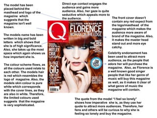
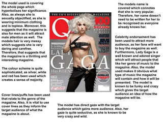
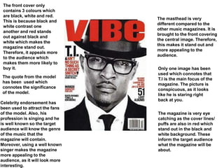
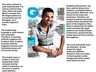
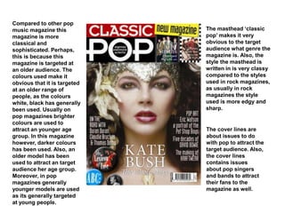
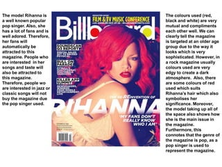
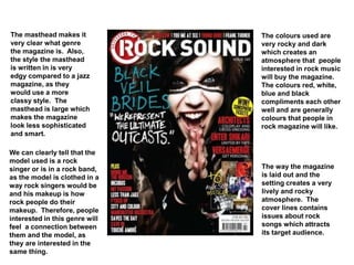
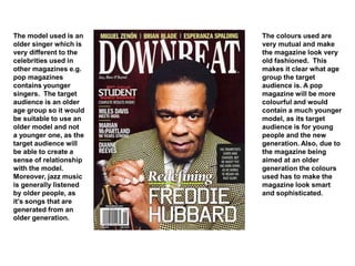
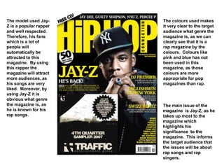
Direct eye contact engages the
audience and gains more
audience. Also, her gaze is quite
seductive which appeals more to
the audience.
The model has been
placed behind the
masthead and logo of the
magazine which
suggests that the
magazine isn't well
known.
The models name has been
written in big and bold
letters which shows that
she is of high significance.
Also, she takes up the most
space which again shows us
how important she is.
The front cover doesn’t
contain any red expect from
the logo/masthead of the
magazine which makes the
audience more aware of
brand of the magazine. Also,
it makes the master head
stand out and more eye
catchy.
Celebrity endorsement has
been used to attract more
audience, as the people that
adore her will purchase the
magazine. Also, as Florence is
a well known good singer
people that like her genre of
music will buy this magazine
as well, as it makes it clear of
what genre of music the
magazine will contain.
The colour scheme flows, as
all the colours used relate to
each other. The models hair
is red which resembles the
logo of magazine. Also, the
models skin colour is pure
white which corresponds
with the cover lines, as they
are also in white. Therefore,
the limited colours used
suggests that the magazine
is very sophisticated.
The quote from the model “I feel so lonely”
shows how imperative she is, as they use her
quote to attract more audiences. Therefore, her
fans and others will be curious to why she is
feeling so lonely and buy the magazine.
The model used is covering
the whole page which
hyperbolises her significance.
Also, as always she is
sexually objectified, as she is
wearing minimum clothing
and is topless. Moreover, this
suggests that the magazine is
also for men as it will attract
male attention as well. The
models hair is very messy
which suggests she is very
daring and carefree.
Therefore, that suggests that
the magazine is a thrilling and
interesting magazine.
The models name is
covered which connotes
that she is very popular.
Therefore, her name doesn’t
need to be written for her to
be recognised as everyone
already knows her.
Celebrity endorsement has
been used to attract more
audience, as her fans will want
to buy the magazine as well.
Furthermore, Lady Gaga is a
well known and adored singer
which will attract people that
like her genre of music to the
magazine. Also, the model
used makes it obvious what
type of music the magazine
will contain and how it will be
presented. The model is
known to be funky and crazy
which gives the target
audience an idea of how the
magazine will be.
The colour scheme is quite
sophisticated, as silver, white
and red has been used which
creates a sense of majority.
Cover lines/puffs has been used
that relate to the genre of the
magazine. Also, it is vital to use
cover lines as they inform the
target audience of what the
magazine is about.
The model has direct gaze with the target
audience which gains more audience. Also, her
gaze is quite seductive, as she is known to be
very crazy and wild.
The masthead is very
different compared to the
other music magazines. It is
brought to the front covering
the central image. Therefore,
this makes it stand out and
more appealing to the
audience.
Only one image has been
used which connotes that
T.I is the main focus of the
magazine. The picture is
conspicuous, as it looks
like he is staring right
back at you.
The magazine is very eye
catching as the cover lines/
puffs are also in red which
stand out in the black and
white background. These
inform the target audience
what the magazine will be
about.
The front cover only
contains 3 colours which
are black, white and red.
This is because black and
white contrast one
another and red stands
out against black and
white which makes the
magazine stand out.
Therefore, it appeals more
to the audience which
makes them more likely to
buy it.
The quote from the model
has been used which
connotes the significance
of the model.
Celebrity endorsement has
been used to attract the fans
of the model. Also, his
profession is singing and he
is well known so the target
audience will know the genre
of the music that the
magazine will contain.
Moreover, using a well known
singer makes the magazine
more appealing to the
audience, as it will look more
interesting.
Celebrity endorsement has
been used to attract more
audience, as Drake(model) is
very prevalent. Moreover, he is
known for his looks and
profession. Therefore, his
songs are adored and breaks
records which ensembles the
genre of the magazine. Also,
Drake is idolised by the ladies
which connotes the target
audience are mostly females.
Furthermore, people that like
Drakes genre of music will buy
the magazine.
The colour scheme is
quite sophisticated. The
colours used are blue,
silver, black and white.
Which connotes that
the target audience is
young adults and not
teenagers, as it
wouldn't appeal to
them.
The models body
language is quite relaxed
and composed.
Therefore, it connotes
what the magazine will
be about. Also, it makes
it obvious that the
magazine contains more
interesting issues and
not serious issues.
The models name is
written in bold and
capital letter which
connotes that the
model is imperative, as
his name is used to
catch attention.
The cover lines/puffs used
are essential , as they
attract the target
audiences attention.
Moreover, they are written
in black against a white
background which makes
them stand out more.
Celebrity endorsement has
been used to attract more
audience. Cherly Cole is
sexually objectified to gain
the attention of more males.
Also, she is wearing red
lipstick which connotes
danger, lust, love and
passion. Therefore, it gives
the target audience an idea of
what kind of issues the
magazine will contain.
Moreover, she is wearing dark
eye liner and has wet, messy
hair which shows us how
carefree and wild she is.
Furthermore, the models gaze
is quite seductive, as if she is
trying to seduce the audience.
The sells line is
significant, as it is the
main selling point of the
magazine. This is because
the audience see the sells
line first before anything
else . Therefore, the sells
line has to be very
interesting.
The colour scheme is
limited. The only colours
used are red, white and
silver which creates a
sense of danger and
excitement. Moreover,
only the vital issues are in
red, for example, the logo
and certain cover lines.
Therefore, this makes the
magazine more appealing
to the audience, as only
the interesting things are
in red.
Pop magazines
It is obvious that this is a pop
magazine due to the colours
and model used. Katy Perry
is a well known and an
adored singer. She is known
for singing pop music.
Therefore, that gives the
target audience an idea of
what genre the magazine is.
Also, her name is in big and
bold letters which highlights
her significance to the target
audience. Moreover, the
colours used are quite light
and feminine where as a rock
magazine would contain
more dark colours. Also, the
way the model is clothed is
quite elegant and beautiful
whereas a rap magazine’s
model will dress more edgy.
Billboard is generally known to present pop music.
Therefore, it informs the target audience what genre the
magazine is. Moreover, as it’s a well known brand
people will know what genre music it will be about.
The cover lines are used
to give the target
audience an idea of
what the magazine will
contain inside.
Therefore, the cover
lines contain
information about the
genre of the magazine
which is pop, as
mentioned in the
magazine.
The model used (Katy
Perry) is described
as ‘the new queen of
pop’ which
hyperbolises the fact
that it is a pop
magazine. Also, the
cover lines are about
other pop singers
e.g. Taylor Swift.
The masthead of the
magazine ‘Top of the
pops’ explains to the
target audience what
genre the magazine is.
Moreover, the colours
used are quite girly ad
feminine which makes it
obvious that it is a pop
magazine, as other
genres would not contain
these colours. For
example, a jazz magazine
would contain more
mutual colours due to
jazz songs being quite
calm and relaxing,
whereas pop songs bring
the wild side out of you
and are quite life full.
Also, the colours pink,
purple and white
represent the model used
Britney Spears, as she
generally wears clothing
in that colour.
Britney Spears is a well
known pop singer.
Therefore, her representing
this magazine shows the
target audience that it is
indeed a pop magazine due
to the singer used. Also, the
sell line is about pop badges
and posters which makes it
obvious to the target
audience the genre of the
magazine. Also, the writings
that are in white are suppose
to stand out and catch the
attention of the audience.
Therefore, the singers name
is in white which shows how
significant she is . Moreover,
she is taking up all the space
which shows the target
audience that she is the
most important issue in the
magazine and the fact that
she is a pop singer shows
the target audience the
genre of the magazine.
The cover lines used contains issues about pop
singers and songs . However, in a rock magazine the
cover lines would contain issues about rock singers
and rock songs.
The band used (one
direction) is a very famous
and adored band by many
people especially females.
They are popular for singing
pop songs. Therefore, as
soon as we look at this
magazine we can tell the
genre of the magazine due to
the band used. Also, the
colours used represent the
band as their band logo is in
red, blue and white which
again highlights the genre of
the magazine. A rock or a
rap magazine however
would contain darker
colours, as you would never
see the colour red or clue in
a rock or rap magazine
because it would not suit the
genre
The masthead of the
magazine (we love pop)
makes it very obvious to
the magazine of what
genre the magazine is, as
the word pop is used in the
masthead.
The cover lines
contains issues about
pop singers and bands
and does not contain
issues about other
genre’s such as rock as
it is a pop magazine.
The magazine
contains issues
about other pop
singers and bands
which is very
effective, as it
attracts more
audience by this
way.
Compared to other pop
music magazine this
magazine is more
classical and
sophisticated. Perhaps,
this is because this
magazine is targeted at
an older audience. The
colours used make it
obvious that it is targeted
at an older range of
people, as the colours
white, black has generally
been used. Usually on
pop magazines brighter
colours are used to
attract an younger age
group. In this magazine
however, darker colours
has been used. Also, an
older model has been
used to attract an target
audience her age group.
Moreover, in pop
magazines generally
younger models are used
as its generally targeted
at young people.
The masthead ‘classic
pop’ makes it very
obvious to the target
audience what genre the
magazine is. Also, the
style the masthead is
written in is very classy
compared to the styles
used in rock magazines,
as usually in rock
magazines the style
used is more edgy and
sharp.
The cover lines are
about issues to do
with pop to attract the
target audience. Also,
the cover lines
contains issues
about pop singers
and bands to attract
their fans to the
magazine as well.
The model Rihanna is
a well known popular
pop singer. Also, she
has a lot of fans and is
well adored. Therefore,
her fans will
automatically be
attracted to this
magazine. People who
are interested in her
songs and taste will
also be attracted to
this magazine.
Therefore, people wo
are interested in jazz or
classic songs will not
buy the magazine due
the pop singer used.
The colours used (red,
black and white) are very
mutual and compliments
each other well. We can
clearly tell the magazine
is targeted at an older age
group due to the way it
looks which is very
sophisticated. However, in
a rock magazine usually
colours used are very
edgy to create a dark
atmosphere. Also, there
are some colours of red
used which suits
Rihanna’s hair which also
symbolises her
significance. Moreover,
the model taking up all of
the space also shows how
she is the main issue in
the magazine.
Furthermore, this
connotes that the genre of
the magazine is pop, as a
pop singer is used to
represent the magazine.
The masthead makes it
very clear what genre
the magazine is. Also,
the style the masthead
is written in is very
edgy compared to a jazz
magazine, as they
would use a more
classy style. The
masthead is large which
makes the magazine
look less sophisticated
and smart.
The colours used are
very rocky and dark
which creates an
atmosphere that people
interested in rock music
will buy the magazine.
The colours red, white,
blue and black
compliments each other
well and are generally
colours that people in
rock magazine will like.
We can clearly tell that the
model used is a rock
singer or is in a rock band,
as the model is clothed in a
way rock singers would be
and his makeup is how
rock people do their
makeup. Therefore, people
interested in this genre will
feel a connection between
them and the model, as
they are interested in the
same thing.
The way the magazine
is laid out and the
setting creates a very
lively and rocky
atmosphere. The
cover lines contains
issues about rock
songs which attracts
its target audience.
The model used is an
older singer which is
very different to the
celebrities used in
other magazines e.g.
pop magazines
contains younger
singers. The target
audience is an older
age group so it would
be suitable to use an
older model and not
a younger one, as the
target audience will
be able to create a
sense of relationship
with the model.
Moreover, jazz music
is generally listened
by older people, as
it’s songs that are
generated from an
older generation.
The colours used are
very mutual and make
the magazine look very
old fashioned. This
makes it clear what age
group the target
audience is. A pop
magazine will be more
colourful and would
contain a much younger
model, as its target
audience is for young
people and the new
generation. Also, due to
the magazine being
aimed at an older
generation the colours
used has to make the
magazine look smart
and sophisticated.
The model used Jay-
Z is a popular rapper
and well respected.
Therefore, his fans
which is a lot of
people will
automatically be
attracted to this
magazine. By using
this rapper the
magazine will attract
more audiences, as
his songs are very
liked. Moreover, by
using Jay-Z it is
obvious what genre
the magazine is, as
he is known for his
rap songs.
The colours used makes
it very clear to the target
audience what genre the
magazine is, as we can
clearly see that it is a
rap magazine by the
colours. Colours like
pink and blue has not
been used in this
magazine, as those
colours are more
appropriate for pop
magazines than rap.
The main issue of the
magazine is Jay-Z, as he
takes up most to the
magazine which
highlights his
significance to the
magazine. This informs
the target audience that
the issues will be about
rap songs and rap
singers.

Musicmagazines+new

  • 1.
    Direct eye contactengages the audience and gains more audience. Also, her gaze is quite seductive which appeals more to the audience. The model has been placed behind the masthead and logo of the magazine which suggests that the magazine isn't well known. The models name has been written in big and bold letters which shows that she is of high significance. Also, she takes up the most space which again shows us how important she is. The front cover doesn’t contain any red expect from the logo/masthead of the magazine which makes the audience more aware of brand of the magazine. Also, it makes the master head stand out and more eye catchy. Celebrity endorsement has been used to attract more audience, as the people that adore her will purchase the magazine. Also, as Florence is a well known good singer people that like her genre of music will buy this magazine as well, as it makes it clear of what genre of music the magazine will contain. The colour scheme flows, as all the colours used relate to each other. The models hair is red which resembles the logo of magazine. Also, the models skin colour is pure white which corresponds with the cover lines, as they are also in white. Therefore, the limited colours used suggests that the magazine is very sophisticated. The quote from the model “I feel so lonely” shows how imperative she is, as they use her quote to attract more audiences. Therefore, her fans and others will be curious to why she is feeling so lonely and buy the magazine.
  • 2.
    The model usedis covering the whole page which hyperbolises her significance. Also, as always she is sexually objectified, as she is wearing minimum clothing and is topless. Moreover, this suggests that the magazine is also for men as it will attract male attention as well. The models hair is very messy which suggests she is very daring and carefree. Therefore, that suggests that the magazine is a thrilling and interesting magazine. The models name is covered which connotes that she is very popular. Therefore, her name doesn’t need to be written for her to be recognised as everyone already knows her. Celebrity endorsement has been used to attract more audience, as her fans will want to buy the magazine as well. Furthermore, Lady Gaga is a well known and adored singer which will attract people that like her genre of music to the magazine. Also, the model used makes it obvious what type of music the magazine will contain and how it will be presented. The model is known to be funky and crazy which gives the target audience an idea of how the magazine will be. The colour scheme is quite sophisticated, as silver, white and red has been used which creates a sense of majority. Cover lines/puffs has been used that relate to the genre of the magazine. Also, it is vital to use cover lines as they inform the target audience of what the magazine is about. The model has direct gaze with the target audience which gains more audience. Also, her gaze is quite seductive, as she is known to be very crazy and wild.
  • 3.
    The masthead isvery different compared to the other music magazines. It is brought to the front covering the central image. Therefore, this makes it stand out and more appealing to the audience. Only one image has been used which connotes that T.I is the main focus of the magazine. The picture is conspicuous, as it looks like he is staring right back at you. The magazine is very eye catching as the cover lines/ puffs are also in red which stand out in the black and white background. These inform the target audience what the magazine will be about. The front cover only contains 3 colours which are black, white and red. This is because black and white contrast one another and red stands out against black and white which makes the magazine stand out. Therefore, it appeals more to the audience which makes them more likely to buy it. The quote from the model has been used which connotes the significance of the model. Celebrity endorsement has been used to attract the fans of the model. Also, his profession is singing and he is well known so the target audience will know the genre of the music that the magazine will contain. Moreover, using a well known singer makes the magazine more appealing to the audience, as it will look more interesting.
  • 4.
    Celebrity endorsement has beenused to attract more audience, as Drake(model) is very prevalent. Moreover, he is known for his looks and profession. Therefore, his songs are adored and breaks records which ensembles the genre of the magazine. Also, Drake is idolised by the ladies which connotes the target audience are mostly females. Furthermore, people that like Drakes genre of music will buy the magazine. The colour scheme is quite sophisticated. The colours used are blue, silver, black and white. Which connotes that the target audience is young adults and not teenagers, as it wouldn't appeal to them. The models body language is quite relaxed and composed. Therefore, it connotes what the magazine will be about. Also, it makes it obvious that the magazine contains more interesting issues and not serious issues. The models name is written in bold and capital letter which connotes that the model is imperative, as his name is used to catch attention. The cover lines/puffs used are essential , as they attract the target audiences attention. Moreover, they are written in black against a white background which makes them stand out more.
  • 5.
    Celebrity endorsement has beenused to attract more audience. Cherly Cole is sexually objectified to gain the attention of more males. Also, she is wearing red lipstick which connotes danger, lust, love and passion. Therefore, it gives the target audience an idea of what kind of issues the magazine will contain. Moreover, she is wearing dark eye liner and has wet, messy hair which shows us how carefree and wild she is. Furthermore, the models gaze is quite seductive, as if she is trying to seduce the audience. The sells line is significant, as it is the main selling point of the magazine. This is because the audience see the sells line first before anything else . Therefore, the sells line has to be very interesting. The colour scheme is limited. The only colours used are red, white and silver which creates a sense of danger and excitement. Moreover, only the vital issues are in red, for example, the logo and certain cover lines. Therefore, this makes the magazine more appealing to the audience, as only the interesting things are in red.
  • 6.
  • 7.
    It is obviousthat this is a pop magazine due to the colours and model used. Katy Perry is a well known and an adored singer. She is known for singing pop music. Therefore, that gives the target audience an idea of what genre the magazine is. Also, her name is in big and bold letters which highlights her significance to the target audience. Moreover, the colours used are quite light and feminine where as a rock magazine would contain more dark colours. Also, the way the model is clothed is quite elegant and beautiful whereas a rap magazine’s model will dress more edgy. Billboard is generally known to present pop music. Therefore, it informs the target audience what genre the magazine is. Moreover, as it’s a well known brand people will know what genre music it will be about. The cover lines are used to give the target audience an idea of what the magazine will contain inside. Therefore, the cover lines contain information about the genre of the magazine which is pop, as mentioned in the magazine. The model used (Katy Perry) is described as ‘the new queen of pop’ which hyperbolises the fact that it is a pop magazine. Also, the cover lines are about other pop singers e.g. Taylor Swift.
  • 8.
    The masthead ofthe magazine ‘Top of the pops’ explains to the target audience what genre the magazine is. Moreover, the colours used are quite girly ad feminine which makes it obvious that it is a pop magazine, as other genres would not contain these colours. For example, a jazz magazine would contain more mutual colours due to jazz songs being quite calm and relaxing, whereas pop songs bring the wild side out of you and are quite life full. Also, the colours pink, purple and white represent the model used Britney Spears, as she generally wears clothing in that colour. Britney Spears is a well known pop singer. Therefore, her representing this magazine shows the target audience that it is indeed a pop magazine due to the singer used. Also, the sell line is about pop badges and posters which makes it obvious to the target audience the genre of the magazine. Also, the writings that are in white are suppose to stand out and catch the attention of the audience. Therefore, the singers name is in white which shows how significant she is . Moreover, she is taking up all the space which shows the target audience that she is the most important issue in the magazine and the fact that she is a pop singer shows the target audience the genre of the magazine. The cover lines used contains issues about pop singers and songs . However, in a rock magazine the cover lines would contain issues about rock singers and rock songs.
  • 9.
    The band used(one direction) is a very famous and adored band by many people especially females. They are popular for singing pop songs. Therefore, as soon as we look at this magazine we can tell the genre of the magazine due to the band used. Also, the colours used represent the band as their band logo is in red, blue and white which again highlights the genre of the magazine. A rock or a rap magazine however would contain darker colours, as you would never see the colour red or clue in a rock or rap magazine because it would not suit the genre The masthead of the magazine (we love pop) makes it very obvious to the magazine of what genre the magazine is, as the word pop is used in the masthead. The cover lines contains issues about pop singers and bands and does not contain issues about other genre’s such as rock as it is a pop magazine. The magazine contains issues about other pop singers and bands which is very effective, as it attracts more audience by this way.
  • 10.
    Compared to otherpop music magazine this magazine is more classical and sophisticated. Perhaps, this is because this magazine is targeted at an older audience. The colours used make it obvious that it is targeted at an older range of people, as the colours white, black has generally been used. Usually on pop magazines brighter colours are used to attract an younger age group. In this magazine however, darker colours has been used. Also, an older model has been used to attract an target audience her age group. Moreover, in pop magazines generally younger models are used as its generally targeted at young people. The masthead ‘classic pop’ makes it very obvious to the target audience what genre the magazine is. Also, the style the masthead is written in is very classy compared to the styles used in rock magazines, as usually in rock magazines the style used is more edgy and sharp. The cover lines are about issues to do with pop to attract the target audience. Also, the cover lines contains issues about pop singers and bands to attract their fans to the magazine as well.
  • 11.
    The model Rihannais a well known popular pop singer. Also, she has a lot of fans and is well adored. Therefore, her fans will automatically be attracted to this magazine. People who are interested in her songs and taste will also be attracted to this magazine. Therefore, people wo are interested in jazz or classic songs will not buy the magazine due the pop singer used. The colours used (red, black and white) are very mutual and compliments each other well. We can clearly tell the magazine is targeted at an older age group due to the way it looks which is very sophisticated. However, in a rock magazine usually colours used are very edgy to create a dark atmosphere. Also, there are some colours of red used which suits Rihanna’s hair which also symbolises her significance. Moreover, the model taking up all of the space also shows how she is the main issue in the magazine. Furthermore, this connotes that the genre of the magazine is pop, as a pop singer is used to represent the magazine.
  • 12.
    The masthead makesit very clear what genre the magazine is. Also, the style the masthead is written in is very edgy compared to a jazz magazine, as they would use a more classy style. The masthead is large which makes the magazine look less sophisticated and smart. The colours used are very rocky and dark which creates an atmosphere that people interested in rock music will buy the magazine. The colours red, white, blue and black compliments each other well and are generally colours that people in rock magazine will like. We can clearly tell that the model used is a rock singer or is in a rock band, as the model is clothed in a way rock singers would be and his makeup is how rock people do their makeup. Therefore, people interested in this genre will feel a connection between them and the model, as they are interested in the same thing. The way the magazine is laid out and the setting creates a very lively and rocky atmosphere. The cover lines contains issues about rock songs which attracts its target audience.
  • 13.
    The model usedis an older singer which is very different to the celebrities used in other magazines e.g. pop magazines contains younger singers. The target audience is an older age group so it would be suitable to use an older model and not a younger one, as the target audience will be able to create a sense of relationship with the model. Moreover, jazz music is generally listened by older people, as it’s songs that are generated from an older generation. The colours used are very mutual and make the magazine look very old fashioned. This makes it clear what age group the target audience is. A pop magazine will be more colourful and would contain a much younger model, as its target audience is for young people and the new generation. Also, due to the magazine being aimed at an older generation the colours used has to make the magazine look smart and sophisticated.
  • 14.
    The model usedJay- Z is a popular rapper and well respected. Therefore, his fans which is a lot of people will automatically be attracted to this magazine. By using this rapper the magazine will attract more audiences, as his songs are very liked. Moreover, by using Jay-Z it is obvious what genre the magazine is, as he is known for his rap songs. The colours used makes it very clear to the target audience what genre the magazine is, as we can clearly see that it is a rap magazine by the colours. Colours like pink and blue has not been used in this magazine, as those colours are more appropriate for pop magazines than rap. The main issue of the magazine is Jay-Z, as he takes up most to the magazine which highlights his significance to the magazine. This informs the target audience that the issues will be about rap songs and rap singers.