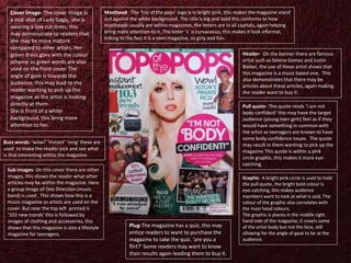
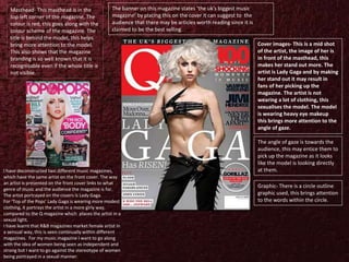
MUSIC MAGAZINE
COVER
DECONSTRUCTION
Masthead- The masthead is big and bold,
this makes the magazine stand out to the
reader. The colour of the masthead is black,
this goes with the colour scheme of the
magazine. The masthead has a gradient
effect , so it fades, this helps bring more
attention to the cover image of the model.
Another reason to why the masthead is at
the back is due to the magazine brand is
largely known so people can guess what
magazine it is by looking at the few letters
which can be seen.
Cover image- A full body shot is used, the
model is wearing no clothing, this
sexualises the model on it. This may be
seen for the male gaze or for more mature
audience members. She is crouching this
is a revealing pose making the image
adding to the sexualisation of teh artist.
The image is in front of the masthead this
brings more attention to the model on the
cover. The model on the cover is Ciara,
fans of this artist may pick up this
magazine as she may be their favourite
artist.
The colour scheme of the magazine is black white
and red, the black could have come from the
models black hair and shoes. There are not too
many colours on the magazine, this makes the
magazine look more professional as the cover is
not clouded with too much colour.
A barcode is on the bottom right of the
magazine, on it is also the price and date of
them issue, is follows the stereo typical
conventions of a magazine.
Pull quote- The pull quote is in
bold, capitals this may entice
reader to want to pick up the
magazine and buy it. It reads ‘I’m
not gonna hold back too much’
This quote may have been used
to slightly contradict the cover
image as the artist is wearing
nothing but shoes.
Header- The header shows the
audience that this magazine is a
music based magazine. ‘R&B goes
soft’ This can show the audience
the genre of music may be r&b
this may attract people who enjoy
this genre of music to pick it up.
Artist names such as John Legend
and Ne-yo are used to show to
the audience that there may be
articles about them within the
magazine. The colour of the font
is black and white, this goes along
with the colour scheme helping
the magazine look clean and
professional.
Cover lines- This shows the audience
the articles that may be within the
magazine. The colours correlate with
the rest of the magazine. The writing
is bold making it more eye-catching
inticing the audience to read it.
Angle of gaze is towards the cover lines, this may lead to
the audience looking at what is written on the
magazine.
Pull quote- This quote reads ‘I am not
body confident’ this may have the target
audience (young teen girls) feel as if they
would have something in common with
the artist as teenagers are known to have
some body confidence issues. The quote
may result in them wanting to pick up the
magazine This quote is within a pink
circle graphic, this makes it more eye-
catching.
Graphic- A bright pink circle is used to hold
the pull quote, the bright bold colour is
eye-catching, this makes audience
members want to look at what is said. The
colour of the graphic also correlates with
the mast head colours.
The graphic is places in the middle right
hand side of the magazine, it covers some
of the artist body but not the face, still
allowing for the angle of gaze to be at the
audience.
Plug-The magazine has a quiz, this may
entice readers to want to purchase the
magazine to take the quiz. ‘are you a
flirt?’ Some readers may want to know
their results again leading them to buy it.
Cover image- The cover image is
a mid-shot of Lady Gaga, she is
wearing a low cut dress, this
may demonstrate to readers that
she may be more mature
compared to other artists. Her
green dress goes with the colour
scheme as green words are also
used on the front cover. The
angle of gaze is towards the
audience, this may lead to the
reader wanting to pick up the
magazine as the artist is looking
directly at them.
She is front of a white
background, this bring more
attention to her.
Masthead- The ‘top of the pops’ logo is in bright pink, this makes the magazine stand
out against the white background. The title is big and bold this conforms to how
mastheads usually are within magazines, the letters are in all capitals, again helping
bring more attention to it. The letter ‘s’ is curvaceous, this makes it look informal,
linking to the fact it is a teen magazine, so girly and fun.
Buzz words- ‘wow!’ ‘instant’ ‘omg’ these are
used to make the reader pick and see what
is that interesting within the magazine
Header- On the banner there are famous
artist such as Selena Gomez and Justin
Bieber, the use of these artist shows that
this magazine is a music based one. This
also demonstrates that there may be
articles about these articles, again making
the reader want to buy it.
Sub images- On this cover there are other
images, this shows the reader what other
articles may be within the magazine. Here
a group image of One Direction (music
band) is used . This shows how this is a
music magazine as artists are used on the
cover. But near the top left printed is
‘103 new trends’ this is followed by
images of clothing and accessories, this
shows that this magazine is also a lifestyle
magazine for teenagers.
Graphic- There is a circle outline
graphic used, this brings attention
to the words within the circle.
Cover images- This is a mid shot
of the artist, the image of her is
in front of the masthead, this
makes her stand out more. The
artist is Lady Gaga and by making
her stand out it may result in
fans of her picking up the
magazine. The artist is not
wearing a lot of clothing, this
sexualises the model. The model
is wearing heavy eye makeup
this brings more attention to the
angle of gaze.
The angle of gaze is towards the
audience, this may entice them to
pick up the magazine as it looks
like the model is looking directly
at them.
Masthead- This masthead is in the
top left corner of the magazine, The
colour is red, this goes along with the
colour scheme of the magazine. The
title is behind the model, this helps
bring more attention to the model.
This also shows that the magazine
branding is so well known that it is
recognisable even if the whole title is
not visible.
The banner on this magazine states ‘the uk’s biggest music
magazine’ by placing this on the cover it can suggest to the
audience that there may be articles worth reading since it is
claimed to be the best selling.
I have deconstructed two different music magazines,
which have the same artist on the front cover. The way
an artist is presented on the front cover links to what
genre of music and the audience the magazine is for.
The artist portrayed on the covers is Lady Gaga.
For ‘Top of the Pops’ Lady Gaga is wearing more modest
clothing, it portrays the artist in a more girly way,
compared to the Q magazine which places the artist in a
sexual light.
I have learnt that R&B magazines market female artist in
a sensual way, this is seen continually within different
magazines. For my music magazine I want to go along
with the idea of women being seen as independent and
strong but I want to go against the stereotype of women
being portrayed in a sexual manner.

Magazine front cover decon

  • 1.
  • 2.
    Masthead- The mastheadis big and bold, this makes the magazine stand out to the reader. The colour of the masthead is black, this goes with the colour scheme of the magazine. The masthead has a gradient effect , so it fades, this helps bring more attention to the cover image of the model. Another reason to why the masthead is at the back is due to the magazine brand is largely known so people can guess what magazine it is by looking at the few letters which can be seen. Cover image- A full body shot is used, the model is wearing no clothing, this sexualises the model on it. This may be seen for the male gaze or for more mature audience members. She is crouching this is a revealing pose making the image adding to the sexualisation of teh artist. The image is in front of the masthead this brings more attention to the model on the cover. The model on the cover is Ciara, fans of this artist may pick up this magazine as she may be their favourite artist. The colour scheme of the magazine is black white and red, the black could have come from the models black hair and shoes. There are not too many colours on the magazine, this makes the magazine look more professional as the cover is not clouded with too much colour. A barcode is on the bottom right of the magazine, on it is also the price and date of them issue, is follows the stereo typical conventions of a magazine. Pull quote- The pull quote is in bold, capitals this may entice reader to want to pick up the magazine and buy it. It reads ‘I’m not gonna hold back too much’ This quote may have been used to slightly contradict the cover image as the artist is wearing nothing but shoes. Header- The header shows the audience that this magazine is a music based magazine. ‘R&B goes soft’ This can show the audience the genre of music may be r&b this may attract people who enjoy this genre of music to pick it up. Artist names such as John Legend and Ne-yo are used to show to the audience that there may be articles about them within the magazine. The colour of the font is black and white, this goes along with the colour scheme helping the magazine look clean and professional. Cover lines- This shows the audience the articles that may be within the magazine. The colours correlate with the rest of the magazine. The writing is bold making it more eye-catching inticing the audience to read it. Angle of gaze is towards the cover lines, this may lead to the audience looking at what is written on the magazine.
  • 3.
    Pull quote- Thisquote reads ‘I am not body confident’ this may have the target audience (young teen girls) feel as if they would have something in common with the artist as teenagers are known to have some body confidence issues. The quote may result in them wanting to pick up the magazine This quote is within a pink circle graphic, this makes it more eye- catching. Graphic- A bright pink circle is used to hold the pull quote, the bright bold colour is eye-catching, this makes audience members want to look at what is said. The colour of the graphic also correlates with the mast head colours. The graphic is places in the middle right hand side of the magazine, it covers some of the artist body but not the face, still allowing for the angle of gaze to be at the audience. Plug-The magazine has a quiz, this may entice readers to want to purchase the magazine to take the quiz. ‘are you a flirt?’ Some readers may want to know their results again leading them to buy it. Cover image- The cover image is a mid-shot of Lady Gaga, she is wearing a low cut dress, this may demonstrate to readers that she may be more mature compared to other artists. Her green dress goes with the colour scheme as green words are also used on the front cover. The angle of gaze is towards the audience, this may lead to the reader wanting to pick up the magazine as the artist is looking directly at them. She is front of a white background, this bring more attention to her. Masthead- The ‘top of the pops’ logo is in bright pink, this makes the magazine stand out against the white background. The title is big and bold this conforms to how mastheads usually are within magazines, the letters are in all capitals, again helping bring more attention to it. The letter ‘s’ is curvaceous, this makes it look informal, linking to the fact it is a teen magazine, so girly and fun. Buzz words- ‘wow!’ ‘instant’ ‘omg’ these are used to make the reader pick and see what is that interesting within the magazine Header- On the banner there are famous artist such as Selena Gomez and Justin Bieber, the use of these artist shows that this magazine is a music based one. This also demonstrates that there may be articles about these articles, again making the reader want to buy it. Sub images- On this cover there are other images, this shows the reader what other articles may be within the magazine. Here a group image of One Direction (music band) is used . This shows how this is a music magazine as artists are used on the cover. But near the top left printed is ‘103 new trends’ this is followed by images of clothing and accessories, this shows that this magazine is also a lifestyle magazine for teenagers.
  • 4.
    Graphic- There isa circle outline graphic used, this brings attention to the words within the circle. Cover images- This is a mid shot of the artist, the image of her is in front of the masthead, this makes her stand out more. The artist is Lady Gaga and by making her stand out it may result in fans of her picking up the magazine. The artist is not wearing a lot of clothing, this sexualises the model. The model is wearing heavy eye makeup this brings more attention to the angle of gaze. The angle of gaze is towards the audience, this may entice them to pick up the magazine as it looks like the model is looking directly at them. Masthead- This masthead is in the top left corner of the magazine, The colour is red, this goes along with the colour scheme of the magazine. The title is behind the model, this helps bring more attention to the model. This also shows that the magazine branding is so well known that it is recognisable even if the whole title is not visible. The banner on this magazine states ‘the uk’s biggest music magazine’ by placing this on the cover it can suggest to the audience that there may be articles worth reading since it is claimed to be the best selling. I have deconstructed two different music magazines, which have the same artist on the front cover. The way an artist is presented on the front cover links to what genre of music and the audience the magazine is for. The artist portrayed on the covers is Lady Gaga. For ‘Top of the Pops’ Lady Gaga is wearing more modest clothing, it portrays the artist in a more girly way, compared to the Q magazine which places the artist in a sexual light. I have learnt that R&B magazines market female artist in a sensual way, this is seen continually within different magazines. For my music magazine I want to go along with the idea of women being seen as independent and strong but I want to go against the stereotype of women being portrayed in a sexual manner.