Downloaded 265 times


![References www.w3.org/tr/mobile-bp Designing the Mobile User Experience - Barbara Ballard Using Microsoft Silverlight for Creating Rich Mobile User Experience - Giorgio Sardo www.abcofdesign.com contact: [email_address]](https://image.slidesharecdn.com/mobile-user-experience-878541-22181/85/Mobile-User-Experience-iRajLal-24-320.jpg)

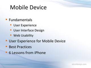
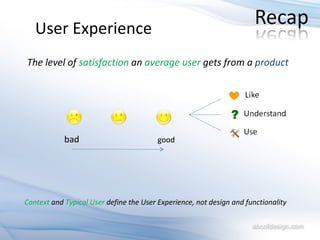
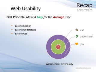
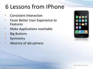
The document outlines best practices and key lessons for designing mobile user interfaces, emphasizing user experience over mere functionality. It highlights the importance of consistency, simplicity, and responsive design in enhancing usability across different mobile devices. Additionally, it summarizes six key lessons learned from the iPhone's interface design, stressing the significance of intuitive navigation and user feedback.