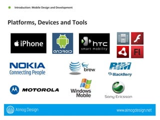
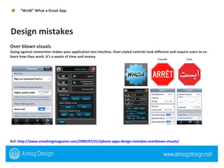
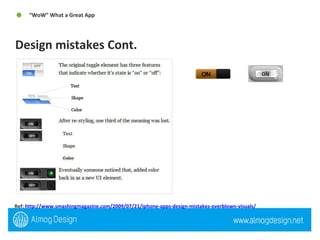
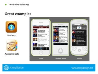
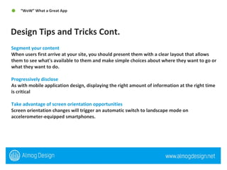
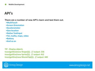
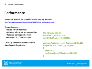
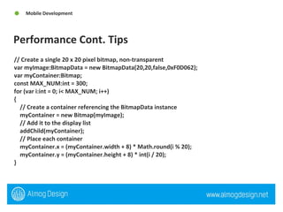
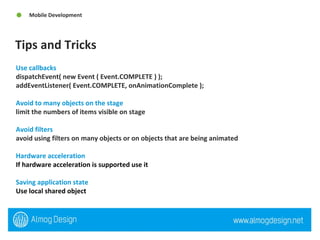
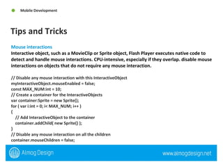
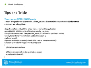
QuickSoft Meeting Mobile Design and Development 11-03-10
An interactive developer & designer specializing in Flash, Flex, Web, Adobe Air, 3D Experiences, and Mobile Devices. Associate's degree in Interactive Communications and over 4 years of Flash development and design experience.  Originally from Las Vegas  currently based in Israel, been evolved in the community for the past 5+ years I attend and speak at conference. Run and mange Flash & Flex Israel “Adobe User Group” http://groups.adobe.com/groups/a76a825573/summary   My site and blog -  http://www.almogdesign.net Twitter @almogdesign Almog Koren “Almog Design”  Interactive Developer & Designer
1. Introduction: Mobile Design and Development What is mobile, Why?  Types of mobile development  Open Screen Project (OSP) Platforms, devices and tools  Flash Lite, Flash Player 10.1 and Adobe Air 2 2. Designing for Mobile  Considerations (State of mind)  User Interface / User Experience  Screen Size Typography User Input  Agenda   Table of Contents
3. “WoW” What a Great App  Design mistakes  Great examples Design tips and tricks 4.  Mobile Development Considerations (State of mind)  API’s  Performance Tips and Tricks 5 .Workflow  Flash CS4, Device Manger  Agenda Continued   Table of Contents
INTRODUCTION
When talking about mobile development, were referencing and mobile phones that supports stand only applications or web based applications, not just smart phones.  Why? In the past few years, one of the biggest areas of change has been the amount of Internet users who are accessing websites via phones and mobile devices.  Apple App Store hits 2 billion downloads, 160,000 apps. Android market has 10,000 apps An Android Success Story: $13,000/month App Sales “Car Locator” Netting an average of about $80-$100/day, until it became a featured app on the Marketplace. Since then, sales have been phenomenal, netting an average of $435/day, with a one day record of $772 on Valentine's Day.  http://eddiekim.posterous.com/an-android-success-story-13000month-sales-0#   What is Mobile, Why? Introduction: Mobile Design and Development
Web based application or site can be free or cost as a subscription. Can be developed with HTML/CSS, HTML5, Javascript, Flash Lite (CS4/5), Flash Player 10.1(CS5)  “Mobile Websites”  Types of Mobile Development  Introduction: Mobile Design and Development  www.smashing.com  www.jaimeedesigns.com
Stand only Application: User downloads and installs to on his or hers device.  Can be developed with many languages some examples - Object C, Java, Brew, Flash Lite(CS4/5), Adobe Air(CS5) and Native ipa(CS5).  Types of Mobile Development Cont.  Introduction: Mobile Design and Development  US.Govt.Index  Spreadsheet  Ovi Store  gRef
The number and diversity of devices in our lives is exploding. Consumers want and demand the total Internet, with open access to websites, applications, and services using all devices. The challenge is that fragmentation across devices, operating systems, and browsers hinders innovation. The result? Consumer demands are not being met. The Open Screen Project was established to meet these challenges and expectations. It is an industry-wide initiative, led by Adobe with the participation of other industry leaders, to enable the delivery of rich multiscreen experiences built on a consistent runtime environment for open web browsing and standalone applications. Open Screen Project (OSP) Introduction: Mobile Design and Development
Platforms, Devices and Tools  Introduction: Mobile Design and Development
Adobe Flash Lite is a lightweight version of Adobe Flash Player, a software application published by Adobe Systems. This version is intended for mobile phones and other portable electronic devices. (***) Adobe Flash Player 10.1 prerelease software is the first runtime release of the Open Screen Project that enables uncompromised web browsing of expressive applications, content, and video across devices. With support for a broad range of mobile devices. (Browser) Adobe AIR 2 extends the mobile capabilities of Flash Player 10.1 by delivering rich applications outside the browser and across multiple operating systems. (Stand only app) Flash Lite, Flash Player 10.1 and Adobe Air 2 Introduction: Mobile Design and Development
DESIGNING FOR MOBIE
Think different – mobile design requires different thought from idea, GUI to execution.  It can very from screen size, platform and application type.  There are guidelines that ensure a successfully design these guidelines are different from web design, print design and so on.  They are similar to Flash design  Recommend reading  iPhone Human Interface Guidelines -  http://developer.apple.com/iphone/library/documentation/UserExperience/Conceptual/MobileHIG/Introduction/Introduction.html   Android User Interface Guidelines  http://www.linuxtopia.org/online_books/android/devguide/guide/practices/ui_guidelines/index.html   Considerations (State of mind)  Designing for Mobile
Our fingers are not mouse pointers If your designing for touch device, remember that a user is using there finger not a mouse,  There is no rollover or rollout.  Accelerometer Movement of the device can create a different user experience.  Device layout portrait or landscape   Use the built in device GUI Do over kill the design with over design everything always use the built in GUI  Keep navigation simple Always keep the navigation simple, when you can stick with the phone navigation but sometimes its best to provide your  own app structure and navigation User Interface / User Experience Designing for Mobile
Mobile devices are location-aware This is one of the most powerful aspects of mobile and one that has spawned a whole host of location-based services. Mobile devices promote quick focused usage Need a vital bit of information like my shopping list, current traffic reports, flight arrival times, stock prices, or recent messages. The exception to this is entertainment. Mobile devices are sometimes connected It’s important to develop for both the online and offline scenarios. Mobile devices support a spontaneous lifestyle Carrying all of your PIM (Personal Information Management) data means you can respond to events as they unfold and share new data in real time. User Interface / User Experience Cont. Designing for Mobile
Screen size very from device to device but they all have one thing in common there isn't much screen size. Consider pixel density and screen - size most mobile devices are going to have a higher pixel density than computer monitors, so everything will look different when viewed on the device. Screen Size Designing for Mobile
Users use mobile devices under the broadest possible range of environmental conditions (e.g. poor lighting) and at a glance. The typical mobile user is working with the device in a highly interruptible manner, glancing at the screen for much of their interaction. The type elements must be immediately findable, readable and comprehendible. Use device fonts for input fields Make sure your font size is big Helvetica is a great mobile font  Typography Designing for Mobile
User Input Designing for Mobile  Depending on the device your designing you need to consider a number possibilities like software based keyboard, touch input, roller input (blackberry) and so on.  General guidelines  Be aware of the space used by the virtual keyboard User prefer not to type Touch input - Less accurate than mouse, Create larger hit area (7mm 44px) Remember Finger obscures screen
“ WOW”
Over-blown visuals Going against convention makes your application less intuitive. Over-styled controls look different and require users to re-learn how they work. It’s a waste of time and money Ref:  http://www.smashingmagazine.com/2009/07/21/iphone-apps-design-mistakes-overblown-visuals/   Design mistakes “ WoW” What a Great App
Ref:  http://www.smashingmagazine.com/2009/07/21/iphone-apps-design-mistakes-overblown-visuals/   Design mistakes Cont.  “ WoW” What a Great App
Great examples  “ WoW” What a Great App  Feathers  Awesome Note
Design Tips and Tricks  “ WoW” What a Great App  Treat your site like a canvas lash technology allows designers to think of their site in terms of surfaces. These surfaces may extend beyond the screen, inviting users to interact with them. In this way, a user is able to engage with the content in a more direct way without having to navigate to different pages. Reinforce spatial relationships with motion The more the motion in your site can reinforce the physical relationships of its elements, the more natural it will feel to the user. Use true full-screen for video and games There are some instances where the user will be better served with a more immersive experience.
Design Tips and Tricks Cont.  “ WoW” What a Great App  Segment your content When users first arrive at your site, you should present them with a clear layout that allows them to see what's available to them and make simple choices about where they want to go or what they want to do.  Progressively disclose As with mobile application design, displaying the right amount of information at the right time is critical Take advantage of screen orientation opportunities Screen orientation changes will trigger an automatic switch to landscape mode on accelerometer-equipped smartphones.
MOBILE  DEVELOPMENT
Considerations (State of mind)  Mobile Development Think Optimized  Its not a PC, very low memory, everything counts.  Think Ahead  Plan your development ahead, looking for the best solution.  Test, Test and Re Test  Testing everything, more then once, always test it on the device  TIP - Use the vector array class instead of array class var v:Vector.<String>; v = new Vector.<String>();
API’s Mobile Development There are a number of new API’s learn and test them out.   MulitTouch  Screen Orientation  Accelerometer Geo-location Native TextInput Tel, mailto, maps, video Battery And so on TIP - Display objects  trace(getSize(new Shape()));  // output: 236  trace(getSize(new Sprite()));  // output: 412  trace(getSize(new MovieClip()));  // output: 440
Performance Mobile Development Use Gratn Skinner’s AS3 Performance Testing Harness http://www.gskinner.com/blog/archives/2009/04/as3_performance.html   Resuse Instances Reuse object instances  Memory allocation very expensive Reduces Garbage collection Reduces CPU / Initialization  Clean up unneeded event handlers Avoid event dispatching  Tip - Reusing objects  const MAX_NUM:int = 18;  const COLOR:uint = 0xCCCCCC;  var area:Rectangle = new Rectangle(0,0,1,10);  for (var:int = 0; i < MAX_NUM; i++)  {  area.x = i;  myBitmapData.fillRect(area,COLOR);  }
Performance Cont. Tips  Mobile Development // Create a single 20 x 20 pixel bitmap, non-transparent  var myImage:BitmapData = new BitmapData(20,20,false,0xF0D062);  var myContainer:Bitmap;  const MAX_NUM:int = 300;  for (var i:int = 0; i< MAX_NUM; i++)  {  // Create a container referencing the BitmapData instance  myContainer = new Bitmap(myImage);  // Add it to the display list  addChild(myContainer);  // Place each container  myContainer.x = (myContainer.width + 8) * Math.round(i % 20);  myContainer.y = (myContainer.height + 8) * int(i / 20);  }
Tips and Tricks Mobile Development Use callbacks  dispatchEvent( new Event ( Event.COMPLETE ) ); addEventListener( Event.COMPLETE, onAnimationComplete ); Avoid to many objects on the stage limit the numbers of items visible on stage  Avoid filters  avoid using filters on many objects or on objects that are being animated Hardware acceleration If hardware acceleration is supported use it   Saving application state  Use local shared object
Tips and Tricks Mobile Development Mouse interactions Interactive object, such as a MovieClip or Sprite object, Flash Player executes native code to detect and handle mouse interactions. CPU-intensive, especially if they overlap. disable mouse interactions on objects that do not require any mouse interaction.  // Disable any mouse interaction with this InteractiveObject  myInteractiveObject.mouseEnabled = false;  const MAX_NUM:int = 10;  // Create a container for the InteractiveObjects  var container:Sprite = new Sprite();  for ( var i:int = 0; i< MAX_NUM; i++ )  {  // Add InteractiveObject to the container  container.addChild( new Sprite() );  }  // Disable any mouse interaction on all the children  container.mouseChildren = false;
Tips and Tricks Mobile Development Timers versus ENTER_FRAME events  Timers are preferred over Event.ENTER_FRAME events for non-animated content that executes for a long time. stage.frameRate = 10; // Use  a low frame rate for the application  const FRAME_RATE:int = 30; // Update rate for the timer  var updateInterval:int = 1000/FRAME_RATE; // Choose 30 updates a second  var myTimer:Timer = new Timer( updateInterval, 0 );  myTimer.start();  myTimer.addEventListener ( TimerEvent.TIMER, updateControls );  function updateControls ( e:TimerEvent ):void  {  // Update controls here  // Force the controls to be updated on screen  e.updateAfterEvent();  }
THANK YOU

QuickSoft Mobile Tips & Tricks 11-03-10

  • 1.
    QuickSoft Meeting MobileDesign and Development 11-03-10
  • 2.
    An interactive developer& designer specializing in Flash, Flex, Web, Adobe Air, 3D Experiences, and Mobile Devices. Associate's degree in Interactive Communications and over 4 years of Flash development and design experience. Originally from Las Vegas currently based in Israel, been evolved in the community for the past 5+ years I attend and speak at conference. Run and mange Flash & Flex Israel “Adobe User Group” http://groups.adobe.com/groups/a76a825573/summary My site and blog - http://www.almogdesign.net Twitter @almogdesign Almog Koren “Almog Design” Interactive Developer & Designer
  • 3.
    1. Introduction: MobileDesign and Development What is mobile, Why? Types of mobile development Open Screen Project (OSP) Platforms, devices and tools Flash Lite, Flash Player 10.1 and Adobe Air 2 2. Designing for Mobile Considerations (State of mind) User Interface / User Experience Screen Size Typography User Input Agenda Table of Contents
  • 4.
    3. “WoW” Whata Great App Design mistakes Great examples Design tips and tricks 4. Mobile Development Considerations (State of mind) API’s Performance Tips and Tricks 5 .Workflow Flash CS4, Device Manger Agenda Continued Table of Contents
  • 5.
  • 6.
    When talking aboutmobile development, were referencing and mobile phones that supports stand only applications or web based applications, not just smart phones. Why? In the past few years, one of the biggest areas of change has been the amount of Internet users who are accessing websites via phones and mobile devices. Apple App Store hits 2 billion downloads, 160,000 apps. Android market has 10,000 apps An Android Success Story: $13,000/month App Sales “Car Locator” Netting an average of about $80-$100/day, until it became a featured app on the Marketplace. Since then, sales have been phenomenal, netting an average of $435/day, with a one day record of $772 on Valentine's Day. http://eddiekim.posterous.com/an-android-success-story-13000month-sales-0# What is Mobile, Why? Introduction: Mobile Design and Development
  • 7.
    Web based applicationor site can be free or cost as a subscription. Can be developed with HTML/CSS, HTML5, Javascript, Flash Lite (CS4/5), Flash Player 10.1(CS5) “Mobile Websites” Types of Mobile Development Introduction: Mobile Design and Development www.smashing.com www.jaimeedesigns.com
  • 8.
    Stand only Application:User downloads and installs to on his or hers device. Can be developed with many languages some examples - Object C, Java, Brew, Flash Lite(CS4/5), Adobe Air(CS5) and Native ipa(CS5). Types of Mobile Development Cont. Introduction: Mobile Design and Development US.Govt.Index Spreadsheet Ovi Store gRef
  • 9.
    The number anddiversity of devices in our lives is exploding. Consumers want and demand the total Internet, with open access to websites, applications, and services using all devices. The challenge is that fragmentation across devices, operating systems, and browsers hinders innovation. The result? Consumer demands are not being met. The Open Screen Project was established to meet these challenges and expectations. It is an industry-wide initiative, led by Adobe with the participation of other industry leaders, to enable the delivery of rich multiscreen experiences built on a consistent runtime environment for open web browsing and standalone applications. Open Screen Project (OSP) Introduction: Mobile Design and Development
  • 10.
    Platforms, Devices andTools Introduction: Mobile Design and Development
  • 11.
    Adobe Flash Liteis a lightweight version of Adobe Flash Player, a software application published by Adobe Systems. This version is intended for mobile phones and other portable electronic devices. (***) Adobe Flash Player 10.1 prerelease software is the first runtime release of the Open Screen Project that enables uncompromised web browsing of expressive applications, content, and video across devices. With support for a broad range of mobile devices. (Browser) Adobe AIR 2 extends the mobile capabilities of Flash Player 10.1 by delivering rich applications outside the browser and across multiple operating systems. (Stand only app) Flash Lite, Flash Player 10.1 and Adobe Air 2 Introduction: Mobile Design and Development
  • 12.
  • 13.
    Think different –mobile design requires different thought from idea, GUI to execution. It can very from screen size, platform and application type. There are guidelines that ensure a successfully design these guidelines are different from web design, print design and so on. They are similar to Flash design Recommend reading iPhone Human Interface Guidelines - http://developer.apple.com/iphone/library/documentation/UserExperience/Conceptual/MobileHIG/Introduction/Introduction.html Android User Interface Guidelines http://www.linuxtopia.org/online_books/android/devguide/guide/practices/ui_guidelines/index.html Considerations (State of mind) Designing for Mobile
  • 14.
    Our fingers arenot mouse pointers If your designing for touch device, remember that a user is using there finger not a mouse, There is no rollover or rollout. Accelerometer Movement of the device can create a different user experience. Device layout portrait or landscape Use the built in device GUI Do over kill the design with over design everything always use the built in GUI Keep navigation simple Always keep the navigation simple, when you can stick with the phone navigation but sometimes its best to provide your own app structure and navigation User Interface / User Experience Designing for Mobile
  • 15.
    Mobile devices arelocation-aware This is one of the most powerful aspects of mobile and one that has spawned a whole host of location-based services. Mobile devices promote quick focused usage Need a vital bit of information like my shopping list, current traffic reports, flight arrival times, stock prices, or recent messages. The exception to this is entertainment. Mobile devices are sometimes connected It’s important to develop for both the online and offline scenarios. Mobile devices support a spontaneous lifestyle Carrying all of your PIM (Personal Information Management) data means you can respond to events as they unfold and share new data in real time. User Interface / User Experience Cont. Designing for Mobile
  • 16.
    Screen size veryfrom device to device but they all have one thing in common there isn't much screen size. Consider pixel density and screen - size most mobile devices are going to have a higher pixel density than computer monitors, so everything will look different when viewed on the device. Screen Size Designing for Mobile
  • 17.
    Users use mobiledevices under the broadest possible range of environmental conditions (e.g. poor lighting) and at a glance. The typical mobile user is working with the device in a highly interruptible manner, glancing at the screen for much of their interaction. The type elements must be immediately findable, readable and comprehendible. Use device fonts for input fields Make sure your font size is big Helvetica is a great mobile font Typography Designing for Mobile
  • 18.
    User Input Designingfor Mobile Depending on the device your designing you need to consider a number possibilities like software based keyboard, touch input, roller input (blackberry) and so on. General guidelines Be aware of the space used by the virtual keyboard User prefer not to type Touch input - Less accurate than mouse, Create larger hit area (7mm 44px) Remember Finger obscures screen
  • 19.
  • 20.
    Over-blown visuals Goingagainst convention makes your application less intuitive. Over-styled controls look different and require users to re-learn how they work. It’s a waste of time and money Ref: http://www.smashingmagazine.com/2009/07/21/iphone-apps-design-mistakes-overblown-visuals/ Design mistakes “ WoW” What a Great App
  • 21.
  • 22.
    Great examples “ WoW” What a Great App Feathers Awesome Note
  • 23.
    Design Tips andTricks “ WoW” What a Great App Treat your site like a canvas lash technology allows designers to think of their site in terms of surfaces. These surfaces may extend beyond the screen, inviting users to interact with them. In this way, a user is able to engage with the content in a more direct way without having to navigate to different pages. Reinforce spatial relationships with motion The more the motion in your site can reinforce the physical relationships of its elements, the more natural it will feel to the user. Use true full-screen for video and games There are some instances where the user will be better served with a more immersive experience.
  • 24.
    Design Tips andTricks Cont. “ WoW” What a Great App Segment your content When users first arrive at your site, you should present them with a clear layout that allows them to see what's available to them and make simple choices about where they want to go or what they want to do. Progressively disclose As with mobile application design, displaying the right amount of information at the right time is critical Take advantage of screen orientation opportunities Screen orientation changes will trigger an automatic switch to landscape mode on accelerometer-equipped smartphones.
  • 25.
  • 26.
    Considerations (State ofmind) Mobile Development Think Optimized Its not a PC, very low memory, everything counts. Think Ahead Plan your development ahead, looking for the best solution. Test, Test and Re Test Testing everything, more then once, always test it on the device TIP - Use the vector array class instead of array class var v:Vector.<String>; v = new Vector.<String>();
  • 27.
    API’s Mobile DevelopmentThere are a number of new API’s learn and test them out. MulitTouch Screen Orientation Accelerometer Geo-location Native TextInput Tel, mailto, maps, video Battery And so on TIP - Display objects trace(getSize(new Shape())); // output: 236 trace(getSize(new Sprite())); // output: 412 trace(getSize(new MovieClip())); // output: 440
  • 28.
    Performance Mobile DevelopmentUse Gratn Skinner’s AS3 Performance Testing Harness http://www.gskinner.com/blog/archives/2009/04/as3_performance.html Resuse Instances Reuse object instances Memory allocation very expensive Reduces Garbage collection Reduces CPU / Initialization Clean up unneeded event handlers Avoid event dispatching Tip - Reusing objects const MAX_NUM:int = 18; const COLOR:uint = 0xCCCCCC; var area:Rectangle = new Rectangle(0,0,1,10); for (var:int = 0; i < MAX_NUM; i++) { area.x = i; myBitmapData.fillRect(area,COLOR); }
  • 29.
    Performance Cont. Tips Mobile Development // Create a single 20 x 20 pixel bitmap, non-transparent var myImage:BitmapData = new BitmapData(20,20,false,0xF0D062); var myContainer:Bitmap; const MAX_NUM:int = 300; for (var i:int = 0; i< MAX_NUM; i++) { // Create a container referencing the BitmapData instance myContainer = new Bitmap(myImage); // Add it to the display list addChild(myContainer); // Place each container myContainer.x = (myContainer.width + 8) * Math.round(i % 20); myContainer.y = (myContainer.height + 8) * int(i / 20); }
  • 30.
    Tips and TricksMobile Development Use callbacks dispatchEvent( new Event ( Event.COMPLETE ) ); addEventListener( Event.COMPLETE, onAnimationComplete ); Avoid to many objects on the stage limit the numbers of items visible on stage Avoid filters avoid using filters on many objects or on objects that are being animated Hardware acceleration If hardware acceleration is supported use it Saving application state Use local shared object
  • 31.
    Tips and TricksMobile Development Mouse interactions Interactive object, such as a MovieClip or Sprite object, Flash Player executes native code to detect and handle mouse interactions. CPU-intensive, especially if they overlap. disable mouse interactions on objects that do not require any mouse interaction. // Disable any mouse interaction with this InteractiveObject myInteractiveObject.mouseEnabled = false; const MAX_NUM:int = 10; // Create a container for the InteractiveObjects var container:Sprite = new Sprite(); for ( var i:int = 0; i< MAX_NUM; i++ ) { // Add InteractiveObject to the container container.addChild( new Sprite() ); } // Disable any mouse interaction on all the children container.mouseChildren = false;
  • 32.
    Tips and TricksMobile Development Timers versus ENTER_FRAME events Timers are preferred over Event.ENTER_FRAME events for non-animated content that executes for a long time. stage.frameRate = 10; // Use a low frame rate for the application const FRAME_RATE:int = 30; // Update rate for the timer var updateInterval:int = 1000/FRAME_RATE; // Choose 30 updates a second var myTimer:Timer = new Timer( updateInterval, 0 ); myTimer.start(); myTimer.addEventListener ( TimerEvent.TIMER, updateControls ); function updateControls ( e:TimerEvent ):void { // Update controls here // Force the controls to be updated on screen e.updateAfterEvent(); }
  • 33.