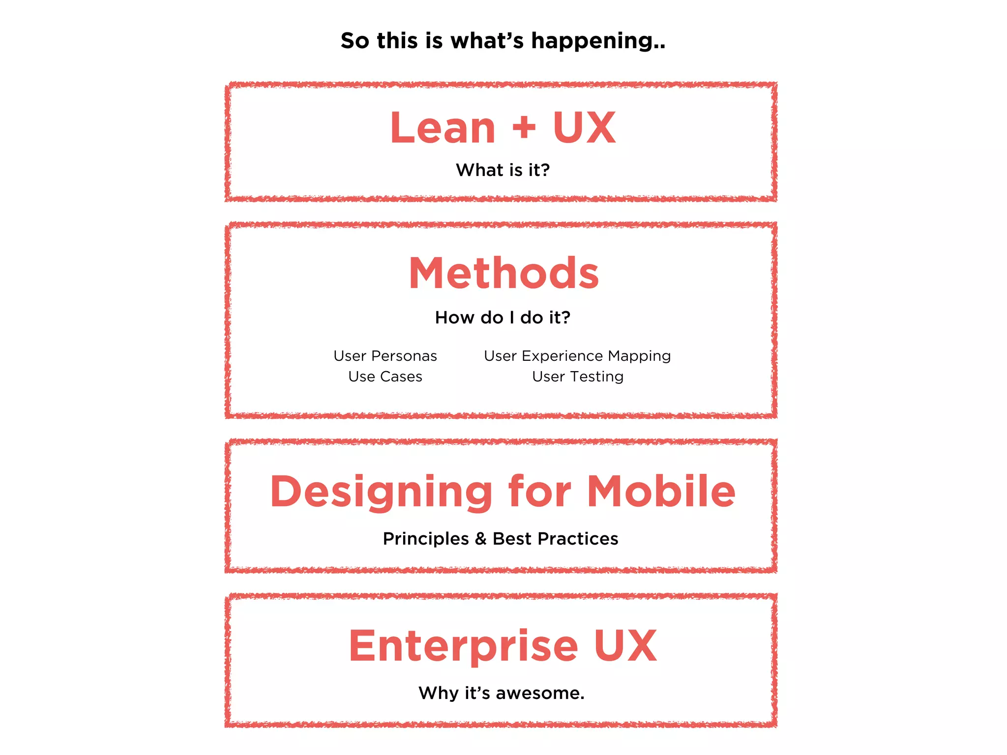
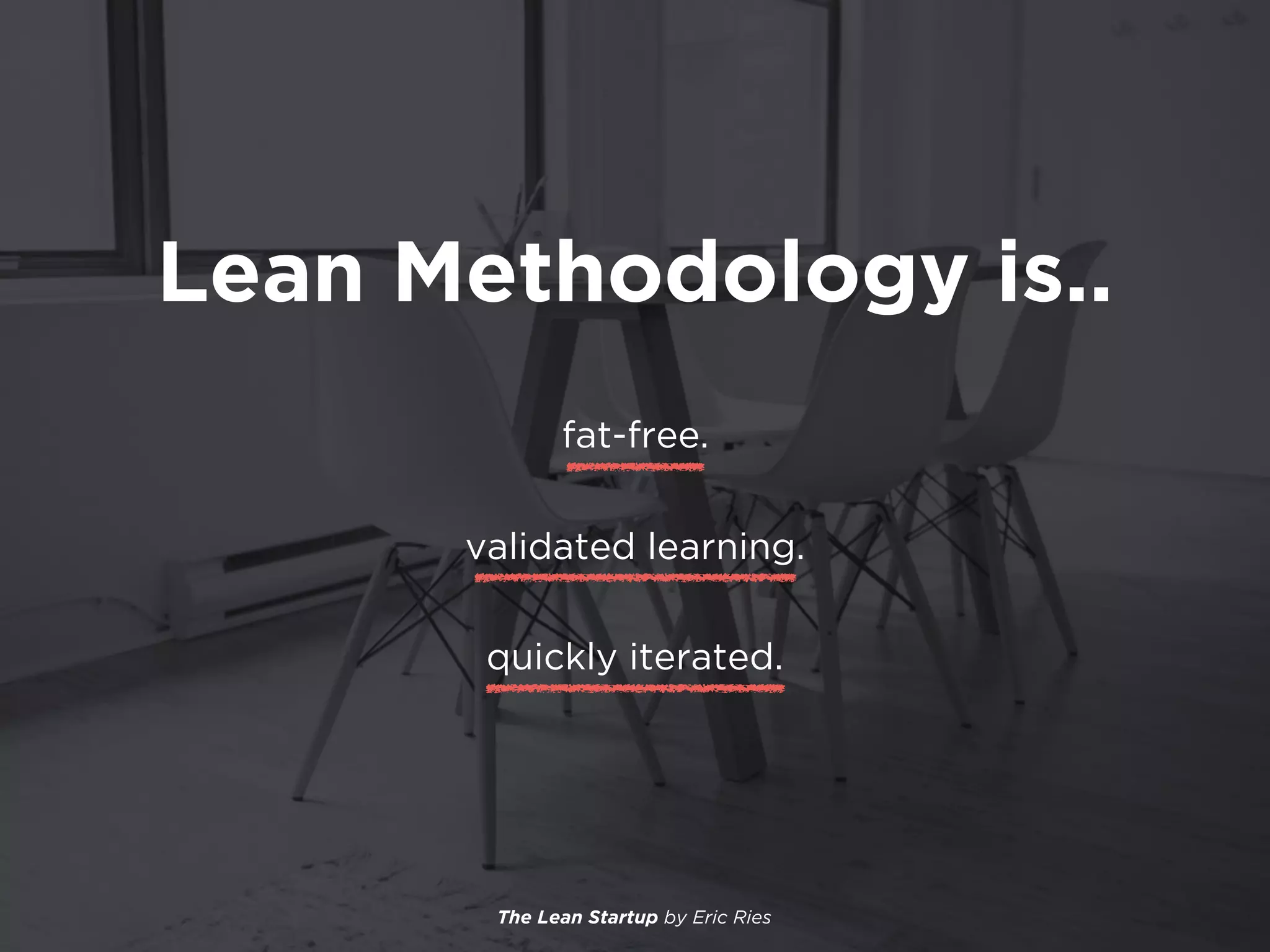
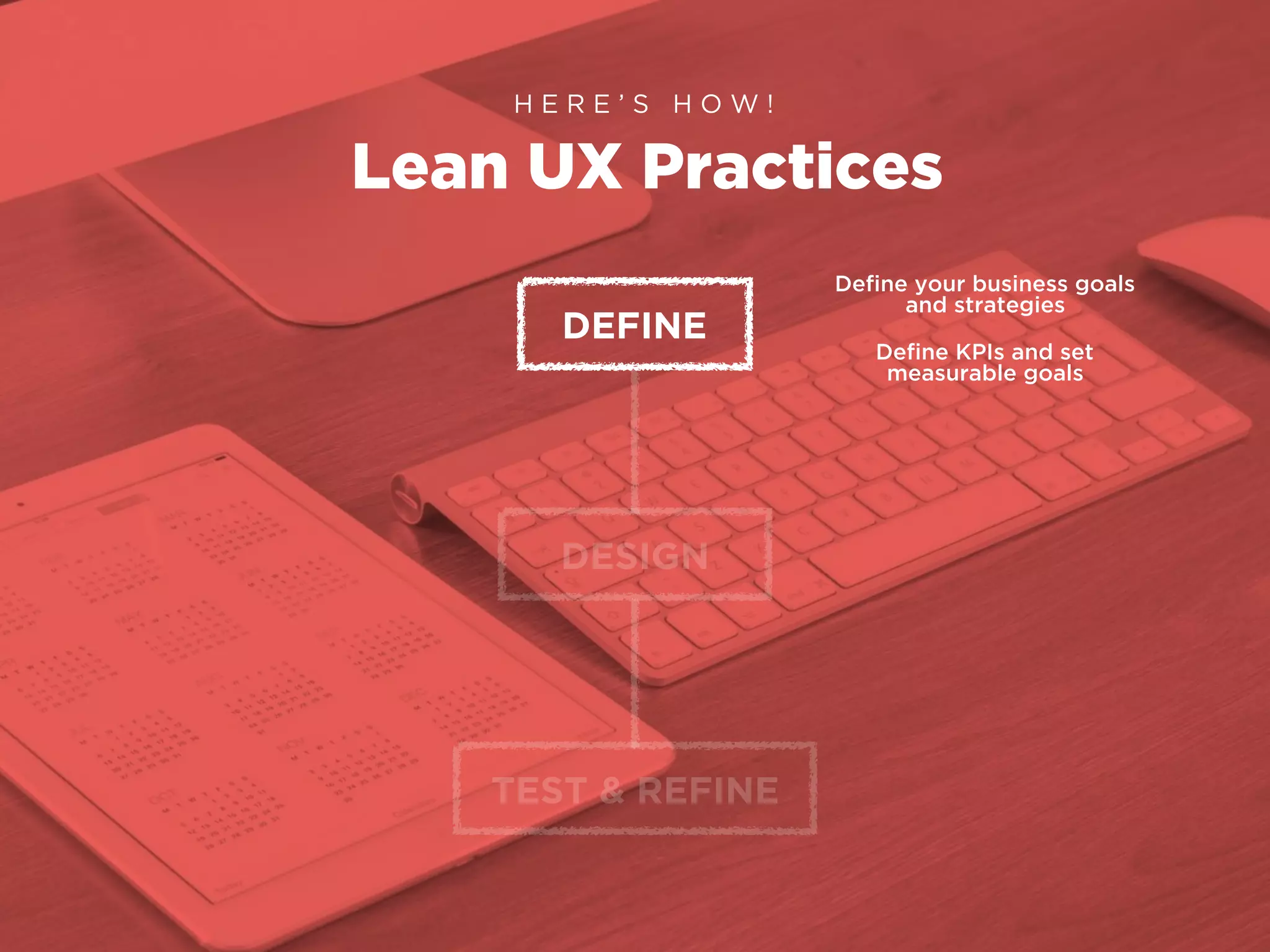
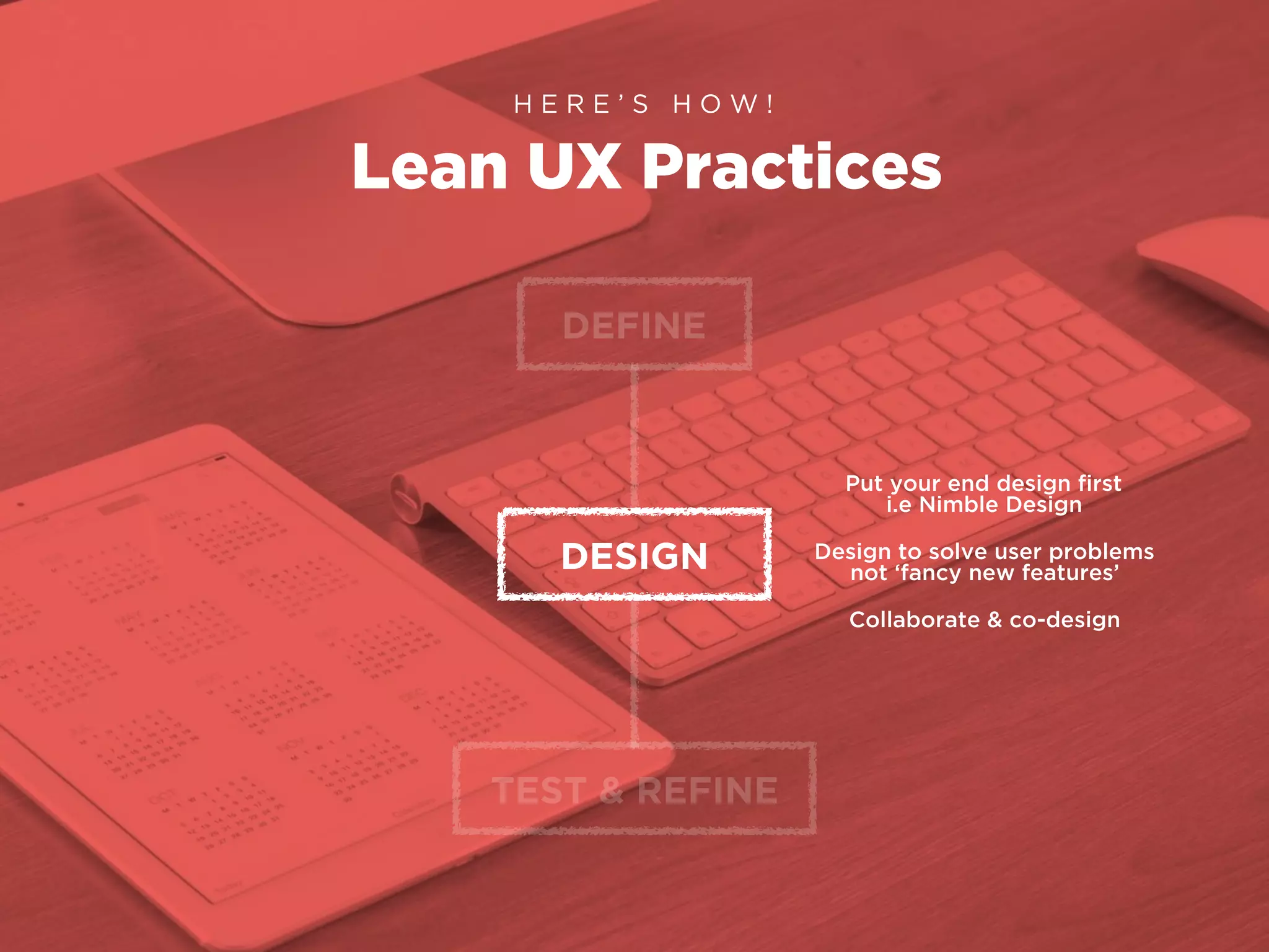
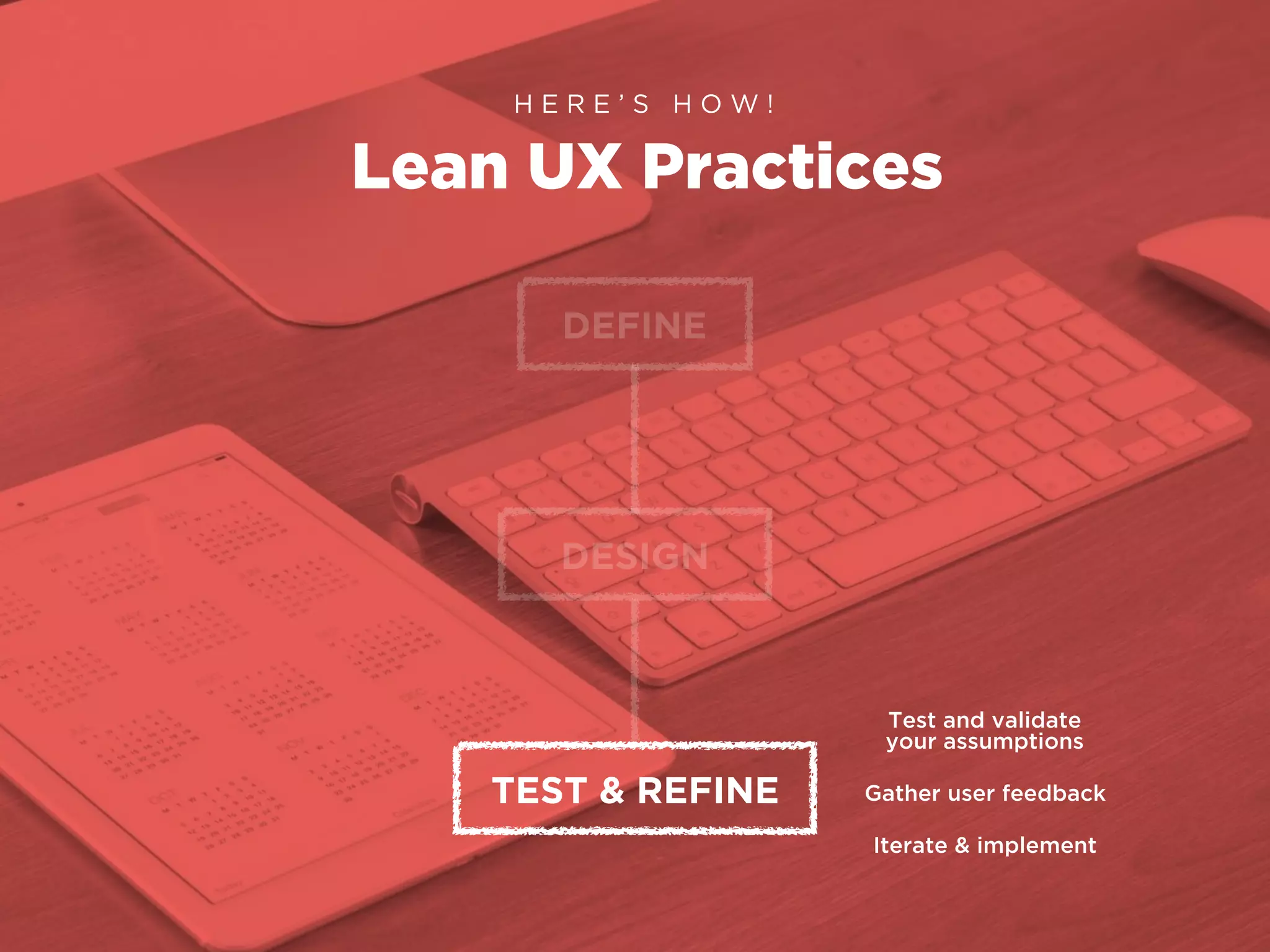
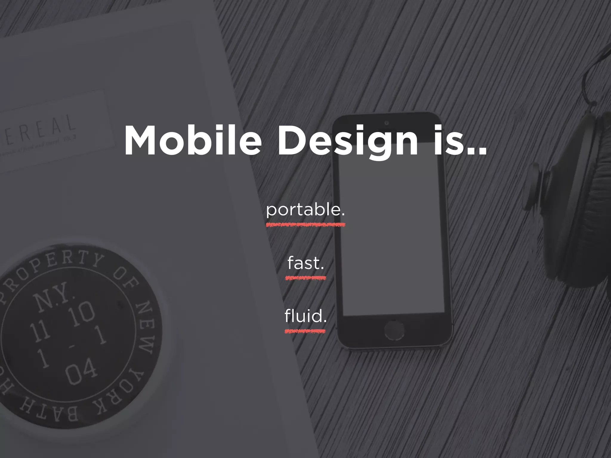
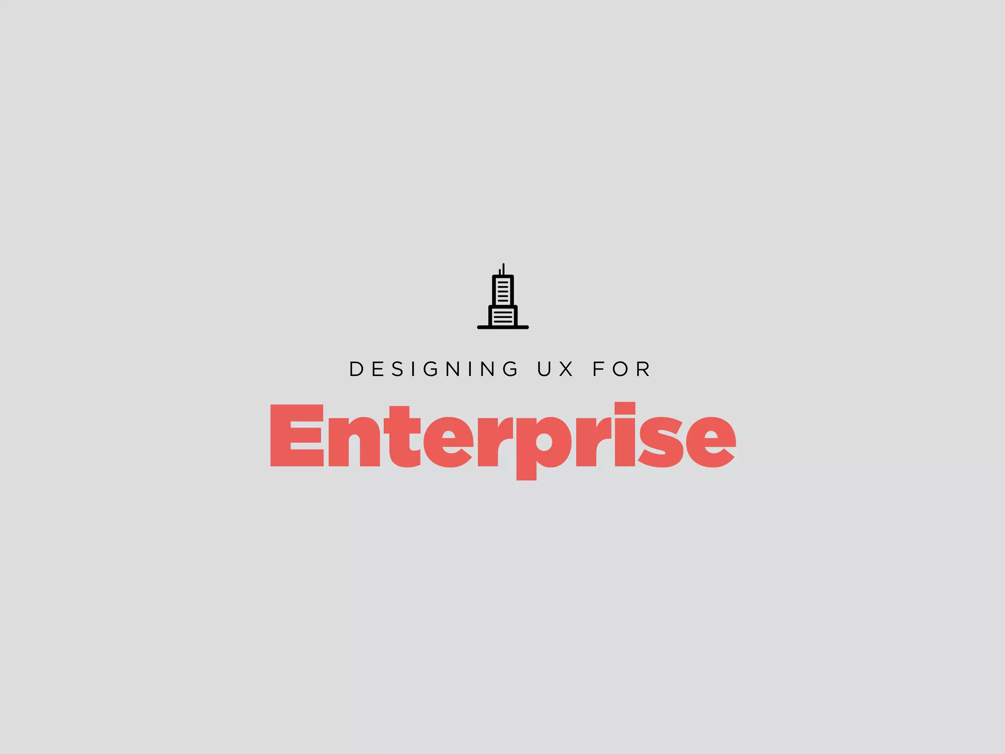
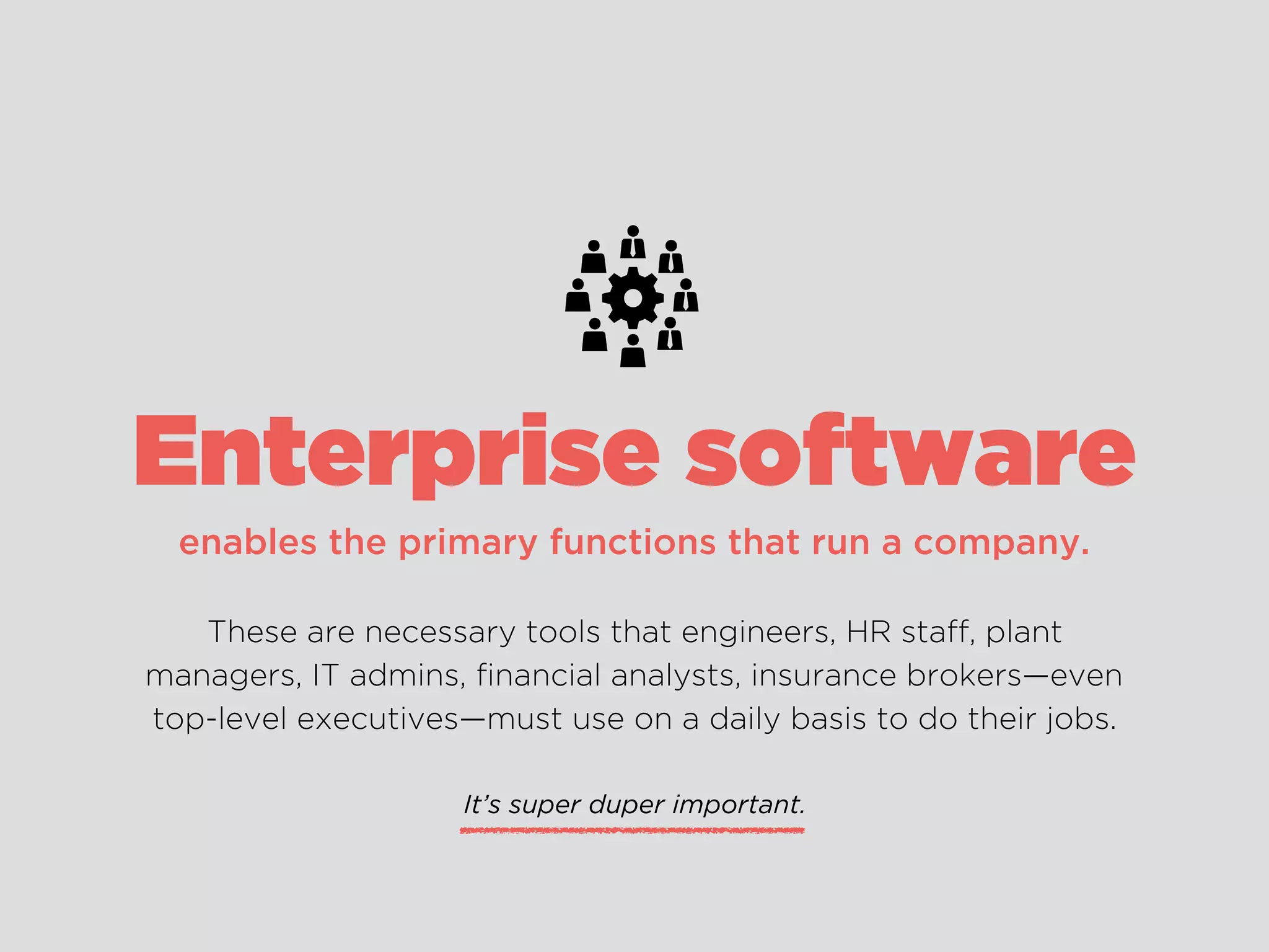
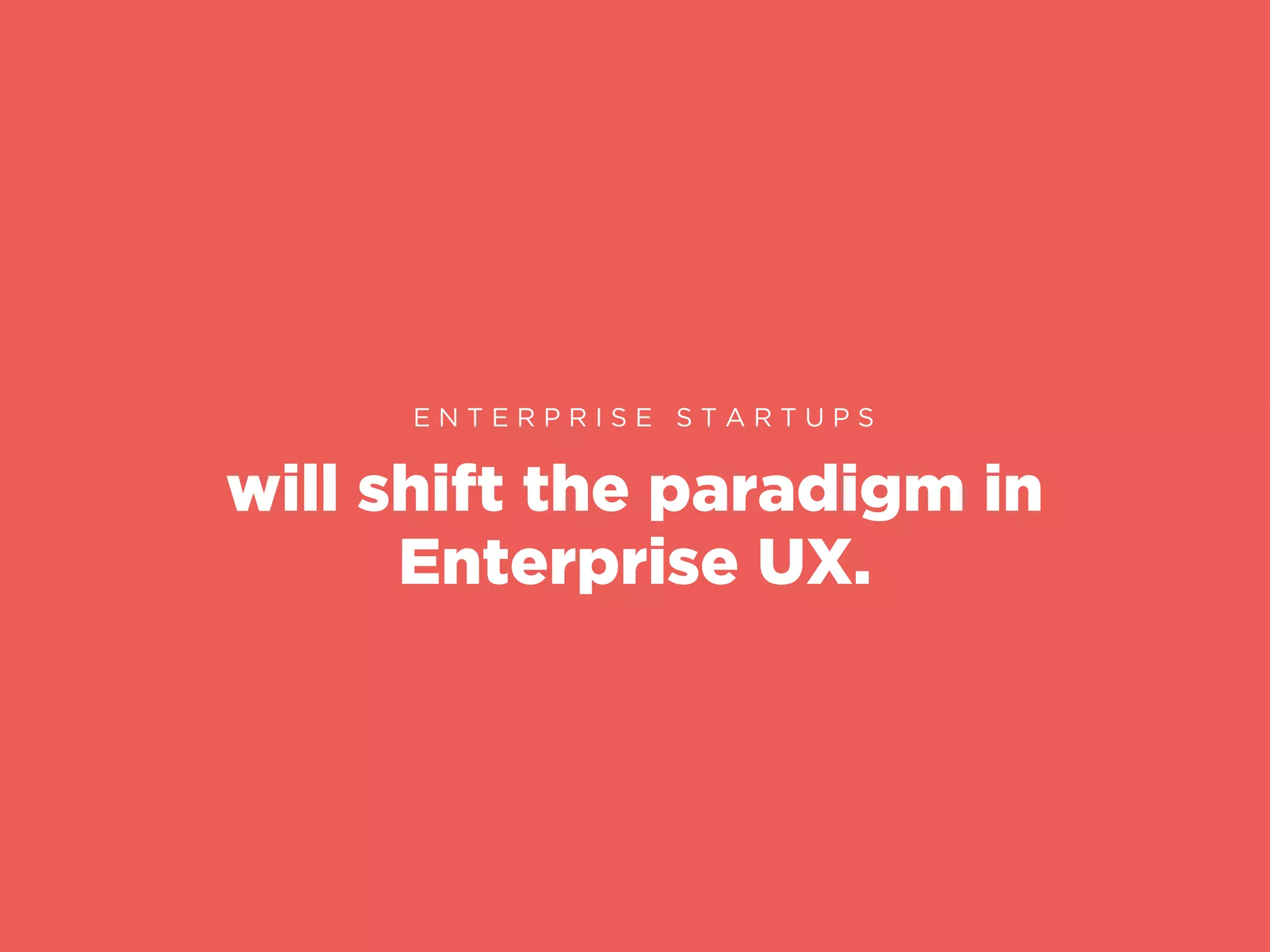
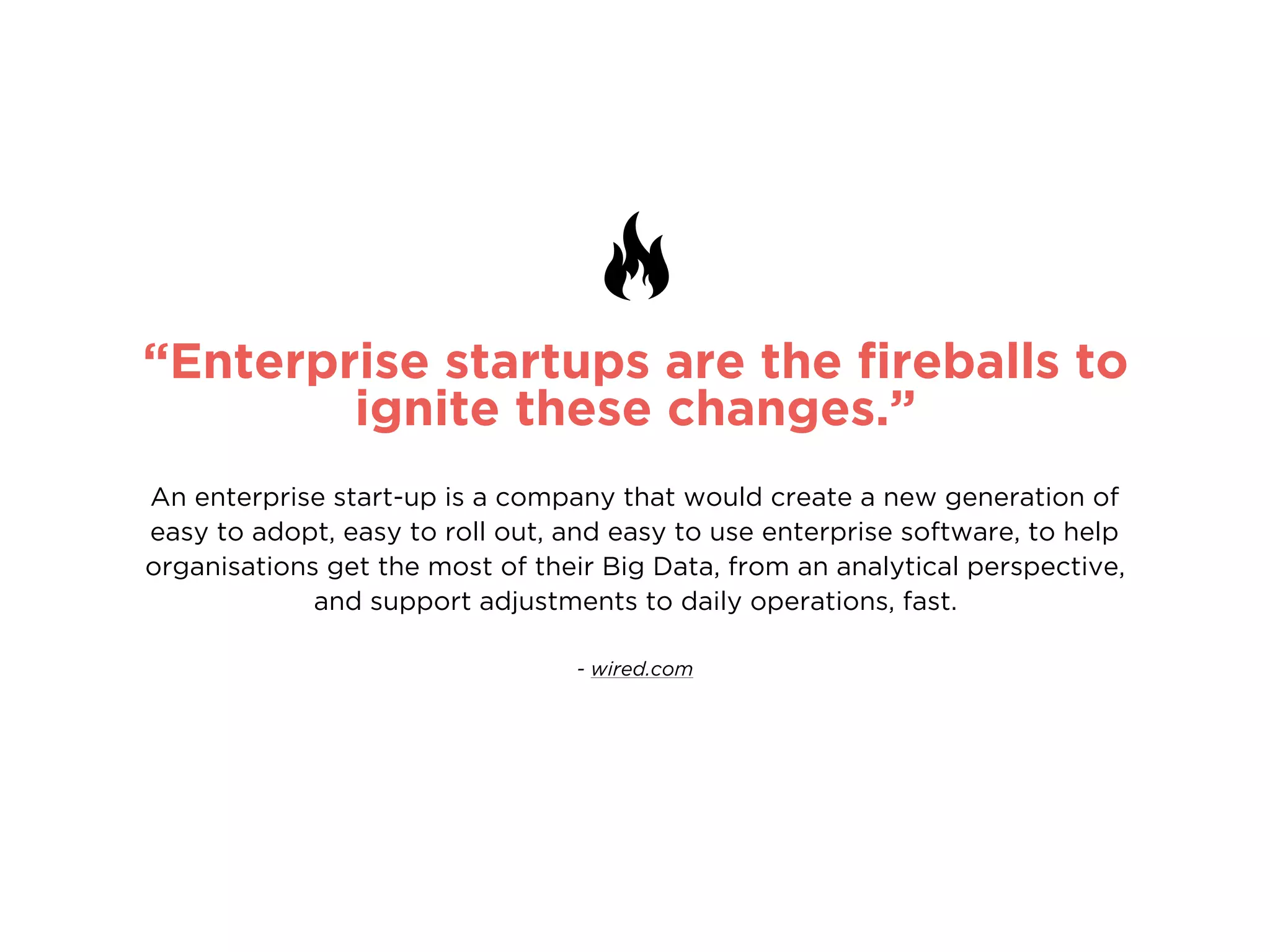
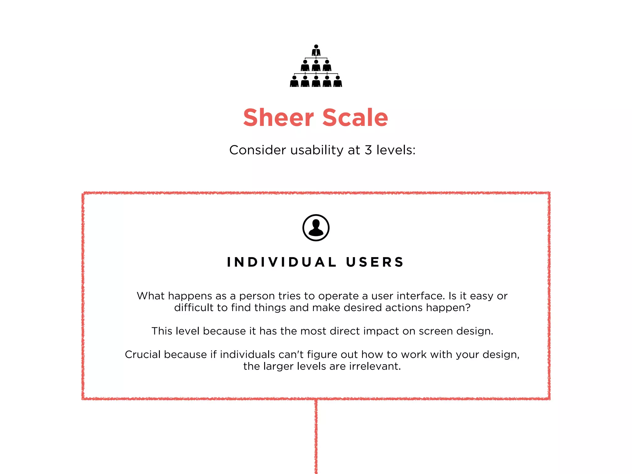
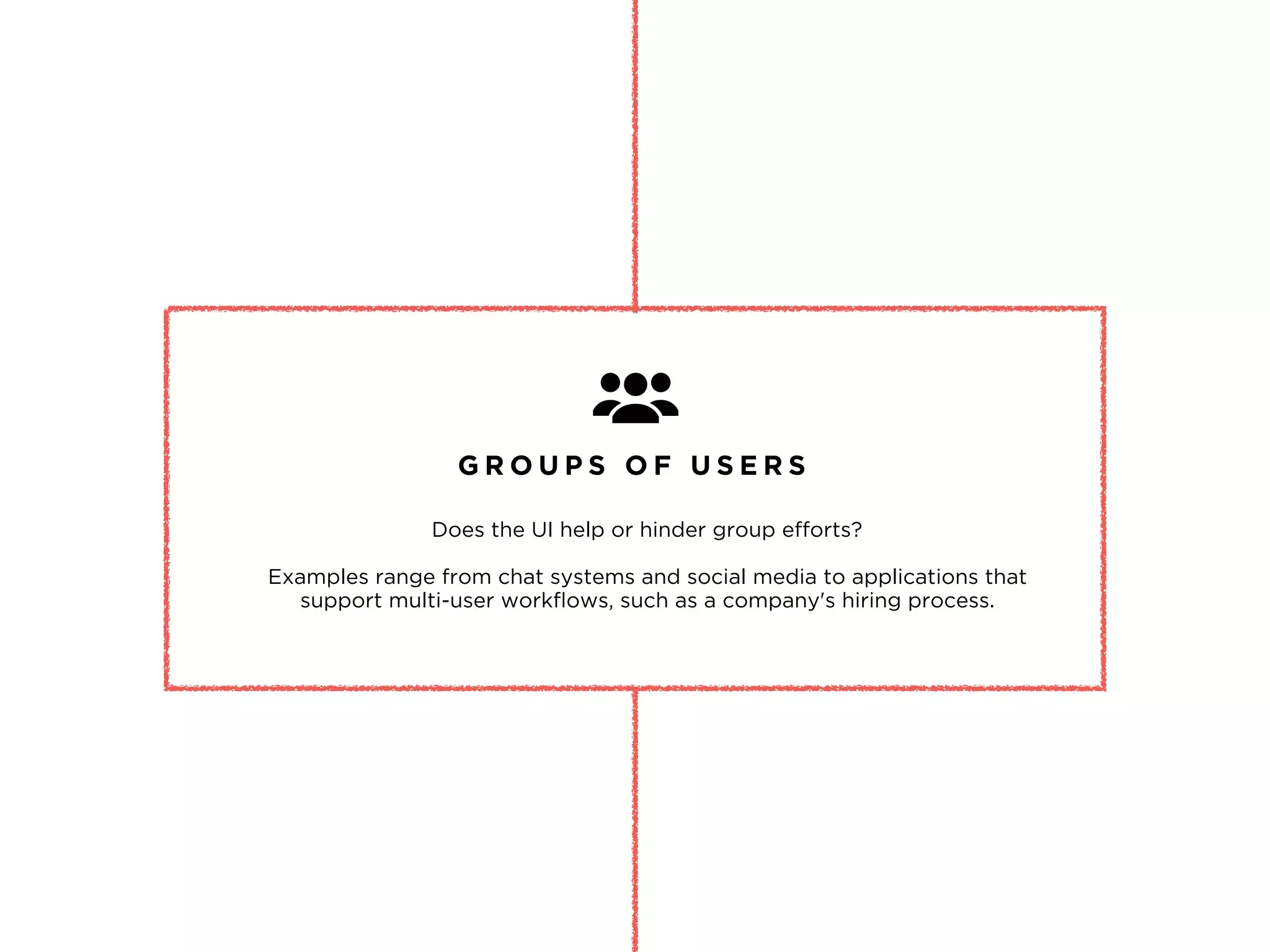
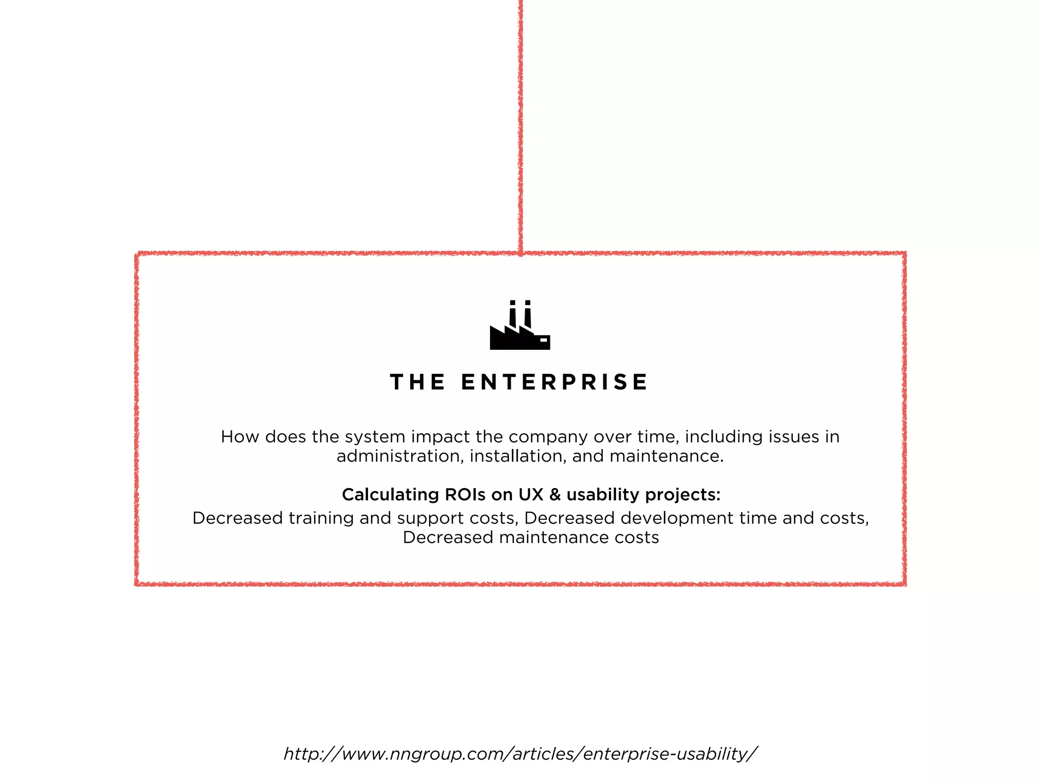
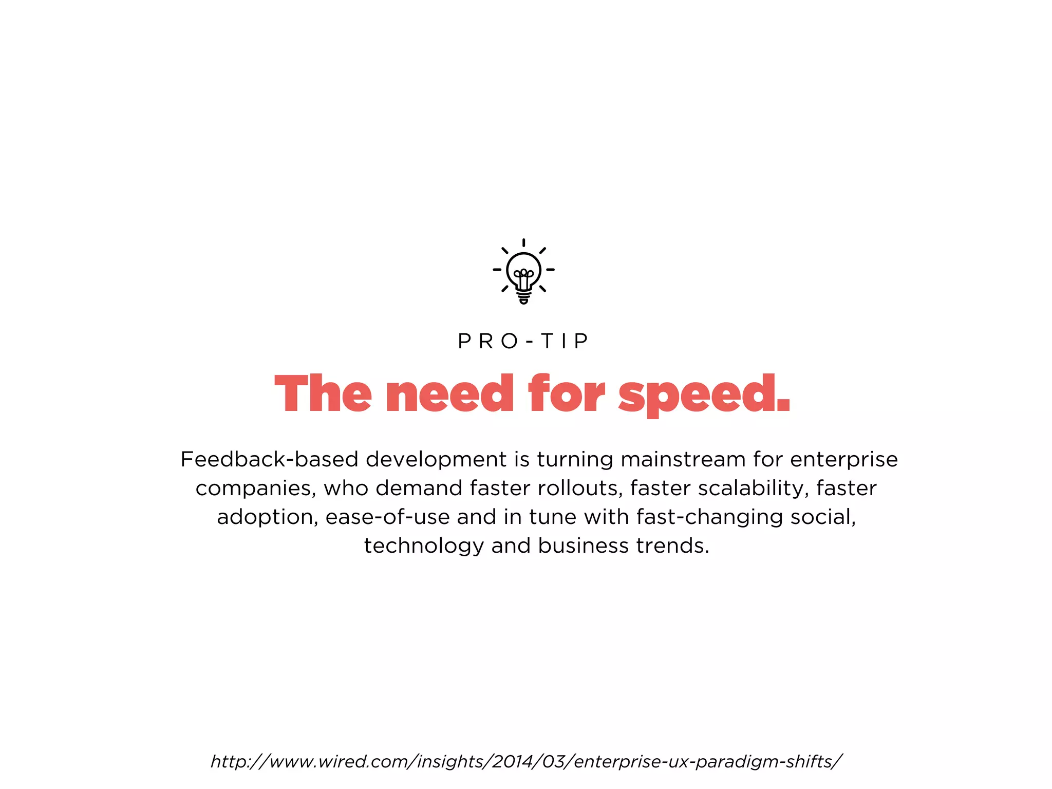
Lean UX ,
Designing for
Mobile..
and why Enterprise UX is awesome!
“Hello there!”
- DORALIN KELLY
UI/UX designer and Star Wars fangirl
“What about you?”
Hello,
my name is..
So this is what’s happening..
Lean + UX
What is it?
User Personas
Use Cases
Methods
How do I do it?
Designing for Mobile
Principles & Best Practices
User Experience Mapping
User Testing
Enterprise UX
Why it’s awesome.
Lean Methodology is..
fat-free.
validated learning.
quickly iterated.
The Lean Startup by Eric Ries
encompasses all aspects of the end-user's
interaction with the company, its services,
and its products.
"User experience"
Design for Hackers by David Kadavy
User Experience Design
encompasses all.
― David Kadavy,
Design for Hackers: Reverse Engineering Beauty
The user experience design of a product
essentially lies between the intentions of
the product and the characteristics
of your user.
“
Product.
Market.
Fit.
3 I M P O R T A N T W O R D S
LEAN UX
Lean UX Practices
H E R E ’ S H O W !
DEFINE
DESIGN
TEST & REFINE
Define your business goals
and strategies
Define KPIs and set
measurable goals
Lean UX Practices
H E R E ’ S H O W !
DEFINE
DESIGN
TEST & REFINE
Put your end design first
i.e Nimble Design
Design to solve user problems
not ‘fancy new features’
Collaborate & co-design
Lean UX Practices
H E R E ’ S H O W !
DEFINE
DESIGN
TEST & REFINE
Test and validate
your assumptions
Gather user feedback
Iterate & implement
User Personas
H A N D S O N !
1.
In your teams, get some markers and one
of those massive sheets of paper.
2.
Draw out your User Personas.
User Personas
P R O - T I P
Imagine what your user’s Tinder profile would look like..
Likes/Dislikes
Daily schedule
Hobbies
Goals Frustrations
Relationships
Use Cases
H A N D S O N !
1.
Write out a simple Use Case for your User Persona.
2.
Discuss and evaluate.
Consider..
How would your user complete a task on your app/website?
What is your user’s goal?
How many steps will it take them to accomplish this goal?
How will your app/website respond to an action?
Use Cases
P R O - T I P
USE CASE #1
JOEY
Personal pizza order
at home
When:
Where:
How:
Dinner time
At home
pizza.com
• He is a picky eater so he customises
his order with specific ingredients
• Joey is hungry, he goes online
to order a pizza.
• He prefers to pay with credit card
• His address is pre-populated
from his previous order as well
• The website allows him to fully
customise the pizza toppings
• The website has his payment details
saved from his previous order
*Success Scenario - use case in which nothing goes wrong.
• Joey receives his order in
30 minutes
Consider..
How can you cater for scenarios in which a user gets stuck?
i.e Form errors can be super annoying
Can you cut down on steps to accomplish the user’s goal?
i.e Joey’s forms were pre-populated from his previous orders
Think about leveraging from the highs/lows in your Use Cases
i.e Joey’s order arrives 15 minutes late, he gets a $10 coupon as an apology
from pizza.com
Use Cases
E V A L U A T E
User Experience Mapping
A L S O . .
Guide to Experience Mapping by Adaptive Path
User Testing
A N D . .
Give your users simple but
specific tasks to complete.
Observe their behaviour.
Do they pause to think?
Always use open-ended,
non-leading questions.
Make it casual.
Have participants talk aloud
as they perform tasks.
User Testing
P R O - T I P
Don’t ask leading questions.
People are socially wired to
give ‘polite’ answers.
If you have specific user sets,
test within that range.
Don’t test with more than 4-5
people in a day. Take an hour
to recap in-between
interviews.
Did your User manage to accomplish the task?
Was it easy or challenging? How long did it take them?
Did your User get confused/stuck at any point?
i.e The Moderator should ask “What are you thinking now?”
when the User appears to pause to think.
What were the barriers in the way of the User’s goal?
i.e Navigation wasn’t clear enough, making it difficult to find what
they were looking for.
How can you fix the issues that surfaced?
i.e Can you simplify the tasks for the User?
What did you observe?
E V A L U A T E
Don’t base anything on
your assumptions.
Don’t base anything on
your assumptions.
Evaluate based on data from your users.
Designing
for Mobile
Mobile Design is..
portable.
fast.
fluid.
Mobile Design
B E S T P R A C T I C E S
Design for Touch
Size your touch targets and spacing right.
Use a minimum of minimum of 50px by 50px.
Keep spaces between buttons and touch targets
at least 20px–32px.
“ I H A V E F A T F I N G E R S ”
01
Design for Legibility
Keep your font size at 15px and up.
Use web-safe fonts when designing for mobile on web.
Custom fonts can slow down page load time and not every
mobile browser supports custom fonts.
“ I C A N ’ T R E A D I T ”
02
Design for Speed
Keep your content and images light and optimised
for maximum compression.
“ T H I S I S T A K I N G T O O L O N G T O L O A D ”
https://developers.google.com/speed/pagespeed/insights/
PageSpeed Insights
03
Design for Fluidity
Avoid fixed width images. Buffer for text overflow.
Keep multiple screen widths in mind.
Designing a fluid grid creates a better user
experience for multiple screen sizes.
“ B E L I K E W A T E R - B R U C E L E E ”
04
Design with APIs
Mobile devices can access user location, make phone calls,
take pictures and more. If it makes your user’s goal easier to
achieve, implement it.
“ M O R E U S E F U L F E A T U R E S O N M O B I L E ”
05
Don’t design Pop-ups
Don’t do it.
“ J U S T N O . ”
This applies mainly to web, but for app design be careful with pop-up
notifications, make sure they’re easy to tap out of.
06
Don’t design ‘a smaller version’
Don’t do that either.
Scale and shuffle and minimise content specifically for a mobile experience.
Some things that may work for web may not work for mobile.
Cut Down on unnecessary content and make sure users can get to their
goal faster on mobile.
“ B I G S I T E S R E W O R K E D T O F I T I N A S M A L L E R B O X ”
Check out: Alternate Layouts in Adobe Muse
07
Don’t make users sign up first
Allow users to temporarily skip registration so that they can try out your
product first. If they find value in it they will sign up. Cut the funnel.
“ B E N E F I T > P A I N - P O I N T ”
For Example…
08
Hotel Tonight
Hotel Tonight used A/B testing to create a variant where users could complete the transaction
without having to create a dedicated account. Previously all users had to sign in before
completing a booking. They tracked the bounce rate, as well as completed transactions, and
found that discovered that making sign-ins optional actually increased bookings by 15%.
To encourage users to sign up still, they're given the option to sign up in order to save their
data to make future bookings even more painless and quick.
Keep on-boarding short & sweet
No. Don’t use long drawn video tutorials on how to use your app. Once a user
has installed it, you don’t need to throw your value proposition at them. Let
them use it, but show them how in a quick and hands-on way.
If they have questions later, make sure they know where to find the answer.
“ L E T ’ S B O M B A R D T H E M W I T H V A L U E ”
Check out: Slack’s on-boarding process
09
Designing Forms & Filters
Use placeholder text and icons in singular, common forms (i.e. login forms, search
boxes or address forms) but display the labels above input forms for longer more
complex fields. Always, always strip away unnecessary forms.
Forms
Build useful filters based off of your products and what’s most important to users.
Don’t use branded terms or jargon. Make sure it’s easy for users to edit or clear
filters and always display clearly what has been filtered.
Filters
10
Design for Ergonomics
Other than tapping, how can users interact with your product?
i.e Double Tap, Press & Hold, Pinch/Spread, Swipe
Gestures
Transitions smooth the boundaries between application states,
transitions also help facilitate recall and prevent users from getting lost.
i.e Expand, Flip, Slide Along
Transitions
11
Design in Grids
12
With a good Grid System, you can determine the most effective
placement for buttons, headlines, or images across devices.
For Example…
“ G R I D S A R E G O O D ”
Static items VS Interactive
13
Make sure you make a clear differentiation between static items
and interactive functionality.
For Example, all clickable elements are BLUE but inactive fields are GREY
“ M A K E C L I C K A B L E T H I N G S L O O K C L I C K A B L E ”
Design for Feedback
14
Always give a User instant feedback once they have interacted with
your design. Tell them what happens next, if the action has worked/or
failed. Don’t leave them hanging!
For Example, a button should change upon being tapped.
Give Users a ‘Thumb-Up’ after submitting a form.
“ W H A T H A P P E N S N O W ? ”
One-Size-Fits-All
U L T I M A T E L Y T H E R E I S N O
How do your users use
your site/app?
E V A L U A T E
UX patterns will have to be customised to best fit YOUR user base.
So make sure you understand your user behaviour,
especially when they’re on the go, on mobile.
Think through it then validate by testing with real users.
Enterprise
D E S I G N I N G U X F O R
enables the primary functions that run a company.
These are necessary tools that engineers, HR staff, plant
managers, IT admins, financial analysts, insurance brokers—even
top-level executives—must use on a daily basis to do their jobs.
Enterprise software
It’s super duper important.
BUT.. What is the first thing that comes to
mind when we hear the words:
“Enterprise Software”
Dull
Bulky
Cumbersome
Weighty
Hard to use
will shift the paradigm in
Enterprise UX.
E N T E R P R I S E S T A R T U P S
“Enterprise startups are the fireballs to
ignite these changes.”
An enterprise start-up is a company that would create a new generation of
easy to adopt, easy to roll out, and easy to use enterprise software, to help
organisations get the most of their Big Data, from an analytical perspective,
and support adjustments to daily operations, fast.
- wired.com
Sheer Scale
Consider usability at 3 levels:
I N D I V I D U A L U S E R S
What happens as a person tries to operate a user interface. Is it easy or
difficult to find things and make desired actions happen?
This level because it has the most direct impact on screen design.
Crucial because if individuals can't figure out how to work with your design,
the larger levels are irrelevant.
G R O U P S O F U S E R S
Does the UI help or hinder group efforts?
Examples range from chat systems and social media to applications that
support multi-user workflows, such as a company's hiring process.
T H E E N T E R P R I S E
How does the system impact the company over time, including issues in
administration, installation, and maintenance.
Calculating ROIs on UX & usability projects:
Decreased training and support costs, Decreased development time and costs,
Decreased maintenance costs
http://www.nngroup.com/articles/enterprise-usability/
The need for speed.
Feedback-based development is turning mainstream for enterprise
companies, who demand faster rollouts, faster scalability, faster
adoption, ease-of-use and in tune with fast-changing social,
technology and business trends.
P R O - T I P
http://www.wired.com/insights/2014/03/enterprise-ux-paradigm-shifts/
Questions?
I T ’ S A W R A P !
design@doralinkelly.ninja
@doralinkelly
doralinkelly.ninja

UX Masterclass at muru-D

  • 1.
    Lean UX , Designingfor Mobile.. and why Enterprise UX is awesome!
  • 2.
    “Hello there!” - DORALINKELLY UI/UX designer and Star Wars fangirl
  • 5.
  • 6.
    So this iswhat’s happening.. Lean + UX What is it? User Personas Use Cases Methods How do I do it? Designing for Mobile Principles & Best Practices User Experience Mapping User Testing Enterprise UX Why it’s awesome.
  • 7.
    Lean Methodology is.. fat-free. validatedlearning. quickly iterated. The Lean Startup by Eric Ries
  • 8.
    encompasses all aspectsof the end-user's interaction with the company, its services, and its products. "User experience"
  • 9.
    Design for Hackersby David Kadavy
  • 10.
    Design for Hackersby David Kadavy User Experience Design encompasses all.
  • 11.
    ― David Kadavy, Designfor Hackers: Reverse Engineering Beauty The user experience design of a product essentially lies between the intentions of the product and the characteristics of your user. “
  • 12.
    Product. Market. Fit. 3 I MP O R T A N T W O R D S
  • 13.
  • 14.
    Lean UX Practices HE R E ’ S H O W ! DEFINE DESIGN TEST & REFINE Define your business goals and strategies Define KPIs and set measurable goals
  • 15.
    Lean UX Practices HE R E ’ S H O W ! DEFINE DESIGN TEST & REFINE Put your end design first i.e Nimble Design Design to solve user problems not ‘fancy new features’ Collaborate & co-design
  • 16.
    Lean UX Practices HE R E ’ S H O W ! DEFINE DESIGN TEST & REFINE Test and validate your assumptions Gather user feedback Iterate & implement
  • 17.
    User Personas H AN D S O N ! 1. In your teams, get some markers and one of those massive sheets of paper. 2. Draw out your User Personas.
  • 19.
    User Personas P RO - T I P Imagine what your user’s Tinder profile would look like.. Likes/Dislikes Daily schedule Hobbies Goals Frustrations Relationships
  • 20.
    Use Cases H AN D S O N ! 1. Write out a simple Use Case for your User Persona. 2. Discuss and evaluate.
  • 21.
    Consider.. How would youruser complete a task on your app/website? What is your user’s goal? How many steps will it take them to accomplish this goal? How will your app/website respond to an action? Use Cases P R O - T I P
  • 22.
    USE CASE #1 JOEY Personalpizza order at home When: Where: How: Dinner time At home pizza.com • He is a picky eater so he customises his order with specific ingredients • Joey is hungry, he goes online to order a pizza. • He prefers to pay with credit card • His address is pre-populated from his previous order as well • The website allows him to fully customise the pizza toppings • The website has his payment details saved from his previous order *Success Scenario - use case in which nothing goes wrong. • Joey receives his order in 30 minutes
  • 24.
    Consider.. How can youcater for scenarios in which a user gets stuck? i.e Form errors can be super annoying Can you cut down on steps to accomplish the user’s goal? i.e Joey’s forms were pre-populated from his previous orders Think about leveraging from the highs/lows in your Use Cases i.e Joey’s order arrives 15 minutes late, he gets a $10 coupon as an apology from pizza.com Use Cases E V A L U A T E
  • 25.
  • 26.
    Guide to ExperienceMapping by Adaptive Path
  • 27.
  • 28.
    Give your userssimple but specific tasks to complete. Observe their behaviour. Do they pause to think? Always use open-ended, non-leading questions. Make it casual. Have participants talk aloud as they perform tasks. User Testing P R O - T I P Don’t ask leading questions. People are socially wired to give ‘polite’ answers. If you have specific user sets, test within that range. Don’t test with more than 4-5 people in a day. Take an hour to recap in-between interviews.
  • 29.
    Did your Usermanage to accomplish the task? Was it easy or challenging? How long did it take them? Did your User get confused/stuck at any point? i.e The Moderator should ask “What are you thinking now?” when the User appears to pause to think. What were the barriers in the way of the User’s goal? i.e Navigation wasn’t clear enough, making it difficult to find what they were looking for. How can you fix the issues that surfaced? i.e Can you simplify the tasks for the User? What did you observe? E V A L U A T E
  • 30.
    Don’t base anythingon your assumptions.
  • 31.
    Don’t base anythingon your assumptions. Evaluate based on data from your users.
  • 32.
  • 33.
  • 34.
    Mobile Design B ES T P R A C T I C E S
  • 35.
    Design for Touch Sizeyour touch targets and spacing right. Use a minimum of minimum of 50px by 50px. Keep spaces between buttons and touch targets at least 20px–32px. “ I H A V E F A T F I N G E R S ” 01
  • 36.
    Design for Legibility Keepyour font size at 15px and up. Use web-safe fonts when designing for mobile on web. Custom fonts can slow down page load time and not every mobile browser supports custom fonts. “ I C A N ’ T R E A D I T ” 02
  • 37.
    Design for Speed Keepyour content and images light and optimised for maximum compression. “ T H I S I S T A K I N G T O O L O N G T O L O A D ” https://developers.google.com/speed/pagespeed/insights/ PageSpeed Insights 03
  • 38.
    Design for Fluidity Avoidfixed width images. Buffer for text overflow. Keep multiple screen widths in mind. Designing a fluid grid creates a better user experience for multiple screen sizes. “ B E L I K E W A T E R - B R U C E L E E ” 04
  • 39.
    Design with APIs Mobiledevices can access user location, make phone calls, take pictures and more. If it makes your user’s goal easier to achieve, implement it. “ M O R E U S E F U L F E A T U R E S O N M O B I L E ” 05
  • 40.
    Don’t design Pop-ups Don’tdo it. “ J U S T N O . ” This applies mainly to web, but for app design be careful with pop-up notifications, make sure they’re easy to tap out of. 06
  • 41.
    Don’t design ‘asmaller version’ Don’t do that either. Scale and shuffle and minimise content specifically for a mobile experience. Some things that may work for web may not work for mobile. Cut Down on unnecessary content and make sure users can get to their goal faster on mobile. “ B I G S I T E S R E W O R K E D T O F I T I N A S M A L L E R B O X ” Check out: Alternate Layouts in Adobe Muse 07
  • 42.
    Don’t make userssign up first Allow users to temporarily skip registration so that they can try out your product first. If they find value in it they will sign up. Cut the funnel. “ B E N E F I T > P A I N - P O I N T ” For Example… 08
  • 43.
    Hotel Tonight Hotel Tonightused A/B testing to create a variant where users could complete the transaction without having to create a dedicated account. Previously all users had to sign in before completing a booking. They tracked the bounce rate, as well as completed transactions, and found that discovered that making sign-ins optional actually increased bookings by 15%. To encourage users to sign up still, they're given the option to sign up in order to save their data to make future bookings even more painless and quick.
  • 44.
    Keep on-boarding short& sweet No. Don’t use long drawn video tutorials on how to use your app. Once a user has installed it, you don’t need to throw your value proposition at them. Let them use it, but show them how in a quick and hands-on way. If they have questions later, make sure they know where to find the answer. “ L E T ’ S B O M B A R D T H E M W I T H V A L U E ” Check out: Slack’s on-boarding process 09
  • 45.
    Designing Forms &Filters Use placeholder text and icons in singular, common forms (i.e. login forms, search boxes or address forms) but display the labels above input forms for longer more complex fields. Always, always strip away unnecessary forms. Forms Build useful filters based off of your products and what’s most important to users. Don’t use branded terms or jargon. Make sure it’s easy for users to edit or clear filters and always display clearly what has been filtered. Filters 10
  • 46.
    Design for Ergonomics Otherthan tapping, how can users interact with your product? i.e Double Tap, Press & Hold, Pinch/Spread, Swipe Gestures Transitions smooth the boundaries between application states, transitions also help facilitate recall and prevent users from getting lost. i.e Expand, Flip, Slide Along Transitions 11
  • 47.
    Design in Grids 12 Witha good Grid System, you can determine the most effective placement for buttons, headlines, or images across devices. For Example… “ G R I D S A R E G O O D ”
  • 49.
    Static items VSInteractive 13 Make sure you make a clear differentiation between static items and interactive functionality. For Example, all clickable elements are BLUE but inactive fields are GREY “ M A K E C L I C K A B L E T H I N G S L O O K C L I C K A B L E ”
  • 50.
    Design for Feedback 14 Alwaysgive a User instant feedback once they have interacted with your design. Tell them what happens next, if the action has worked/or failed. Don’t leave them hanging! For Example, a button should change upon being tapped. Give Users a ‘Thumb-Up’ after submitting a form. “ W H A T H A P P E N S N O W ? ”
  • 51.
    One-Size-Fits-All U L TI M A T E L Y T H E R E I S N O
  • 52.
    How do yourusers use your site/app? E V A L U A T E UX patterns will have to be customised to best fit YOUR user base. So make sure you understand your user behaviour, especially when they’re on the go, on mobile. Think through it then validate by testing with real users.
  • 53.
    Enterprise D E SI G N I N G U X F O R
  • 54.
    enables the primaryfunctions that run a company. These are necessary tools that engineers, HR staff, plant managers, IT admins, financial analysts, insurance brokers—even top-level executives—must use on a daily basis to do their jobs. Enterprise software It’s super duper important.
  • 55.
    BUT.. What isthe first thing that comes to mind when we hear the words: “Enterprise Software”
  • 56.
  • 57.
    will shift theparadigm in Enterprise UX. E N T E R P R I S E S T A R T U P S
  • 58.
    “Enterprise startups arethe fireballs to ignite these changes.” An enterprise start-up is a company that would create a new generation of easy to adopt, easy to roll out, and easy to use enterprise software, to help organisations get the most of their Big Data, from an analytical perspective, and support adjustments to daily operations, fast. - wired.com
  • 59.
    Sheer Scale Consider usabilityat 3 levels: I N D I V I D U A L U S E R S What happens as a person tries to operate a user interface. Is it easy or difficult to find things and make desired actions happen? This level because it has the most direct impact on screen design. Crucial because if individuals can't figure out how to work with your design, the larger levels are irrelevant.
  • 60.
    G R OU P S O F U S E R S Does the UI help or hinder group efforts? Examples range from chat systems and social media to applications that support multi-user workflows, such as a company's hiring process.
  • 61.
    T H EE N T E R P R I S E How does the system impact the company over time, including issues in administration, installation, and maintenance. Calculating ROIs on UX & usability projects: Decreased training and support costs, Decreased development time and costs, Decreased maintenance costs http://www.nngroup.com/articles/enterprise-usability/
  • 62.
    The need forspeed. Feedback-based development is turning mainstream for enterprise companies, who demand faster rollouts, faster scalability, faster adoption, ease-of-use and in tune with fast-changing social, technology and business trends. P R O - T I P http://www.wired.com/insights/2014/03/enterprise-ux-paradigm-shifts/
  • 63.
    Questions? I T ’S A W R A P ! design@doralinkelly.ninja @doralinkelly doralinkelly.ninja