Downloaded 3,642 times
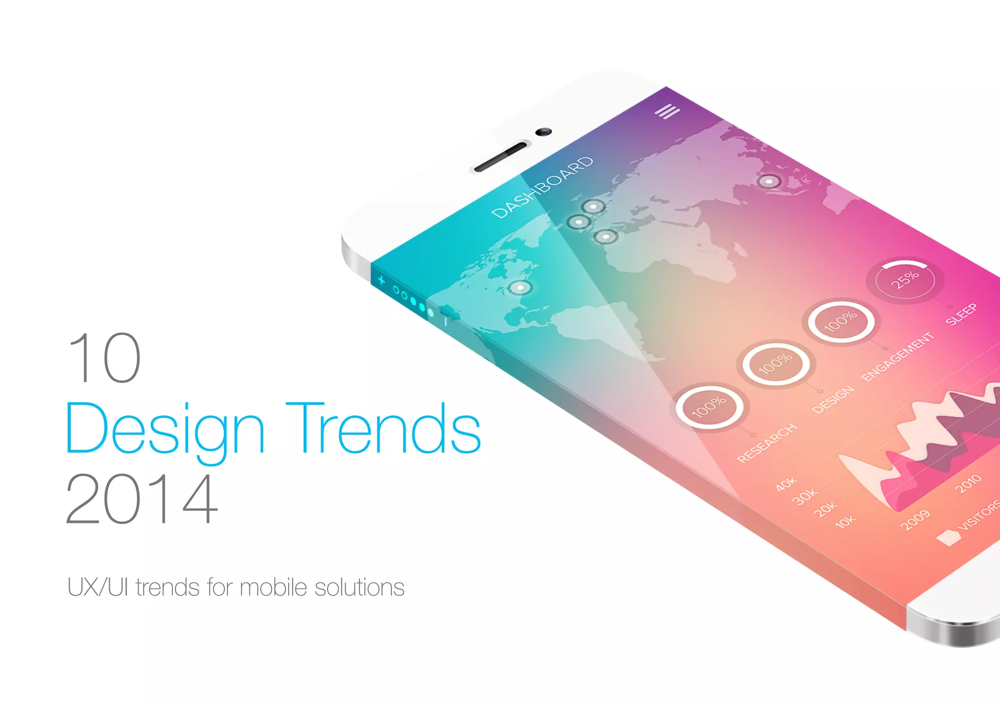
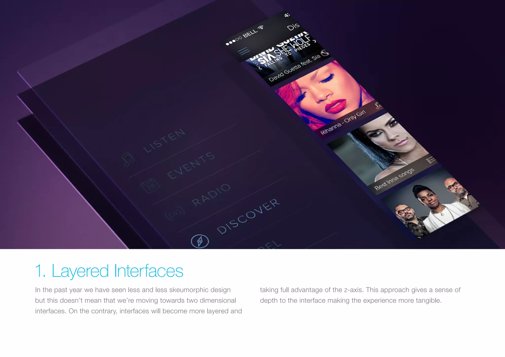
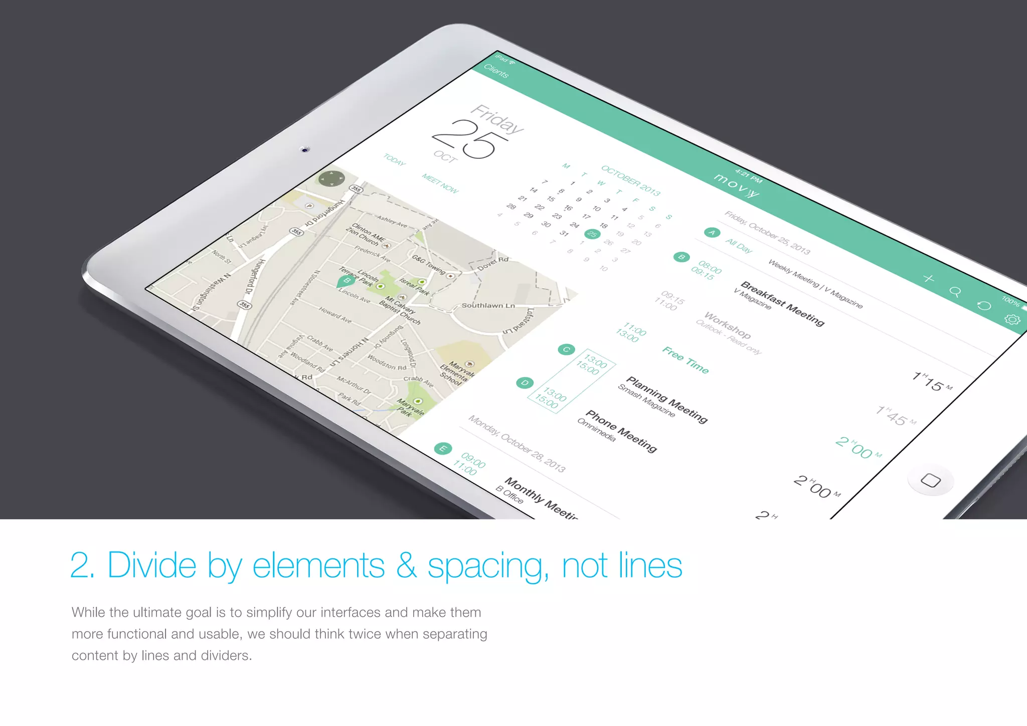
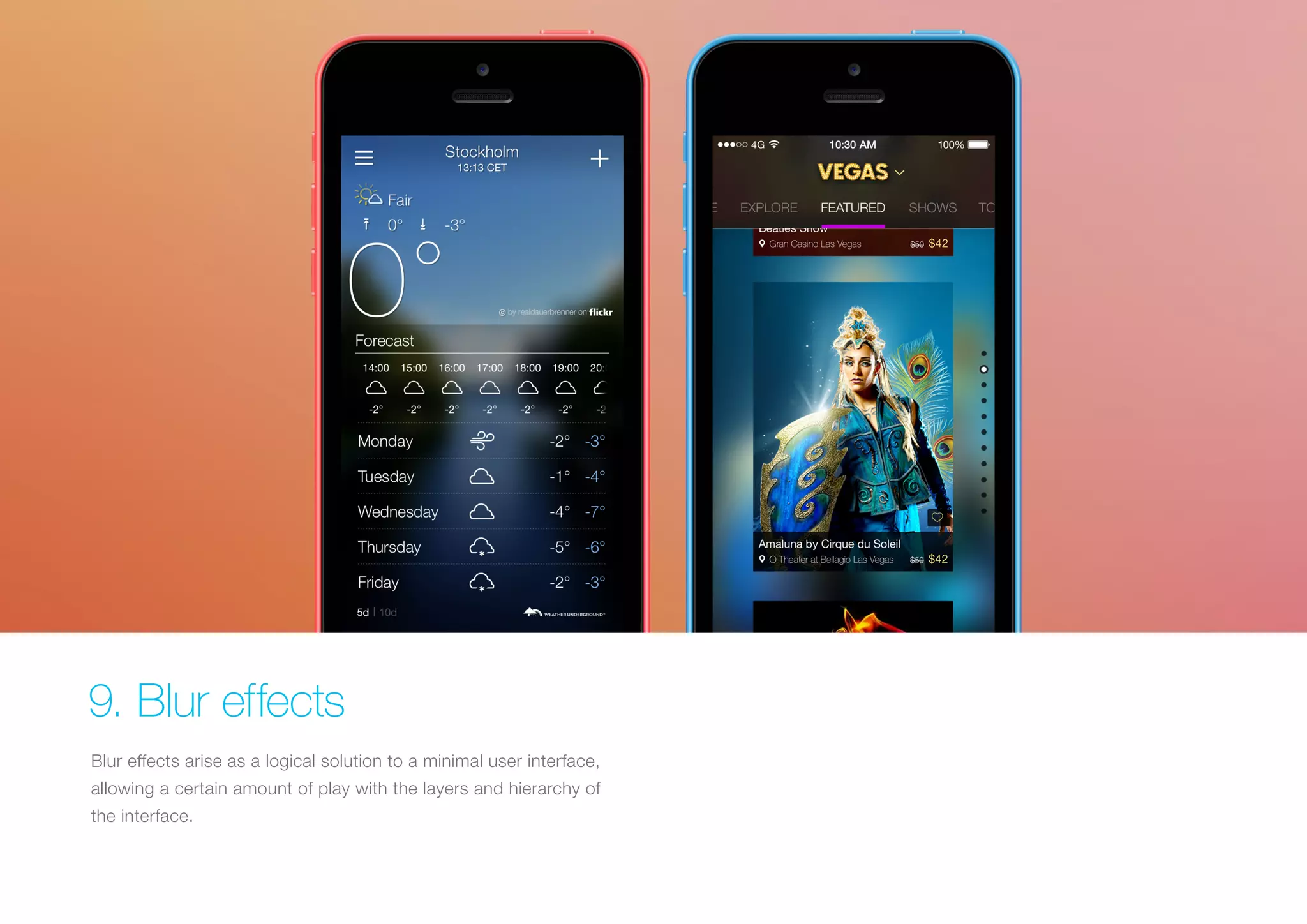
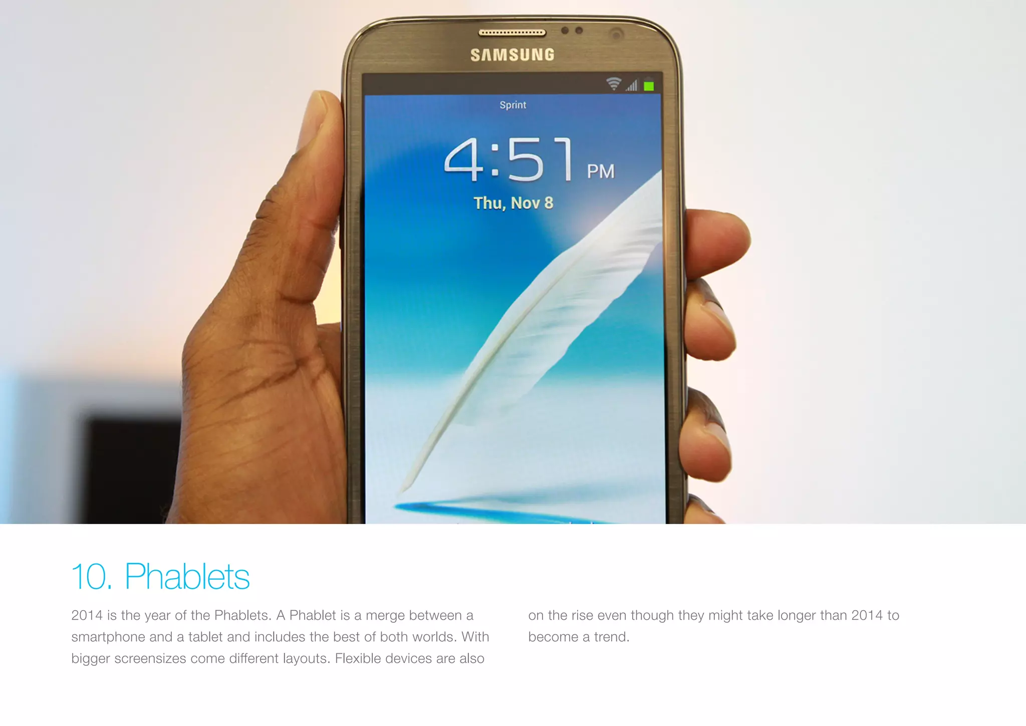


The document outlines ten key design trends for mobile UX/UI in 2014, emphasizing the shift towards layered interfaces, thumb-focused interactions, and the use of simpler color schemes. It highlights the importance of gestures and animations, while advocating for a consistent typeface and effective use of blur effects. Additionally, it notes the rise of phablets and the need for responsive design to accommodate larger screens.


![AnyTrans for iOS 8.9.14.20251127 With Crack for MacOS [Latest] pptx](https://cdn.slidesharecdn.com/ss_thumbnails/softwareoverview-251207190907-2316965f-thumbnail.jpg?width=640&height=640&fit=bounds)
![iStat Menus 7.20 Crack for MacOS 2026 Full Version [Latest] pptx](https://cdn.slidesharecdn.com/ss_thumbnails/softwareoverview-251207191544-22b737dc-thumbnail.jpg?width=640&height=640&fit=bounds)


![Moho Pro 14.4 Crack for MacOS Works Until 2050 [Latest] pptx](https://cdn.slidesharecdn.com/ss_thumbnails/softwareoverview-251207192639-797289c4-thumbnail.jpg?width=640&height=640&fit=bounds)


