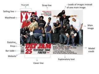
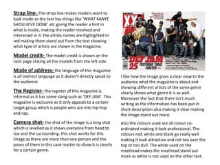
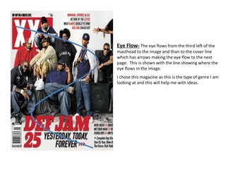
This magazine cover analysis discusses the design elements of a music magazine called "XXL". Key elements discussed include the masthead using a catchy but partially obscured title, a main cover image featuring multiple artists to indicate the genre, and short descriptive text phrases in bold fonts that clearly convey the magazine's focus on hip hop music. Overall the cover utilizes simple layout, bold colors and fonts, and visual cues to eye flow to effectively communicate its brand and contents to the target audience.