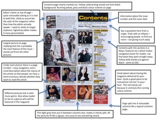
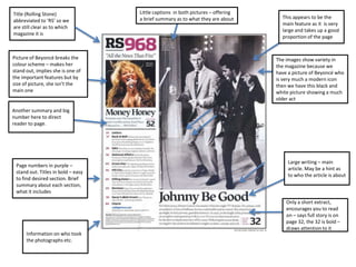
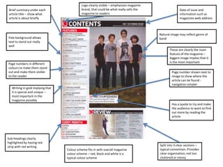
Contents page clearly marked out. Yellow, bold writing stands out from black
                                           background. Running yellow, grey and black colour scheme on page

Editor’s letter at top of page –
quite noticeable seeing as it is next                                                                                   Information about the issue
to bold title. Likely to sound like                                                                                     number and the cover date
the style of the magazine rather
than how the editor actually
speaks – need to relate to target
audience. Signed by editor makes                                                                                          See a quotation here from a
it more personalised                                                                                                      singer. Ends with an ellipses –
                                                                                                                          encouraging people to find out
                                                                                                                          more – not giving much away
Largest picture on page
implying that this is probably
the main feature of this issue –                                                                                      Contents split into sections (i.e.
stands out from the other                                                                                             News, Features etc.) which makes
pictures                                                                                                              navigation easier for reader, can
                                                                                                                      find what they want straight away.
                                                                                                                      Yellow bold stands out against
                                                                                                                      black – same as title
Under each picture there is a page
number – easy navigation, and a
small description about the nature of
the article so that people can have a                                                                                Small advert about having the
short summary, decide whether they                                                                                   magazine delivered to your
want to read the article                                                                                             door. Quite a good place to be
                                                                                                                     noticed but not too ‘in-your-
                                                                                                                     face’. The red stands out
                                                                                                                     because it contrasts the running
                                                                                                                     colour scheme
 Different pictures link in with
 music genre. Also allow reader
 to see at a glance who will be
 featured in the magazine
                                                                                                                           Page split into 3 noticeable
                                                                                                                           columns like a typical contents
                                                                                                                           page.
                                    Thin light grey lines put in between columns also, makes it clearly split. All
                                    the pictures fit like a jigsaw, very easy to see everything clearly
Title (Rolling Stone)               Little captions in both pictures – offering
                                    a brief summary as to what they are about       This appears to be the
abbreviated to ‘RS’ so we
                                                                                    main feature as it is very
are still clear as to which
                                                                                    large and takes up a good
magazine it is
                                                                                    proportion of the page


Picture of Beyoncé breaks the                                                     The images show variety in
colour scheme – makes her                                                         the magazine because we
stand out, implies she is one of                                                  have a picture of Beyoncé who
the important features but by                                                     is very much a modern icon
size of picture, she isn’t the                                                    then we have this black and
main one                                                                          white picture showing a much
                                                                                  older act

Another summary and big
number here to direct
reader to page.


                                                                                       Large writing – main
 Page numbers in purple –
                                                                                       article. May be a hint as
 stand out. Titles in bold – easy
                                                                                       to who the article is about
 to find desired section. Brief
 summary about each section,
 what it includes
                                                                                      Only a short extract,
                                                                                      encourages you to read
                                                                                      on – says full story is on
                                                                                      page 32, the 32 is bold –
                                                                                      draws attention to it
      Information on who took
      the photographs etc.
Logo clearly visible – emphasizes magazine
 Brief summary under each                    brand, that could be what really sells the                 Date of issue and
 article title – show what                   magazine to readers                                        information such as
 article is about briefly                                                                               magazines web address


                                                                                          Natural image may reflect genre of
Pale background allows                                                                    band
text to stand out really
well
                                                                                                 These are clearly the main
                                                                                                 feature of the magazine –
                                                                                                 biggest image implies that it
Page numbers in different                                                                        is the most important
colours to make them stand
out and make them visible                                                                         Page number shown next to
to the reader                                                                                     image to show where the
                                                                                                  article can be found -
                                                                                                  navigation simpler
   Writing in gold implying that
   it is special and unique –
   most important in the
   magazine possibly
                                                                                                  Has a quote to try and make
                                                                                                  the audience to want to find
                                                                                                  out more by reading the
                                                                                                  article


Sub-headings clearly
highlighted by having red
strip with red writing                                                                    Split into 3 clear sections –
                                   Colour scheme fits in with overall magazine            typical convention. Provides
                                   colour scheme – red, black and white is a              clear organisation, not too
                                   typical colour scheme                                  cluttered or messy

Contents page analysis

  • 1.
    Contents page clearlymarked out. Yellow, bold writing stands out from black background. Running yellow, grey and black colour scheme on page Editor’s letter at top of page – quite noticeable seeing as it is next Information about the issue to bold title. Likely to sound like number and the cover date the style of the magazine rather than how the editor actually speaks – need to relate to target audience. Signed by editor makes See a quotation here from a it more personalised singer. Ends with an ellipses – encouraging people to find out more – not giving much away Largest picture on page implying that this is probably the main feature of this issue – Contents split into sections (i.e. stands out from the other News, Features etc.) which makes pictures navigation easier for reader, can find what they want straight away. Yellow bold stands out against black – same as title Under each picture there is a page number – easy navigation, and a small description about the nature of the article so that people can have a Small advert about having the short summary, decide whether they magazine delivered to your want to read the article door. Quite a good place to be noticed but not too ‘in-your- face’. The red stands out because it contrasts the running colour scheme Different pictures link in with music genre. Also allow reader to see at a glance who will be featured in the magazine Page split into 3 noticeable columns like a typical contents page. Thin light grey lines put in between columns also, makes it clearly split. All the pictures fit like a jigsaw, very easy to see everything clearly
  • 2.
    Title (Rolling Stone) Little captions in both pictures – offering a brief summary as to what they are about This appears to be the abbreviated to ‘RS’ so we main feature as it is very are still clear as to which large and takes up a good magazine it is proportion of the page Picture of Beyoncé breaks the The images show variety in colour scheme – makes her the magazine because we stand out, implies she is one of have a picture of Beyoncé who the important features but by is very much a modern icon size of picture, she isn’t the then we have this black and main one white picture showing a much older act Another summary and big number here to direct reader to page. Large writing – main Page numbers in purple – article. May be a hint as stand out. Titles in bold – easy to who the article is about to find desired section. Brief summary about each section, what it includes Only a short extract, encourages you to read on – says full story is on page 32, the 32 is bold – draws attention to it Information on who took the photographs etc.
  • 3.
    Logo clearly visible– emphasizes magazine Brief summary under each brand, that could be what really sells the Date of issue and article title – show what magazine to readers information such as article is about briefly magazines web address Natural image may reflect genre of Pale background allows band text to stand out really well These are clearly the main feature of the magazine – biggest image implies that it Page numbers in different is the most important colours to make them stand out and make them visible Page number shown next to to the reader image to show where the article can be found - navigation simpler Writing in gold implying that it is special and unique – most important in the magazine possibly Has a quote to try and make the audience to want to find out more by reading the article Sub-headings clearly highlighted by having red strip with red writing Split into 3 clear sections – Colour scheme fits in with overall magazine typical convention. Provides colour scheme – red, black and white is a clear organisation, not too typical colour scheme cluttered or messy