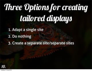
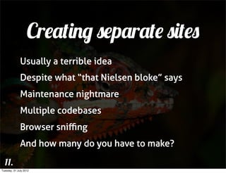
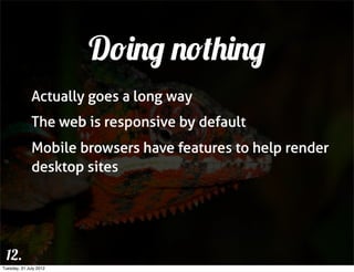
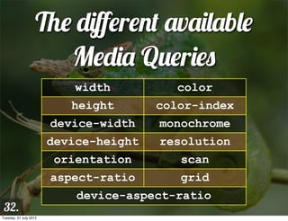
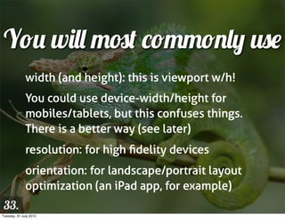
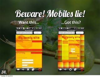
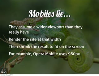
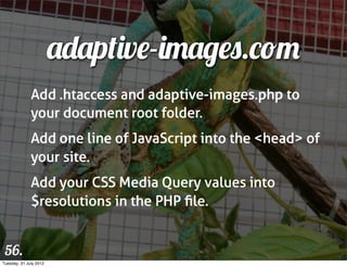
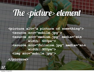
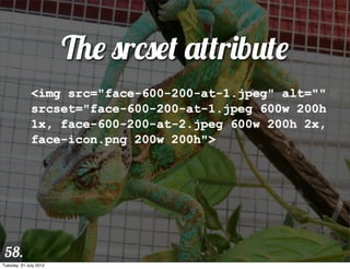
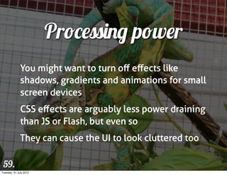
Adapt!
                        MEDIA QUERIES AND VIEWPORT
  1.
Tuesday, 31 July 2012
Hi — I’m Chris Mills!
              Open standards advocate and Education agitator
              dev.opera.com editor
              W3C web education community group chair
              Accessibility whiner
              HTML5/CSS3 wrangler
              Heavy metal drummer and proud dad


 2.
Tuesday, 31 July 2012
3.
Tuesday, 31 July 2012
Useful Stuff
              dev.opera.com
              slideshare.net/chrisdavidmills
              cmills@opera.com
              @chrisdavidmills


 4.
Tuesday, 31 July 2012
Context For
 5.
           Adaptive Design
Tuesday, 31 July 2012
Adaptive
              “Able to be easily modified to suit a new
              purpose or situation”


 6.
Tuesday, 31 July 2012
Responsive
              “Reacting quickly and positively.”


 7.
Tuesday, 31 July 2012
RWD/AWD
              “Designing sites that will dynamically adapt
              their layout, graphics and other features to suit
              different browsers and devices.”


              Responsive design? Adaptive design? It
              matters not which term you use.


 8.
Tuesday, 31 July 2012
Responsive Web
                        Design is Hot!!


 9.
Tuesday, 31 July 2012
Three Options for creating
          tailored displays
              1. Adapt a single site
              2. Do nothing
              3. Create a separate site/separate sites


 10.
Tuesday, 31 July 2012
Creating separate sites
              Usually a terrible idea
              Despite what “that Nielsen bloke” says
              Maintenance nightmare
              Multiple codebases
              Browser sniffing
              And how many do you have to make?

  11.
Tuesday, 31 July 2012
Doing nothing
              Actually goes a long way
              The web is responsive by default
              Mobile browsers have features to help render
              desktop sites


 12.
Tuesday, 31 July 2012
Adapt a single site
              By far the best option, usually
              Let’s see how!


 13.
Tuesday, 31 July 2012
Adaptive

                        technologies
  14.
Tuesday, 31 July 2012
Adaptive Bread
                          and Butter
              Liquid layouts
              Media types
              Media queries
              Viewport
              Adaptive images

 15.
Tuesday, 31 July 2012
Media Types
              The idea of adaptive design isn’t new
              Media types have been around since CSS2


                        media="screen"
                        media="print"


 16.
Tuesday, 31 July 2012
Media Types
                        media="handheld"
                        media="tv"


 17.
Tuesday, 31 July 2012
Small TV Rant
              “Searching, browsing, updating and
              buffering are not TV-like. In fact an enormous
              number of people found that the technology
              they had purchased wasn't what they
              expected at all, that they were bringing the
              worst parts of using a computer into the
              television environment.”
                   -- www.insideci.co.uk/news/rovi-research-reveals-
 18.                                 changing-consumer-habits.aspx
Tuesday, 31 July 2012
19.
Tuesday, 31 July 2012
Media Types Failed
              Because they make too many assumptions
              And don’t give enough control
              Devs used “handheld” to serve crap dumbed
              down experiences to mobile
              “handheld”, “tv” and “projection” are really
              just “screen”


 20.
Tuesday, 31 July 2012
Media Queries &
 21.
            Viewport
Tuesday, 31 July 2012
Media Queries
              ...succeed where media types failed, mostly
              www.w3.org/TR/css3-mediaqueries/
              Build on top of media types
              Allow more granular control of style
              application
              See mediaqueri.es for tonnes of examples

 22.
Tuesday, 31 July 2012
Basic Media Query
              media="screen and (max-width: 480px)"


              @media screen and (max-width: 480px) {
                        /* Insert rules for
                           narrow screens here */
              }


 23.
Tuesday, 31 July 2012
24.
Tuesday, 31 July 2012
Adding extra conditions
              @media screen and (min-width: 480px) and
              (max-width: 1024px) {
                        /* Rules to be applied between
                           480 and 1024 pixels */
              }


 25.
Tuesday, 31 July 2012
Multiple right answers
              @media screen and (max-width: 1024px),
                     print and (max-width: 21cm) {
                        /* Rules to be applied if either of
                           the two queries are true */
              }


 26.
Tuesday, 31 July 2012
Media Query negation
              @media not screen and (max-width: 480px)
              {
                        /* Rules to be applied when the
                           screen is NOT narrow */
              }


 27.
Tuesday, 31 July 2012
Exclusive Queries
              @media only screen and (max-width:
              480px) {
                        /* An exclusive set of rules,
                           ONLY for narrow screens */
              }


 28.
Tuesday, 31 July 2012
Typical stylesheet
              /* Default styles here */
              @media screen and (min-width: 1400px) {}
              @media screen and (max-width: 800px) {}
              @media screen and (max-width: 480px) {}
              @media screen and (max-width: 320px) {}


 29.
Tuesday, 31 July 2012
Breakpoints
              Where do you need to change your styles?
              Device breakpoint: change styles for specific
              target device screen sizes
              Content breakpoint: changes styles at the
              point where your layout actually breaks


 30.
Tuesday, 31 July 2012
Which way do you do it?
              For a general web site, content breakpoints
              For a platform-targetted app, device
              breakpoints
              More realistically, you’ll do a combination, eg
              fluid width for wide screens, a fixed width
              and height for iPad portrait/landscape, and a
              fluid width for smartphones and other
              devices.
 31.
Tuesday, 31 July 2012
The different available
                       Media Queries
                            width          color
                           height       color-index
                        device-width    monochrome
                        device-height   resolution
                         orientation       scan
                        aspect-ratio       grid
                            device-aspect-ratio
 32.
Tuesday, 31 July 2012
You will most commonly use
              width (and height): this is viewport w/h!
              You could use device-width/height for
              mobiles/tablets, but this confuses things.
              There is a better way (see later)
              resolution: for high fidelity devices
              orientation: for landscape/portrait layout
              optimization (an iPad app, for example)
 33.
Tuesday, 31 July 2012
Beware! Mobiles lie!
                        Want this...   ...Got this?


 34.
Tuesday, 31 July 2012
Mobiles lie...
              They assume a wider viewport than they
              really have
              Render the site at that width
              Then shrink the result to fit on the screen
              For example, Opera Mobile uses 980px


 35.
Tuesday, 31 July 2012
Viewport
              Invented by Apple
              A meta tag
              Suggests initial viewport, zoom, and
              resolution


 36.
Tuesday, 31 July 2012
Viewport example
              <meta name="viewport"
              content="width=device-width">


 37.
Tuesday, 31 July 2012
Much better!


 38.
Tuesday, 31 July 2012
Another common use
              <meta name="viewport"
              content="width=550">


 39.
Tuesday, 31 July 2012
40.
Tuesday, 31 July 2012
Different available
                         Viewport options
                           width         height

                        minimum-scale maximum-scale

                        initial-scale user-scalable

                             target-densitydpi


 41.
Tuesday, 31 July 2012
CSS Device Adaptation
              Viewport = more of a style thing than a
              content thing
              Provides @viewport at-rule to contain
              viewport info
              Supported in Opera and IE10, with prefixes
              dev.opera.com/articles/view/an-introduction-
              to-meta-viewport-and-viewport
 42.
Tuesday, 31 July 2012
CSS Device Adaptation
              <meta name="viewport"
                        content="width=550,
                        maximum-scale=1.0,
                        target-densitydpi=device-dpi">


              @viewport { width: 550px; max-zoom: 1;
                          resolution: device; }

 43.
Tuesday, 31 July 2012
Other Responsive
  Web Design Issues

 44.
Tuesday, 31 July 2012
What else have we got to
              worry about?
              Responsive replaced elements
              Bandwidth/loading of resources
              Resolution
              Processing power
              Control mechanisms

 45.
Tuesday, 31 July 2012
Replaced elements


 46.
Tuesday, 31 July 2012
Replaced elements
              #related img {
                        display: block;
                        margin: 0 auto;
                        max-width: 100%;
              }


 47.
Tuesday, 31 July 2012
Be warned
              Old IE versions don’t support max-width, so
              you’ll have to fallback to width: 100%
              instead.


 48.
Tuesday, 31 July 2012
File size also important
              Users on slow connections won’t want to
              download huge media files.
              We need to try to serve them smaller files/
              alternatives.
              Assumptions: e.g. narrow equals mobile
              equals slow connection


 49.
Tuesday, 31 July 2012
CSS resources easy
                           to deal with
              Use “mobile first”
              Load smaller resources by default, and larger
              ones inside MQs
              Saves narrow screen devices from loading
              wide screen resources


 50.
Tuesday, 31 July 2012
“Mobile first” stylesheet
              /* Default styles here */
              @media screen and (min-width: 320px) {}
              @media screen and (min-width: 480px) {}
              @media screen and (min-width: 800px) {}
              @media screen and (min-width: 1400px) {}


 51.
Tuesday, 31 July 2012
“Mobile first” example
              header { background: url(small-
              image.png); }


              @media screen and (min-width: 480px) {
                header { background: url(large-
              image.png); }
              }


 52.
Tuesday, 31 July 2012
“Mobile first” problems
              IE 6-8 left with mobile layout, as they don’t
              support media queries
              You’ll need to polyfill media queries, e.g. with
              respond.js


 53.
Tuesday, 31 July 2012
HTML5 <video> well served
                  <source src="crystal320.webm"
              type="video/webm" media="all and (max-
              width: 480px)">
                  <source src="crystal720.webm"
              type="video/webm" media="all and (min-
              width: 481px)">


 54.
Tuesday, 31 July 2012
<img> not so lucky
              http://dev.opera.com/articles/view/
              responsive-images-problem/
              None work perfectly
              Pre-fetch is a bitch


 55.
Tuesday, 31 July 2012
adaptive-images.com
              Add .htaccess and adaptive-images.php to
              your document root folder.
              Add one line of JavaScript into the <head> of
              your site.
              Add your CSS Media Query values into
              $resolutions in the PHP file.


 56.
Tuesday, 31 July 2012
The <picture> element
              <picture alt="a picture of something">
                <source src="mobile.jpg">
                <source src="medium.jpg" media="min
                        width: 600px">
                <source src="fullsize.jpg" media="min
                        width: 900px">
                <img src="mobile.jpg">
              </picture>

 57.
Tuesday, 31 July 2012
The srcset attribute
              <img src="face-600-200-at-1.jpeg" alt=""
              srcset="face-600-200-at-1.jpeg 600w 200h
              1x, face-600-200-at-2.jpeg 600w 200h 2x,
              face-icon.png 200w 200h">


 58.
Tuesday, 31 July 2012
Processing power
              You might want to turn off effects like
              shadows, gradients and animations for small
              screen devices
              CSS effects are arguably less power draining
              than JS or Flash, but even so
              They can cause the UI to look cluttered too

 59.
Tuesday, 31 July 2012
Resolution
              Hi-fidelity devices are causing an issue, e.g.
              iPhone 4s is 960 x 640 pixels at 326ppi
              These devices lie twice
              One CSS pixel = multiple device pixels
              Images can start to look pixellated


 60.
Tuesday, 31 July 2012
Solutions
              <img src="500px_image.jpg" width="250">


 61.
Tuesday, 31 July 2012
Solutions
              @media screen and (-o-min-device-pixel-
              ratio: 3/2) {
                        body { background-size: 250px; }
              }
              @media screen and (-webkit-min-device-
              pixel-ratio: 1.5) {
                        body { background-size: 250px; }
              }
 62.
Tuesday, 31 July 2012
63.
Tuesday, 31 July 2012
Soon to be replaced by
              @media screen and (resolution: 1.5dppx)
              {
                        body { background-size: 250px; }
              }


 64.
Tuesday, 31 July 2012
Tell the truth with viewport
              <meta name="viewport"
                        content="width=device-width,
                        target-densitydpi=device-dpi">


 65.
Tuesday, 31 July 2012
All good, but...
              Images may now start to look a little small
              You could serve larger images for devices
              with higher resolutions


 66.
Tuesday, 31 July 2012
Control mechanisms
              Currently tricky
              Usual wisdom about web sites applies: Make
              pages keyboard accessible, etc.
              Can’t be detected in CSS (yet)
              JavaScript touch detection is an option:
              Modernizr, jQuery


 67.
Tuesday, 31 July 2012
“Subtle” advertisment
                 Buy my book
 68.
Tuesday, 31 July 2012
dev.opera.com | cmills@opera.com | @chrisdavidmills


              Thanks!
 69.
Tuesday, 31 July 2012

Adapt! Media queries and viewport

  • 1.
    Adapt! MEDIA QUERIES AND VIEWPORT 1. Tuesday, 31 July 2012
  • 2.
    Hi — I’mChris Mills! Open standards advocate and Education agitator dev.opera.com editor W3C web education community group chair Accessibility whiner HTML5/CSS3 wrangler Heavy metal drummer and proud dad 2. Tuesday, 31 July 2012
  • 3.
  • 4.
    Useful Stuff dev.opera.com slideshare.net/chrisdavidmills cmills@opera.com @chrisdavidmills 4. Tuesday, 31 July 2012
  • 5.
    Context For 5. Adaptive Design Tuesday, 31 July 2012
  • 6.
    Adaptive “Able to be easily modified to suit a new purpose or situation” 6. Tuesday, 31 July 2012
  • 7.
    Responsive “Reacting quickly and positively.” 7. Tuesday, 31 July 2012
  • 8.
    RWD/AWD “Designing sites that will dynamically adapt their layout, graphics and other features to suit different browsers and devices.” Responsive design? Adaptive design? It matters not which term you use. 8. Tuesday, 31 July 2012
  • 9.
    Responsive Web Design is Hot!! 9. Tuesday, 31 July 2012
  • 10.
    Three Options forcreating tailored displays 1. Adapt a single site 2. Do nothing 3. Create a separate site/separate sites 10. Tuesday, 31 July 2012
  • 11.
    Creating separate sites Usually a terrible idea Despite what “that Nielsen bloke” says Maintenance nightmare Multiple codebases Browser sniffing And how many do you have to make? 11. Tuesday, 31 July 2012
  • 12.
    Doing nothing Actually goes a long way The web is responsive by default Mobile browsers have features to help render desktop sites 12. Tuesday, 31 July 2012
  • 13.
    Adapt a singlesite By far the best option, usually Let’s see how! 13. Tuesday, 31 July 2012
  • 14.
    Adaptive technologies 14. Tuesday, 31 July 2012
  • 15.
    Adaptive Bread and Butter Liquid layouts Media types Media queries Viewport Adaptive images 15. Tuesday, 31 July 2012
  • 16.
    Media Types The idea of adaptive design isn’t new Media types have been around since CSS2 media="screen" media="print" 16. Tuesday, 31 July 2012
  • 17.
    Media Types media="handheld" media="tv" 17. Tuesday, 31 July 2012
  • 18.
    Small TV Rant “Searching, browsing, updating and buffering are not TV-like. In fact an enormous number of people found that the technology they had purchased wasn't what they expected at all, that they were bringing the worst parts of using a computer into the television environment.” -- www.insideci.co.uk/news/rovi-research-reveals- 18. changing-consumer-habits.aspx Tuesday, 31 July 2012
  • 19.
  • 20.
    Media Types Failed Because they make too many assumptions And don’t give enough control Devs used “handheld” to serve crap dumbed down experiences to mobile “handheld”, “tv” and “projection” are really just “screen” 20. Tuesday, 31 July 2012
  • 21.
    Media Queries & 21. Viewport Tuesday, 31 July 2012
  • 22.
    Media Queries ...succeed where media types failed, mostly www.w3.org/TR/css3-mediaqueries/ Build on top of media types Allow more granular control of style application See mediaqueri.es for tonnes of examples 22. Tuesday, 31 July 2012
  • 23.
    Basic Media Query media="screen and (max-width: 480px)" @media screen and (max-width: 480px) { /* Insert rules for narrow screens here */ } 23. Tuesday, 31 July 2012
  • 24.
  • 25.
    Adding extra conditions @media screen and (min-width: 480px) and (max-width: 1024px) { /* Rules to be applied between 480 and 1024 pixels */ } 25. Tuesday, 31 July 2012
  • 26.
    Multiple right answers @media screen and (max-width: 1024px), print and (max-width: 21cm) { /* Rules to be applied if either of the two queries are true */ } 26. Tuesday, 31 July 2012
  • 27.
    Media Query negation @media not screen and (max-width: 480px) { /* Rules to be applied when the screen is NOT narrow */ } 27. Tuesday, 31 July 2012
  • 28.
    Exclusive Queries @media only screen and (max-width: 480px) { /* An exclusive set of rules, ONLY for narrow screens */ } 28. Tuesday, 31 July 2012
  • 29.
    Typical stylesheet /* Default styles here */ @media screen and (min-width: 1400px) {} @media screen and (max-width: 800px) {} @media screen and (max-width: 480px) {} @media screen and (max-width: 320px) {} 29. Tuesday, 31 July 2012
  • 30.
    Breakpoints Where do you need to change your styles? Device breakpoint: change styles for specific target device screen sizes Content breakpoint: changes styles at the point where your layout actually breaks 30. Tuesday, 31 July 2012
  • 31.
    Which way doyou do it? For a general web site, content breakpoints For a platform-targetted app, device breakpoints More realistically, you’ll do a combination, eg fluid width for wide screens, a fixed width and height for iPad portrait/landscape, and a fluid width for smartphones and other devices. 31. Tuesday, 31 July 2012
  • 32.
    The different available Media Queries width color height color-index device-width monochrome device-height resolution orientation scan aspect-ratio grid device-aspect-ratio 32. Tuesday, 31 July 2012
  • 33.
    You will mostcommonly use width (and height): this is viewport w/h! You could use device-width/height for mobiles/tablets, but this confuses things. There is a better way (see later) resolution: for high fidelity devices orientation: for landscape/portrait layout optimization (an iPad app, for example) 33. Tuesday, 31 July 2012
  • 34.
    Beware! Mobiles lie! Want this... ...Got this? 34. Tuesday, 31 July 2012
  • 35.
    Mobiles lie... They assume a wider viewport than they really have Render the site at that width Then shrink the result to fit on the screen For example, Opera Mobile uses 980px 35. Tuesday, 31 July 2012
  • 36.
    Viewport Invented by Apple A meta tag Suggests initial viewport, zoom, and resolution 36. Tuesday, 31 July 2012
  • 37.
    Viewport example <meta name="viewport" content="width=device-width"> 37. Tuesday, 31 July 2012
  • 38.
  • 39.
    Another common use <meta name="viewport" content="width=550"> 39. Tuesday, 31 July 2012
  • 40.
  • 41.
    Different available Viewport options width height minimum-scale maximum-scale initial-scale user-scalable target-densitydpi 41. Tuesday, 31 July 2012
  • 42.
    CSS Device Adaptation Viewport = more of a style thing than a content thing Provides @viewport at-rule to contain viewport info Supported in Opera and IE10, with prefixes dev.opera.com/articles/view/an-introduction- to-meta-viewport-and-viewport 42. Tuesday, 31 July 2012
  • 43.
    CSS Device Adaptation <meta name="viewport" content="width=550, maximum-scale=1.0, target-densitydpi=device-dpi"> @viewport { width: 550px; max-zoom: 1; resolution: device; } 43. Tuesday, 31 July 2012
  • 44.
    Other Responsive Web Design Issues 44. Tuesday, 31 July 2012
  • 45.
    What else havewe got to worry about? Responsive replaced elements Bandwidth/loading of resources Resolution Processing power Control mechanisms 45. Tuesday, 31 July 2012
  • 46.
  • 47.
    Replaced elements #related img { display: block; margin: 0 auto; max-width: 100%; } 47. Tuesday, 31 July 2012
  • 48.
    Be warned Old IE versions don’t support max-width, so you’ll have to fallback to width: 100% instead. 48. Tuesday, 31 July 2012
  • 49.
    File size alsoimportant Users on slow connections won’t want to download huge media files. We need to try to serve them smaller files/ alternatives. Assumptions: e.g. narrow equals mobile equals slow connection 49. Tuesday, 31 July 2012
  • 50.
    CSS resources easy to deal with Use “mobile first” Load smaller resources by default, and larger ones inside MQs Saves narrow screen devices from loading wide screen resources 50. Tuesday, 31 July 2012
  • 51.
    “Mobile first” stylesheet /* Default styles here */ @media screen and (min-width: 320px) {} @media screen and (min-width: 480px) {} @media screen and (min-width: 800px) {} @media screen and (min-width: 1400px) {} 51. Tuesday, 31 July 2012
  • 52.
    “Mobile first” example header { background: url(small- image.png); } @media screen and (min-width: 480px) { header { background: url(large- image.png); } } 52. Tuesday, 31 July 2012
  • 53.
    “Mobile first” problems IE 6-8 left with mobile layout, as they don’t support media queries You’ll need to polyfill media queries, e.g. with respond.js 53. Tuesday, 31 July 2012
  • 54.
    HTML5 <video> wellserved <source src="crystal320.webm" type="video/webm" media="all and (max- width: 480px)"> <source src="crystal720.webm" type="video/webm" media="all and (min- width: 481px)"> 54. Tuesday, 31 July 2012
  • 55.
    <img> not solucky http://dev.opera.com/articles/view/ responsive-images-problem/ None work perfectly Pre-fetch is a bitch 55. Tuesday, 31 July 2012
  • 56.
    adaptive-images.com Add .htaccess and adaptive-images.php to your document root folder. Add one line of JavaScript into the <head> of your site. Add your CSS Media Query values into $resolutions in the PHP file. 56. Tuesday, 31 July 2012
  • 57.
    The <picture> element <picture alt="a picture of something"> <source src="mobile.jpg"> <source src="medium.jpg" media="min width: 600px"> <source src="fullsize.jpg" media="min width: 900px"> <img src="mobile.jpg"> </picture> 57. Tuesday, 31 July 2012
  • 58.
    The srcset attribute <img src="face-600-200-at-1.jpeg" alt="" srcset="face-600-200-at-1.jpeg 600w 200h 1x, face-600-200-at-2.jpeg 600w 200h 2x, face-icon.png 200w 200h"> 58. Tuesday, 31 July 2012
  • 59.
    Processing power You might want to turn off effects like shadows, gradients and animations for small screen devices CSS effects are arguably less power draining than JS or Flash, but even so They can cause the UI to look cluttered too 59. Tuesday, 31 July 2012
  • 60.
    Resolution Hi-fidelity devices are causing an issue, e.g. iPhone 4s is 960 x 640 pixels at 326ppi These devices lie twice One CSS pixel = multiple device pixels Images can start to look pixellated 60. Tuesday, 31 July 2012
  • 61.
    Solutions <img src="500px_image.jpg" width="250"> 61. Tuesday, 31 July 2012
  • 62.
    Solutions @media screen and (-o-min-device-pixel- ratio: 3/2) { body { background-size: 250px; } } @media screen and (-webkit-min-device- pixel-ratio: 1.5) { body { background-size: 250px; } } 62. Tuesday, 31 July 2012
  • 63.
  • 64.
    Soon to bereplaced by @media screen and (resolution: 1.5dppx) { body { background-size: 250px; } } 64. Tuesday, 31 July 2012
  • 65.
    Tell the truthwith viewport <meta name="viewport" content="width=device-width, target-densitydpi=device-dpi"> 65. Tuesday, 31 July 2012
  • 66.
    All good, but... Images may now start to look a little small You could serve larger images for devices with higher resolutions 66. Tuesday, 31 July 2012
  • 67.
    Control mechanisms Currently tricky Usual wisdom about web sites applies: Make pages keyboard accessible, etc. Can’t be detected in CSS (yet) JavaScript touch detection is an option: Modernizr, jQuery 67. Tuesday, 31 July 2012
  • 68.
    “Subtle” advertisment Buy my book 68. Tuesday, 31 July 2012
  • 69.
    dev.opera.com | cmills@opera.com| @chrisdavidmills Thanks! 69. Tuesday, 31 July 2012