Download to read offline


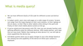
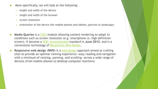
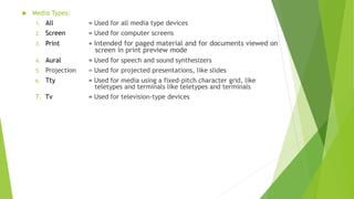
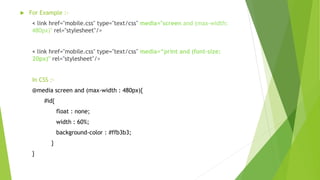


Media queries allow different CSS styles to be applied based on screen size and device capabilities. They enable responsive web design, where content adapts to different devices like smartphones, tablets, laptops and desktops. Media queries examine properties like width, height, resolution and orientation and apply CSS rules if the media type or feature matches. They became a W3C standard in 2012 and are a key part of building websites that provide optimal viewing on various screens.