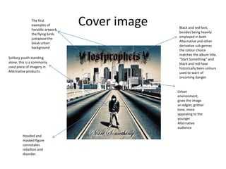
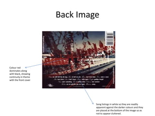
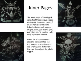
Analysis of “Start Something”
Digipak
Kristian Harrison
The first
examples of
heraldic artwork,
the flying birds
juxtapose the
bleak urban
background
Solitary youth standing
alone, this is a commonly
used piece of imagery in
Alternative products.

Cover image

Black and red font,
besides being heavily
employed in both
Alternative and other
derivative sub genres
the colour choice
matches the album title,
“Start Something” and
black and red have
historically been colours
used to warn of
oncoming danger.

Urban
environment,
gives the image
an edgier, grittier
tone, more
appealing to the
younger
Alternative
audience
Hooded and
masked figure
connotates
rebellion and
disorder.
Back Image

Colour red
dominates along
with black, showing
continuity in theme
with the front cover

Song listings in white so they are readily
apparent against the darker colours and they
are placed at the bottom of the image so as
not to appear cluttered.
Inner Pages
The inner pages of the digipak
consists of these unique pieces
of artwork. They are a blend of
classic heraldic symbolism
hybridized with such modern
images, skulls, gas masks, guns,
graffiti art etc. To create a truly
unique piece of artwork.
I am a fan of both styles of
artwork, however I feel that
this imagery is so unique and
eye catching that it should be
featured throughout the whole
digipak.

Analysis of

  • 1.
    Analysis of “StartSomething” Digipak Kristian Harrison
  • 2.
    The first examples of heraldicartwork, the flying birds juxtapose the bleak urban background Solitary youth standing alone, this is a commonly used piece of imagery in Alternative products. Cover image Black and red font, besides being heavily employed in both Alternative and other derivative sub genres the colour choice matches the album title, “Start Something” and black and red have historically been colours used to warn of oncoming danger. Urban environment, gives the image an edgier, grittier tone, more appealing to the younger Alternative audience Hooded and masked figure connotates rebellion and disorder.
  • 3.
    Back Image Colour red dominatesalong with black, showing continuity in theme with the front cover Song listings in white so they are readily apparent against the darker colours and they are placed at the bottom of the image so as not to appear cluttered.
  • 4.
    Inner Pages The innerpages of the digipak consists of these unique pieces of artwork. They are a blend of classic heraldic symbolism hybridized with such modern images, skulls, gas masks, guns, graffiti art etc. To create a truly unique piece of artwork. I am a fan of both styles of artwork, however I feel that this imagery is so unique and eye catching that it should be featured throughout the whole digipak.