1) The document compares two images - one from a preliminary task using a mid-shot from an iPhone, and one from a coursework task using a close-up from a Canon camera.
2) The preliminary image used natural lighting from a window, while the coursework image was darker since the subject was not as exposed to outdoor lighting.
3) Improvements in the coursework image included better cropping, clearer color, higher quality, consistent fonts and text colors, and a neater layout with more detailed cover lines and information to better attract and inform readers.
This Presentation shows my evaluation of the overall proccess of making my magazine from research to its final finishing stages by answering seven questions in depth.
This Presentation shows my evaluation of the overall proccess of making my magazine from research to its final finishing stages by answering seven questions in depth.
The Art Pastor's Guide to Sabbath | Steve ThomasonSteve Thomason
What is the purpose of the Sabbath Law in the Torah. It is interesting to compare how the context of the law shifts from Exodus to Deuteronomy. Who gets to rest, and why?
The French Revolution, which began in 1789, was a period of radical social and political upheaval in France. It marked the decline of absolute monarchies, the rise of secular and democratic republics, and the eventual rise of Napoleon Bonaparte. This revolutionary period is crucial in understanding the transition from feudalism to modernity in Europe.
For more information, visit-www.vavaclasses.com
The Roman Empire A Historical Colossus.pdfkaushalkr1407
The Roman Empire, a vast and enduring power, stands as one of history's most remarkable civilizations, leaving an indelible imprint on the world. It emerged from the Roman Republic, transitioning into an imperial powerhouse under the leadership of Augustus Caesar in 27 BCE. This transformation marked the beginning of an era defined by unprecedented territorial expansion, architectural marvels, and profound cultural influence.
The empire's roots lie in the city of Rome, founded, according to legend, by Romulus in 753 BCE. Over centuries, Rome evolved from a small settlement to a formidable republic, characterized by a complex political system with elected officials and checks on power. However, internal strife, class conflicts, and military ambitions paved the way for the end of the Republic. Julius Caesar’s dictatorship and subsequent assassination in 44 BCE created a power vacuum, leading to a civil war. Octavian, later Augustus, emerged victorious, heralding the Roman Empire’s birth.
Under Augustus, the empire experienced the Pax Romana, a 200-year period of relative peace and stability. Augustus reformed the military, established efficient administrative systems, and initiated grand construction projects. The empire's borders expanded, encompassing territories from Britain to Egypt and from Spain to the Euphrates. Roman legions, renowned for their discipline and engineering prowess, secured and maintained these vast territories, building roads, fortifications, and cities that facilitated control and integration.
The Roman Empire’s society was hierarchical, with a rigid class system. At the top were the patricians, wealthy elites who held significant political power. Below them were the plebeians, free citizens with limited political influence, and the vast numbers of slaves who formed the backbone of the economy. The family unit was central, governed by the paterfamilias, the male head who held absolute authority.
Culturally, the Romans were eclectic, absorbing and adapting elements from the civilizations they encountered, particularly the Greeks. Roman art, literature, and philosophy reflected this synthesis, creating a rich cultural tapestry. Latin, the Roman language, became the lingua franca of the Western world, influencing numerous modern languages.
Roman architecture and engineering achievements were monumental. They perfected the arch, vault, and dome, constructing enduring structures like the Colosseum, Pantheon, and aqueducts. These engineering marvels not only showcased Roman ingenuity but also served practical purposes, from public entertainment to water supply.
We all have good and bad thoughts from time to time and situation to situation. We are bombarded daily with spiraling thoughts(both negative and positive) creating all-consuming feel , making us difficult to manage with associated suffering. Good thoughts are like our Mob Signal (Positive thought) amidst noise(negative thought) in the atmosphere. Negative thoughts like noise outweigh positive thoughts. These thoughts often create unwanted confusion, trouble, stress and frustration in our mind as well as chaos in our physical world. Negative thoughts are also known as “distorted thinking”.
Model Attribute Check Company Auto PropertyCeline George
In Odoo, the multi-company feature allows you to manage multiple companies within a single Odoo database instance. Each company can have its own configurations while still sharing common resources such as products, customers, and suppliers.
Palestine last event orientationfvgnh .pptxRaedMohamed3
An EFL lesson about the current events in Palestine. It is intended to be for intermediate students who wish to increase their listening skills through a short lesson in power point.
Welcome to TechSoup New Member Orientation and Q&A (May 2024).pdfTechSoup
In this webinar you will learn how your organization can access TechSoup's wide variety of product discount and donation programs. From hardware to software, we'll give you a tour of the tools available to help your nonprofit with productivity, collaboration, financial management, donor tracking, security, and more.
2024.06.01 Introducing a competency framework for languag learning materials ...Sandy Millin
http://sandymillin.wordpress.com/iateflwebinar2024
Published classroom materials form the basis of syllabuses, drive teacher professional development, and have a potentially huge influence on learners, teachers and education systems. All teachers also create their own materials, whether a few sentences on a blackboard, a highly-structured fully-realised online course, or anything in between. Despite this, the knowledge and skills needed to create effective language learning materials are rarely part of teacher training, and are mostly learnt by trial and error.
Knowledge and skills frameworks, generally called competency frameworks, for ELT teachers, trainers and managers have existed for a few years now. However, until I created one for my MA dissertation, there wasn’t one drawing together what we need to know and do to be able to effectively produce language learning materials.
This webinar will introduce you to my framework, highlighting the key competencies I identified from my research. It will also show how anybody involved in language teaching (any language, not just English!), teacher training, managing schools or developing language learning materials can benefit from using the framework.
Operation “Blue Star” is the only event in the history of Independent India where the state went into war with its own people. Even after about 40 years it is not clear if it was culmination of states anger over people of the region, a political game of power or start of dictatorial chapter in the democratic setup.
The people of Punjab felt alienated from main stream due to denial of their just demands during a long democratic struggle since independence. As it happen all over the word, it led to militant struggle with great loss of lives of military, police and civilian personnel. Killing of Indira Gandhi and massacre of innocent Sikhs in Delhi and other India cities was also associated with this movement.
How to Split Bills in the Odoo 17 POS ModuleCeline George
Bills have a main role in point of sale procedure. It will help to track sales, handling payments and giving receipts to customers. Bill splitting also has an important role in POS. For example, If some friends come together for dinner and if they want to divide the bill then it is possible by POS bill splitting. This slide will show how to split bills in odoo 17 POS.
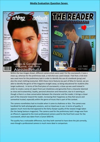
1. Within the two images shown, different camera shots were used. For the coursework, it was a
close-up, whereas for the preliminary task, a mid-shot was used instead. I feel that a mid-shot
was used more for the preliminary task in order to identify the use of a textbook (prop) and
also the smart clothing (costume). With these micro features (as part of Mise En Scene), we are
able to identify the genre of the magazine straight away; as being educational for students (the
target audience). In terms of the final piece of coursework, a close-up was used instead in
order to create a sense of, (apart from just cheekiness and genuinity from a character deemed
as close and trustworthy), loyalty, personal attraction and interaction, due to it seeming as
though a there is a close conversation between the character and the reader; it brings a closer
part of the character toward the reader, increasing their happiness as they feel secure and
somewhat trusted, especially within the genre of music that is part of the context.
The camera nonetheless had no trouble when it came to shakiness or blur. The camera was
handheld for both photography sessions, and no tripod was in use. In terms of quality, it
appears much more blurred opposed to the fairly sharper quality of the newest image taken
(for the Swing Saviours magazine). The camera used for the preliminary task’s image was from
an iPhone 4, opposed to the more professional camera used for the final front cover for the
coursework, which was taken from a Canon SX50 HS.
The quality has a noticeable difference, but they both seemed to have done the job correctly,
even though a professional camera is much more ideal in comparison.
Media Evaluation Question Seven
2. In terms of lighting, the preliminary task’s front cover didn’t have any major adjustments, due
to the character being stood close to a window, receiving natural/ambient lighting opposed to
artificial lighting. A few taps of brightness were added to the character within Photoshop to
make the image stand out a little bit more, but nothing major. The lighting wasn’t necessarily
used to signify anything, but now thinking about it, it suggests that through education/ working
hard, it will lead to a brighter future for students, such as the one
who was being photographed, studying (as well).
Within the final front cover, lighting wasn’t actually a major
contributor to the final look. If you look to the image on the lower
right, you will see that the character is fairly darker in comparison
to the preliminary task’s image. This was due to the character in
this photo not being fully exposed to outdoor lighting, opposed to
the glass window that was closer in the preliminary task.
Nevertheless, brightness effects were used in order to suggest a
sense of brighter happiness upon the reader, and through reading
Swing Saviours, your life will stand out greater (like the image),
and feel mentally brighter/ happier.
The colour of the preliminary task’s image was brighter than it was darker, which, in some
ways, made it a little bit harder to use. This was due to the colour appearing quite blurred, and
also lacked the capable focus in which would be required for the final piece. Also, the brighter
image didn’t fit as easily, which is why a gradient background was used, and fairly concentrated
in comparison to the gradient used in the final piece. This was in order to allow the brighter
area to fit in more, and equally, with the background.
The colour within the final image was better, and deemed a yellow-orange colour, which was
ideal in comparison to the brighter image. I was able to darken and brighten it easier, due to it
being less blurred, and also easier to see darker areas, as with natural shadows to follow on
certain sides of the face. I was able to incorporate a more natural look, which was ideal in order
to convey the music magazines genre as being genuine, and the music natural; it is unique as it
doesn’t’ require computer technology opposed to Rap music and House music. I wanted my
character to shine to the world.
The composition of the image was fairly standard, as it held no meaning behind it. It was merely
a mid-shot, which could be interpreted as suggesting that as we see more of him, education
increases knowledge, so more of the character suggests greater knowledge. At the time, this
wasn’t intended.
The composition of the final image would be hard to expand on. You could say that due to him
being in the centre of the page, with a close-up, it suggests that he is in the centre of people’s
minds. Not to mention the fact that the music that he creates is from the past but recreating in
the future, which is why he is in the centre; to show a link between time, as he is now in the
present day. I do feel that the quality of the image is quite good, benefiting in order to convey
professionalism within the final piece.
In terms of continuity, in the preliminary task, I used two different characters, which all-in-all,
wouldn’t live up to conventions of a magazine. I made the magazines edition continuous in
terms of images, due to it mainly focusing on one character. I used that character only.
3. Improvements:
The cropping of the image: opposed to the preliminary task, I was able to crop the imagine
easier and clearer, considering that in the preliminary task, I cropped the textbook accidently.
The colour of the image: opposed to preliminary task, the colour seemed clearer, and less
blurred also a bit more orange in comparison, making the skin colour and tone clearer (olive
skin/ a slight tan).
The quality of the image: opposed to the preliminary task, the image is much clearer and crisp,
and the lighting is able to create a natural shadow, which was also enhanced through
Photoshop.
The fonts used: opposed to the preliminary task, I used the same fonts throughout the page,
which created clarity and fluidity. Also, it creates a more mature approach to the genre, as it is
openly stubborn and consistent.
The texts colour: opposed to the preliminary task, the colour is consistent, and also due to it
being black, hints a sense of maturity required in order to purchase this magazine, hence the
target audience being adults.
The layout used: opposed to the preliminary task, the layout is much neater. It isn’t all over the
place, like the preliminary task’s one. It seems childish, as children aren’t as neat/ organised as
adults are; mine is for adults.
The cover lines used: opposed to the preliminary task, there is greater detail within the cover
lines opposed to just one word. It gives greater detail of the magazines content. Also, it holds
greater purpose, as with conventions too.
The content on the page: opposed to the preliminary task, there’s more information on the
page, which is ideal in order to attract and inform the user greater, giving them greater detail.
The colouring and brightening: opposed to the preliminary task, I have adjusted the brightness
in order to symbolise of happiness and brightness in order to attract and inspire the audience.
The size of text, as with rotation: opposed to the preliminary task, the text is straight; also in
line horizontally with text below and above. No text is rotated, due to it conveying immaturity.
The mastheads font: opposed to the preliminary task, the font has uniqueness. It also doesn’t
look as tacky, due to the outline glowing. Also, the font isn’t a visual cliché, as it’s used so much.
On average, this piece of
work took around 1-2 hours
to fully complete.
On average, this piece of
work took around 12-14
hours to fully complete.