The document analyzes the positioning and design choices for ancillary materials promoting an album. It discusses positioning the artist name, album name, and central image on the CD cover according to the "rule of three". It describes using a white background and high-contrast colors to make the darker images stand out. Images on the CD back and poster relate to the cover image but differ to intrigue audiences. Text is positioned around images to draw attention. A consistent color scheme, white space, and unconventional images are used throughout to attract audiences.


![Images
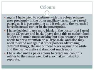
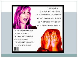
The image I used is two images combined, I began with a
simple image of my model covering her eyes, I then
decided to use the eyes from another image over the top.
I did this as I think it makes the image more interesting
and it will attract the audience to look at the image closer
and potentially buy the album.
The eyes are also much bigger than regular eyes, [they
have been enlarged] I have done this to make the image
seem even stranger and to attract the audience further.
I have also chosen to use strange images because the
model used is only a model and not the actual artist,
therefore I have decided not to use a straight shot of her
face.](https://image.slidesharecdn.com/analysisofmyancillary-101105114753-phpapp01/85/Analysis-of-my-ancillary-5-320.jpg)
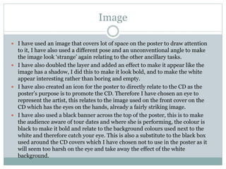
![colours
The colours used are applicable to the colours used on
the front of the CD, I have done this to display a colour
scheme. I have used these colours as they have
connotations of warmth and heat therefore
subconsciously making the audience feel better about
buying.
I have decided to use black as the font colour as it is
easier on the eyes against a white background, it relates
to the black box [also featured in the front cover] and
also it ensures that there is not too much colour contrast
between the images and the text which can potentially be
off-putting to the audience.](https://image.slidesharecdn.com/analysisofmyancillary-101105114753-phpapp01/85/Analysis-of-my-ancillary-9-320.jpg)