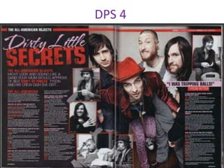
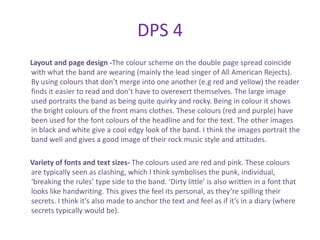
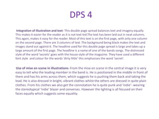
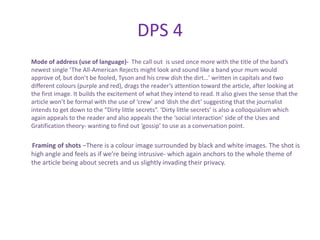
This document analyzes the layout, design elements, and language used across five different double-page spreads from music magazines. Some key findings include:
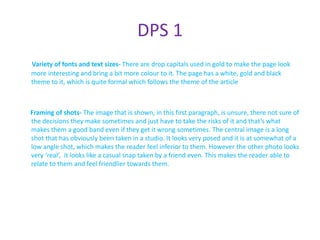
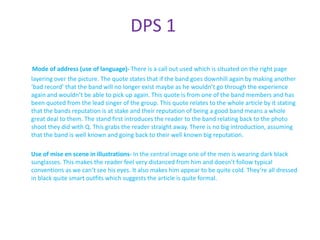
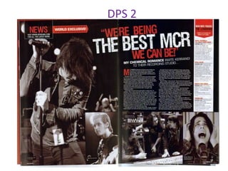
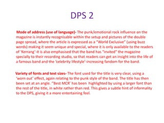
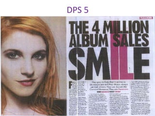
1) Call outs are often used to set the topic for interviews and anchor images to text.
2) Color schemes typically reflect the style of the artist being featured.
3) Placement of images, use of fonts, and framing techniques aim to portray the band or artist in a particular way and draw readers in.
4) Columns, varied text sizes, and balanced use of images and text aid readability.
The analysis provides insights into crafting effective double-page spreads through techniques like anchoring, using colors that fit the subject,