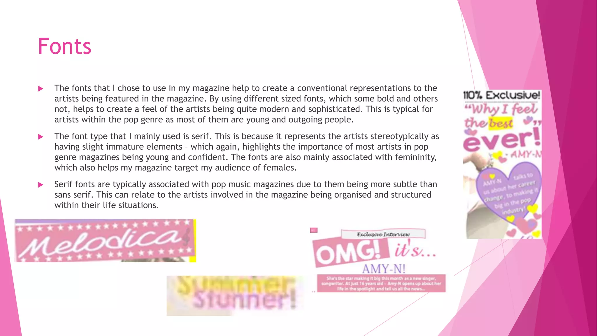
3. Fonts
The fonts that I chose to use in my magazine help to create a conventional representations to the
artists being featured in the magazine. By using different sized fonts, which some bold and others
not, helps to create a feel of the artists being quite modern and sophisticated. This is typical for
artists within the pop genre as most of them are young and outgoing people.
The font type that I mainly used is serif. This is because it represents the artists stereotypically as
having slight immature elements – which again, highlights the importance of most artists in pop
genre magazines being young and confident. The fonts are also mainly associated with femininity,
which also helps my magazine target my audience of females.
Serif fonts are typically associated with pop music magazines due to them being more subtle than
sans serif. This can relate to the artists involved in the magazine being organised and structured
within their life situations.
4. Colours
The use of colours in my magazine, helps me to create conventional representations for my artists.
The main colours that I chose to use as my house style were pink, purple, yellow/gold, and white.
I chose to use pink and purple as these are the most stereotypical colours represented with females.
They help to create a very feminine vibe to my magazine. They are also very conventional pop genre
colours as they help to represents the artists as fun and outgoing individuals.
I chose to use the yellow/gold colour as I felt that it contrasted very well with my background
colour of pure white and allowed whatever I chose to put in yellow, such as some text, was able to
stand out from the rest. This made the text look quote bold and outgoing, which again, relates to
the artists featured in the magazine due to that being part of their characterization.
I also used the colour yellow to highlight important information in my magazine. This highlights to
the audience that the artists like to be the centre of attention and stand out from the crowd.
5. Images
My choice of images help to create a stereotypical representation of the artists in my magazine. An
example of this is that I chose to use quite a lot of close-up shots in order to convey a sense of
emotion and connection with the target audience.
The use of a medium close-up shot for my front cover helps to represent the artist in a friendly was
as they are fully connecting with the target audience. This is expressed through the facial
expressions of her being happy and smiling. This represents the artists in my magazine as being
friendly individuals with a warming attitude, which is stereotypical for the pop music genre as it
conveys a good image for the magazine and its readers.
The artists are also represented as having fun in the images due to them laughing at each other and
being together with their friends. This is also shown through their body language being natural
whilst posing for the image.
Lastly, the use of mise-en-scene is typical in in the way that it represents my artists in my magazine.
For example, the use of high key lighting represents them as being bright and bold individuals. The
use of jewellery and costume choice of nice flowy tops and converse represents my artists as being
stylish and trendy. This is stereotypical for my music magazine as due to the age of my artists, they
would be familiar with the latest fashion trends. This would be good for the readers of my magazine
too as they would be able to get tips whilst reading.
6. Language Choice
The language that I have used in my magazine represents the artists clearly, as I chose to use
language that the artists would use in their every day lives, as well as the target audience being
able to relate to it.
I have use slang words such as ‘OMG’ and ‘ever’ as it represents the artist as quite young figures.
This means that my target audience of young females would be able to relate to this type of
language. The use of the bold font for the slang words also represents the language as being quite
loud and sharp.
The language that I have used throughout my magazine is quite informal, but has a few formal
elements within. This is because of the use of slang words, and content that I have chosen to
include. However, my magazine also has informative parts where the audience are able to find out
exclusive information out about the artists, which represents them as artists who keep secrets and
aren’t always the people you expect them to be. This relates to the target audience too as this is
how they choose to represent themselves mostly too.
They language used is basic, and easy for anyone of any age to read. This represents the artists to
be individual and considerate of the audience that will be reading about them. However, due to the
text and article being quite small, it represents them as being quite laid-back and lazy as they
haven’t gone into much detail for their audience.
7. Content
The content that I have put into my magazine helps to represent the artists as being very trendy and
stylish individuals.
I have included advertisements with clothing and prizes which represents the artists in a
stereotypical way. It shows they care about their appearance and their everyday life events.
This type of representation is stereotypical as it’s what you would expect of young artists (mainly
girls). This also relates to my magazine being female-populated.