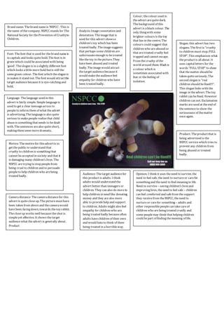
1. Colour; the colour used in
the advert are quite dark.
The background of this
advert is a black colour. The
only thing with some
brighter colours is the toy
that lies in the centre. The
colours could suggest that
children who are abused or
that are treated cruelly feel
trapped and cannot escape.
From the cruelty of the
world around them. Black is
a colour which is
sometimes associated with
fear or the feeling of
isolation.
Slogan; this advert has two
slogans. The first is “cruelty
to children must stop. FULL
STOP”. This emphasises what
the product is all about. It
uses capital letters for the
words “FULL STOP” to show
that the matter should be
taken quite seriously. The
second slogan is “real
children should be fixed!!!”.
This slogan links with the
image in the advert. The toy
rabbit can be fixed. However
children can not. Exclamation
marks are used at the end of
the sentence to show the
seriousness of the matter
once again.
Analysis Image connotation and
denotation: The image that is
used for this advert shows a
children’s toy which has been
treated badly. The image suggests
that perhaps some children are
unfortunate enough to be treated
like the toy in the picture. They
have been abused and treated
badly. The image would attract
the target audience because it
would make the audience feel
empathy for children who have
been treated badly.
Product: The product that is
being advertised is the
NSPCC service which tries to
prevent any children from
being abused or treated
badly.
Brand name: The brand name is ‘NSPCC’. This is
the name of the company. NSPCC stands for The
National Society for the Prevention of Cruelty to
Children.
Font: The font that is used for the brand name is
in capitals and looks quite bold. The font is in
green which could be associated with being
‘good’. The slogan is in a slightly different font
which looks a little more bold but is still the
same green colour. The font which the slogan is
in makes it stand out. The font would attract the
target audience because it is eye-catching and
bold.
Language: The language used in this
advert is fairly simple. Simple language is
used to get a clear message across to
people to inform them of what the advert
is advertising. The language is also quite
serious to make people realise that child
abuse is something that needs to be dealt
with. The sentences are also quite short,
making them seem more dramatic.
Camera distance: The camera distance for this
advert is quite close up. The picture must have
been taken from above and the camera would
have been facing down, towards the toy rabbit.
The close up works well because the shot is
simple yet effective. It shows the target
audience what the advert is generally about.
Product
Audience: The target audience for
this product is adults. I think
adults would understand the
advert better than teenagers or
children. They can also do more to
help children in need like donating
money and they are also more
able to provide help and support
to children. Adults might also feel
empathy for children who are
being treated badly because often
adults have children of their own
and would hate to think of them
being treated in a horrible way.
Motive: The motive for this advert is to
get the public to understand that
cruelty to children is something that
cannot be accepted in society and that it
is damaging many children’s lives. The
NSPCC are trying to stop people from
being cruel to children and to persuade
people to help children who are being
treated badly.
Opinion; I think it uses the need to survive, the
need to feel safe, the need to nurture or care for
something and the need to find meaning in life.
Need to survive – saving children’s lives and
improving lives, the need to feel safe – children
can feel comforted and safe from the support
they receive from the NSPCC, the need to
nurture or care for something – adults and
other responsible people can take care of
children who are being treated cruelly and
some people may think that helping children
could be part of finding the meaning of life.