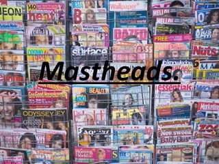
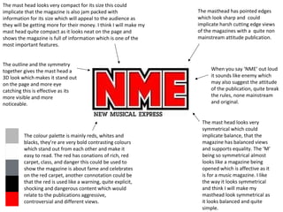
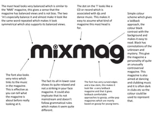
The document discusses the design elements of various magazine mastheads and what they imply about the publications. It notes that mastheads use simple, symmetrical, and high contrast designs to appear balanced and eye-catching. Font styles, colors, and layouts are chosen to represent the magazine's brand and target audience. Elements like outlines, shadows, and capitalization are manipulated to make the masthead stand out while conveying the publication's personality through stylistic choices.