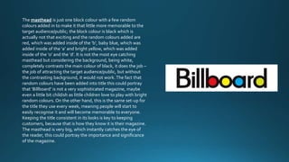
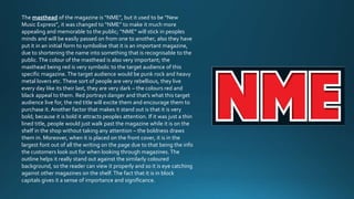
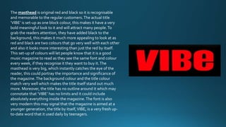
The masthead is just one block colour with a few random 
colours added in to make it that little more memorable to the 
target audience/public; the block colour is black which is 
actually not that exciting and the random colours added are 
red, which was added inside of the ‘b’, baby blue, which was 
added inside of the ‘a’ and bright yellow, which was added 
inside of the ‘o’ and the ‘d’. It is not the most eye catching 
masthead but considering the background, being white, 
completely contrasts the main colour of black, it does the job – 
the job of attracting the target audience/public, but without 
the contrasting background, it would not work. The fact that 
random colours have been added into title this could portray 
that ‘Billboard’ is not a very sophisticated magazine, maybe 
even a little bit childish as little children love to play with bright 
random colours. On the other hand, this is the same set-up for 
the title they use every week, meaning people will start to 
easily recognise it and will become memorable to everyone. 
Keeping the title consistent in its looks is key to keeping 
customers, because that is how they know it is their magazine. 
The masthead is very big, which instantly catches the eye of 
the reader, this could portray the importance and significance 
of the magazine.
The masthead of the magazine is “NME”, but it used to be “New 
Music Express”, it was changed to “NME” to make it much more 
appealing and memorable to the public; “NME” will stick in peoples 
minds and will be easily passed on from one to another, also they have 
put it in an initial form to symbolise that it is an important magazine, 
due to shortening the name into something that is recognisable to the 
public. The colour of the masthead is also very important; the 
masthead being red is very symbolic to the target audience of this 
specific magazine. The target audience would be punk rock and heavy 
metal lovers etc. These sort of people are very rebellious, they live 
every day like its their last, they are very dark – the colours red and 
black appeal to them. Red portrays danger and that’s what this target 
audience live for, the red title will excite them and encourage them to 
purchase it. Another factor that makes it stand out is that it is very 
bold; because it is bold it attracts peoples attention. If it was just a thin 
lined title, people would just walk past the magazine while it is on the 
shelf in the shop without taking any attention – the boldness draws 
them in. Moreover, when it is placed on the front cover, it is in the 
largest font out of all the writing on the page due to that being the info 
the customers look out for when looking through magazines. The 
outline helps it really stand out against the similarly coloured 
background, so the reader can view it properly and so it is eye catching 
against other magazines on the shelf. The fact that it is in block 
capitals gives it a sense of importance and significance.
The masthead is original red and black so it is recognisable 
and memorable to the regular customers. The actual title 
‘VIBE’ is set-up as one block colour, this makes it have a very 
bold meaningful look to it and will attract many people. To 
grab the readers attention, they have added black to the 
background, this makes it much more appealing to look at as 
red and black are two colours that go very well with each other 
and also it looks more interesting than just the red by itself. 
This set-up of colours will let people know that it is a good 
music magazine to read as they see the same font and colour 
every week, if they recognise it they want to buy it. The 
masthead is very big, which instantly catches the eye of the 
reader, this could portray the importance and significance of 
the magazine. The background colour and the title colour 
match very well which makes the title itself stand out much 
more. Moreover, the title has no outline around it which may 
connotate that ‘VIBE’ has no limits and it could include 
absolutely everything inside the magazine. The font is also 
very modern this may signal that the magazine is aimed at a 
younger generation, the title by itself, VIBE, is a very fresh up-to- 
date word that it used daily by teenagers.

Existing magazine mastheads

  • 2.
    The masthead isjust one block colour with a few random colours added in to make it that little more memorable to the target audience/public; the block colour is black which is actually not that exciting and the random colours added are red, which was added inside of the ‘b’, baby blue, which was added inside of the ‘a’ and bright yellow, which was added inside of the ‘o’ and the ‘d’. It is not the most eye catching masthead but considering the background, being white, completely contrasts the main colour of black, it does the job – the job of attracting the target audience/public, but without the contrasting background, it would not work. The fact that random colours have been added into title this could portray that ‘Billboard’ is not a very sophisticated magazine, maybe even a little bit childish as little children love to play with bright random colours. On the other hand, this is the same set-up for the title they use every week, meaning people will start to easily recognise it and will become memorable to everyone. Keeping the title consistent in its looks is key to keeping customers, because that is how they know it is their magazine. The masthead is very big, which instantly catches the eye of the reader, this could portray the importance and significance of the magazine.
  • 3.
    The masthead ofthe magazine is “NME”, but it used to be “New Music Express”, it was changed to “NME” to make it much more appealing and memorable to the public; “NME” will stick in peoples minds and will be easily passed on from one to another, also they have put it in an initial form to symbolise that it is an important magazine, due to shortening the name into something that is recognisable to the public. The colour of the masthead is also very important; the masthead being red is very symbolic to the target audience of this specific magazine. The target audience would be punk rock and heavy metal lovers etc. These sort of people are very rebellious, they live every day like its their last, they are very dark – the colours red and black appeal to them. Red portrays danger and that’s what this target audience live for, the red title will excite them and encourage them to purchase it. Another factor that makes it stand out is that it is very bold; because it is bold it attracts peoples attention. If it was just a thin lined title, people would just walk past the magazine while it is on the shelf in the shop without taking any attention – the boldness draws them in. Moreover, when it is placed on the front cover, it is in the largest font out of all the writing on the page due to that being the info the customers look out for when looking through magazines. The outline helps it really stand out against the similarly coloured background, so the reader can view it properly and so it is eye catching against other magazines on the shelf. The fact that it is in block capitals gives it a sense of importance and significance.
  • 4.
    The masthead isoriginal red and black so it is recognisable and memorable to the regular customers. The actual title ‘VIBE’ is set-up as one block colour, this makes it have a very bold meaningful look to it and will attract many people. To grab the readers attention, they have added black to the background, this makes it much more appealing to look at as red and black are two colours that go very well with each other and also it looks more interesting than just the red by itself. This set-up of colours will let people know that it is a good music magazine to read as they see the same font and colour every week, if they recognise it they want to buy it. The masthead is very big, which instantly catches the eye of the reader, this could portray the importance and significance of the magazine. The background colour and the title colour match very well which makes the title itself stand out much more. Moreover, the title has no outline around it which may connotate that ‘VIBE’ has no limits and it could include absolutely everything inside the magazine. The font is also very modern this may signal that the magazine is aimed at a younger generation, the title by itself, VIBE, is a very fresh up-to- date word that it used daily by teenagers.