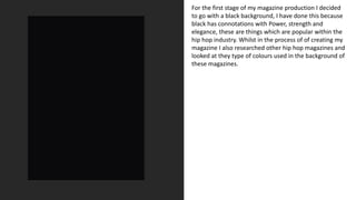
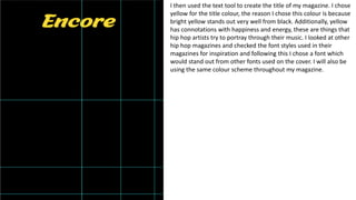
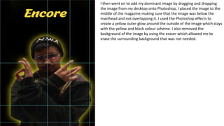
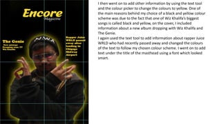
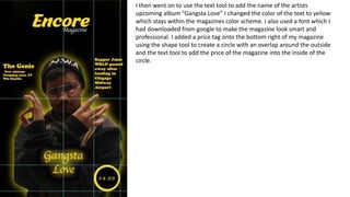
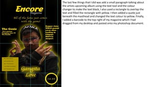
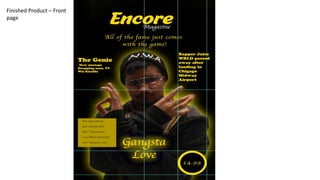
Magazine
Production Log
Layton Mensforth
For the first stage of my magazine production I decided
to go with a black background, I have done this because
black has connotations with Power, strength and
elegance, these are things which are popular within the
hip hop industry. Whilst in the process of of creating my
magazine I also researched other hip hop magazines and
looked at they type of colours used in the background of
these magazines.
I then used the text tool to create the title of my magazine. I chose
yellow for the title colour, the reason I chose this colour is because
bright yellow stands out very well from black. Additionally, yellow
has connotations with happiness and energy, these are things that
hip hop artists try to portray through their music. I looked at other
hip hop magazines and checked the font styles used in their
magazines for inspiration and following this I chose a font which
would stand out from other fonts used on the cover. I will also be
using the same colour scheme throughout my magazine.
I then went on to add my dominant image by dragging and dropping
the image from my desktop onto Photoshop, I placed the image to the
middle of the magazine making sure that the image was below the
masthead and not overlapping it. I used the Photoshop effects to
create a yellow outer glow around the outside of the image which stays
with the yellow and black colour scheme. I also removed the
background of the image by using the eraser which allowed me to
erase the surrounding background that was not needed.
I then went on to add other information by using the text tool
and the colour picker to change the colours to yellow. One of
the main reasons behind my choice of a black and yellow colour
scheme was due to the fact that one of Wiz Khalifa’s biggest
songs is called black and yellow, on the cover, I included
information about a new album dropping with Wiz Khalifa and
The Genie.
I again used the text tool to add information about rapper Juice
WRLD who had recently passed away and changed the colours
of the text to follow my chosen colour scheme. I went on to add
text under the title of the masthead using a font which looked
smart.
I then went on to use the text tool to add the name of the artists
upcoming album “Gangsta Love” I changed the color of the text to yellow
which stays within the magazines color scheme. I also used a font which I
had downloaded from google to make the magazine look smart and
professional. I added a price tag onto the bottom right of my magazine
using the shape tool to create a circle with an overlap around the outside
and the text tool to add the price of the magazine into the inside of the
circle.
The last few things that I did was add a small paragraph talking about
the artists upcoming album using the text tool and the colour
changer to make the text black, I also used a rectangle to overlap the
text and filled the rectangle with yellow. I then added a quote just
beneath the masthead and changed the text colour to yellow. Finally,
I added a barcode to the top right of my magazine which I had
dragged from my desktop and pasted onto my photoshop document.
Finished Product – Front
page
Double page spread
production log
Firstly, I copied and pasted the wide-shot
picture from my desktop onto Photoshop and
added it onto the page. I chose this picture
because it shows both the artist and the
music producer, it is also a well setup shot
which has them both looking towards the
camera. I then used the text tool and put the
name of each person over their picture, using
the glow tool I added a slight red glow behind
the names and changed the colour of the text
to a light blue.
Next, I added the image of the artist with
his middle finger pointing towards the
camera I used the blur tool to make the
middle finger less obvious. However, due to
the nature of the magazine, it
stereotypically would not be fully censored
as the magazine is aimed at an older
audience. I then added a black border
around the outside of the picture to give
more of an effect. I used the text tool to
write about an upcoming album and added
a black dotted shadow type effect in order
to make the red writing stand out more.
Following this I added the text “Gangsta
love coming soon” which is the name of the
album, I changed the colour of the text to
red and used the glow effect to create a
light blue glow around the text which ties in
with the text used for Potts Beatz and The
Genie.
The next step was adding a picture of the
music producer, again with his middle
fingers pointing towards the camera. I
again used the blur tool to make the
fingers less obvious to the audience
however, it would not be fully censored
due to the nature and target audience of
the magazine. I also added a black border
around the image for extra effect. I used
the text tool to include a small snippet of
information about the producer to which I
added another black glow effect to the
back of the writing. I then added a white
background to a box and used the text box
tool to write an article about ”The Genie”.
Another box with a white background was
added to which I wrote a brief paragraph
about the producer “Potts Beatz”.
Finally, I added an image of the rapper Juice
WRLD to which I added a white background
around the outside of the image for extra
effect. I then used the text tool to draw a
text box next to the image of the rapper
and went on to talk about the death of the
much-loved music artist.
Finished Product – Double page spread

Magazine production log

  • 1.
  • 2.
    For the firststage of my magazine production I decided to go with a black background, I have done this because black has connotations with Power, strength and elegance, these are things which are popular within the hip hop industry. Whilst in the process of of creating my magazine I also researched other hip hop magazines and looked at they type of colours used in the background of these magazines.
  • 3.
    I then usedthe text tool to create the title of my magazine. I chose yellow for the title colour, the reason I chose this colour is because bright yellow stands out very well from black. Additionally, yellow has connotations with happiness and energy, these are things that hip hop artists try to portray through their music. I looked at other hip hop magazines and checked the font styles used in their magazines for inspiration and following this I chose a font which would stand out from other fonts used on the cover. I will also be using the same colour scheme throughout my magazine.
  • 4.
    I then wenton to add my dominant image by dragging and dropping the image from my desktop onto Photoshop, I placed the image to the middle of the magazine making sure that the image was below the masthead and not overlapping it. I used the Photoshop effects to create a yellow outer glow around the outside of the image which stays with the yellow and black colour scheme. I also removed the background of the image by using the eraser which allowed me to erase the surrounding background that was not needed.
  • 5.
    I then wenton to add other information by using the text tool and the colour picker to change the colours to yellow. One of the main reasons behind my choice of a black and yellow colour scheme was due to the fact that one of Wiz Khalifa’s biggest songs is called black and yellow, on the cover, I included information about a new album dropping with Wiz Khalifa and The Genie. I again used the text tool to add information about rapper Juice WRLD who had recently passed away and changed the colours of the text to follow my chosen colour scheme. I went on to add text under the title of the masthead using a font which looked smart.
  • 6.
    I then wenton to use the text tool to add the name of the artists upcoming album “Gangsta Love” I changed the color of the text to yellow which stays within the magazines color scheme. I also used a font which I had downloaded from google to make the magazine look smart and professional. I added a price tag onto the bottom right of my magazine using the shape tool to create a circle with an overlap around the outside and the text tool to add the price of the magazine into the inside of the circle.
  • 7.
    The last fewthings that I did was add a small paragraph talking about the artists upcoming album using the text tool and the colour changer to make the text black, I also used a rectangle to overlap the text and filled the rectangle with yellow. I then added a quote just beneath the masthead and changed the text colour to yellow. Finally, I added a barcode to the top right of my magazine which I had dragged from my desktop and pasted onto my photoshop document.
  • 8.
  • 9.
  • 10.
    Firstly, I copiedand pasted the wide-shot picture from my desktop onto Photoshop and added it onto the page. I chose this picture because it shows both the artist and the music producer, it is also a well setup shot which has them both looking towards the camera. I then used the text tool and put the name of each person over their picture, using the glow tool I added a slight red glow behind the names and changed the colour of the text to a light blue.
  • 11.
    Next, I addedthe image of the artist with his middle finger pointing towards the camera I used the blur tool to make the middle finger less obvious. However, due to the nature of the magazine, it stereotypically would not be fully censored as the magazine is aimed at an older audience. I then added a black border around the outside of the picture to give more of an effect. I used the text tool to write about an upcoming album and added a black dotted shadow type effect in order to make the red writing stand out more. Following this I added the text “Gangsta love coming soon” which is the name of the album, I changed the colour of the text to red and used the glow effect to create a light blue glow around the text which ties in with the text used for Potts Beatz and The Genie.
  • 12.
    The next stepwas adding a picture of the music producer, again with his middle fingers pointing towards the camera. I again used the blur tool to make the fingers less obvious to the audience however, it would not be fully censored due to the nature and target audience of the magazine. I also added a black border around the image for extra effect. I used the text tool to include a small snippet of information about the producer to which I added another black glow effect to the back of the writing. I then added a white background to a box and used the text box tool to write an article about ”The Genie”. Another box with a white background was added to which I wrote a brief paragraph about the producer “Potts Beatz”.
  • 13.
    Finally, I addedan image of the rapper Juice WRLD to which I added a white background around the outside of the image for extra effect. I then used the text tool to draw a text box next to the image of the rapper and went on to talk about the death of the much-loved music artist.
  • 14.
    Finished Product –Double page spread