The document analyzes six magazine front covers promoting movies. All follow conventions of the genre, such as a dominant image, masthead at the top in bold font, and sell lines promoting the film. Key details like the film name and genre-appropriate color scheme are consistently featured. Positioning of elements draws attention, with mastheads and cover lines placed in the natural viewing route. Fonts, colors and styles are chosen carefully to represent the film and grab readers' interest. Overall the covers effectively promote the films using visual design conventions.
As part of my A Level Media coursework component, I needed to research and analyse conventions of a film magazine within my genre. I looked at Shutter Island, Inception, and Gone Girl prior to my production of a psycho crime thriller.
As part of my A Level Media coursework component, I needed to research and analyse conventions of a film magazine within my genre. I looked at Shutter Island, Inception, and Gone Girl prior to my production of a psycho crime thriller.
film trailer overview, looking and picking out the codes and conventions of horror movie trailers using the trailers from nightmare on elm street, texas chainsaw massacre, friday 13th and my bloody valentine.
Honest Reviews of Tim Han LMA Course Program.pptxtimhan337
Personal development courses are widely available today, with each one promising life-changing outcomes. Tim Han’s Life Mastery Achievers (LMA) Course has drawn a lot of interest. In addition to offering my frank assessment of Success Insider’s LMA Course, this piece examines the course’s effects via a variety of Tim Han LMA course reviews and Success Insider comments.
Operation “Blue Star” is the only event in the history of Independent India where the state went into war with its own people. Even after about 40 years it is not clear if it was culmination of states anger over people of the region, a political game of power or start of dictatorial chapter in the democratic setup.
The people of Punjab felt alienated from main stream due to denial of their just demands during a long democratic struggle since independence. As it happen all over the word, it led to militant struggle with great loss of lives of military, police and civilian personnel. Killing of Indira Gandhi and massacre of innocent Sikhs in Delhi and other India cities was also associated with this movement.
Instructions for Submissions thorugh G- Classroom.pptxJheel Barad
This presentation provides a briefing on how to upload submissions and documents in Google Classroom. It was prepared as part of an orientation for new Sainik School in-service teacher trainees. As a training officer, my goal is to ensure that you are comfortable and proficient with this essential tool for managing assignments and fostering student engagement.
Read| The latest issue of The Challenger is here! We are thrilled to announce that our school paper has qualified for the NATIONAL SCHOOLS PRESS CONFERENCE (NSPC) 2024. Thank you for your unwavering support and trust. Dive into the stories that made us stand out!
A Strategic Approach: GenAI in EducationPeter Windle
Artificial Intelligence (AI) technologies such as Generative AI, Image Generators and Large Language Models have had a dramatic impact on teaching, learning and assessment over the past 18 months. The most immediate threat AI posed was to Academic Integrity with Higher Education Institutes (HEIs) focusing their efforts on combating the use of GenAI in assessment. Guidelines were developed for staff and students, policies put in place too. Innovative educators have forged paths in the use of Generative AI for teaching, learning and assessments leading to pockets of transformation springing up across HEIs, often with little or no top-down guidance, support or direction.
This Gasta posits a strategic approach to integrating AI into HEIs to prepare staff, students and the curriculum for an evolving world and workplace. We will highlight the advantages of working with these technologies beyond the realm of teaching, learning and assessment by considering prompt engineering skills, industry impact, curriculum changes, and the need for staff upskilling. In contrast, not engaging strategically with Generative AI poses risks, including falling behind peers, missed opportunities and failing to ensure our graduates remain employable. The rapid evolution of AI technologies necessitates a proactive and strategic approach if we are to remain relevant.
Francesca Gottschalk - How can education support child empowerment.pptxEduSkills OECD
Francesca Gottschalk from the OECD’s Centre for Educational Research and Innovation presents at the Ask an Expert Webinar: How can education support child empowerment?
Biological screening of herbal drugs: Introduction and Need for
Phyto-Pharmacological Screening, New Strategies for evaluating
Natural Products, In vitro evaluation techniques for Antioxidants, Antimicrobial and Anticancer drugs. In vivo evaluation techniques
for Anti-inflammatory, Antiulcer, Anticancer, Wound healing, Antidiabetic, Hepatoprotective, Cardio protective, Diuretics and
Antifertility, Toxicity studies as per OECD guidelines
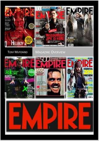
2. Six magazine front covers which are placed accordingly have all been designed to effectively
promote movies. You can clearly see by exploring them that the magazine front covers all share
common features and they relate to each other. The entire magazine front covers above follow the
general layout conventions of this type of media. Such as an image that dominates the frame, a
masthead that is situated at the top of the frame in the biggest and boldest font, the main sell-line, a
puff, and other sell-lines and, in addition to his, the front covers obey the conventions of the film
magazines also. For example, the main sell-line is consistently the name of the film being promoted,
while the colour scheme is always dictated by the genre, signature colour and style of the film
referenced within the main image.
Following on from this, we see clear repeated patterns. As mentioned before, all of the mastheads
are located at the top of the frame which is significant are on the magazine where western eyes will
automatically look first. Each time, this piece of text is the biggest and boldest text on the frame and
is presented in a bold, display font. Uppercase is use repeatedly across all front covers in the
selection, ensuring that the bold personality of each publication is suggested, along with the
enormous power of the film industry. This use of caps could also suggest a largely male target
audience. A symbiotic link is maintained across the different issues of ‘empire’.
The magazine front cover of Hell Boy 2 follows a simple colour scheme of red, white and gold to
attract the viewers and connote how danger and horror are dominant and very powerful. They also
make the magazine seem very authoritative, the image is layered on top a black background, this
could be a small preview to show how dark the genre is and how there is a lot of darkness in this
movie genre. Hell boy, who feature on the front cover is the main character in the film (hence the
name), he is in red which connotes danger. This is relevant due to red also being the colour of hell,
fire, blood and is the most used colour in the horror genre. Furthermore, we see that this character
is different, his small yellow eyes, cut off horns, rosary beads and facial hair and expressions suggest
that he may not be evil, just like the his appearance may suggest. In the Shining, the readership are
reminded and allowed to reminisce or reflect back on the famous bathroom scene where killer
Johnny breaks down the door indoor to catch his victims. This has been used to adv ertise that
edition of Empire as fans of Psycho will be intrigued to find out what place Psycho finished in
Empire’s 500th Greatest Movies of all time. The conventional colours of red, white and black, just like
Hell Boy 2, shows the audience that this particular scene does belong to a horror movie. Whereas,
Empire’s use of the colours red and blue in the ‘Inglorious’ magazine front cover; allows the cover to
stand out when the background image is quite dull. Blue is a calming and friendly colour which
juxtaposes with the harshness and danger that the colour red connotes. Apart from the ‘Empire’ title
at the top, on the magazine front cover of ‘The Pirates of the Caribbean’, the cover uses a basic
colour scheme with the text, being yellow, black and white. This makes the cover look exciting, yet
professional.
The main image is centred on the Hell Boy front cover and this follows the conventions of the rule of
thirds. There is a connotation that this magazine is well known as the image is overlapping the
masthead; however this also connotes that the model and the movie are more important in this
issue, they have more dominance over other information in this magazine. The Dark Knight
magazine front cover shows that the head of the joker covers the ‘P’ in empire; which gives the
sense that it is overpowering the magazine itself because the film is so big and successful. The bright
colours make the magazine stand out and the different shapes around the letters shows that it is
3. unique. The picture of the film is the main aspect of the cover. The other features are written over
the picture, as opposed to the picture being a small feature on the magazine. The colours of his
socks are shown, which, with the different colours they relate to the word ‘joker’; his title in the film.
Whereas the main image and background on the Hobbit front magazine front cover is conventional
because it gives an insight into the film by showing the costumes and actions of characters, useful
for those who might be new to the film or may be aware of it, with view to possibly wanting to
watch it in the future.
On the Hell boy 2 magazine front cover, the masthead shows strong connotations of the film being
in the horror genre. Firstly the writing is in red suggesting that there is an element of danger in the
film as well as the magazine helping us understand what the issue of the magazine is based on. We
then see the masthead being burnt and up in flames connoting there is a horror dominance in this
issue as well as giving us the a visual effect that suggesting that this magazine is not like the others.
This magazine will grab the attention of the other audience and can be full of all the film gossip and
interviews that will set the place of fire making it unique. On the Dark Knight magazine front cover,
the red title of the empire magazine masthead enhances the darkness and sense of the film, giving
clues or reinforcing the genre and general narrative. Whilst on the Hobbit: Desolation of Smaug
magazine front cover there is a cover line above the masthead. By placing this cover line here,
attention is drawn to it. Its black sans serif font contrasts the plain background which makes it easier
to read. The masthead appears in a conventional style at the very top and across the page. This
draws more attention to it and is useful because it appears in a familiar position. Positioning is
important. If something is in the route of the eye, its importance grows significantly. The cover story
uses a font that is similar although not an exact repl ica of the actual font of ‘The Hobbit’ film. This
probably helps to avoid copyright issues, but it helps to make the magazine more professional as
well as building a brand image of the film in question. All the main pieces of text, including the
masthead are in the route of the eye. This is a convention of magazine construction and design.
On The Hell boy 2 magazine front cover, we see that there is a button displayed above the image
allowing us to see the other information that will be in this edition of empire magazine. Buttons grab
the attention of the reader and make the magazines unique from one another. It allows us to be
excited about what may appear in the magazine and is clear and easy to read. On the other hand the
use of the word ‘plus’ on the Dark Knight magazine front cover shows that the film situated on the
front of the poster is the main focus and everything else is just ‘extra’. The white font used for the
‘extra’ information shows a sense of innocence for those topics, but more so enhances the horror
genre of the dark knight. On the dark knight magazine front cover a website is shown, the website is
fairly small and just about hidden underneath the title of the magazine, which shows where you can
find out more about what is in the magazine. Empire took a different approach on the Shining and
Inglorious front covers, where on these editions; the magazine uses both text and images for its
content features. This helps to promote the films and to illustrate the greatest movie moments.
On the hell boy 2 front cover posters, the headline is large and bold on the page meaning it can grab
the attention of the readers and allow us to see what this image is suggesting. The fact that it says
first look connotes that this is a new film that hasn’t arrived in cinemas yet for the public to see.
Empire have given their readership the privilege to be the first to hear about the film and have sneak
preview shots of the release of the sequel to hell boy and what’s to be in the film. There is white
writing suggesting dominance and power as well as impact that this film will have in the cinemas.
4. This is effective alongside the use of simplistic fonts used. On the Dark Knight magazine front cover,
the writing shows that the film is/will are relatively eerie. The font used looks handwritten and looks
as if it has been carved. The words ‘world exclusive’ show that the film is going to be successful or is
already successful. It gives the impression that this is a rare opportunity to read this anywhere else
so as it promotes the magazine. The Inglorious front cover features signifiers such as ‘epic’,
‘exclusives’ and ‘greatest’ are used to promote both films and the magazine as they have ‘exclusive’
information. Whereas on the Pirates of the Caribbean magazine front cover some pieces of text have
a font that resembles the image, the Pirates of the Caribbean movie set eras ago; therefore a swirly
italic text creates a theme for the cover.
On all six of the Empire movie magazine front covers, one similarity is the barcode. This is there to
allow the readership to see that this magazine is in the mass market as well as being sold to readers
if they want to buy a copy. Significantly, the Hell Boy 2 magazine follows common conventions such
as the issue date and price in the centre of the ‘M’ in the masthead suggesting that the magazine is
not new and is well known to produce lots of film information. The cover line on Empires edition of
The Hobbit, in the route of the eye at the bottom of the front cover, uses a variety of techniques to
make it standout to the reader. Eye-catching contract of colours are used to enhance how the text
appears in the eye of the reader. Furthermore, bold and simple sans-serif fonts mean that the even
in this area of the magazine is looked t indirectly, it still stands out very well. The three images are
conventional of the form because they give insight into the article in question. In addition to this,
they feature three very well known stars of comedy, which enhances the appeal of this article. On
the Dark Knight magazine front cover, the date and the price of the magazine is very small and
doesn’t stand out. This could be as it may not attract the readers as much, and the film may also be
taking over the whole page and divert their attention to that instead.