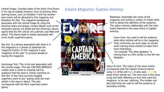
The document describes the layout and design elements of magazine covers. It analyzes covers for magazines advertising the films Captain America, Hellboy 2, and Hatchet. All three magazine covers follow typical conventions such as displaying the magazine masthead, main image, anchorage text, sell lines, and advertisements. However, the design elements are tailored to the genre of the featured film, using colors, images, and text that will attract the intended audience and convey the tone and content of the film being advertised.
1. Central Image: Consists solely of the Actor Chris Evans
in his role as Captain America. Fans of previous films
starring Evans, such as Fantastic 4 and not another
teen movie will be attracted to this magazine and
therefore the film. The magazine background
associates with the central image by using the
American stars and stripes. Certain details such as the
characters stance, his shield and the American colours
signify that the film will be very patriotic and filled with
action. The theme itself is mainly associated with
comic book/ superhero genre.
Masthead: Essentially the name of the
magazine and writing is written in a bold white
font to attract the attention of the audience.
The colour scheme collaborates with the main
brand featured in this issue which is Captain
America.
Cover lines: Are used to tell the audience
what other articles will be in the magazine.
They commonly use puns (play on words)
when naming these articles to make them
more interesting.
For example ‘The other gladiator’ is
hinting there is a film similar to the film the
Gladiator.
Colour & Font: The colour of this issue mainly
corresponds with the Captain America theme
using red white and blue. It also uses yellow in
areas which stands out. The main text in this issue
is big and bold reflecting on how they want the
magazine to be eye- catching. The smaller and
less bold fonts are used to tell the audience of
secondary articles.
Sky line: Is a phrase associated with what is in
the magazine or a phrase to advertise the
magazine further. In this magazine it says
‘magazine of the year’ to pursued people to
buying the magazine.
Anchorage Text: This is the text associated with
the central image. This has ‘CAPTAIN AMERICA’
written bold in white to instantly tell the
audience that the issue is mainly reporting on
this film. It has ‘How summers biggest
superhero went to war’ stating what the main
article in the issue is about. This also
corresponds with the films superhero action
genre.
2. Empire Magazine- Hell Boy 2
Masthead: A defining feature of ‘ Empire’ Magazine
is the ever changing Mast heads. On appearance
whilst the size and location always stay the same.
The colour and theme changes with the main
article genre. This is a very eye catching feature
and makes the readers more inclined to but it
regularly.
Main image: The main image is the focal point of the
front cover located in the very centre which is
particularly eye catching and the biggest recognisable
feature. The close up shot of the character in the image
is very useful for attracting the readers attention and
showing the style and genre of film that will be spoken
inside. Here the angry aggressive clenched fisted
character gives off a violent and scary look one you
would associate with a horror/thriller film.
Advertisement: Located in the circular shapes are
particularly well said both provide encouragement to
the reader to look beyond the front cover for the
story, and also attracts the readers attention by
contrast of the gold colour with the black background.
The magazine also shows multiple
conventional features of a magazine front
cover. Sell-lines to the side of the main image
promote the stories within the magazine to the
reader and stand out boldly with the
contrasting black and white colouring. The
price of the magazine is also displayed above
the masthead in a absurd position this shows
that they get regulars that know what the fixed
price is and that the Empire franchise is so well
known it doesn’t have to be clear, the quality
speaks for itself. Also the use of coloured
anchorage text alongside the main image
represents a huge public interest in the Golden
Globe Awards- very appealing.
Colour scheme: the colour scheme of the
magazine is very important to the genre of film /
main story, but is also used to stand out to the
audience in a number of ways. The black
background allows the text and contrasting
coloured image to stand out much clearer to the
reader, while the strong tones of the red and
black colours convey violence and thrill to the
reader. At a glance the genre of the film is very
recognisable and allows the reader to make a
decision instantly.
The organised layout and formal tone of
the magazine creates a professional feel
and a quality magazine appealing to an
audience who want detailed analysis
alongside big industry exclusives.
The layout of the magazine is typical of the popular magazine
franchise ‘Empire’ – the masthead is located on the top of the page.
Anchorage Text accompanying the main image. Multiple sell-lines on
the left hand side of the image and follows the common conventions
of a barcode, slogan and pick me.
3. Masthead:
The mast head shows instantly what the
magazine is about, bold red colour really
stands out to the audience and again fits in
with the name of the magazine too.
Sell lines: theses are the lines on the outside of the main
image which tells the audience a little bit more about
what's inside this magazine not just the main story. The
white writing used makes it stand out on the black
background showing pure or good against evil.
Anchorage Text:
‘Hatchet Horror- Adam Green Speaks out’ this
again instantly tells us that it’s a horror movie
subject. With the white writing on black sledge
hammer it really stands out. Also showing
violence with the choice of prop used by
character.
Main image: The main image is very ghastly
and eye catching to readers. It lets the
audience decide straight away that it is
what it is and would only really
accommodate to a set audience. Dark
clothing worn and props are appropriate for
the type of genre of films that would be cast
for this magazine.
The layout of this magazine is very popular.
Its clear with exactly what the magazine will
bring to the reader. This is shown by the
words ‘BLOOD, GUTS,GORE&MORE’.
Advertisement including price label is in a
neat circular sticker on the top right hand
corner with website and barcode included
too.