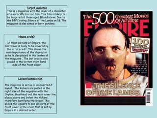
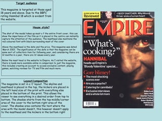
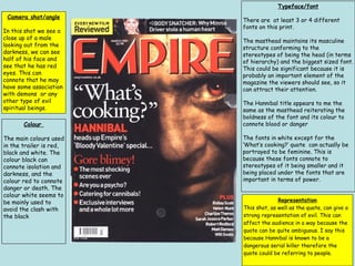
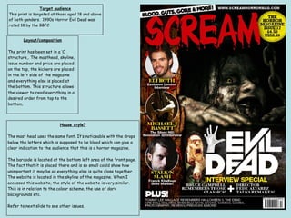
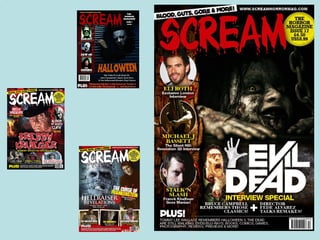
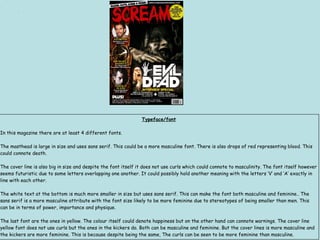
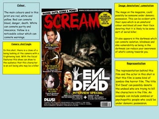
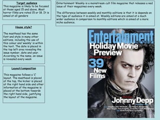
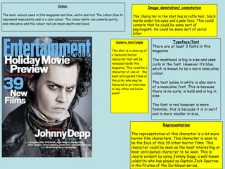
Target audience
This is a magazine with the cover of a character
of a early 90’s Horror film. This film is likely to
be targeted at those aged 18 and above. Due to
the BBFC rating Silence of the Lambs an 18. The
magazine is also aimed at both genders.
Layout/composition
The magazine is set up in an inverted Z
layout. The kickers are placed in the
right size of the magazine with the
Skyline, Masthead and the main cover line
placed above and below the kickers,
therefore justifying the layout. This
allows the viewers to see all parts of the
front cover in the order that is set by
Empire in a desired order.
House style?
In most editions of Empire, the
mast head is lively to be covered by
the actor credit. This shows the
main importance of the character
as he is also placed in the centre of
the magazine . The bar code is also
placed in the bottom right hand
side of the front cover
Camera shot/angle
The camera shot is a close up of a character of the
film, who seems to be wearing a mask to cover his
mouth. I think that this is a studio set up shot
because I believe this is quite an effective shot to
use on the magazine front cover. The meaning
behind this shot is to show the danger of this
character, he is likely to be the film antagonist or
someone who may have psychological issues.
Typeface/font
In this magazine there are about 3 different fonts. The
masthead of the magazine can connote masculinity it is big
and bold the main stereotypes of a male. The main cover line
which is the name of the film is also in bold and is quite big in
size as well. This could also connote masculinity. The third
font is the cover line at the right side. This font is smaller
and uses a serif font which can connote elegance .This can be
a more feminine type of font, this is because it conforms to
stereotypes of a female in terms of a more elegant
personality and placed on the side which could refer to its
importance in comparison to the masthead which is in the
middle.
Colour
The main colours used are red and black. Red ,which is used as the title and as the border
around the front cover, could suggest danger and/or blood with black connoting darkness.
They have been used in this magazine to suit the style of the magazine, which is a horror
slasher type of film.
Representation
The representation of the character in this film is suited to the
colour which can connote certain moods, symbols and signs . This
is due to the character being known for his killing nature which
suits the colours of black and red. The fonts and also in bold and
is big which can give the impression that it is direct and straight
to the point. The character as well can give another impression of
being dangerous and frightening.
Image denotation/ connotation
A close up of a man wearing a mask covering his mouth
and nose with a hole in his mouth. Probably to allow
breathing. Some kind of mask that could show that he
is dangerous if the mask is taken off him. This mask
could suggest a cannibal like nature within him as if he
is an animal
Target audience
This magazine is targeted at those aged
18 years and above. Due to the BBFC
rating Hannibal 18 which is evident from
the website.
Layout/composition
The magazine is set in a ‘C’ layout. The skyline and
masthead is placed in the top, the kickers are placed in
the left hand size of the print with everything else
placed in the bottom of the print. This allows the
viewer to see everything in a desired order from top to
bottom. The shadow starts from the top middle/corner
area of the cover to the bottom right area of the
cover. The shadow area contains the text where the
area with the model doesn’t, this however doesn’t apply
to the masthead and the kickers in the bottom right
House style?
The shot of the model takes up most o f the entire front cover, this can
show the importance of the film as it is placed in the centre can instantly
capture the attention of the audience. The masthead also maintains the
red coloured font with black surrounding most of the cover
Above the masthead is the date and the price. This magazine was dated
‘March 2001’. The significance of the date is that the magazine can be
some sort of collectors item for following year, and considering there are
12 months in a year, there are 12 issues every year.
Below the mast head is the website to Empire. As I visited the website,
there is loads more available online in comparison to just the magazine,
this includes creating an account to access exclusive content, playing
games, watching reviews for TV and Film and much more.
Colour
The main colours used
in the trailer is red,
black and white. The
colour black can
connote isolation and
darkness, and the
colour red to connote
danger or death. The
colour white seems to
be mainly used to
avoid the clash with
the black
Camera shot/angle
In this shot we see a
close up of a male
looking out from the
darkness, we can see
half of his face and
see that he has red
eyes. This can
connote that he may
have some association
with demons or any
other type of evil
spiritual beings.
Typeface/font
There are at least 3 or 4 different
fonts on this print.
The masthead maintains its masculine
structure conforming to the
stereotypes of being the head (in terms
of hierarchy) and the biggest sized font.
This could be significant because it is
probably an important element of the
magazine the viewers should see, so it
can attract their attention.
The Hannibal title appears to me the
same as the masthead reiterating the
boldness of the font and its colour to
connote blood or danger
The fonts in white except for the
‘What’s cooking?’ quote can actually be
portrayed to be feminine. This is
because these fonts connote to
stereotypes of it being smaller and it
being placed under the fonts that are
important in terms of power.
Representation
This shot, as well as the quote, can give a
strong representation of evil. This can
affect the audience in a way because the
quote can be quite ambiguous. I say this
because Hannibal is known to be a
dangerous serial killer therefore the
quote could be referring to people.
Target audience
This print is targeted at those aged 18 and above
of both genders. 1990s Horror Evil Dead was
rated 18 by the BBFC
Layout/composition
The print has been set in a ‘C’
structure,. The masthead, skyline,
issue number and price are placed
on the top, the kickers are placed
in the left side of the magazine
and everything else is placed at
the bottom. This structure allows
the viewer to read everything in a
desired order from top to the
bottom.
House style?
The mast head uses the same font. It’s noticeable with the drops
below the letters which is supposed to be blood which can give a
clear indication to the audience that this is a horror magazine.
The barcode is located at the bottom left area of the front page.
The fact that it is placed there and is so small could show how
unimportant it may be as everything else is quite close together.
The website is located in the skyline of the magazine. When I
accessed this website, the style of the website is very similar.
This is in relation to the colour scheme, the use of dark
backgrounds etc.
Refer to next slide to see other issues.
Typeface/font
In this magazine there are at least 4 different fonts.
The masthead is large in size and uses sans serif. This could be a more masculine font. There is also drops of red representing blood. This
could connote death.
The cover line is also big in size and despite the font itself it does not use curls which could connote to masculinity. The font itself however
seems futuristic due to some letters overlapping one another. It could possibly hold another meaning with the letters ‘V’ and ‘A’ exactly in
line with each other.
The white text at the bottom is much more smaller in size but uses sans serif. This can make the font both masculine and feminine.. The
sans serif is a more masculine attribute with the font size likely to be more feminine due to stereotypes of being smaller than men. This
can be in terms of power, importance and physique.
The last font are the ones in yellow. The colour itself could denote happiness but on the other hand can connote warnings. The cover line
yellow font does not use curls but the ones in the kickers do. Both can be masculine and feminine. But the cover lines is more masculine and
the kickers are more feminine. This is because despite being the same, The curls can be seen to be more feminine than masculine.
Colour
The main colours used in this
print are red, white and
yellow. Red can connote
blood, danger, death. White
can connote purity and
innocence. Yellow is a
noticeable colour which can
connote warnings.
Representation
The representation behind this
film and the actor in this shot is
that this film is some kind of
zombie-like horror film. The title
‘Evil Dead’ can possibly denote
the undead who are trying to kill
the characters in the film. An
example can include zombies or
psychopathic people who could be
under demonic possession.
Camera shot/angle
In this shot, there is a close of a
being looking at the camera with a
frightening look. With the facial
features this show can show to
the audience that this character
is an evil being who may be a killer
Image denotation/ connotation
The image on the magazine, could
possibly be someone under demonic
possession. This can be evident with
their eyes which is an unnatural
colour and blood all over their face
denoting that it is likely to be some
sort of serial killer.
It also appears in the darkness which
can connote isolation, blindness and
also vulnerability as being in the
darkness can reduce your awareness
of what’s coming towards you.
Target audience
This magazine is likely to be focused
at those aged 15 and above. Most
horror films are rated 15 or 18. It is
aimed at all genders
Layout/composition
This magazine follows a ‘C’
layout. The masthead is placed
at the top, the kicker is placed
at the right hand side and other
information of the magazine is
placed at the bottom towards
the right hand side, justifying
the layout of the magazine.
House style?
The masthead has the same
font and style in many other
editions, including the use of
this colour and ‘weekly’ is within
the text. The date is placed in
the top left area revealing the
issue number, date and year.
According to the name, an issue
is revealed every week
Entertainment Weekly is a mainstream cult film magazine that releases a ned
issue of their magazines every week.
The difference between weekly and monthly editions is that it is depends on
the type of audience it is aimed at. Weekly editions are aimed at a much
wider audience in comparison to monthly editions which is aimed at a more
niche audience.
Representation
The representation of this character is a lot more
horror film characters, This character is seen to
be the face of this 39 other horror films. This
character could be seen as the most interesting or
most anticipated character to be seen. This is
clearly evident by using Johnny Depp, a well known
celebrity who has played as Captain Jack Sparrow
in the Pirates of the Caribbean series.
Typeface/font
There are at least 3 fonts in this
magazine
The masthead is big in size and uses
curls in the font. However it’s blue,
which is known to be a more masculine
colour.
The text below in white is also more
of a masculine font. This is because
there is no curls, in bold and is big in
size.
The font in red however is more
feminine, this is because it is in serif
and is more smaller in size,
Image denotation/ connotation
The character in the shot has scruffy hair, black
marks under his eyes and a pale face. This could
connote that he could be some sort of
psychopath. He could be some sort of serial
killer
Colour
The main colours used in this magazine and blue, white and red. The colour blue to
represent masculinity and is a cold colour. The colour white can connote purity,
and innocence and the colour red can mean death and blood.
Camera shot/angle
This shot is a close up of
a featured horror
character that will be
revealed inside this
magazine. This could be a
character of one of the
most anticipated films or
the actor who may be
featured in an interview
or any other exclusive
event.

Film Magazine textual analysis

  • 1.
    Target audience This isa magazine with the cover of a character of a early 90’s Horror film. This film is likely to be targeted at those aged 18 and above. Due to the BBFC rating Silence of the Lambs an 18. The magazine is also aimed at both genders. Layout/composition The magazine is set up in an inverted Z layout. The kickers are placed in the right size of the magazine with the Skyline, Masthead and the main cover line placed above and below the kickers, therefore justifying the layout. This allows the viewers to see all parts of the front cover in the order that is set by Empire in a desired order. House style? In most editions of Empire, the mast head is lively to be covered by the actor credit. This shows the main importance of the character as he is also placed in the centre of the magazine . The bar code is also placed in the bottom right hand side of the front cover
  • 2.
    Camera shot/angle The camerashot is a close up of a character of the film, who seems to be wearing a mask to cover his mouth. I think that this is a studio set up shot because I believe this is quite an effective shot to use on the magazine front cover. The meaning behind this shot is to show the danger of this character, he is likely to be the film antagonist or someone who may have psychological issues. Typeface/font In this magazine there are about 3 different fonts. The masthead of the magazine can connote masculinity it is big and bold the main stereotypes of a male. The main cover line which is the name of the film is also in bold and is quite big in size as well. This could also connote masculinity. The third font is the cover line at the right side. This font is smaller and uses a serif font which can connote elegance .This can be a more feminine type of font, this is because it conforms to stereotypes of a female in terms of a more elegant personality and placed on the side which could refer to its importance in comparison to the masthead which is in the middle.
  • 3.
    Colour The main coloursused are red and black. Red ,which is used as the title and as the border around the front cover, could suggest danger and/or blood with black connoting darkness. They have been used in this magazine to suit the style of the magazine, which is a horror slasher type of film. Representation The representation of the character in this film is suited to the colour which can connote certain moods, symbols and signs . This is due to the character being known for his killing nature which suits the colours of black and red. The fonts and also in bold and is big which can give the impression that it is direct and straight to the point. The character as well can give another impression of being dangerous and frightening. Image denotation/ connotation A close up of a man wearing a mask covering his mouth and nose with a hole in his mouth. Probably to allow breathing. Some kind of mask that could show that he is dangerous if the mask is taken off him. This mask could suggest a cannibal like nature within him as if he is an animal
  • 4.
    Target audience This magazineis targeted at those aged 18 years and above. Due to the BBFC rating Hannibal 18 which is evident from the website. Layout/composition The magazine is set in a ‘C’ layout. The skyline and masthead is placed in the top, the kickers are placed in the left hand size of the print with everything else placed in the bottom of the print. This allows the viewer to see everything in a desired order from top to bottom. The shadow starts from the top middle/corner area of the cover to the bottom right area of the cover. The shadow area contains the text where the area with the model doesn’t, this however doesn’t apply to the masthead and the kickers in the bottom right House style? The shot of the model takes up most o f the entire front cover, this can show the importance of the film as it is placed in the centre can instantly capture the attention of the audience. The masthead also maintains the red coloured font with black surrounding most of the cover Above the masthead is the date and the price. This magazine was dated ‘March 2001’. The significance of the date is that the magazine can be some sort of collectors item for following year, and considering there are 12 months in a year, there are 12 issues every year. Below the mast head is the website to Empire. As I visited the website, there is loads more available online in comparison to just the magazine, this includes creating an account to access exclusive content, playing games, watching reviews for TV and Film and much more.
  • 5.
    Colour The main coloursused in the trailer is red, black and white. The colour black can connote isolation and darkness, and the colour red to connote danger or death. The colour white seems to be mainly used to avoid the clash with the black Camera shot/angle In this shot we see a close up of a male looking out from the darkness, we can see half of his face and see that he has red eyes. This can connote that he may have some association with demons or any other type of evil spiritual beings. Typeface/font There are at least 3 or 4 different fonts on this print. The masthead maintains its masculine structure conforming to the stereotypes of being the head (in terms of hierarchy) and the biggest sized font. This could be significant because it is probably an important element of the magazine the viewers should see, so it can attract their attention. The Hannibal title appears to me the same as the masthead reiterating the boldness of the font and its colour to connote blood or danger The fonts in white except for the ‘What’s cooking?’ quote can actually be portrayed to be feminine. This is because these fonts connote to stereotypes of it being smaller and it being placed under the fonts that are important in terms of power. Representation This shot, as well as the quote, can give a strong representation of evil. This can affect the audience in a way because the quote can be quite ambiguous. I say this because Hannibal is known to be a dangerous serial killer therefore the quote could be referring to people.
  • 6.
    Target audience This printis targeted at those aged 18 and above of both genders. 1990s Horror Evil Dead was rated 18 by the BBFC Layout/composition The print has been set in a ‘C’ structure,. The masthead, skyline, issue number and price are placed on the top, the kickers are placed in the left side of the magazine and everything else is placed at the bottom. This structure allows the viewer to read everything in a desired order from top to the bottom. House style? The mast head uses the same font. It’s noticeable with the drops below the letters which is supposed to be blood which can give a clear indication to the audience that this is a horror magazine. The barcode is located at the bottom left area of the front page. The fact that it is placed there and is so small could show how unimportant it may be as everything else is quite close together. The website is located in the skyline of the magazine. When I accessed this website, the style of the website is very similar. This is in relation to the colour scheme, the use of dark backgrounds etc. Refer to next slide to see other issues.
  • 8.
    Typeface/font In this magazinethere are at least 4 different fonts. The masthead is large in size and uses sans serif. This could be a more masculine font. There is also drops of red representing blood. This could connote death. The cover line is also big in size and despite the font itself it does not use curls which could connote to masculinity. The font itself however seems futuristic due to some letters overlapping one another. It could possibly hold another meaning with the letters ‘V’ and ‘A’ exactly in line with each other. The white text at the bottom is much more smaller in size but uses sans serif. This can make the font both masculine and feminine.. The sans serif is a more masculine attribute with the font size likely to be more feminine due to stereotypes of being smaller than men. This can be in terms of power, importance and physique. The last font are the ones in yellow. The colour itself could denote happiness but on the other hand can connote warnings. The cover line yellow font does not use curls but the ones in the kickers do. Both can be masculine and feminine. But the cover lines is more masculine and the kickers are more feminine. This is because despite being the same, The curls can be seen to be more feminine than masculine.
  • 9.
    Colour The main coloursused in this print are red, white and yellow. Red can connote blood, danger, death. White can connote purity and innocence. Yellow is a noticeable colour which can connote warnings. Representation The representation behind this film and the actor in this shot is that this film is some kind of zombie-like horror film. The title ‘Evil Dead’ can possibly denote the undead who are trying to kill the characters in the film. An example can include zombies or psychopathic people who could be under demonic possession. Camera shot/angle In this shot, there is a close of a being looking at the camera with a frightening look. With the facial features this show can show to the audience that this character is an evil being who may be a killer Image denotation/ connotation The image on the magazine, could possibly be someone under demonic possession. This can be evident with their eyes which is an unnatural colour and blood all over their face denoting that it is likely to be some sort of serial killer. It also appears in the darkness which can connote isolation, blindness and also vulnerability as being in the darkness can reduce your awareness of what’s coming towards you.
  • 10.
    Target audience This magazineis likely to be focused at those aged 15 and above. Most horror films are rated 15 or 18. It is aimed at all genders Layout/composition This magazine follows a ‘C’ layout. The masthead is placed at the top, the kicker is placed at the right hand side and other information of the magazine is placed at the bottom towards the right hand side, justifying the layout of the magazine. House style? The masthead has the same font and style in many other editions, including the use of this colour and ‘weekly’ is within the text. The date is placed in the top left area revealing the issue number, date and year. According to the name, an issue is revealed every week Entertainment Weekly is a mainstream cult film magazine that releases a ned issue of their magazines every week. The difference between weekly and monthly editions is that it is depends on the type of audience it is aimed at. Weekly editions are aimed at a much wider audience in comparison to monthly editions which is aimed at a more niche audience.
  • 11.
    Representation The representation ofthis character is a lot more horror film characters, This character is seen to be the face of this 39 other horror films. This character could be seen as the most interesting or most anticipated character to be seen. This is clearly evident by using Johnny Depp, a well known celebrity who has played as Captain Jack Sparrow in the Pirates of the Caribbean series. Typeface/font There are at least 3 fonts in this magazine The masthead is big in size and uses curls in the font. However it’s blue, which is known to be a more masculine colour. The text below in white is also more of a masculine font. This is because there is no curls, in bold and is big in size. The font in red however is more feminine, this is because it is in serif and is more smaller in size, Image denotation/ connotation The character in the shot has scruffy hair, black marks under his eyes and a pale face. This could connote that he could be some sort of psychopath. He could be some sort of serial killer Colour The main colours used in this magazine and blue, white and red. The colour blue to represent masculinity and is a cold colour. The colour white can connote purity, and innocence and the colour red can mean death and blood. Camera shot/angle This shot is a close up of a featured horror character that will be revealed inside this magazine. This could be a character of one of the most anticipated films or the actor who may be featured in an interview or any other exclusive event.