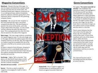
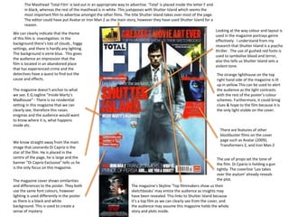
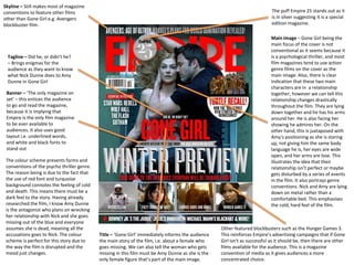
Masthead – Placed at the top of the page. It is
also the largest and boldest font making it stand
out the most from the rest of the trailer. The
masthead follows basic magazine conventions as
it is an editing technique used to immediately
draw the audience’s attention, giving them a first
impression which is important for the publishing
company, Empire.
Coverlines – We can see the title ‘Inception’ is
the most important film topic in the poster
compared any other film. The title Inception is
placed in the centre of the poster, and is the
closest object within the poster. It is also in bold
red font, whereas the other film titles are in
black. This is juxtaposed with the other film titles
that are placed on the sides of the magazine.
Main image – The main image conforms conventions
of a typical magazine cover. It is the only image used
on the page, therefore the audience gives their direct
reception and focus on the star. Also, the image taken
is a medium long shot to establish the role of the
character in the film as his costume can be clearly
seen.
Di Caprio is placed in front of Empire, showing his
dominance as he is a worldwide known actor. It
confirms, he is more important than Empire because
the audience already know what the company is
therefore he’s an A list.
Anchorage – Tagline “007 on steroids.” This
gives us an idea that Di Caprio plays a similar
role like James Bond except that Di Caprio in
this film is almost unstoppable.
The tagline: ‘The matrix meets 007 on
steroids.” This establishes that
Leonardo Di Caprio is the spy/agent in
this film because 007 was always
associated with James Bond, who
always appeared in a black and white
suit holding a gun just like Di Caprio is
in this poster to establish the genre in
the film. The tagline anchors to what
we see in the image. On the other
hand, there is some kind of enigma as
the audience wants to know extactly
who the matrix is in this film.
Genre ConventionsMagazine Conventions
There’s some indication that the
main artist in the film plays the
heroic role. He is placed in the
centre of the cover, in front of the
masthead, and is one of the closest
objects within the frame.
On the other hand, having actually
researched the film’s plot, it turns
out Leonardo Di Caprio is actually
the villain in the film. He plays the
role of a thief, plays with the
subconscious, and tries to erase his
criminal history.
Barcode and issue number
The urbanised location (city) in
the background hints the theme
of crime in the film.
Banner – This tells us what is inside the
magazine, encouraging the reader to have a
look inside.
Sticker/Puff – This is in gold to suggest it is
a limited edition or something special and
stands out against Leonardo’s black suit.
We can clearly indicate that the theme
of this film is investigation. In the
background there’s lots of clouds , foggy
settings, and there is hardly any lighting.
The background is eerie blue. This gives
the audience an impression that the
film is located in an abandoned place
that has experienced crime and the
detectives have a quest to find out the
cause and effects.
The magazine doesn’t anchor to what
we see. E.G.tagline “Inside Marty’s
Madhouse” - There is no residential
setting in this magazine that we can
clearly see, therefore this raises
enigmas and the audience would want
to know where it is, what happens
inside etc.
We know straight away from the main
image that Leonardo Di Caprio is the
star of the film. He is placed in the
centre of the page, he is large and the
banner “Di Caprio Exclusive” tells us he
is the only focus on this magazine.
Looking at the way colour and layout is
used in the magazine portrays genre
effectively. I understand from my
research that Shutter Island is a psycho
thriller . The use of gushed red fonts is
used to symbolise blood and terror,
also this tells us Shutter Island sets a
violent tone.
The strange lighthouse on the top
right hand side of the magazine is lit
up in yellow.This can be used to alert
the audience as the light contrasts
with the rest of the poster’s colour
schemes. Furthermore, it could bring
clues & hope to the film because it is
the only light visible on the cover.
There are features of other
blockbuster films on the cover
page such as Avatar (2009),
Transformers 2, and Iron Man 2
The magazine cover shows similarities
and differences to the poster. They both
use the same font colours, however
lighting is used differently in the poster
as there is a black and white
background. This is used to create a
sense of mystery.
The use of props set the tone of
the film. Di Cpario is holding a gun
tightly. The coverline ‘Leo takes
over the asylum’ already reveals
the plot.
The Masthead ‘Total Film’ is laid out in an appropriate way to advertise. ‘Total’ is placed inside the letter F and
in black, whereas the rest of the masthead is in white. This juxtaposes with Shutter Island which seems the
most important film to advertise amongst the other films. The title Shutter Island takes over most of the page.
The editor could have put Avatar or Iron Man 2 as the main story, however they have used Shutter Island for a
reason.
The magazine’s Skyline ‘Top filmmakers show us their
sketchbooks’ may entice the audience as insights may
have been revealed. This links to Shutter Island because
it’s a top film as we can clearly see from the cover, and
the audience may assume this magazine holds the whole
story and plots inside.
Skyline – Still makes most of magazine
conventions to feature other films
other than Gone Girl e.g. Avengers
blockbuster film.
Title – ‘Gone Girl’ immediately informs the audience
the main story of the film, i.e. about a female who
goes missing. We can also tell the woman who gets
missing in this film must be Amy Dunne as she is the
only female figure that’s part of the main image.
Tagline – Did he, or didn’t he?
– Brings enigmas for the
audience as they want to know
what Nick Dunne does to Amy
Dunne in Gone Girl
The puff Empire 25 stands out as it
is in silver suggesting it is a special
edition magazine.
Other featured blockbusters such as the Hunger Games 3.
This reinforces Empire’s advertising campaigns that if Gone
Girl isn’t as successful as it should be, then there are other
films available for the audience. This is a magazine
convention of media as it gives audiences a more
concentrated choice.
Banner – ‘The only magazine on
set’ – this entices the audience
to go and read the magazine,
because it is implying that
Empire is the only film magazine
to be ever available to
audiences. It also uses good
layout i.e. underlined words,
and white and black fonts to
stand out
Main image – Gone Girl being the
main focus of the cover is not
conventional as it seems because it
is a psychological thriller, and most
film magazines tend to use action
genre films on the cover as the
main image. Also, there is clear
indication that these two main
characters are in a relationship
together, however we can tell this
relationship changes drastically
throughout the film. They are lying
down together and he has his arms
around her. He is also facing her
showing he admires her. On the
other hand, this is juxtaposed with
Amy’s positioning as she is staring
up, not giving him the same body
language he is, her eyes are wide
open, and her arms are lose. This
illustrates the idea that their
relationship isn’t perfect or maybe
gets disturbed by a series of events
in the film. It also portrays genre
conventions. Nick and Amy are lying
down on metal rather than a
comfortable bed. This emphasises
the cold, hard feel of the film.
The colour scheme presents forms and
conventions of the psycho thriller genre.
The reason being is due to the fact that
the use of red font and turquoise
background connotes the feeling of cold
and death. This means there must be a
dark feel to the story. Having already
researched the film, I know Amy Dunne
is the antagonist who plans on wrecking
her relationship with Nick and she goes
missing out of the blue and everyone
assumes she is dead, meaning all the
accusations goes to Nick. The colour
scheme is perfect for this story due to
the way the film is disrupted and the
mood just changes.
How we will apply these genre
conventions in our magazine production
• We will use all magazine conventions in our
product such as date & price, barcode, issue
number, featured blockbuster films, sticker etc.
• We will use include strong language like Empire
did to entice our audience i.e. hyperbole in Gone
Girl’s banner “The only magazine on set”
• We include appropriate colour schemes towards
our fonts especially red to symbolise the danger
of our serial killer.

Magazine analysis

  • 1.
    Masthead – Placedat the top of the page. It is also the largest and boldest font making it stand out the most from the rest of the trailer. The masthead follows basic magazine conventions as it is an editing technique used to immediately draw the audience’s attention, giving them a first impression which is important for the publishing company, Empire. Coverlines – We can see the title ‘Inception’ is the most important film topic in the poster compared any other film. The title Inception is placed in the centre of the poster, and is the closest object within the poster. It is also in bold red font, whereas the other film titles are in black. This is juxtaposed with the other film titles that are placed on the sides of the magazine. Main image – The main image conforms conventions of a typical magazine cover. It is the only image used on the page, therefore the audience gives their direct reception and focus on the star. Also, the image taken is a medium long shot to establish the role of the character in the film as his costume can be clearly seen. Di Caprio is placed in front of Empire, showing his dominance as he is a worldwide known actor. It confirms, he is more important than Empire because the audience already know what the company is therefore he’s an A list. Anchorage – Tagline “007 on steroids.” This gives us an idea that Di Caprio plays a similar role like James Bond except that Di Caprio in this film is almost unstoppable. The tagline: ‘The matrix meets 007 on steroids.” This establishes that Leonardo Di Caprio is the spy/agent in this film because 007 was always associated with James Bond, who always appeared in a black and white suit holding a gun just like Di Caprio is in this poster to establish the genre in the film. The tagline anchors to what we see in the image. On the other hand, there is some kind of enigma as the audience wants to know extactly who the matrix is in this film. Genre ConventionsMagazine Conventions There’s some indication that the main artist in the film plays the heroic role. He is placed in the centre of the cover, in front of the masthead, and is one of the closest objects within the frame. On the other hand, having actually researched the film’s plot, it turns out Leonardo Di Caprio is actually the villain in the film. He plays the role of a thief, plays with the subconscious, and tries to erase his criminal history. Barcode and issue number The urbanised location (city) in the background hints the theme of crime in the film. Banner – This tells us what is inside the magazine, encouraging the reader to have a look inside. Sticker/Puff – This is in gold to suggest it is a limited edition or something special and stands out against Leonardo’s black suit.
  • 2.
    We can clearlyindicate that the theme of this film is investigation. In the background there’s lots of clouds , foggy settings, and there is hardly any lighting. The background is eerie blue. This gives the audience an impression that the film is located in an abandoned place that has experienced crime and the detectives have a quest to find out the cause and effects. The magazine doesn’t anchor to what we see. E.G.tagline “Inside Marty’s Madhouse” - There is no residential setting in this magazine that we can clearly see, therefore this raises enigmas and the audience would want to know where it is, what happens inside etc. We know straight away from the main image that Leonardo Di Caprio is the star of the film. He is placed in the centre of the page, he is large and the banner “Di Caprio Exclusive” tells us he is the only focus on this magazine. Looking at the way colour and layout is used in the magazine portrays genre effectively. I understand from my research that Shutter Island is a psycho thriller . The use of gushed red fonts is used to symbolise blood and terror, also this tells us Shutter Island sets a violent tone. The strange lighthouse on the top right hand side of the magazine is lit up in yellow.This can be used to alert the audience as the light contrasts with the rest of the poster’s colour schemes. Furthermore, it could bring clues & hope to the film because it is the only light visible on the cover. There are features of other blockbuster films on the cover page such as Avatar (2009), Transformers 2, and Iron Man 2 The magazine cover shows similarities and differences to the poster. They both use the same font colours, however lighting is used differently in the poster as there is a black and white background. This is used to create a sense of mystery. The use of props set the tone of the film. Di Cpario is holding a gun tightly. The coverline ‘Leo takes over the asylum’ already reveals the plot. The Masthead ‘Total Film’ is laid out in an appropriate way to advertise. ‘Total’ is placed inside the letter F and in black, whereas the rest of the masthead is in white. This juxtaposes with Shutter Island which seems the most important film to advertise amongst the other films. The title Shutter Island takes over most of the page. The editor could have put Avatar or Iron Man 2 as the main story, however they have used Shutter Island for a reason. The magazine’s Skyline ‘Top filmmakers show us their sketchbooks’ may entice the audience as insights may have been revealed. This links to Shutter Island because it’s a top film as we can clearly see from the cover, and the audience may assume this magazine holds the whole story and plots inside.
  • 3.
    Skyline – Stillmakes most of magazine conventions to feature other films other than Gone Girl e.g. Avengers blockbuster film. Title – ‘Gone Girl’ immediately informs the audience the main story of the film, i.e. about a female who goes missing. We can also tell the woman who gets missing in this film must be Amy Dunne as she is the only female figure that’s part of the main image. Tagline – Did he, or didn’t he? – Brings enigmas for the audience as they want to know what Nick Dunne does to Amy Dunne in Gone Girl The puff Empire 25 stands out as it is in silver suggesting it is a special edition magazine. Other featured blockbusters such as the Hunger Games 3. This reinforces Empire’s advertising campaigns that if Gone Girl isn’t as successful as it should be, then there are other films available for the audience. This is a magazine convention of media as it gives audiences a more concentrated choice. Banner – ‘The only magazine on set’ – this entices the audience to go and read the magazine, because it is implying that Empire is the only film magazine to be ever available to audiences. It also uses good layout i.e. underlined words, and white and black fonts to stand out Main image – Gone Girl being the main focus of the cover is not conventional as it seems because it is a psychological thriller, and most film magazines tend to use action genre films on the cover as the main image. Also, there is clear indication that these two main characters are in a relationship together, however we can tell this relationship changes drastically throughout the film. They are lying down together and he has his arms around her. He is also facing her showing he admires her. On the other hand, this is juxtaposed with Amy’s positioning as she is staring up, not giving him the same body language he is, her eyes are wide open, and her arms are lose. This illustrates the idea that their relationship isn’t perfect or maybe gets disturbed by a series of events in the film. It also portrays genre conventions. Nick and Amy are lying down on metal rather than a comfortable bed. This emphasises the cold, hard feel of the film. The colour scheme presents forms and conventions of the psycho thriller genre. The reason being is due to the fact that the use of red font and turquoise background connotes the feeling of cold and death. This means there must be a dark feel to the story. Having already researched the film, I know Amy Dunne is the antagonist who plans on wrecking her relationship with Nick and she goes missing out of the blue and everyone assumes she is dead, meaning all the accusations goes to Nick. The colour scheme is perfect for this story due to the way the film is disrupted and the mood just changes.
  • 4.
    How we willapply these genre conventions in our magazine production • We will use all magazine conventions in our product such as date & price, barcode, issue number, featured blockbuster films, sticker etc. • We will use include strong language like Empire did to entice our audience i.e. hyperbole in Gone Girl’s banner “The only magazine on set” • We include appropriate colour schemes towards our fonts especially red to symbolise the danger of our serial killer.