This document analyzes the contents page from various magazines. It discusses the layout, colors, fonts and images used on each contents page and how they appeal to different target audiences. Key points made include the need for contents pages to highlight appealing articles to encourage sales, the use of colors and fonts to draw attention and make information clear and easy to read, and how different styles suit magazines aimed at various age groups. The positioning of logos and dates is also examined.

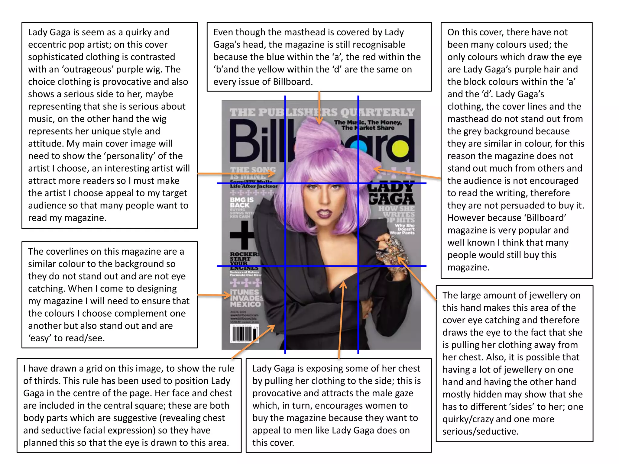


![Front cover analysis [autosaved]](https://cdn.slidesharecdn.com/ss_thumbnails/frontcoveranalysisautosaved-120413070940-phpapp02-thumbnail.jpg?width=640&height=640&fit=bounds)


